Outlook’s New Logo Is Now Live on iOS

Late last year, Microsoft introduced a new set of logos for the entire Office suite. The company recently started rolling out some of these new icons across all platforms, and users are slowly starting to get the new look for apps like Word and Outlook.

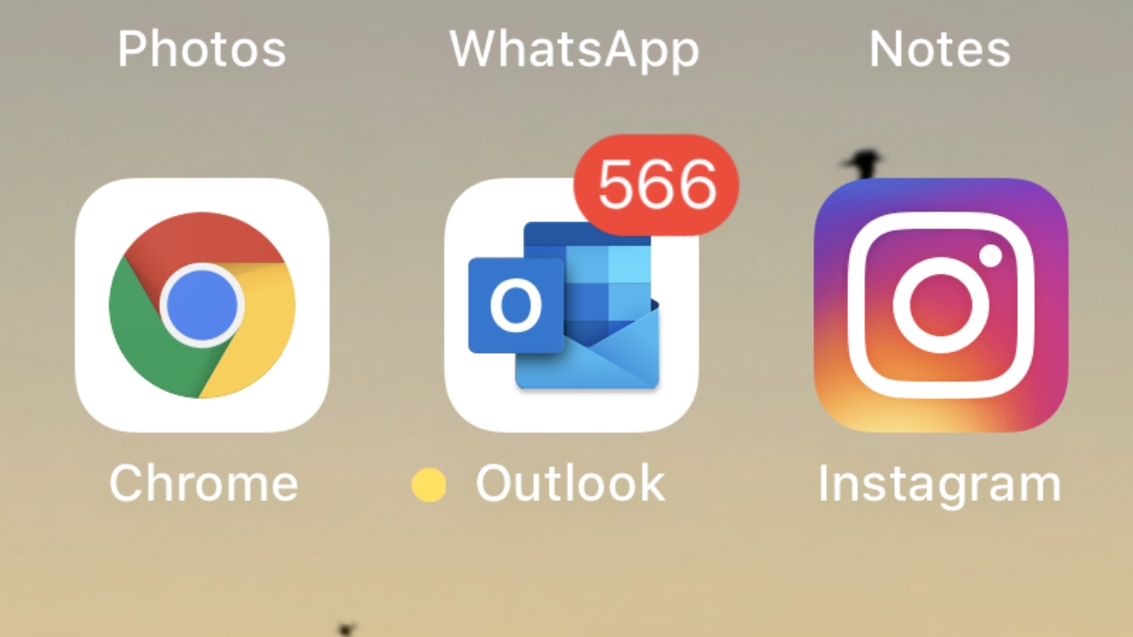
Microsoft today started rolling out the new logo for Outlook to all users on iOS. The company only recently rolled it out to beta testers, so it was a little surprising to see the new logo being already made available to all users.

Windows Intelligence In Your Inbox

Sign up for our new free newsletter to get three time-saving tips each Friday — and get free copies of Paul Thurrott's Windows 11 and Windows 10 Field Guides (normally $9.99) as a special welcome gift!

"*" indicates required fields

This field is for validation purposes and should be left unchanged.

“We’ve updated our icon to reflect how we bring email and calendar together with carefully crafted experiences that honor our Office heritage and welcome the future,” Microsoft said.

The new logos for most of the Office apps aren’t widely available yet, however. Since there are a bunch of different release channels and platforms for Office apps, the rollout is frankly quite slow and all over the place. I have the new logo for Word on my Mac, for example, but apps like Excel and PowerPoint still have their old logos. It’s all very weird.

Either way, Microsoft is getting there, so hopefully these new logos will start showing up everywhere soon. For now, if you have an iPhone and use Outlook, check for updates to get the new logo right away.
Tagged with

Share post

Please check our Community Guidelines before commenting

Conversation 24 comments

  • bluvg

    19 March, 2019 - 2:39 pm

    <p>"The company only recently rolled it out to beta testers, so it was a little surprising to see the new logo being already made available to all users."</p><p><br></p><p>"New logo bricked my iPhone! Hate M$!"</p>

    • StevenLayton

      19 March, 2019 - 2:46 pm

      <blockquote><em><a href="#413782">In reply to bluvg:</a></em></blockquote><p>How can an icon brick your iPhone? That's unlucky! </p>

      • bluvg

        19 March, 2019 - 3:45 pm

        <blockquote><em><a href="#413785">In reply to StevenLayton:</a></em></blockquote><p>It's a joke 😛 Just thought the comment suggesting icons need beta testing was funny.</p>

        • safesax2002

          19 March, 2019 - 4:01 pm

          <blockquote><em><a href="#413803">In reply to bluvg:</a></em></blockquote><p>The new icon was their reward for being beta testers. :)</p>

        • SvenJ

          19 March, 2019 - 7:27 pm

          <blockquote><a href="#413803"><em>In reply to bluvg:</em></a><em> </em>Maybe it was the new version of Outlook that needed beta testing, and it came with the new icon.</blockquote><p><br></p>

  • wright_is

    Premium Member
    19 March, 2019 - 3:18 pm

    <p>Not seeing them on Android or Windows, both using Office 365 Home and Microsoft 365 business.</p>

    • zybch

      22 March, 2019 - 4:33 am

      <blockquote><em><a href="#413795">In reply to wright_is:</a></em></blockquote><p>The headline is a bit of a hint, its ONLY iOS so far lol</p>

  • Tony Barrett

    19 March, 2019 - 3:24 pm

    <p>Is this really even news?</p>

    • nbplopes

      20 March, 2019 - 7:05 am

      <blockquote><em><a href="#413796">In reply to ghostrider:</a></em></blockquote><p><br></p><p>Innovation starts here. Better than keyboard talk isn’t it?</p>

  • christian.hvid

    19 March, 2019 - 5:19 pm

    <p>566 unread emails? I'm not sure, but I think you're legally disqualified from using email once you pass 999. :)</p>

  • clowg

    Premium Member
    19 March, 2019 - 6:08 pm

    <p>My O365 client on Windows 10 just updated (Monthly Channel (Targeted)) and I still don't have the new icons :(</p><p>Now on 1903 Build 11425.20140 C2R.</p>

  • Daekar

    19 March, 2019 - 6:20 pm

    <p>Wow, I don't usually have an opinion on icons, but that one is a real turd.</p><p><br></p><p>Oh well.</p>

    • mclark2112

      Premium Member
      19 March, 2019 - 8:45 pm

      <blockquote><em><a href="#413828">In reply to Daekar:</a></em></blockquote><p>Came here to say the same thing. I really liked the last set of icons, flat and simple. Honestly, the best logos Microsoft has done in years.</p>

    • rbwatson0

      Premium Member
      19 March, 2019 - 10:38 pm

      <blockquote><em><a href="#413828">In reply to Daekar:</a></em></blockquote><p>I absolutely love these new icons! Oh well.</p>

  • siv

    19 March, 2019 - 10:59 pm

    <p>I just hope this isn't to Office what Windows 8 was to Windows. I start twitching when designers start spouting the pretentious twaddle like in the video clip above. Very worrying was the "simpler" … "but more powerful" line. We'll end up having all sorts of non-discoverable stuff like "charms" in Windows 8, in Office.</p><p><br></p><p>God help us!</p>

    • cheetahdriver

      Premium Member
      20 March, 2019 - 12:07 pm

      <blockquote><a href="#413901"><em>In reply to Siv:</em></a></blockquote><p>My thoughts exactly. I'm not saying "Simpler…but more Powerful" is mutually exclusive, but it's durn close in anything other than Hammers. </p><p><br></p><p>I will never get the 1:15 back from watching that video. That's a chunk of my life gone forever…for nothing.</p>

      • siv

        20 March, 2019 - 6:15 pm

        <blockquote><em><a href="#414034">In reply to cheetahdriver:</a></em></blockquote><p>I know exactly how you feel! </p><p>I used to work in a Bank and I had exactly the same feeling about hours of my life lost that I will never get back when we had senior management meetings!</p>

        • zybch

          22 March, 2019 - 4:32 am

          <blockquote><em><a href="#414127">In reply to Siv:</a></em></blockquote><p>Apple have a long history of hiding useful and sometimes essential iOS features. I recently updated to 12.6 from whatever old version I had before and they've even changed the control center swipe in location. Took me ages to find that its ONLY accessible if you swipe down from the top RIGHT, and thats just the latest stupid UI change I've noticed.</p>

  • codymesh

    20 March, 2019 - 2:17 am

    <p>The old office icons stood out like sore thumbs on iOS and Android, but these new icons fit on mobile pretty nicely. Instead, now these new icons look out of place on Windows 10. We know that an icon overhaul is coming to Windows 10, it just needs to be here soon.</p><p>Pity about the white squircle outline on iOS though. I hope they find a way to make the icon round for Android, but I doubt it (I sure do miss legacy icons that could have arbitrary shapes)</p>

  • Tirith

    Premium Member
    20 March, 2019 - 12:08 pm

    <p>It's just terrible. </p><p><br></p><p>Outlook used to "pop" when looking at my iOS app grid, now it just disappears. </p>

  • CyberDadIO

    Premium Member
    20 March, 2019 - 3:58 pm

    <p>Icon looks ugly with the huge white border around it!</p>

  • zorb56

    Premium Member
    21 March, 2019 - 9:09 am

    <p>Looks terrible on banner notifications. When i saw it this morning I was trying to figure out which app was giving me notifications.</p>

  • zybch

    22 March, 2019 - 4:29 am

    <p>Not a fan of it. Took me a few moments to realize what it was its so unnecessarily different from the 'real' outlook logo.</p>

  • minke

    27 March, 2019 - 7:18 am

    <p>Got my new Outlook logo on Android overnight and it is ugly. Way too busy for a smartphone.</p>

Windows Intelligence In Your Inbox

Sign up for our new free newsletter to get three time-saving tips each Friday

"*" indicates required fields

This field is for validation purposes and should be left unchanged.

Thurrott © 2024 Thurrott LLC