Microsoft Promises Fluent Iconography in Edge

Microsoft today said that it will update the core system iconography in its Edge web browser to utilize the Fluent Design System. But it unforgivably didn’t provide even a single image demonstrating what this might look like.

“First, we’re focusing on our core system iconography which hasn’t been updated since the days of our second Microsoft Design Language (MDL2), circa 2014,” Microsoft’s Irina Litvin writes in the announcement post. “This has been a Microsoft-wide design initiative and it was important for Edge to be early adopters of the new, open-source Fluent Design System icons which were announced at the 2020 Build conference. This effort covers more than two hundred icons, many of which have been custom made for Edge.”

Windows Intelligence In Your Inbox

Sign up for our new free newsletter to get three time-saving tips each Friday — and get free copies of Paul Thurrott's Windows 11 and Windows 10 Field Guides (normally $9.99) as a special welcome gift!

"*" indicates required fields

This field is for validation purposes and should be left unchanged.

Over 200 icons, nice. I’d love to see some of them. Unfortunately, this post doesn’t provide a single screenshot or image depicting these new icons in Edge. Instead, it has three illustrations, one drawn by hand, depicting what some of the icons will look like. Sort of.

For example:

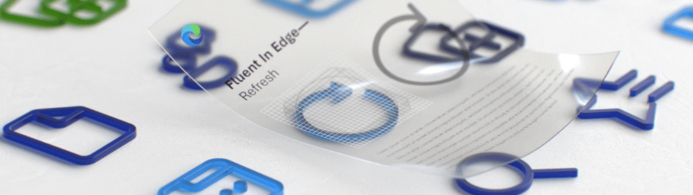
The new icons will be added to Edge in two phases, Litvin says. In phase one, which is now rolling out, Microsoft will replace “high-touch user interfaces, including tabs, address bar, as well as navigational and wayfinding icons found in our various menus.” In phase two, Microsoft will address the remaining icons, including those found in the product’s Developer Tools and Extension experiences.

“Our goal is to make something unique to browsers, while delivering a modern look and feel that matches Microsoft 365 and our brand personality,” Litvin adds.

That sounds great. I’d love to see it.

Share post

Please check our Community Guidelines before commenting

Conversation 25 comments

  • bentessier

    Premium Member
    17 November, 2020 - 5:35 pm

    <p>Looks like the new Edge Dev Build 88.0.702.0 has some new icons based on that according to the new feature screen. I notice the vertical tab icon has changed. </p>

  • remc86007

    17 November, 2020 - 6:13 pm

    <p>It is amazing that Microsoft doesn't focus a bit more money and time on polishing their OS and applications and making them beautiful to look at. Apple consistently beats them at it. Microsoft acts like they think consumers rejected "pretty" OSs with Vista. I think parts of Vista are prettier than what we have in Windows 10. They have billions of dollars…why not spend some of it on the design of your largest consumer facing product?</p>

    • irfaanwahid

      18 November, 2020 - 1:13 am

      <blockquote><em><a href="#593821">In reply to remc86007:</a></em></blockquote><p>In the last few years what has come out clear is that, Microsoft likes to talk about a lot of stuff, Fluent Design, Edge's icongraphy which sounds all pretty, but the implementation of it all is so poor.</p><p>On the other hand, Apple guys hardly discuss anything but put a near complete experience, eg BigSur. That is one big of an update to the OS. </p><p>Meanwhile, we at Windows 10 don't even have consistency across OS and the Fluent Design is staggered across multiple Windows 10 update as if its some architecture change to the core that it has to take so long.</p><p>Funny enough, Microsoft is a "Software" company and Apple a "Products" company!</p><p><br></p>

      • dodavinkeln

        18 November, 2020 - 4:49 am

        <blockquote><em><a href="#593868">In reply to irfaanwahid:</a></em></blockquote><p><br></p><p>Have you noticed that all YouTube videos presenting the design language always looks tons better than the actual implementation? Put the people working on the videos on the actual UI instead.</p>

    • nyghtfall

      18 November, 2020 - 4:37 am

      <blockquote><em><a href="#593821">In reply to remc86007:</a></em></blockquote><p>I'm 49 and have used Windows since v3.0. I currently use Windows 10 on a 7-yr-old custom-built Core i7 tower PC. </p><p><br></p><p>One thing I've always been jealous of about Mac users is how much Apple cares about consistent, aesthetically pleasing design language. To that point, I think MacOS looks beautiful and frequently wish Windows looked more like it.</p><p><br></p><p>A few days ago, I decided to buy my first new laptop in 14 years and take advantage of the opportunity to finally step into Apple's ecosystem with the base version of the M1 MacBook Air. I'm going to use it to read books on Kindle, write short stories with Pages, and surf the web with Safari.</p>

  • rbgaynor

    17 November, 2020 - 7:20 pm

    <p>"Microsoft today said that it will update the core system iconography in its Edge web browser to utilize the Fluent Design System."</p><p><br></p><p>Can't wait for 2025 to see this…</p>

    • dodavinkeln

      18 November, 2020 - 4:47 am

      <blockquote><em><a href="#593833">In reply to rbgaynor:</a></em></blockquote><p><br></p><p>I already have them in the dev version of Edge. But yeah, I wonder if we ever will have a consistent UI in Windows. The start working on new icons and design languages before they have replaced all old ones.</p>

  • truerock2

    17 November, 2020 - 8:48 pm

    <p>As fas as I have heard, Fluent is ditching the flat, 2-dimensional look of Metro and going back to the 3-dimensional look of Aero used in Windows 7.</p><p><br></p><p>I was never that crazy about when Apple went to the flat-2-dimensional look and other companies like Microsoft tried to copy.</p><p>For a desktop PC with a 29" 1080p screen, the Windows 7 GUI was better.</p><p>For a 4.5" iPhone… I could see that a flat-2D GUI might be necessary.</p>

    • dodavinkeln

      18 November, 2020 - 4:45 am

      <blockquote><em><a href="#593857">In reply to truerock2:</a></em></blockquote><p><br></p><p>I would argue that Microsoft came out with a flat design way before Apple and Google. </p>

      • winner

        18 November, 2020 - 4:27 pm

        <blockquote><em><a href="#593893">In reply to dodavinkeln:</a></em></blockquote><p>I'd argue the original Mac was a flat design and that preceeded Windows by quite a bit. ;)</p>

  • dodavinkeln

    18 November, 2020 - 4:38 am

    <p>The hero image to this article contains the new icons. If you look at the original image from Microsoft's article, which you have cropped, you can see both the old and new icons. The caption to the image even says so.</p><p><br></p><p>The difference seems to be that they are a bit more rounded. </p>

    • Paul Thurrott

      Premium Member
      18 November, 2020 - 8:16 am

      As I wrote, there is literally not a single image of an actual icon in the linked post.

      • dodavinkeln

        18 November, 2020 - 11:38 am

        <blockquote><em><a href="#593912">In reply to paul-thurrott:</a></em></blockquote><p>Yes there is 🙂 Well, technically there are images that contains multiple icons. Every icon in your hero image in this article (and Microsoft's) are updated to the new ones. Basically they have just changed to rounded corners. It's not a big change… </p>

      • dodavinkeln

        18 November, 2020 - 11:45 am

        <blockquote><em><a href="#593912">In reply to paul-thurrott:</a></em></blockquote><p>Please see linked screenshot i.postimg.cc/cHqpJ182/screenshot.png. It's not possible to post links here, so you need to add the protocol in front of the link. Every icon is updated in that screenshot.</p><p><br></p><p>Also noticed now that the browser in the front even says 'Fluent' beneath.</p><p><br></p><p>You usually make fun of Mary Jo when she doesn't notice UI changes, and here we are haha.</p>

        • dell5050

          18 November, 2020 - 12:56 pm

          <blockquote><em><a href="#593980">In reply to dodavinkeln:</a></em></blockquote><p><br></p><p>Interesting. I have the new circle arrow for refresh, but still the old New Tab little icon where you point to with your red arrows. I even notice the magnifying glass or the search icon thing points in the new direction for me. And to be honest, other than the circle arrow, and what you point to with your red arrows I can't see any other difference. I am running the most current of Edge Dev too.</p>

          • lwetzel

            Premium Member
            18 November, 2020 - 3:08 pm

            <blockquote><em><a href="#594008">In reply to dell5050:</a></em></blockquote><p>The old refresh icon has been rotated clockwise about 15 degrees in the new refresh icon</p>

            • dell5050

              20 November, 2020 - 11:47 am

              <blockquote><em><a href="#594059">In reply to lwetzel:</a></em></blockquote><p>Yes, I know the refresh icon is rotated and I referenced that.</p>

        • Paul Thurrott

          Premium Member
          19 November, 2020 - 8:25 am

          That’s not a screenshot. It is hand-drawing that I reference as such in the article.

    • michael_jones

      19 November, 2020 - 10:35 am

      <blockquote><a href="#593892"><em>In reply to dodavinkeln:</em></a><em> Paul is right and u</em><em style="background-color: rgb(255, 255, 255);">nfortunately </em><em>you are incorrect. Running the current production Edge vs the new 'beta' version shows that Microsoft has in fact refreshed every icon in the main UI, not just the address bar. All the icons in the settings, hamburger menu, etc. have also been updated. In most cases, they are just more 'rounded' than the previous versions. But everything you see in the main UI is different. I can't add screenshots here either, but a quick look at the menu with them both running side-by-side will show you that fact.</em></blockquote><p><br></p>

    • ragingthunder

      25 November, 2020 - 8:54 pm

      <blockquote><em><a href="#593892">In reply to dodavinkeln:</a></em></blockquote><p>I am looking at the heros, can only see zeros.</p>

  • ghostrider

    18 November, 2020 - 7:07 am

    <p>Microsoft. Consistency. Are they ever two words that go together well in the same sentence?</p>

  • rmlounsbury

    Premium Member
    18 November, 2020 - 11:56 am

    <p>I will say, nobody promises more in the UI/UX revolution front and fails to delivery any tangible results than Microsoft. It's fun to look the Microsoft Design Instagram account and see all the fun shapes they like to design. Every once in awhile you see interface designs. Of course, none of it ever makes it into Windows 10 aside from a button here, setting screen there, or a toggle there. </p>

  • winner

    18 November, 2020 - 4:25 pm

    <p>What's their date for updating the icons to consistency in Windows?</p><p>Oh, wait…</p>

  • kb923689

    21 November, 2020 - 9:47 am

    <p>Microsoft been promising consistency for the last 5 years. It's not gonna happen.</p>

Windows Intelligence In Your Inbox

Sign up for our new free newsletter to get three time-saving tips each Friday

"*" indicates required fields

This field is for validation purposes and should be left unchanged.

Thurrott © 2024 Thurrott LLC