Google Search Gets a Visual Refresh
- Paul Thurrott
- May 22, 2019
-
7
Google today announced a minor design change to its core Search product that better identifies the websites that appear in results.
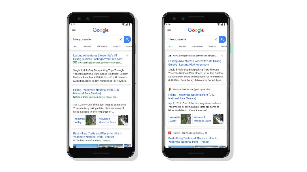
“As we continue our ongoing efforts to improve Search and provide a modern and helpful experience, today we’re unveiling a visual refresh of the mobile search results page to better guide you through the information available on the web,” Google’s Jamie Leach writes. “With this new design, a website’s branding can be front and center, helping you better understand where the information is coming from and what pages have what you’re looking for.”
What this means, in effect, is that individual results will display the site’s icon and name above the body of the result. It’s a subtle change, as you can see in the screenshot above, as is the addition of the word “ad” in place of a site icon when the result is sponsored. But this change apparently lays the groundwork for future changes, too.
“As we continue to make new content formats and useful actions available—from buying movie tickets to playing podcasts—this new design allows us to add more action buttons and helpful previews to search results cards, all while giving you a better sense of the web page’s content with clear attribution back to the source,” Google continues.
The visual refresh is going live first on mobile, and that will be rolling out in the next few days. From there, I assume it will be heading to the web.