In Praise of Android 12 (Premium)
- Paul Thurrott
- Oct 20, 2021
-
29

Last year, Apple wowed me with iOS 14, a major visual and functional refresh of its increasingly creaky mobile OS. Had the camera system in the iPhone 12 it released alongside iOS 14 been Pixel Perfect, so to speak, I would have made the switch. But it wasn’t, and for all the goodness in iOS 14, that wasn’t enough for me to defect.
Flash forward one year and iOS 15 is a much less substantive upgrade, which makes sense since Apple did all the heavy lifting last year. And the iPhone 13, likewise, didn’t move the bar at all on camera quality or performance, at least from my perspective, making a potential switch even less likely than it was a year ago.
But Apple’s hardware and software deeds and misdeeds matter less to me this year because Google, sort of coming out of nowhere, has really raised the bar with its own hardware and software. I wrote last night about my Pixel 6 Pro preorder and my hope that the online giant will finally deliver the home run that I and other Pixel fans have been waiting on since 2015. And today I’d like to address Android 12, which is in its own way an even bigger deal.
Like iOS 14, Android 12 is a major upgrade, one that dramatically changes the visual consistency and quality of the most popular personal computing platform on earth. In some ways, then, we might view Android 12 as the mobile equivalent of Windows 11 on the desktop: the core technology is the same, but the user interface has been thoroughly freshened and made more consistent. (The jury is still out on whether Google will do a better job at this than Microsoft, but that’s a low bar, and both companies will continue to update their respective platforms over time.)
Coming off several years of minor refinements, Android 12 arrives with an almost explosively different visual style, assuming you’re not using a handset that’s made by a company like Samsung or OnePlus that likes to go its own way, I guess. But on my current phone, a Google Pixel 5a, I am getting the pure Android 12 interface, plus some of Google’s Pixel-only (or Pixel-first) modifications. And it’s a game-changer.
The key to the Android 12 visuals is a new feature called dynamic color that changes the entire Android user experience to visually match the color scheme of the home screen wallpaper you select. And I mean that literally: Android 12 will color your lock screen, notifications, Settings, and widgets automatically, and any apps that support this feature, especially Google’s right now, will likewise change accordingly.

There are two fun impacts of this change. First, you will find yourself selecting new wallpaper with different colors just to see what color changes that makes across Android. And two, apps that do adopt the dynamic color scheme suddenly become styled like the rest of the OS, instead of being little islands of branding. Google apps like Phone, Messages, Gmail, Calendar, and others already support it, and I find myself going in and out of these apps when I do make wallpaper changes so I can see the changes there as well.
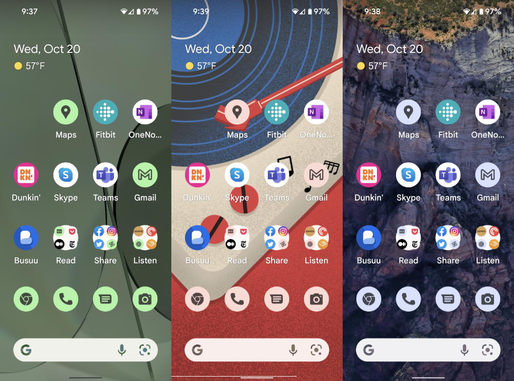
Less successful, to my eyes, is an optional feature called themed icons that also styles most of the icons for built-in apps—and, presumably, in the future any apps—to be themed to the wallpaper as well. These are flat, bland icons, and I’ve enabled this feature for the screenshots here, but I usually leave it off. They just don’t mesh well with most of the other normal icons I have on my home screen. (Oddly, when you enable this feature, it only applies to the home screen icons. The icons look normal in all apps.)
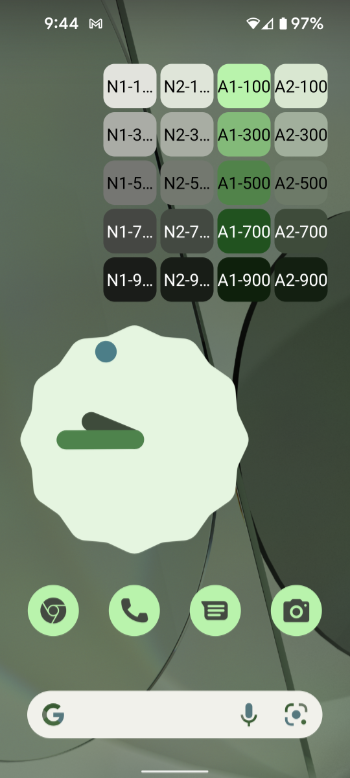
Responding to Apple’s new focus on widgets in iOS 14+ and now iPadOS 15+, Google has responded in kind by significantly updating Android’s support for widgets. (Yes, Android had widgets several years earlier than Apple, but it allowed this feature to languish for years too.) Android 12-specific widgets adopt the new Material You design language that’s also arriving in Android 12, and they’re quirky and organic-looking, with weird shapes and dynamic color capabilities (of course). As I write this, only some are available, and more will debut with the Pixel 6 family before heading to other smartphones, but my one-time dream of an Android home screen full of widgets that closely emulates the live tiles from Windows phone is getting closer to reality with this upgrade.
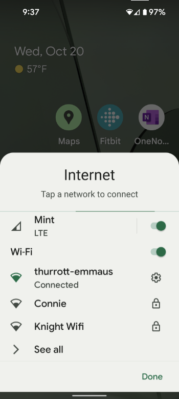
The other visual change that I’m a fan of—though I could see others not being as excited by this—is the new look and feel for the quick action tiles that appear in the notification shade. In previous Android releases, these were just static icons that you could toggle on or off, or use to access specific locations in Settings or features like Wi-Fi, Bluetooth, Flashlight, Do Not Disturb, and so on. But now they are large interactive tiles that can display a lot more information. (And when the information they contain is too large to see all at once, it will scroll automatically.)

Functionally, it mostly works as before, but it’s much easier to see and understand what you’re seeing, and there have been some nice consolidations too. For example, when you select the Internet tile, an Internet settings panel slides up from the bottom of the screen with toggles for the cellular and Wi-Fi networks, and a way to switch to a new Wi-Fi network.
Android 12 is full of various functional updates, as well. There’s a new privacy dashboard, for example, and I like that apps that need location permission can now be configured to use a rough location instead of the exact location. But from a day-to-day perspective, it’s amazing to me how much the dynamic color and Material You changes make Android 12 feel different and special. This is the kind of visual refresh I can get behind, and if you don’t like it yourself, no worries, you can disable it. In many ways, that kind of thing is Android’s greatest strength when compared to iOS: you’re almost never locked into some path because the platform maker thinks it knows better than you.

More to the point, I’ve given up on any ideas about switching the iPhone. Whether the Pixel 6 Pro works out for me or not, Android 12 is here to stay. And I’m loving it.

Gain unlimited access to Premium articles.
With technology shaping our everyday lives, how could we not dig deeper?
Thurrott Premium delivers an honest and thorough perspective about the technologies we use and rely on everyday. Discover deeper content as a Premium member.