Modernizing .NETpad: Hitting the WPF Wall (Update: Solved) (Premium)
- Paul Thurrott
- Jul 31, 2024
-
0

UPDATE: After experimenting with various workarounds for the problems described in this article, I figured out a solution. There’s a brief description at the bottom of the post. –Paul
—
The WPF version of .NETpad has always been my favorite, but the limitations of this app framework continue to frustrate. In my initial go-round, I ran into strange instances in which Windows Forms, an older and less sophisticated app framework, had OS integration features that WPF lacked. And I was curious to see whether that situation had in any way improved.
It has not.
And while I wasn’t consciously putting this off, it’s likely that my unconscious knew what my brain refused to acknowledge: I was always going to run into a wall. That it’s the same wall as before is oddly unsettling.
So what’s this wall I speak of? It’s that WPF still inexplicably doesn’t support some common and decades-old Windows user interfaces. The worst omissions are specific window types, many of which might be characterized as dialog boxes, or just dialogs. And even when WPF does support these dialogs, they haven’t (yet?) been updated to support Windows 11 theming.
I first ran into this problem when I created my first version of .NETpad using WPF in late 2019 (publicly, in early 2020). WPF and its XAML UI capabilities made short work of most of the controls and interfaces required by the main app window, which looks and works like a normal window that supports resizing and includes standard menu, text box, and status bar controls. But WPF didn’t offer a way to easily or elegantly interact with or customize the title bar. And when it came to secondary app windows, WPF was frustratingly limited.
That version of the app uses several sub-windows—an About box, a Fonts dialog, Message boxes for confirming choices, Open and Save as dialogs, and Input boxes for Find, Find/Replace, and Go To line. And WPF only natively supported Message boxes and Open/Save as dialogs. So I had to do what all WPF developers have done over the years and create custom dialogs and windows of my own.
Developers who love WPF will tell you that this is a strength of the framework, that thanks to its deep support for styles and themes, one can recreate any interface that’s needed with a bit of work. Indeed, these capabilities are what make Microsoft’s current WPF modernization work possible: The company is creating skins that make its built-in controls look native in Windows 11 (and, to some degree, in Windows 10 as well; more on that later).
Great. I love that it works at all. But what Microsoft hasn’t done, ever, is address the many necessary UIs that WPF doesn’t support. It doesn’t matter what happened when, but the short version is that WPF arrived alongside Windows Vista, was updated with a few Windows 7-era interfaces, and then was ignored entirely during the Windows 8, Windows 10, and Windows 11 years. So it’s been roughly 15 years since anyone in a position of decision-making authority took a serious look at WPF and ensured it provided all the UI controls needed to fully support the latest Windows capabilities. That’s an eternity.
If you look at the more modern version of .NETpad I’m now creating, you’ll see that the current skinning efforts—the .NET 9-based Windows 11 theming—is successful at a high level. My app looks like a Windows 11 app, feels at home alongside the similarly modern looking desktop apps that Microsoft includes with the OS, like File Explorer and Notepad. I still can’t fully customize the title bar area—not easily, anyway, though it’s possible—but the menu bar nicely bleeds into the title bar, giving .NETpad that modern look. It supports transparencies, the menus look correct, and so on. It’s nice.
If you look at today’s Notepad, however, you’ll notice that it sports far more modern interfaces than are possible in WPF. In fact, there are no “real” sub-windows at all. Microsoft created a modern settings page that contains the fonts options, among other things, instead of using a Fonts dialog, for example. Because I wanted to emulate these modern UIs as much as possible, and eliminate as many sub-windows as possible (again, knowing the limitations of WPF), recreating that settings UI was an early goal of mine. In that, I was successful: In fact, I wouldn’t be surprised to discover that I stumbled on the same basic implementation that Microsoft used with Notepad. I’m pretty proud of that.
Aside from the obvious, one of the reasons I’m so happy with my settings page implementation is that it eliminated a custom dialog I had created for the original WPF version of .NETpad. WPF didn’t then and doesn’t now support the native Fonts dialog, a dialog that Microsoft hasn’t updated in years anyway and doesn’t really use itself anymore either. So I was forced to roll my own interface in both major versions of this app, then semi-successfully, today more so. But I also had to do this for the About box, which I also eliminated in the new version (it’s part of settings too, now, as it is in Notepad).
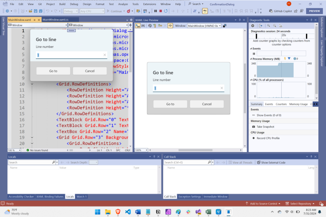
And, I had forgotten, for the “Input boxes” I used for Find, Find/Replace, and Go to line. Microsoft doesn’t use Input boxes—native or otherwise— for Find and Find/Replace in Notepad today, it uses a more modern control that sort of look like windows that float over the center-top of the app window, below the menu bar. Whatever this is
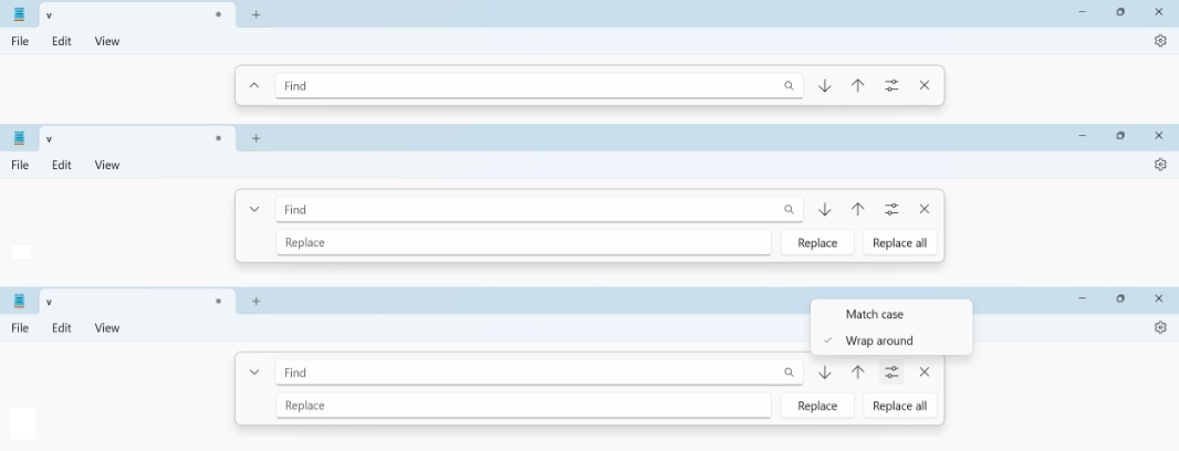
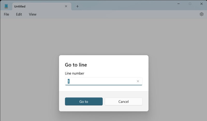
Microsoft does use a modern Input box dialog for Go to line, interestingly. One that is styled with the rest of the app so that the default “Go to” button is solidly colored to match the user’s configured accent color (for some reason). This dialog (or, dialog-like UI) is also not available natively in WPF.
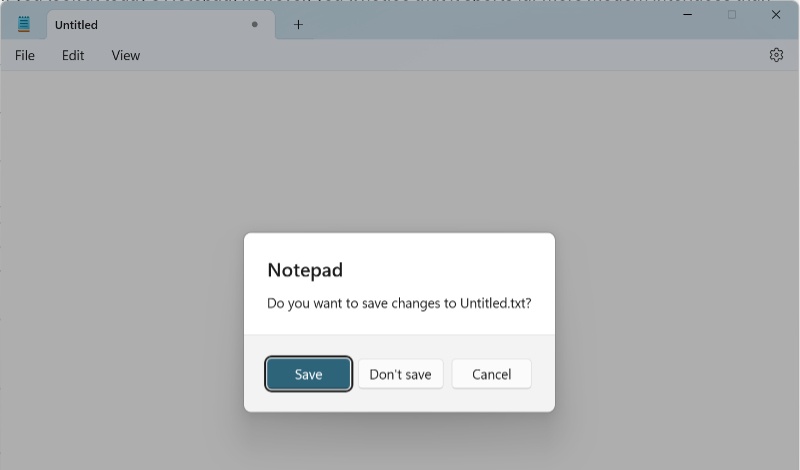
Likewise, the confirmation dialog that Notepad displays is that same UI, whatever it is, and it, too, is styled with that solid accent color.
WPF does support the Message box. But not this styled Message box. In .NETpad, all I get is the old-school version. It’s never been updated with Windows 11 theming. Maybe it will be.
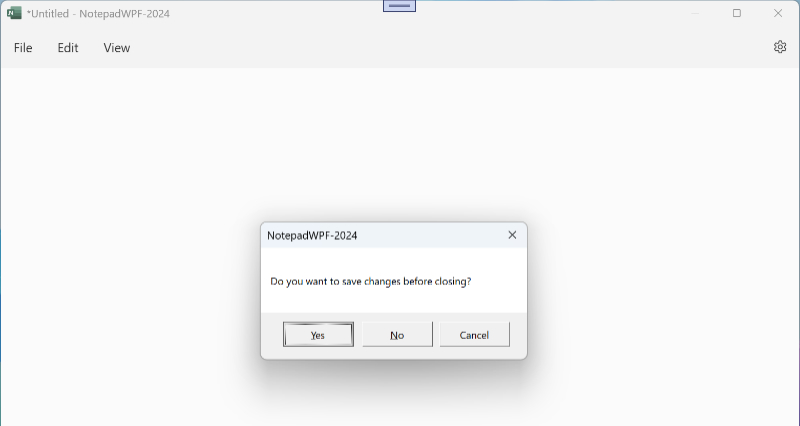
I can live with the Message box as it is. But I had forgotten about the Input box issues. That is, I thought I had used some native Input box implementation for Find, Find/Replace, and Go to line. But I didn’t: I hand-made a custom sub-window using XAML, called it an Input box, and then used that for those features. In other words, I did what WPF developers have always done, because that’s all they could/can do.
And that’s the wall.
As I rewrote .NETpad from scratch, reimplementing this app in WPF in a modern way, using better structured and more efficient C# and XAML code when possible, I knew that I’d eventually run into those remaining sub-windows and would need to deal with them. When I implemented the new Save/Save as functionality—the biggest triumph of my code refactoring work, and something I’m quite proud of—I saw that the Save as and Open dialogs were standard looking, not particularly modern, but also the same that Notepad uses. As with the Message boxes, I can live with that. But I put off the remaining sub-windows. Until I couldn’t.
God damn it.
I was always going to run into the limitations of WPF. Again. But I had had so much success with some of the other interfaces, like that glorious settings page, that I had maybe fooled myself into believing I could overcome this. And so I was surprised when I started researching WPF and Input boxes that there was so little out there. Almost nothing, in fact. And so I finally looked at how I had implemented this. This was confusing at first. And then it clicked. I had created a custom window in XAML called InputBox that I could use with Find, Find/Replace, and Go to line. Because WPF.
20 years ago, Input box was a native Windows control, or window, or dialog box, whatever. But it was never supported in WPF, and it isn’t supported today. I did what WPF developers did/do.
But a goal of this modernization effort is to not create custom sub-windows. You can see the problem with these interfaces when you use them in Windows 10. 15 years later and three major Windows UI themes later, they just don’t look right, let alone native. And while I could hand-create modern-ish versions of these things yet again to match Windows 11, they never look right regardless. They’re always going to be a bit off.
Shamefully, I will admit that I did briefly pursue this strategy. I started creating a modern, Windows 11-like Input box window in XAML. And I probably could get it close enough. Maybe.
But I really want to avoid this type of thing. But that’s the wall in a nutshell: WPF simply doesn’t support all the modern controls I need to do what I want. I will have to work around this.
There are two obvious paths forward now that I’ve decided not to create custom windows. I can use a third-party add-on to or replacement for WPF—WPF UI seems the most promising—or I can simply choose from the available controls and create a custom interface similar to the work I did on the settings page. (I could also rewrite .NETpad with the Windows App SDK, but this is about WPF.)
A custom interface has certain advantages. And one is tied to the unique nature of my app, which supports UI scaling in addition to text zoom (which only impacts the text box). In addition to supporting scaling in the main app window, I also now support it in the new settings page, and it looks great. If I created custom in-window interfaces for Find, Find/Next, and Go to line, those interfaces would automatically adopt that scaling capability too. (System dialogs and other windows, like Open, Save as, and Message box do not.)
A custom interface also has some disadvantages, of course. If I go this route, I will diverge from both Notepad, the app’s inspiration, and from Windows 11 UI norms. My app will be different. And as with the custom Font dialog and other sub-windows I’d created in the past, they would seem off in some ways.
But it’s worth trying. And so I started a new project to see whether I might somehow integrate Find, Find/Replace, and Go to line as custom interfaces in a basic version of .NETpad. These interfaces would be implemented like the settings page, as UI panes that are typically invisible but appear when needed, in this case not replacing the main app window but rather being added to it. The obvious choice was to use panels that would appear under the menu bar, between that and the text box, given that Notepad’s Find and Find/Replace interface appears roughly in that space.
This is still rough—I’m not sure if this is what I want, after all—but this is what I came up with. And … I don’t know.
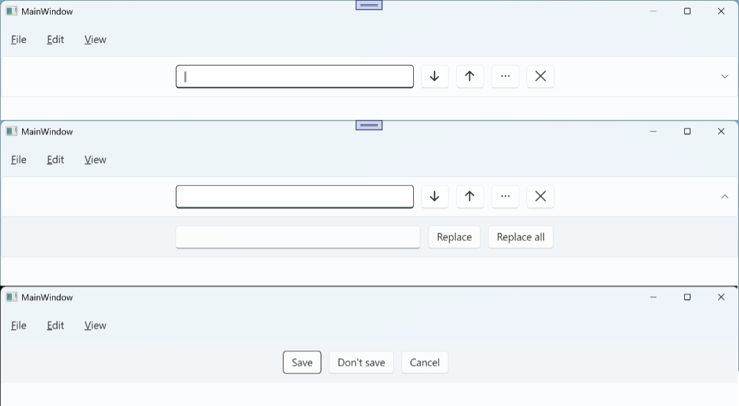
That’s the confirmation pane (formerly/currently a dialog), Find, and Find/Replace. Go to line would be similar, I just haven’t gotten to that yet. Because I’m just not sure about this. It gives me the same unhappy feeling I had when I created those custom dialogs four years ago. It feels … off.
So I’m at a crossroads here. I can…
- Implement the Find, Find/Replace, and Go to line dialogs using custom hand-made windows
- Implement Find, Find/Replace, Go to line, and the confirmation dialog as custom panes that appear between the menu and text box as needed
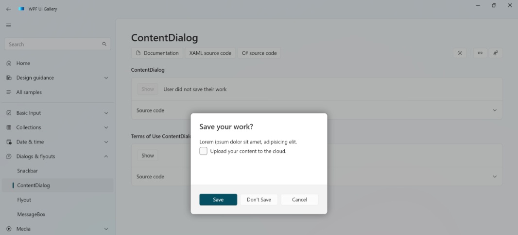
- Examine whether shifting this project to WPF UI makes any sense: WPF UI provides a Content Dialog that would work for Find, Find/Replace Go to line, and that confirmation dialog and it’s nice and modern looking
None of these is ideal. But let me know: My next step is to experiment with WPF UI to see whether its Content Dialog implementation (below) will do the trick. If so, this add-on also provides some other niceties, like a ToggleSwitch control that WPF also lacks, that I could integrate into .NETpad.
We’ll see. But man, this fricking wall. It happens every single time.
UPDATE
I am excited to say I’ve discovered a viable solution to this problem: I can implement the confirmation dialog and the Find, Find/Replace, and Go to line dialogs using native WPF. To be fair, it’s still a workaround, but it works well enough that I’m OK with it.
My solution is to adapt the panes I described above to be floating panes that appear over the text box: As it turns out, WPF controls support z-order, so I can visually stack them front-to-back. And using some styling, I can get very close to the native Windows 11 look. I’ve only done the confirmation “dialog” so far, and this is not complete, and just a rough first step. But it’s clear I can make this work. Here’s what it looks like now, but this will get better.
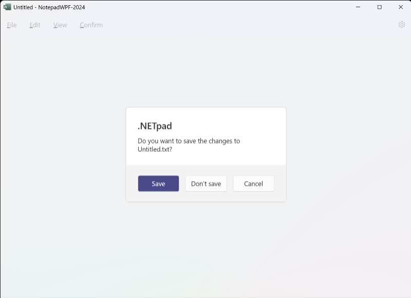
There is style work to be done, but this will work fine.
More soon.

Gain unlimited access to Premium articles.
With technology shaping our everyday lives, how could we not dig deeper?
Thurrott Premium delivers an honest and thorough perspective about the technologies we use and rely on everyday. Discover deeper content as a Premium member.