Modernizing .NETpad: Confirmation (Premium)
- Paul Thurrott
- Aug 03, 2024
-
0
Not that I needed a reminder of my failings as a software developer, but the issues I described last week were just that. As was my belated understanding of a possible fix that turned into something I’m pretty happy with. So I guess I’ve come full circle. Or something.
Without beating this topic to death, I got to a good place in my .NETpad modernization efforts, so I decided to rewrite it from scratch to see if I could refactor the code, improving both the structure and quality. And that was going great as well, until I hit a wall with the remaining parts of the app that require interactivity with a pop-up sub-window of some kind. (A Message Box or Input Box, depending on the feature.) WPF supports Message Box natively, though it’s not been modernized for Windows 11 (yet, hopefully). But it doesn’t support Inbox Box at all, and I had forgotten that. So I came up with a few different ways I could move forward and then set out to experiment with each, vaguely worried that these might be problems I couldn’t solve elegantly.
OK, not vaguely. One of the core strengths of WPF is also one of its core weaknesses: Because you can make almost any custom UI you want with XAML, WPF developers often do just that. But every time you make a custom UI—as I did with the Fonts dialog, About box, and Find, Find/Replace, and Go to line Input Boxes in the original version of this app—you’ve just committed yourself to also keeping them up-to-date forever. That is, they make look fine when you first make them, but as the Windows UI evolves, your app’s custom UIs start looking off, non-native, or out-of-date. And that’s assuming you did a reasonably good job to begin with.
I could live with the out-of-date Message Boxes, though every time I saw its modern equivalent in Notepad and elsewhere, it felt like I was being taunted. But the need to create more custom Input Boxes, more non-standard and non-native-looking UIs, was galling to me. It felt wrong. Regardless, I was pretty sure that I’d be stuck using the slide-down panels I described in Modernizing .NETpad: Hitting the WPF Wall (Premium). It would be OK. But not ideal.
I’m not sure how real developers work. But when I run into a problem this big, I isolate it by starting a new Visual Studio project (and then many more as required) so I can hammer at it without impacting the full app. In this case, I started working on side projects to see what I could do to make something reasonably native-looking. I started with more elegant-looking versions of the previously noted slide-down panels. I also looked at using WPF UI, as described earlier. And at just sucking it up and recreating each UI as its own window, as I had done originally. Though I really didn’t want that.
Remember, the point here is to modernize .NETpad. For me, this means making it look and work more like the modern Notepad in Windows 11. But many of the modern UIs in that app just aren’t available via WPF. And so I need to improvise. In doing so, I try to emulate the modern app design patterns we see throughout Windows 11. And one of those key design patterns is that modern apps minimize or eliminate the need for secondary windows like dialog boxes.
Different apps have different needs. Microsoft Paint displays actual dialogs for things like Resize and Skew (Ctrl + W) and Image Properties (Ctrl + E), so they can be dragged around on-screen independently of the main app window. But Notepad doesn’t display any dialogs beside the system File Open and File Save as dialogs. The other dialog-like interfaces you see in this app—like the Save confirmation prompt and the Find and Find/Replace pop-ups—are not separate windows. Instead, they’re part of the main app window, visually styled to resemble dialogs. They even have shadows. But they’re really just sets of controls laid out and displayed in a way that resembles dialogs.
These interfaces are available in the Windows App SDK, the modern, desktop-based replacement for UWP. In fact, they’re called “dialog controls,” and they are modal, meaning that the rest of the app window is unavailable while they’re visible. But they are not available in WPF. And probably never will be. And so round and round we go. WPF developers have put up with this type of problem for decades, and they respond as they always do, by rolling their own non-standard UIs.
I’ve been trying to avoid that while reimplementing dialogs and other sub-windows in .NETpad using modern app designs pattern. I eliminated the Fonts dialog and About box and implemented a really nice settings page that looks and works just like the one in Notepad. But I still had those custom Input boxes (for Find, Find/Replace, and Go to line) to figure out. And my first pass at a modern, albeit non-standard, replacement was a pane-based UI similar to my settings page solution. What I came up with was OK. But not great.
And then it dawned on me.
While I tend to think of layout in XAML as two-dimensional, where controls and other UIs are laid out in grids of columns and rows on the app window surface, this markup language is more sophisticated than that. It supports multiple layout controls, each with its own unique capabilities. And even in a 2D space with a basic <Grid>, you can use Margin and other properties to align controls so that they appear to overlap with other controls, breaking the bounds of the grid horizontally (the x-plane) and/or vertically (the y-plane). Better still, XAML supports z-planes for 3D positioning in which a control can visually appear above (in front of) other controls. WPF is 20 years old, and it’s supported this capability from day one.
After reviewing the documentation to ensure it could do what I wanted, I came up with something rudimentary: Instead of inserting, say, a Find panel between the menu bar and the text box, I could make it appear on top of the text box, right at its top, and right below the menu bar. And with the shifting of a few Margin attributes, I could actually move that panel down further in the app window, and still above the text box. Obviously, I could design that panel as a box, instead of a full-width panel. And that meant …
Holy crap.
That meant I could create something that looks just like the interfaces in Notepad. Interfaces—boxes, panels, whatever—that look like floating dialogs but are, in fact, collections of controls tied to the main app window. Where the settings page I created replaces the main app view, these “dialogs” would appear to float above the main app view. And they could be designed to be modal, so that everything else in the app was inaccessible while they were visible. This was appealing for a lot of reasons, but especially because I immediately had the same “ah-ha” feeling I had gotten when I figured out the settings page. I think I may have stumbled on an admittedly amateur version of how Microsoft implements the official UI I’d been inspired by.
But this was also troubling: I very much wanted to avoid the custom UI route, where I’m hand-crafting my own UIs, for the reasons noted above. That these UIs were panels, or whatever, and not standalone windows didn’t much matter. It would always be something I’d have to keep up-to-date, and if and when Microsoft moves on to Windows 12, or WinUI 4, or whatever, I’d have work to do.
Perhaps ironically, that’s what sold me on trying this approach. This is an WPF app, after all. That I was doing the most WPF thing of all felt right. If I’m going to use this app framework, I should just embrace it.
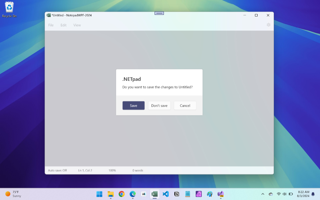
I started with the confirmation dialog, as I think of it. This is the window that pops up and asks the user whether they would like to save the document they’re working on. To date, this confirmation dialog has been implemented with that out-of-date Message Box we’re stuck with in WPF. And I had already rewritten—refactored—the code for this process, allowing me to experiment and determine whether the app would continue working normally if I replaced the Message Box with my new custom UI.
It wasn’t long before I had a squared-off rectangle that otherwise resembled a “Do you want to save this?”-type confirmation “dialog” with “Save,” “Don’t save,” and “Cancel” buttons. Thanks to my ADHD, I was born for the time-consuming detail work required to exactly duplicate the style and layout of the original. And so I had to keep going: Could I round the corners and make it look native?
Well, of course I could: I had done the reverse with the app’s main text box, after all, removing the native Windows 11 rounded corners and making them the hard right angles I wanted. Surely, I could do the reverse and make the hard right angled-corners of this “dialog” be visually rounded. And sure enough, I figured that out very quickly too. This was getting exciting. Despite my lingering worries about hand-crafting native-like UIs, this work came together pretty quickly.
Getting it to work with my refactored code, ideally with minimal change given the improvements I’d just made to it, was the next step. As required, I would display the “dialog” instead of a Message Box, wait until the user clicked a button, and then respond accordingly. Doing this was relatively easy using the system Message Box, which returns the value of the selected button when called. But I’d have to write custom code to do that. What would that look like?
Here, I hit another wall. I knew I’d figure it out, but this is where the dark side of ADHD kicks in: I wanted the code to be elegant, not a hack. I didn’t want to write masses of new spaghetti code just so I could accommodate this Frankenstein’s monster. I wanted it to make sense. To be as elegant as possible given my meager skills. And I was really worried I’d fall short. It’s inevitable, really. I’m not a professional developer.
I grinded away at it.
Most probably never consider the various paths an app can take during what feels, from the outside, to be a simple and common interaction. You’re using an app like Notepad or .NETpad, and you decide to move on to something else, perhaps by closing the app (or current tab, in Notepad), starting a new document, or opening an existing document. In each case, what happens next depends on the state of the document you’re currently working on. If there’s unsaved text, it needs to prompt the user to ask about saving it before continuing. This is what the confirmation dialog, as I think of it, does. It presents that UI, with those three choices, and it waits on the user to make a decision.
What happens next … depends. It depends on which choice the user makes, obviously. But future decisions might roll back the entire operation, too. For example, the user might choose “Yes” when the confirmation dialog appears. If they’re working on a new (unsaved) document, a “Save as” dialog will appear (otherwise, the app will just save the existing document). Then, the user can save their work (choosing a name and location for the document). Or they can cancel. If they close the “Save as” dialog, the app needs to cancel the entire operation. That is, you don’t go back to the confirmation dialog. You go back to the main app, with its state as it was when this all started.
As noted, I had refactored the code to handle all this, and I was really happy with the results. It seemed efficient and well-designed, and it was a big improvement over the original code from four years ago. But in introducing a custom confirmation dialog, I would need to write code to handle user interactions that are provided for free by Message Box. There were many conditions to track, various states related to the document (saved/unsaved, with/without unsaved changes) and to the app itself (control visibility, the text in the title bar, and so on).
I grinded away at it.
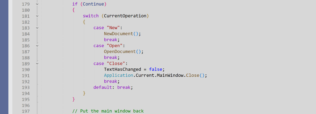
.NETpad already had variables related to state. I use TextHasChanged, a Boolean value, to understand whether there are unsaved changes in the current document. DocumentIsSaved, another Boolean, to understand whether the current document is a new, unsaved document or an existing file. And several others.
My custom confirmation dialog would need a few more. Because the choices the user would make—”Save,” “Don’t save,” and “Cancel”—are textual, I made a new string variable named Confirmation to store the choice they made. And to understand the action, or operation, that triggered the confirmation dialog, I created another string variable named CurrentOperation so that the code would know what to do next. Those operations include “New,” “Open,” and “Close.”
The basic path goes like this.
- When the user undertakes an operation that could trigger a confirmation dialog, CurrentOperation is set to the appropriate value. (“New,” or whatever.)
- If the text in .NETpad is changed and unsaved (that is, TextHasChanged is true), a confirmation dialog appears.
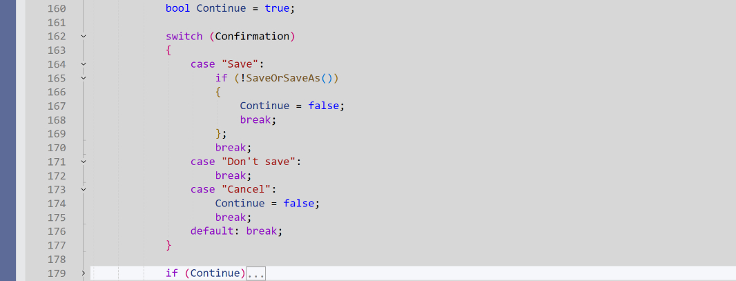
- If the user chooses “Cancel,” the confirmation dialog disappears. And we’re done here.
- If the user chooses “Don’t save,” the operation continues: Based on the value of CurrentOperation, we go to the correct method and do as the user asked. (If CurrentOperation is “New,” the NewDocument() method runs, for example.)
- If the user chooses “Save,” the code runs SaveOrSaveAs(), the refactored code I rewrote over the past few weeks. This method saves the document if it already exists; otherwise it displays a “Save as” dialog. The user can save a new document, in which case SaveOrSaveAs() returns true, allowing the operation indicated by CurrentOperation to continue. If the user cancels the “Save as” dialog, the confirmation dialog hides and the app returns to where it was with the existing unsaved text there, unchanged.
Oddly, the result was a further improvement to the code. In creating this new code, I simplified the event handlers for the operations that could trigger a confirmation dialog (New, Open, and Close), centralizing some repetitive case testing into a single location, CloseConfirmationPrompt(), the method that’s called when the user makes their choice in the confirmation dialog. This mirrored the improvements I had made previously in SaveOrSaveAs(), so I felt pretty good about it.
Is this the right, ideal, or more efficient way to accomplish what I’m trying to do? Probably not. Again, not a professional programmer. The addition of more global variables feels unsophisticated, for starters. But the way it flows at least makes sense to me. Perhaps this will be an area for more refactoring in the future.
For now, here’s how it works. I’ll use “New” for this example. That is, the user is using .NETpad and they type Ctrl + N or open the “File” menu and select “New.” This triggers NewCommand_Executed(), which has been simplified with a new block of code that’s repeated for the event handlers for the “Open” and “Close” operations.
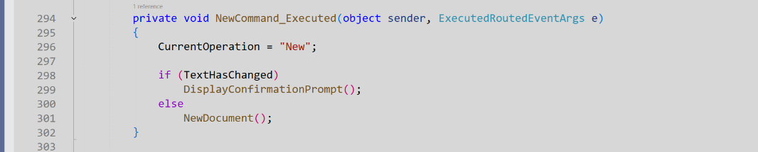
I set CurrentOperation to “New.” And then I test TextHasChanged. If the text has changed, then DisplayConfirmationPrompt() runs.
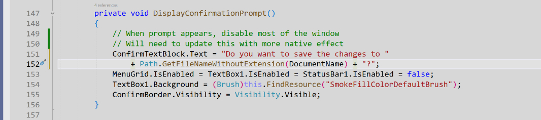
This one needs to be updated to be more visually faithful to the modal effect used by modern apps, but this quick and dirty implementation is OK for now: I disable/recolor the main app UIs and display the “dialog” by making the ConfirmBorder control that contains the dialog’s controls visible. (It’s hidden by default.)
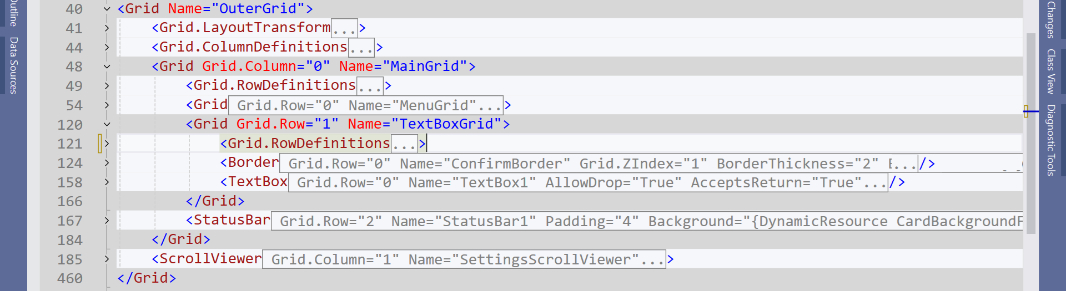
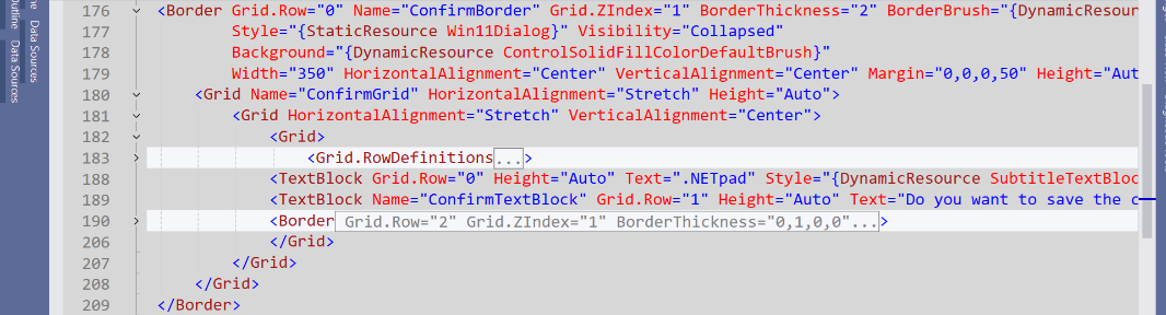
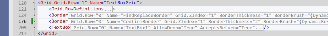
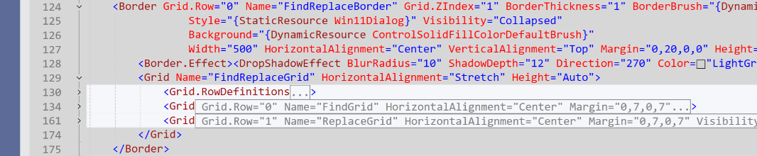
ConfirmBorder—the confirmation dialog—is implemented in XAML. As you may recall, the basic app UI is a grid with three rows: One each for the menu, the textbox, and the status bar. The menu is row 1 (Grid.Row = “0”), while the text box is row 2 (Grid.Row = “1”). I implemented Confirm Border as a separate row 2 (Grid.Row = “1”) but set its Visibility property to Visibility.Collapsed. This not only hides the control, but it removes it from the layout, so it doesn’t take up any space. (If it was set to Visibility.Visible by default, it would appear “over” the text box because they’re both drawn in the same grid row.)
Because of the layout needs here—ConfirmBorder and then future “dialogs” for Find and Find/Next, and Go to line, all have complicated layout of their own—I put the text box, TextBox1, inside a grid (TextBoxGrid) consisting of a single row. TextBox1 is in the first (and only) row (GridRow = “0”). And so is ConfirmBorder, though it’s hidden by default. And its z-order is changed so that it appears above the next box when visible (Grid.ZIndex = “1”).
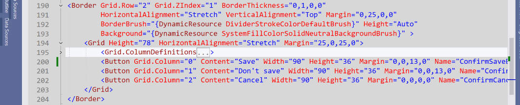
There’s a Border control at the base of this “dialog” so I can draw a border around it: You can’t do this with a Grid control. I customized that using a new style in the resource library I’d made earlier and some hard-coded properties in XAML (this should be consolidated where possible). That grid (ConfirmGrid) consists of three rows: Two for text blocks that mimic the text you see in the similar UI in Notepad, and the third for the three buttons (“Save,” “Don’t save,” and “Cancel”); those buttons are in a grid that is itself in a border because I wanted a line between it and the above text in an early rendition. I will probably simplify that in the future because it’s no longer necessary.
But it will do for now: To date, I’ve been more concerned about just getting it to work. Here’s the current XAML code for the confirmation “dialog” buttons.
To test this, I created a new method (in Backend.cs, as it’s not an event handler) called DisplayConfirmationPrompt() as noted above. And then I temporarily commented out the code in NewCommand_Executed(), the event handler that runs when the user types Ctrl + N or chooses “File” and then “New.” And I replaced it with code to run DisplayConfirmationPrompt() if needed (i.e. if the text has changed).
Displaying the confirmation dialog is easy enough. Handling the user choice required more work. I do this work in a new method called CloseConfirmationPrompt(), which appears regardless of what the user chooses. The basic structure looks like this:
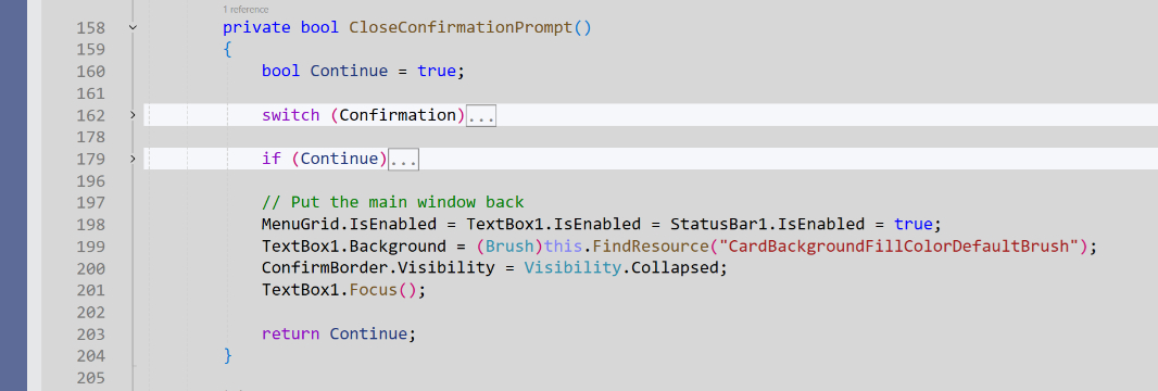
Here’s what it does:
- Create a temporary state variable named Continue that is type Boolean and set it to true.
- Test the value of the Confirmation variable using a switch statement that will or will not run SaveOrSaveAs() and will or will not change the value of Continue as needed.
- If Continue is true, test the value of CurrentOperation and run the appropriate code. Either way, we wrap up by putting the app window back the way it was and “closing” the confirmation dialog by setting the visibility of ConfirmBorder to be collapsed.
From here, I just updated OpenCommand_Executed() and CloseCommand_Executed() to work similarly to NewCommand_Executed(). And … it seems to work pretty well.
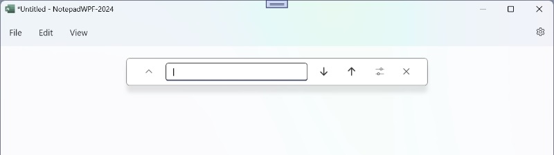
From there, I moved on to Find and Find/Replace, which will be implemented as a single panel (a grid inside a border) and will look like the similar UI in Notepad. I’m not sure how that’s implemented, but it appears over the text box like the confirmation dialog but doesn’t disable it because they need to interact. I’m still early days on this bit, but I have a rough Find/Replace panel worked up in XAML and have done the basics to display it (in the FindCommand_Executed() event handler and then close it when the user click its close button.
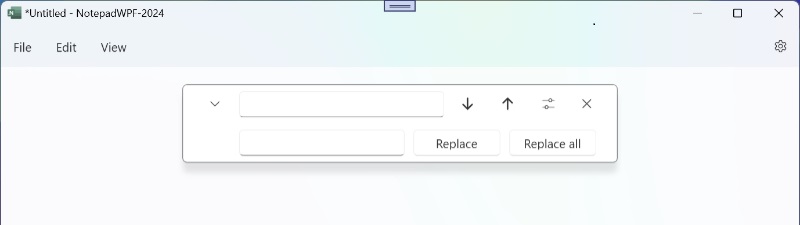
I also implemented the basic UI for the Replace bit, which appears when you toggle on it using the control on the left.
As with the confirmation dialog, the Find/Replace “dialog” (FindReplaceBorder) appears in the same row as the app’s central text box, is hidden by default, and has a z-order that places it above the text box when it is visible.
This UI requires two rows—one for the Find controls and one for the optional Replace controls—and I added a proto-shadow to match the one that appears in Notepad (but will need to be updated in the future).
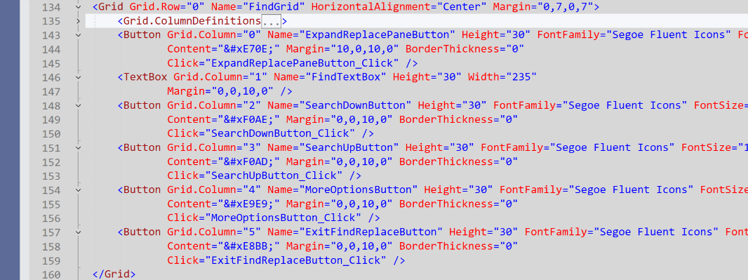
Both rows are just columns of button and textbox controls. All temporary and roughed-out, as I just want to get it working first. For example, here’s the code for the Find panel.
And that’s all I’ve done so far. Next, I’ll bring over the code from the old version of .NETpad and implement Find, Find Next, Find Previous, Replace, and Replace All. You know, assuming there are no more major issues.
And after that, I’ll create a Go to line “dialog” in XAML in a similar manner, and build that out.
Assuming I can get those to both work, a big assumption, that’s pretty much all the hard work. Then I can focus on fine-tuning the code, and the UI and layout of these new bits, and try to get them as close as possible to the native implementations.
More soon.

Gain unlimited access to Premium articles.
With technology shaping our everyday lives, how could we not dig deeper?
Thurrott Premium delivers an honest and thorough perspective about the technologies we use and rely on everyday. Discover deeper content as a Premium member.