Modernizing .NETpad Step-By-Step, Part 1: The Basics (Premium)
- Paul Thurrott
- Sep 01, 2024
-
2
In this first phase of modernizing the WPF version of .NETpad, we’ll take the original project, apply Windows 11 theming, and make some other basic updates.
For those unfamiliar, .NETpad is my basic clone of Notepad, an update I created–and then recreated in various forms–while I was writing the Programming Windows series that I turned into the book Windows Everywhere. There are many versions, in different languages and app frameworks, but my favorite, by far, is the WPF version. And thanks to Microsoft’s renewed interest in WPF this year, I’ve decided to modernize .NETpad so that it looks and feels more natural in Windows 11 and offers as many of the features Microsoft has added to Notepad in recent years as is possible.
And that’s the uncertainty: I’ve spent the past three-plus months working on that to see what is possible. And while .NETpad isn’t quite where I want it as I write this, it’s in a much better place than it was when I published three versions of the .NETpad codebase to GitHub back in 2020. And so I feel that I can now document the process anyone can go through to take the code for the WPF version of .NETpad and start that modernization process for themselves.
Let’s get started.
Prerequisites
The .NETpad modernization project requires .NET 9, which is in preview as I write this, and will ship in stable in November 2024. That means we’ll need the preview version of Visual Studio 2022 (17.12) and the preview version of .NET 9 (Preview 7 at the time of this writing). Then, install the “.NET desktop development” workload when you configure Visual Studio.
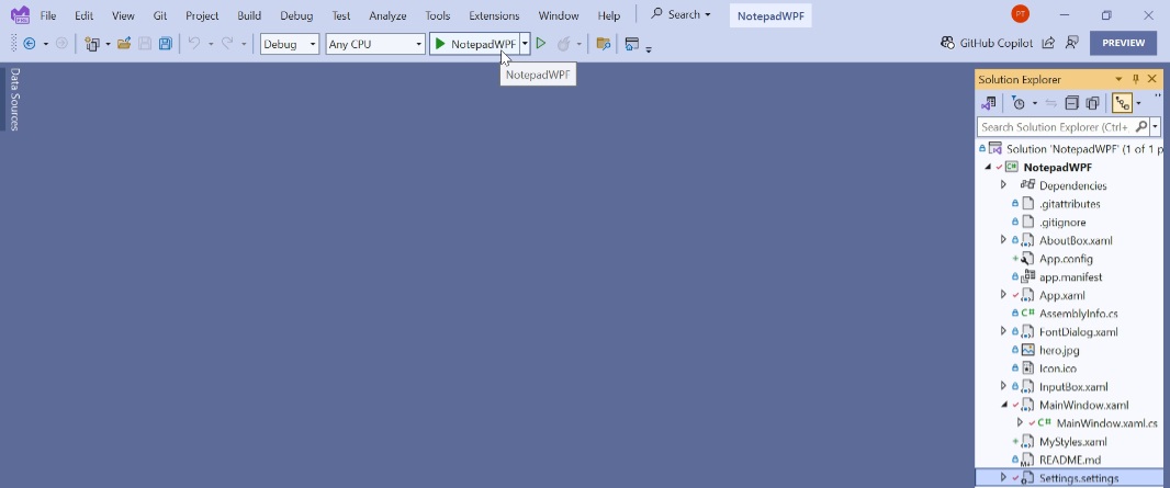
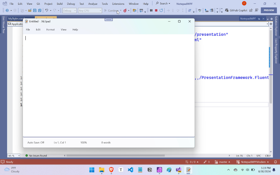
Once Visual Studio is up and running and you’ve signed in, choose “Clone a repository” from the opening screen. You can find the repository location Visual Studio requires on GitHub. (Here’s a direct link.) Review/configure the path, click “Clone,” and let Visual Studio do its thing. When it’s done, you can expand the “NotepadWPF” project name in the Solution Explorer pane to see all the files in the project. And then click the “Start” button (which has a green triangle and the text “NotepadWPF”) in the toolbar to build and execute the app.
When you’re done playing around with and noting how old-fashioned it looks, close the app. It’s time to modernize it.

Update the .NET and app versions
The first step in this process is to upgrade the version of .NET the app uses from version 6 to version 9. To do so, right-click on the “NotepadWPF” project name in Solution Explorer and choose Properties. Then, in the project properties view that appears, locate “Target framework” near the top. Change it from “.NET 6.0” to “.NET 9.0”.
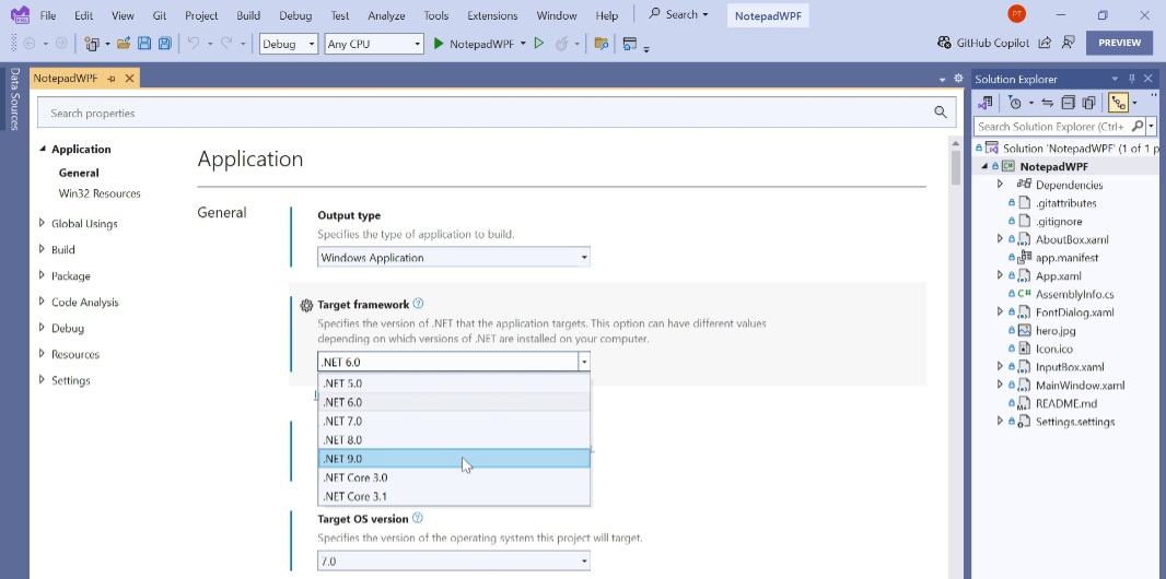
Then, change “Target OS version” from “7.0” to “10.22000.0,” which is for the initial version of Windows 11. This will change “Supported OS version” to the same version, which we’ll leave as-is.
Scroll down until you find “Package version.” This is currently set to 2.1.0. Change that to 3.0. Change “Copyright” to “2024 Paul Thurrott”. Then, change “Assembly version” and “File version” to 3.0. Then, close the project properties view.
If you run the app now, it should work normally. It will still display the old user interface. But now it’s running on .NET 9, and if you look at the About box, the version is now 3.0.
Add support for Windows 11 theming
Now, it’s time for the most significant change in this first modernization phase: Adding Windows 11 theming. To do so, open App.xaml. It should look like so:
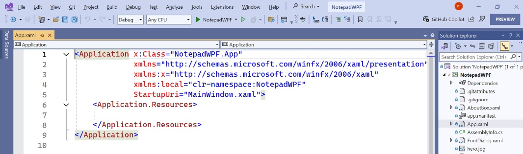
Add the following code inside the <Application.Resources> block:
<ResourceDictionary>
<ResourceDictionary.MergedDictionaries>
<ResourceDictionary Source=”pack://application:,,,/PresentationFramework.Fluent;component/Themes/Fluent.xaml” />
</ResourceDictionary.MergedDictionaries>
</ResourceDictionary>
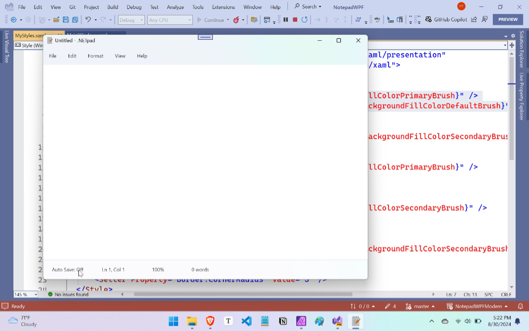
This is the “secret sauce” that adds Windows 11 theming to the app. (For now: After .NET 9 exits beta, this functionality will just be built-in.) Save the file, then run the app. You will see something like this.
This is close, but not quite right. The app is indeed styled to look correct in Windows 11. But the text box has curved corners, which looks wrong. And the status bar at the bottom of the window is too large. Both of these issues are tied to how UI controls are styled differently in Windows 11. They’re usually larger than before and have more spacing around them. So we have some work to do.
Add custom styles to fix the text box, status bar, and other controls
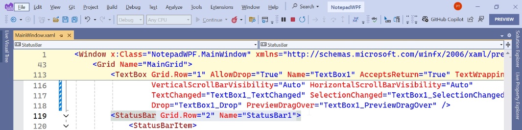
Let’s figure out the text box first. If you open MainWindow.xaml, you’ll see that the text box is currently described like so using XAML code (with some style changes applied for readability):
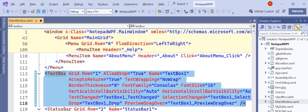
We need to make a few changes. While most of this code block is fine, the following bits need to be removed, as they’re superfluous. We already define these properties dynamically in C# code:
FontFamily=”Consolas” FontSize=”16″
And the following should be added:
SpellCheck.IsEnabled=”False”
<Style> block, but since we’ll need to make several similar changes throughout the app, I’m using a resource dictionary, which is a separate file that contains styles.
To do so, right-click “NotepadWPF” (the project name) in the Solution Explorer pane and choose “Add” and then “Resource dictionary (WPF)”. A new, mostly empty resource dictionary opens.
Inside the <ResourceDictionary>
<Style x:Key=”Win11TextBox” TargetType=”TextBox”>
<Setter Property=”Border.CornerRadius” Value=”0″ />
<Setter Property=”Foreground”
Value=”{DynamicResource TextFillColorPrimaryBrush}” />
<Setter Property=”Background”
Value=”{DynamicResource CardBackgroundFillColorDefaultBrush}” />
</Style>
But formatted correctly. Not sure why WordPress isn’t allowing that in the above code block, but it should look like this:
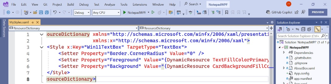
So … what the heck is that all about?
Windows defines various color brushes that developers can use. The modern definitions for these colors support both Light and Dark mode in Windows 10/11, and many of them are transparent or translucent. TextFillColorPrimaryBrush is for text, and it will display as black when Windows is configured for Light mode and white for Dark mode. CardBackgroundFillColorDefaultBrush, meanwhile, is a background color that will display as white when Windows is configured for Light mode and as a dark gray in Dark mode. We’ll test that later, but you can learn more about these modern color definitions on the Microsoft Learn website. I use the apps WinUI 3 Gallery and WPF Gallery Preview, both of which are available in the Microsoft Store, when I’m trying to figure out which colors to use in my apps.
OK, save the file. Then, open App.xaml. Currently, the app references a single resource dictionary (that starts with <ResourceDictionary Source=”pack://application:). Add a single reference:
<ResourceDictionary Source=”MyStyles.xaml” />
So that the file now looks like so:
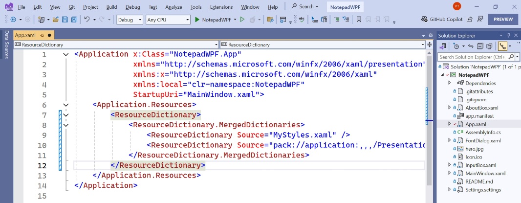
Save App.xaml and close it. Then, open MainWindow.xaml and locate the text box block. Add the following code inside that:
Style=”{StaticResource Win11TextBox}”
When complete, it should like something like so:
<TextBox Grid.Row=”1″ AllowDrop=”True” Name=”TextBox1″
AcceptsReturn=”True” TextWrapping=”NoWrap”
BorderThickness=”0″
VerticalScrollBarVisibility=”Auto” HorizontalScrollBarVisibility=”Auto”
Style=”{StaticResource Win11TextBox}”
TextChanged=”TextBox1_TextChanged”
SelectionChanged=”TextBox1_SelectionChanged”
Drop=”TextBox1_Drop”
PreviewDragOver=”TextBox1_PreviewDragOver” />
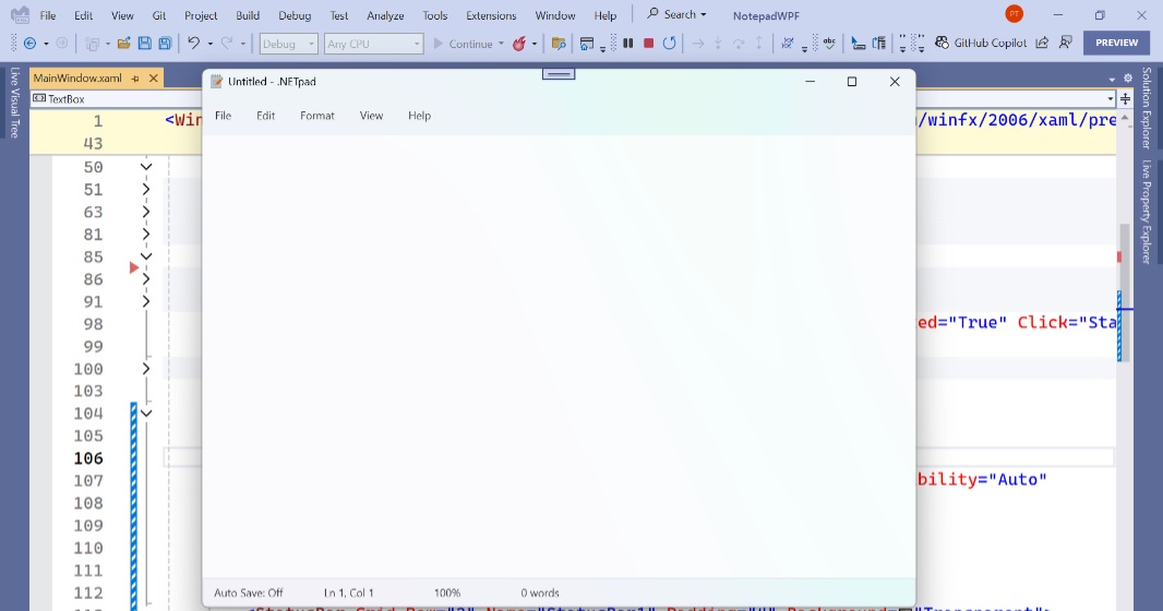
Now, run the app again. The text box will now look correct, with squared off, not rounded, corners.
Next, let’s look at the status bar code in MainWindow.xaml. It’s below the text box block and starts off like so:
As noted, the status bar is too tall. To fix this style issue, edit the code so that it looks like so:
<StatusBar Grid.Row=”2″ Name=”StatusBar1″ Padding=”4″>
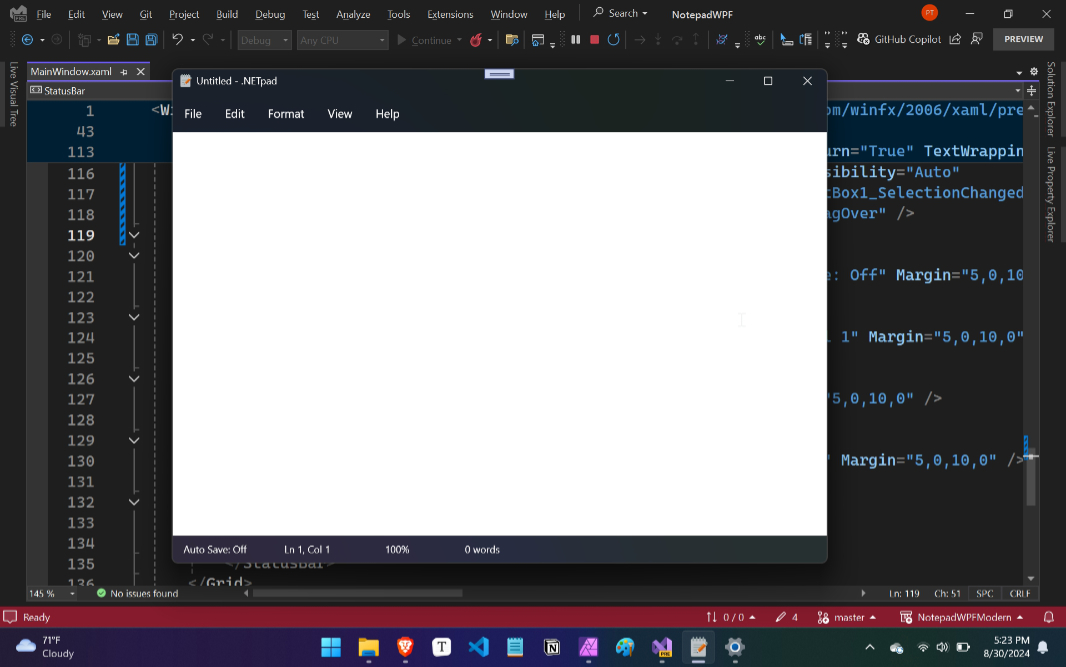
As indicated by the code displayed in bold, we’re now manually changing the Padding property for this control to be hard-coded to 4 device independent pixels (DIPs). If you run the app now, it will look correct in Windows 11.
That’s good. But we’re also going to be adding transparency effects throughout the app to match what you now see in the title bar and menu bar. So we can get started with that now, with the status bar. Edit the start of the status bar code block again, so that it now looks like this (as before, the new bit is bolded):
<StatusBar Grid.Row=”2″ Name=”StatusBar1″ Padding=”4″ Background=”Transparent”>
Now, when we run the app, you can see a subtle transparency effect in the status bar (that will be more/less visible depending on your desktop wallpaper).
So, this mostly works and it looks pretty good … assuming you’re using Light mode in Windows 11. But it falls apart when you switch to Dark mode. Yikes.
Why is that?
.NETpad was created when WPF didn’t support the Light and Dark modes in Windows 10/11 natively, so I created my own app theme functionality. And the default theme is black text on a white background. Which is what the app will look like, no matter which theme Windows is using. That needs to be fixed.
Fix Dark mode support by removing the custom themes
Unfortunately, the fix is to remove my custom app theme support. This isn’t difficult per se, it just requires us to find and delete all the relevant code.
The first step is to remove the XAML code that represents the themes-related menu items in MainWindow.xaml. This is currently found under (or, inside of) the View menu:
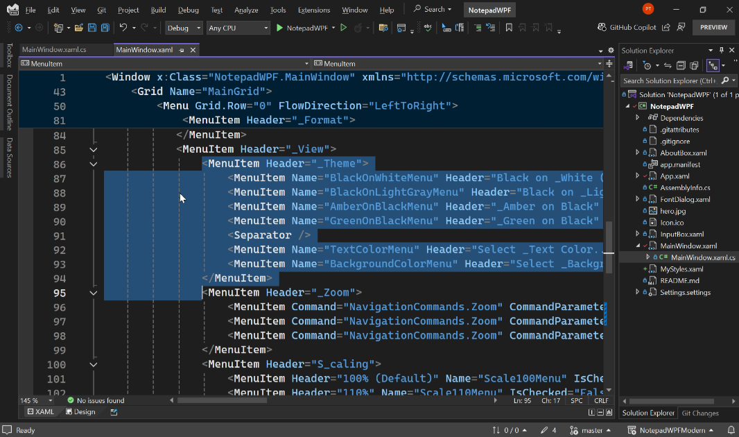
So, delete that. (That is, delete the entire theme menu item block.)
Then, open MainWindow.xaml.cs. Here, you will need to make several changes.
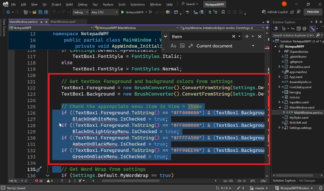
In the AppWindow_Initialized() event handler, locate the code for setting the textbox foreground and background colors checking the appropriate menu item in View > Theme, and delete that. (The selected text in the shot below doesn’t include all the code, so I added a red box around the full set of code to be deleted.)
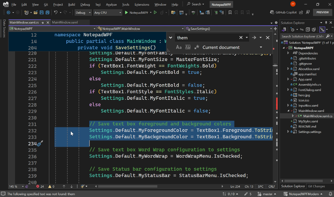
In the SaveSettings() method, similarly find the code for saving the text box foreground and background colors and delete that.
Then, find and delete each of the following event handlers:
- BlackOnWhiteMenu_Click()
- BlackOnLightGrayMenu_Click()
- AmberOnBlackMenu_Click()
- GreenOnBlackMenu_Click()
- TextColorMenu_Click()
- BackgroundColorMenu_Click()
Finally, open Settings.settings and delete MyForegroundColor and MyBackgroundColor.
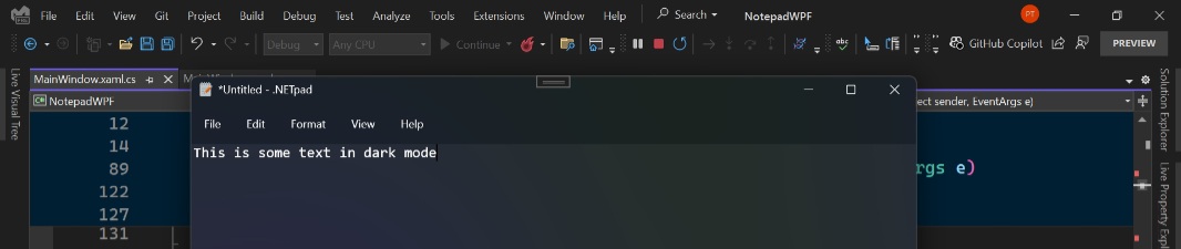
Now, re-run the app. It should work fine, and it should look correct in both Light and Dark mode.
Thinking about the next steps
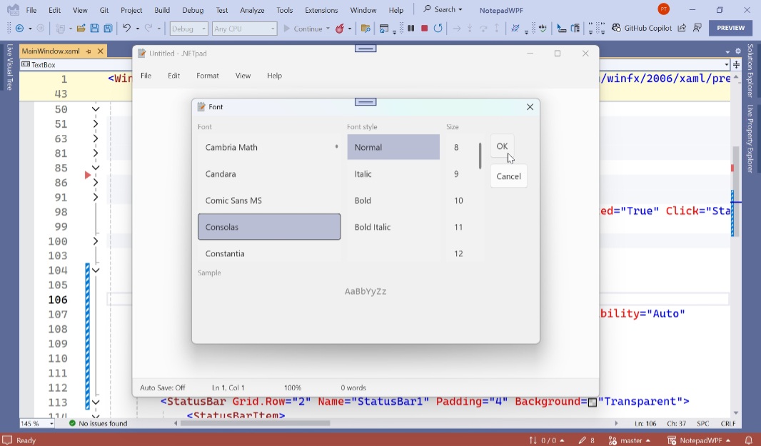
OK, that’s the basics. But .NETpad has plenty of other issues that need to be resolved. And then several more that should be resolved. The biggest, to my mind, is its custom dialogs–sub-windows like Find, Replace, Replace All, Go to line, Font, and About–which are non-standard (and objectively ugly) and have some coding issues.
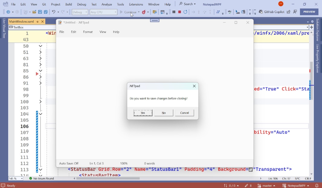
But I’m also not a fan of the Message Boxes that appear as a Save confirmation or when you toggle Auto save: These are old-school, non-themed sub-windows that look out of place in Windows 11. So all those need to be updated and/or replaced.
But before that can happen, .NETpad needs some structural work. We’re going to clean up the code in various ways to make it more readable and maintainable, and to provide a more solid foundation for future updates. And there are some modern design patterns used by Notepad, most especially its new settings pane, that need to be implemented. (That will solve the Font dialog issue, at least.) And I have a few small functional additions to make, too. So we’ll do all that next. And then we’ll fix the remaining horrible sub-windows after that.
More soon.

Gain unlimited access to Premium articles.
With technology shaping our everyday lives, how could we not dig deeper?
Thurrott Premium delivers an honest and thorough perspective about the technologies we use and rely on everyday. Discover deeper content as a Premium member.