The UWP Notepad Project (Redux): Windows 10 Theme Support (Premium)
- Paul Thurrott
- Jul 12, 2020
-
7

When I first started working with the Universal Windows Platform (UWP) several months ago, I ran into a weird problem: While the platform’s native support for Windows 10’s app modes—what most people erroneously call “themes”—is excellent, it doesn’t work so well for a document-based app like .NETpad. That is, we always want the textbox to be white with black text, even if the user has selected a Dark app mode.
But that’s not exactly how it works. When you switch from Light app mode to Dark app mode (in Windows 10 Settings > Personalization > Colors), the command bars turn black, which is nice. But there are situations in which the textbox is also black, which is never acceptable. This was more problematic in the original UWP version of .NETpad, where the textbox would change from white to black when the user opened a menu. And while it’s less problematic in the current command bar-based version, you still can see this happen sometimes. For example, when you mouse over the app when it doesn’t have the focus.
To my Neanderthal brain, this should be easy to fix: If I just specify the background color for the textbox, UWP will respect that and I’ll have nothing to worry about, right?
Wrong. As it turns out, there’s a whole new world of resource dictionaries and theme dictionaries that UWP developers need to learn about and deal with. Frustrated by this, I asked Rafael Rivera if he had an easy fix. And he gave me some code that manually ensures that the textbox will always be black text on a white background. It ain’t pretty—this isn’t the most elegant way to deal with this kind of thing—but it works.
If you want to see it in action, just open MainPage.xaml and switch the TextBox1 definition, which is currently a single line of code, to this two-line version:
<TextBox Grid.Row="1" Name="TextBox1" Background="White" AcceptsReturn="True" BorderThickness="0,1,0,1" BorderBrush="Black" TextChanged="TextBox1_TextChanged">
</TextBox>
Then, add the following code between TextBox1’s opening and closing tags:
<TextBox.Resources>
    <ResourceDictionary>
        <ResourceDictionary.ThemeDictionaries>
            <ResourceDictionary x:Key="Light">
                <SolidColorBrush x:Key="TextControlBackgroundDisabled" Color="White" />
                <SolidColorBrush x:Key="TextControlForegroundDisabled" Color="Black" />
                <SolidColorBrush x:Key="TextControlBackgroundFocused" Color="White" />
                <SolidColorBrush x:Key="TextControlBackground" Color="White" />
                <SolidColorBrush x:Key="TextControlBackgroundPointerOver" Color="White" />
                <SolidColorBrush x:Key="TextControlForegroundPointerOver" Color="Black" />
            </ResourceDictionary>
        <ResourceDictionary x:Key="Default">
                <SolidColorBrush x:Key="TextControlBackgroundDisabled" Color="White" />
                <SolidColorBrush x:Key="TextControlBackgroundFocused" Color="White" />
                <SolidColorBrush x:Key="TextControlForegroundDisabled" Color="Black" />
                <SolidColorBrush x:Key="TextControlForeground" Color="Black" />
                <SolidColorBrush x:Key="TextControlBackground" Color="White" />
                <SolidColorBrush x:Key="TextControlBackgroundPointerOver" Color="White" />
                <SolidColorBrush x:Key="TextControlForegroundPointerOver" Color="Black" />
            </ResourceDictionary>
        </ResourceDictionary.ThemeDictionaries>
    </ResourceDictionary>
</TextBox.Resources>
As you can probably tell just by looking at this, you need to specify foreground and background colors for three different conditions—focused, disabled, and pointer over—and do so for both Dark and Light app modes. (You could also explicitly support High Contrast too.)
Of course, putting this right in the main page’s XAML isn’t all that sophisticated, since depending on the app, you might need to specify these things for multiple controls. And if you’re familiar with previous .NETpad versions, you know that they supported editor themes, where the user could specify their own foreground (text) and background colors. I’d like to do that for the UWP version too, if feasible.
Anyway, I’ve known all along there was a better approach, which Microsoft describes in its documentation. Color in Windows Apps – UWP Applications and XAML Theme Resources – UWP Applications are two good starting points.
I figured I could just create a custom theme resource dictionary in which I would duplicate the functionality of the XAML code above, allowing me to remove all that from MainPage.xaml. And once that is working, I could look at supporting editor themes.
To add a new resource dictionary to the project, right-click the project name in Solution Explorer and choose Add > New Item. Then, in the Add New Item window that appears, select Resource Dictionary.

Rename the file to ThemeDictionary.xaml and click Add. ThemeDictionary.xaml will appear under your project name in the Solution Explorer, and when you double-click it, it will open and display the XAML it contains.
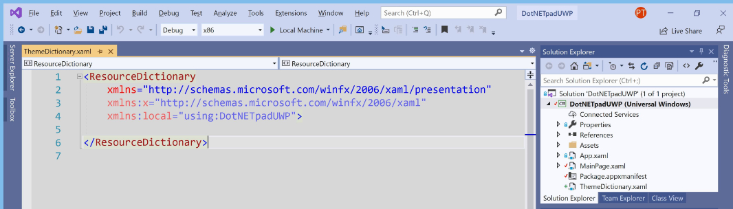
Comparing the structure of the code above with that found in ThemeDictionary.xaml, it seemed like I could just cut everything inside of <ResourceDictionary> and </ResourceDictionary> out of MainPage.xaml and paste it into the corresponding open and close tags in ThemeDictionary.xaml. So do that. But we also will need to reference ThemeDictionary.xaml somehow in MainPage.xaml. How else would the textbox know to use that theme?
That’s easy enough: Just replace the textbox’s <TextBox.Resources> and <ResourceDictionary> blocks with this:
<TextBox.Resources><ResourceDictionary Source="ThemeDictionary.xaml"/></TextBox.Resources>
And that works just fine. In fact, to make MainPage.xaml just as clean as it was before, you could put all of the code for the textbox on a single line again:
<TextBox Grid.Row="1" Name="TextBox1" Background="White" AcceptsReturn="True" BorderThickness="0,1,0,1" BorderBrush="Black" TextChanged="TextBox1_TextChanged"><TextBox.Resources><ResourceDictionary Source="ThemeDictionary.xaml"/></TextBox.Resources></TextBox>
Next, I’ll try to figure out whether it makes sense to add editor theme support as well.

Gain unlimited access to Premium articles.
With technology shaping our everyday lives, how could we not dig deeper?
Thurrott Premium delivers an honest and thorough perspective about the technologies we use and rely on everyday. Discover deeper content as a Premium member.