Programming Windows: Hello, Ribbon and Jump Lists (Premium)
- Paul Thurrott
- Mar 31, 2022
-
10

Of the few developer innovations delivered with Windows 7, the new Scenic Ribbon and Jump Lists are arguably the most interesting. So here are some very quick examples of how one might add these constructs to a Windows app using the Windows Presentation Foundation (WPF).
Scenic Ribbon
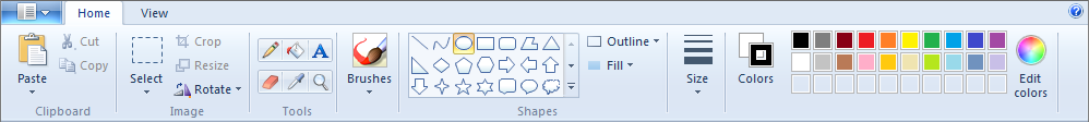
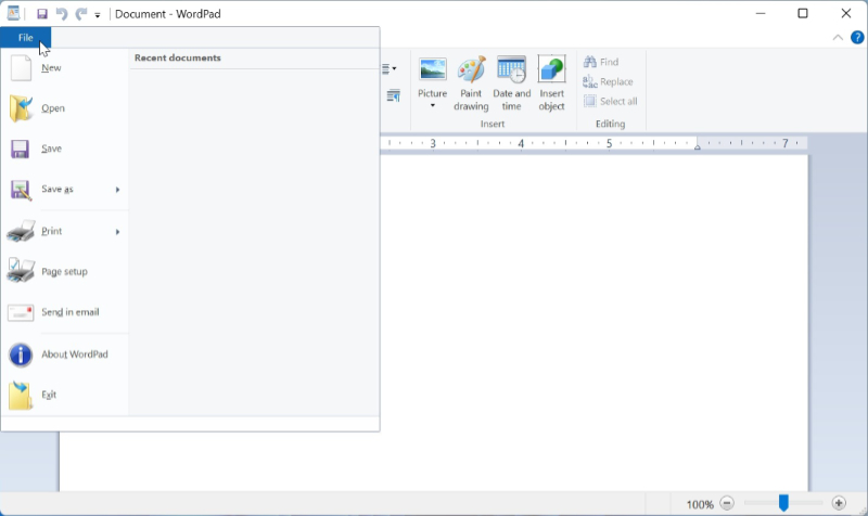
The Scenic Ribbon had debuted earlier than Windows 7, in the key Office 2007 apps. But a slightly updated version appeared in the refreshed Paint and WordPad apps that arrived with Windows 7.
Less obviously, the Scenic Ribbon—I’ll just use the term “Ribbon” from here on—introduced a new user experience paradigm that replaced the old command-based system exposed by the menus and toolbars of the past. Now, this new intent-based UI would expose features—rather than commands—to the user. And these features were easier to find because none were hidden, and features could dynamically appear as needed based on context. For example, if a user selected an image in a document, a new Picture Format tab could appear with image-related features.
Even the earliest versions of the Ribbon were quite full-featured. Each Ribbon consisted of two or more tabs, each of which contained named and grouped sets of features, which could be exposed by buttons, style galleries, and other controls. There was a circular application “pearl”—as with the Office 2007 apps—or a rectangular application button—as with WordPad—that, when clicked, displayed a menu of choices. And a Quick Access toolbar that contained a customizable set of often-needed command buttons like New, Open, Save, and the like.
For developers, the Ribbon was—and still is—a dense and complex control with many moving parts. One had to specify the contents of the Quick Access toolbar, the application menu, and each Ribbon tab. And each Ribbon tab could consist of groups, each of which could contain any number of buttons and other controls in different types of layouts. All of these items could be tied to a command or event handler. And the resulting XAML—for those using the Windows Presentation Foundation (WPF), the preferred approach—would very quickly grow out of control.
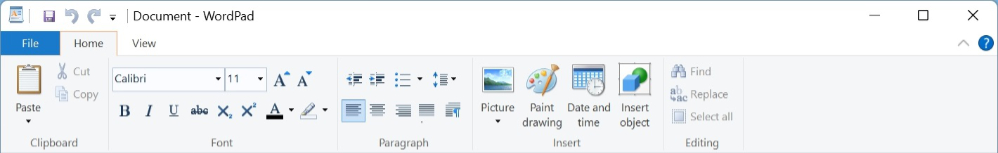
To understand why, let’s look at some XAML code. This won’t be a complete app, not even close, as the ribbon is just too much work. But here I’ll model a small part of the look and feel of the WordPad ribbon, and fill out some of its functionality. It’s not hard to imagine using this interface for a .NETpad-style productivity app, though a Ribbon is overkill for a text editor. Here’s our inspiration.
Note: The icons I use here are from the Visual Studio Image Library. Yes, they are terrible.
Ribbon basics
WPF provides a native Ribbon control, so adding one to an app is as simple as creating a set of <RIBBON> tags in a Windows app’s main window.

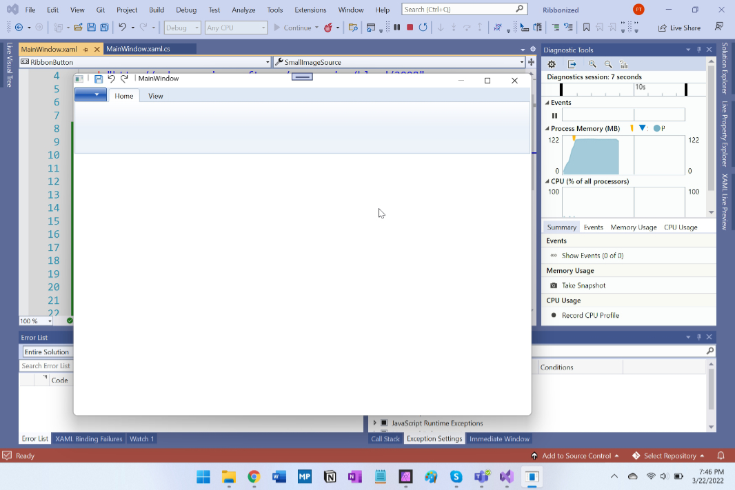
And if you run this without doing anything else, you’ll see that a blank Ribbon has been added like any other toolbar to the top of the app.
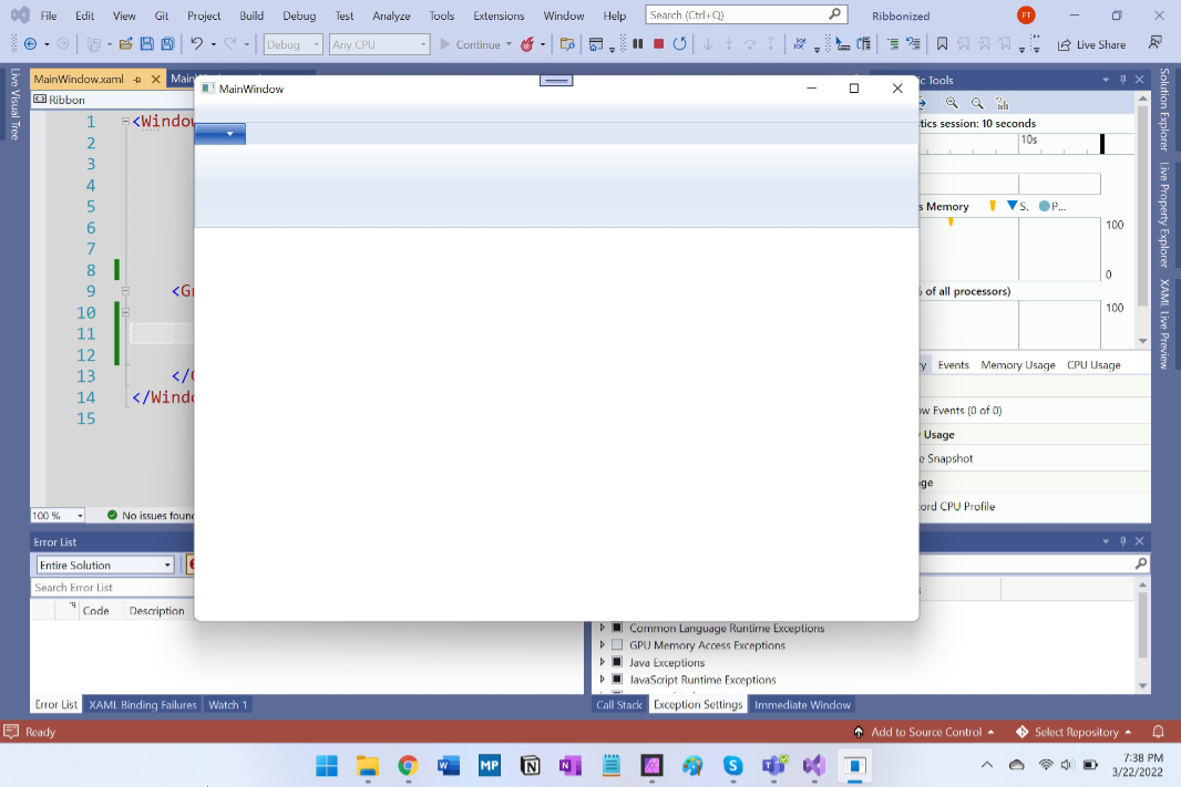
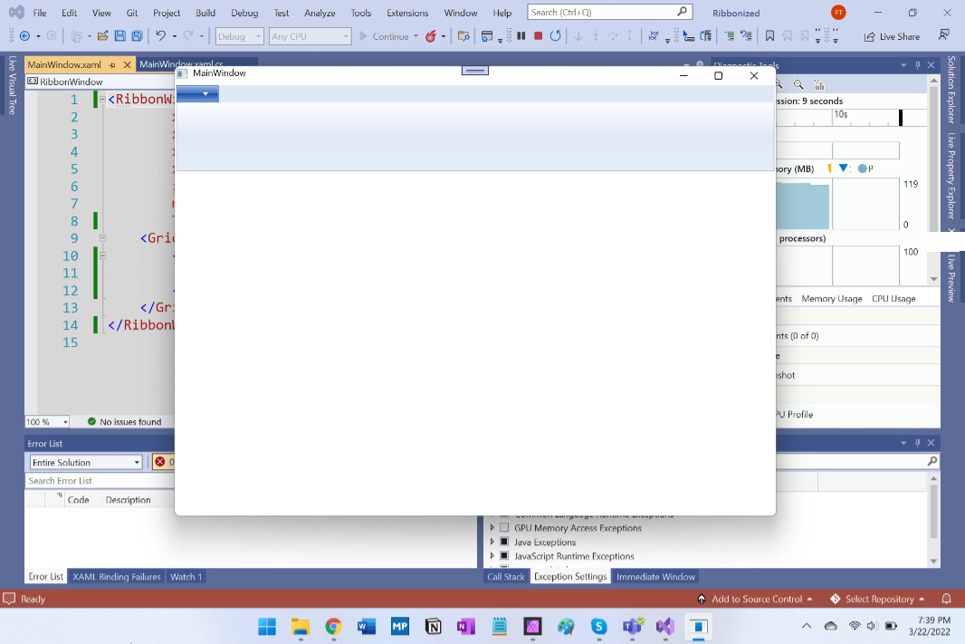
But most Ribbons integrate into the top of their containing app window. To accomplish this, we just need to replace the main <WINDOW> container in the XAML file with a <RIBBONWINDOW>.
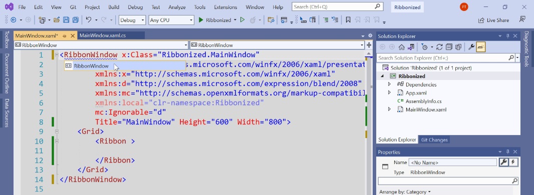
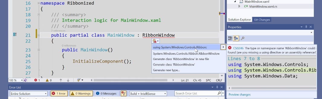
And then we need to make the same change in the C# file since that’s the other half of the partial class. (This will require adding System.Windows.Control.Ribbon to the using section at the top of the C# file as well.)
Once that’s done, you’ll see that the Ribbon is now attached to the top of the window, which means that the Quick Access toolbar and any contextual tab groups will display properly at the top.
From here, you will face the very time-consuming task of filling out the ribbon, which means defining a Quick Access toolbar and its associated icons, an application menu and its associated menu items, and two or more ribbons, each accessible via a tab, and each consisting of groups, each with associated buttons and other controls and in a specific layout. It’s pretty tedious, and because some common controls, like the drop-down button, aren’t even available in WPF, it’s not possible to fully duplicate even a relatively simple Ribbon layout like that found in WordPad. At least not easily.
Here are the basics.
Ribbons and tabs
First, you can specify each of the major tabs inside the Ribbon using RibbonTab tags. WordPad has two, Home and View, so that’s easy enough to define inside of the <Ribbon> and </Ribbon> tags:
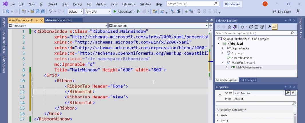
With just this simple addition, you can now switch between the two (empty) tabs when you run the app.

Quick Access toolbar
To create a very basic Quick Access toolbar, which will sit above the Ribbon, just add code like the following.
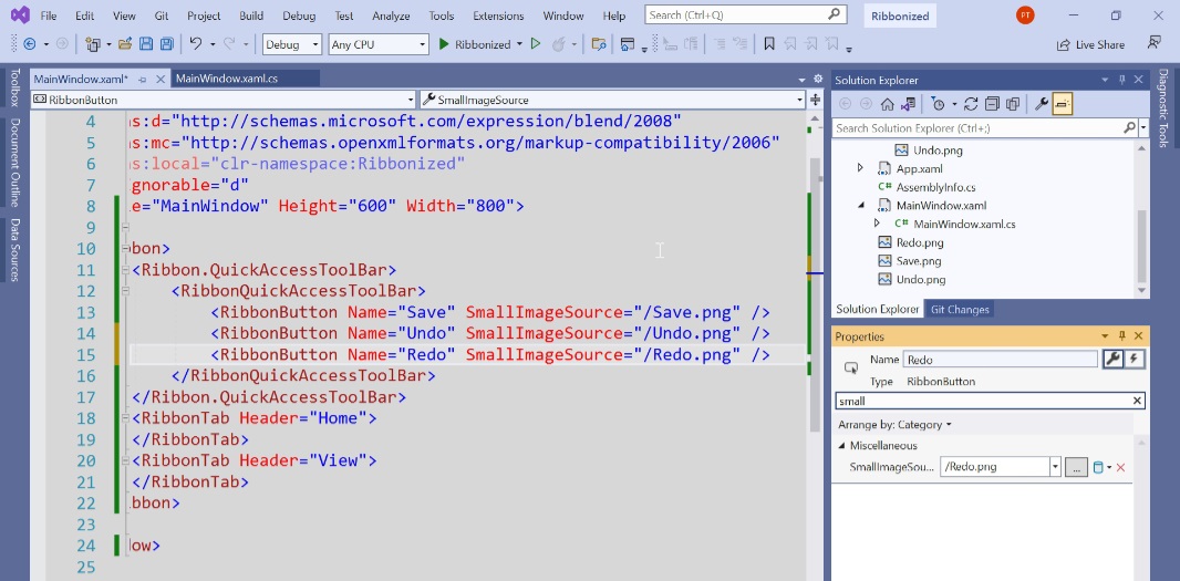
Now, when you run the application, you’ll see a non-customizable Quick Access toolbar above the Ribbon.
Ribbon groups
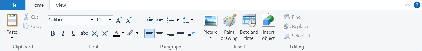
Each Ribbon tab is split into groups, and if you look at WordPad’s Home Ribbon, you will see five such groups: Clipboard, Font, Paragraph, Insert, and Editing.
These are added using <RibbonTab> tags inside of a <RibbonTab>.

When you run the application, you’ll see the empty groups appear.

After this, the real tedium begins. As noted, each group has a set of buttons and other controls, all presented in a specific layout. I will examine the first two groups, Clipboard and Font.
The Clipboard group has three items: a large button with a drop-down and two smaller buttons. In Ribbon parlance, the large button is called a RibbonMenuButton, and you can specify a large image to give it the right sizing and an arbitrary number of RibbonMenuItems. There are two in WordPad, so I’ve recreated that with this code:

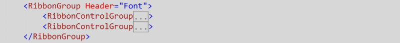
The Font group is a bit more complex from a XAML perspective: it features two rows of items, so we need to contain each in a <RibbonControlGroup>. The top RibbonControlGroup has two combo boxes and two drop-down buttons, the latter of which are not available natively in WPF. And the bottom RibbonControlGroup has 6 buttons and two drop-down buttons.
The basic structure of this group will look like so:
Inside of the top RibbonControlGroup, I added two comboboxes (each with just one item so that something displays; normally, you would pull in the system’s full font list as I did with .NETpad) and two buttons. It looks like so:

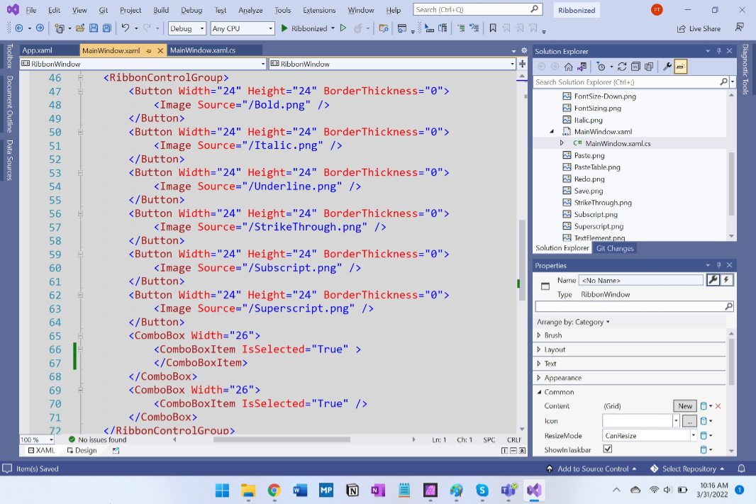
For the bottom RibbonControlGroup, I created the 6 buttons and then substituted two small and empty combo boxes as spacers to represent the drop-down buttons that WPF doesn’t support. We’re just approximating here.
This is already a ton of code, and all it does is display something that sort of looks like the first two Ribbon groups in WordPad. We would still need to add the basic UIs for the other three groups in the Home tab, plus the three groups in View. And then each would need to be fine-tuned, and each item in the Ribbons would need event/command handlers. As promised, it gets hairy pretty quickly.

Application menu
Even if you do figure out the entire Ribbon, you’re still not done: the Ribbon also supports an application menu, and that has to be created too. (Or hidden/collapsed if you don’t want to use one for some reason.) WordPad’s application menu is a two-column control (similar to the Windows 7 Start menu, actually) with a list of commands like New, Open, Save, and more on the left and an MRU in the right auxiliary pane.
Both sides can be statically created in XAML, but the right side is more typically populated dynamically with C#.
Here, again, I will simplify things.
Fortunately, the XAML is straightforward enough: all you need to do is create a <Ribbon.ApplicationMenu> section somewhere inside the <Ribbon> section and populate it with one or more Ribbon Application Menu Items, including the auxiliary pane. For purposes of this demonstration, I’ve just created some bogus static items for that latter part to save time; normally, this would be filled dynamically with a real MRU list.
Here’s the left side of the application menu, with the auxiliary pane section collapsed:
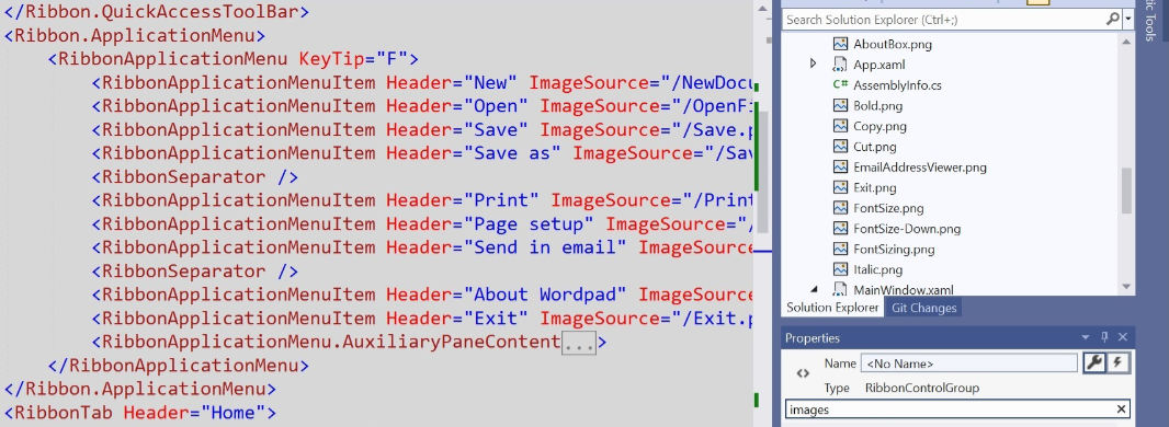
And then there’s the auxiliary pane code:

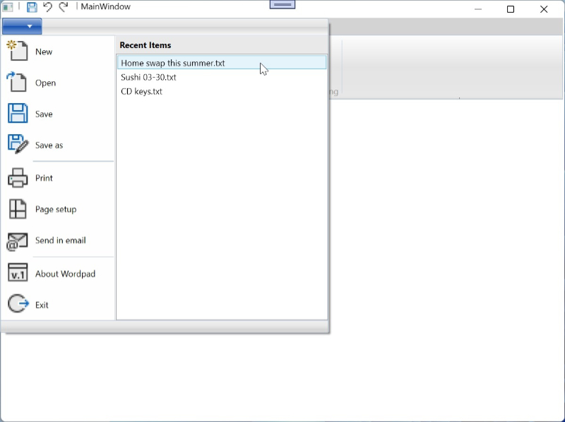
As always, a metric ton of code just to define a basic and non-functional UI. Here’s what it looks like in the app:
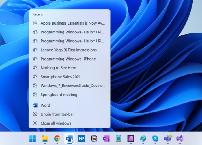
Jump Lists
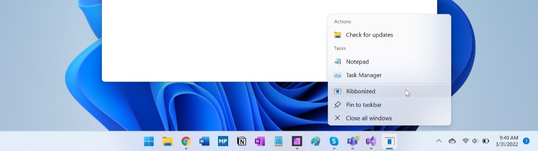
Microsoft originally described Jump Lists as miniature Start menus for your apps that display frequent destinations (typically documents) and tasks. You access them by right-clicking an app icon in the taskbar or Start menu:
WPF also lets you modify an app’s Jump List from both XAML and C#. The former is perhaps better/easier for items that are permanent, while the C# approach is required when the list of tasks needs to change dynamically, as would be the case with a most recently used (MRU) list for a document-centric app like .NETpad or Microsoft Word. (You can also use C# to modify or remove XAML-based Jump List items as well, of course.)
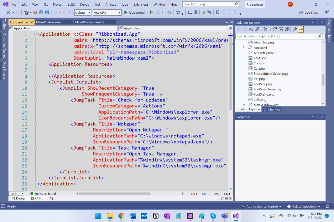
To customize the Jump List from XAML, you need to access App.xaml not MainWindow.xaml (or whatever). That’s because the Jump List is for the entire app and not for a particular window. I don’t believe I’d ever edited App.xaml before, but adding a Jump List is straightforward enough: you create a <JumpList.JumpList> block, optionally set a few properties related to what types of items may appear there, and then create individual Jump Tasks and optionally assign them to a custom category if desired.
Here is a very simple example that adds three Jump Tasks, two to the normal Tasks group and one to a custom group named Actions.

When I run the app and right-click its Taskbar icon, the Jump List appears:
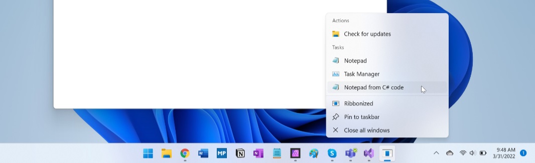
Jump Lists can also be modified from MainWindow.xaml.cs or any other C# file that’s associated with the project. Were I to add an MRU Jump List to .NETpad, for example, I would likely add a Jump List item in the event handler that runs each time the user opens a new text file. But to make this as simple as possible, here I’m simply adding a new Jump Task to the default Tasks group dynamically when the main window first opens, in the MainWindow() constructor. Note that accessing an app’s Jump List requires you to include System.Windows.Shell as noted at the top of the source code:
And when I run the app again and right-click its Taskbar icon, I can see the new Jump Task added at the bottom of the tasks I had added in XAML.
And that’s about all I can take of that.

Gain unlimited access to Premium articles.
With technology shaping our everyday lives, how could we not dig deeper?
Thurrott Premium delivers an honest and thorough perspective about the technologies we use and rely on everyday. Discover deeper content as a Premium member.