The Return of At a Glance (Premium)
- Paul Thurrott
- Jun 08, 2022
-
9
The “at a glance” functionality in Live tiles was one of the central innovations in Windows Phone 7 Series. But this feature is now making a comeback.
I always expected this to happen. But then, I also expected it to happen because Windows Phone achieved some level of success and secured a position as the third platform in the smartphone industry. Obviously, that didn’t happen: Microsoft quickly stepped back from its Nokia acquisition and began dismantling Windows Phone back in 2015. And today, the smartphone industry remains a two-way race.
As you may know, I’ve been switching back and forth between the iPhone and Android ever since, mostly Android, though I’ve used an iPhone semi-exclusively since December. And while I suppose both platforms have their Windows Phone influences now, it is particularly interesting to me that Apple has gone further than Google in this regard. (That said, I feel like Google’s Material Design is the modern equivalent of what Microsoft initially called the Metro design language.)
Apple’s quiet move into the design space previously occupied by Windows Phone—a transition no Apple fan would ever admit to nor acknowledge—started with the design-forward iOS 7, which ditched the silly skeuomorphic UIs of iOS past and catapulted Apple’s mobile platform into the 21st century.
The original release of iOS was as radical as that of Windows Phone 7 Series, with stark whites, new font treatments, and huge, open areas of whitespace. (It is also perhaps notable that some apps, like Mail and Apple Music, briefly displayed big, bold header fonts that were very similar to the classic Microsoft font of old, Franklin Gothic.)
“A lot of the language Apple is using to describe iOS 7 will be familiar to anyone who’s followed Microsoft’s Metro moves over the past three years or so,” I wrote back in 2013. “(An Apple executive actually uttered the phrase ‘fast and fluid’ during Monday’s presentation, if you can believe that.) iOS 7 uses a grid design, just like Metro, features bigger fonts with an eye on typography, again just like Metro, and uses an ‘edge to edge design that takes advantage of every pixel.’ Sound familiar? It should.”
In iOS 14, Apple added widgets to the home screen. This was five years since the demise of Windows Phone, so most people compared this feature to the similar but, at that time, ignored feature in Android.
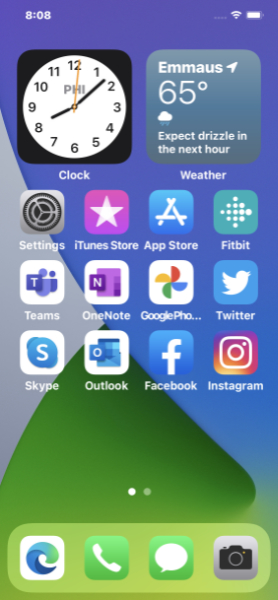
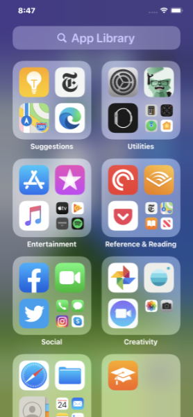
But anyone with a Windows Phone background would have been struck by the look of Apple’s widgets, and by the Windows Phone-like App Library interface that also debuted in iOS 14.
“In bringing widgets to the Home screen and expanding their capabilities to include multiple sizes, Apple has, sort of, brought that feature that Windows phone users still lament to its flagship mobile platform,” I wrote at the time.
“Widgets can each be one of three sizes—small (the size of four icons), medium (a wide style the size of eight icons), or large (huge, really, and the size of 16 icons)—and they can be used judiciously at the tops of home pages where they can force app icons closer to the bottom where they are more easily reached,” I wrote elsewhere at the time. “Widgets work much like the live tiles in Windows Phone, which should warm the cockles of any Lumia fan’s heart, providing ‘at a glance’ views of useful information.”
Of course, for “at a glance” to make sense, you need to access that functionality, literally, at a glance. And one of the minor nits about the iPhone is that the lock screen gets in the way. If you use Face ID, for example, it’s not enough to just look at the screen: you have to also swipe up before you can glance at anything. The iOS lock screen displays the date and time—and camera and flashlight icons, the former of which helps emulate Windows Phone’s “pocket to picture” functionality—and not much else. Well, some notifications. Which are borderline useless in iOS.
So with iOS 16, Apple is taking what I think of as the final step into “at a glance” functionality by adding widgets to the lock screen where they can be seen, literally and for the first time, at a glance.

“The Lock Screen features widgets that take inspiration from Apple Watch complications,” Apple claims disingenuously, “making it easy to get information at a glance, such as upcoming calendar events, the weather, battery levels, alarms, time zones, Activity ring progress, and more.”
iOS 16 will also provide a Lock Screen gallery for customizing the lock screen, a feature that had previously been almost completely ignored. And it will even support multiple lock screens, which I’m not sure I’ve seen elsewhere.
And then there’s Live Activities, which to me seems like an obvious evolution of live tiles. Apple describes Live Activities as “a new feature that helps users stay on top of things that are happening in real time, such as a sports game, workout, ride-share, or food delivery order, right from the Lock Screen.”
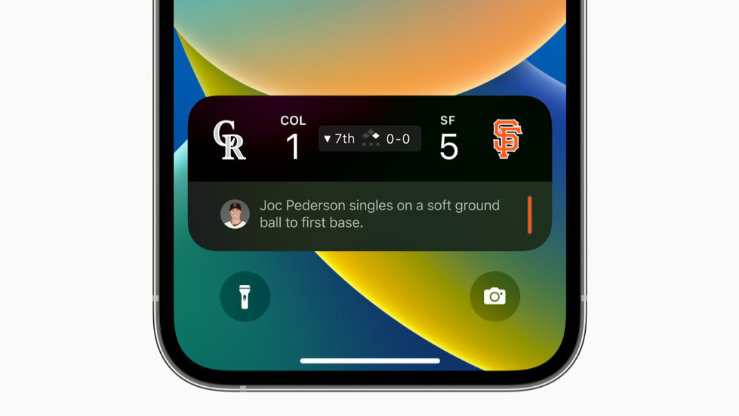
They appear as live tile-like interfaces, similar to the Now Playing interface you see on today’s iOS lock screen, but tailored for the activity in question. For example, one Live Activity Apple demoed shows a baseball game in progress, with a live score and play-by-play information. Another shows the details of an in-progress workout.
Together, Lock Screen widgets and Live Activities give us our best view yet of an imaginary future in which Windows Phone both survived and thrived. And while it’s depressing that such a thing came from Apple—and with zero acknowledgment about past implementations that provided the first steps towards this functionality—it is at least comforting to see good ideas continue forward.
You know. Sort of.

Gain unlimited access to Premium articles.
With technology shaping our everyday lives, how could we not dig deeper?
Thurrott Premium delivers an honest and thorough perspective about the technologies we use and rely on everyday. Discover deeper content as a Premium member.