Another Example of Windows 11 Leaving Power Users Behind (Premium)
- Paul Thurrott
- Jul 19, 2022
-
52
Many seem to be excited about tabs coming to File Explorer in Windows 11 22H2. But it’s the other changes to File Explorer that I’m concerned about: Microsoft is also making fairly major changes to File Explorer’s navigation bar and what used to be called Quick access, and I’m not sure it even understands the ramifications of what it’s doing.
This one is going to be a bit hard to explain. But it impacts me personally, given how I configure File Explorer, and it’s something I’ll need to understand and document fully for the Windows 11 Field Guide. So I’ll see if I can muddle through it in a way that will make sense.
In the initial version of Windows 11 (21H2), Microsoft upgraded File Explorer with a new look and feel, but it kept the configuration mostly the same as it was in Windows 10, with a default Quick access view and a Quick access entry at the top of the navigation pane to match. And, as before, you could change the default view to This PC if you wanted.
With Windows 11 22H2, Microsoft is making further changes. The Quick access view has been renamed to Home, and it’s still the default view, but it now displays a new Favorites section for pinned files and folders. And, in the navigation pane, the Quick access section has likewise been renamed to Home, which makes sense. (And there’s also a new option to set OneDrive as the default view.)
By default, Quick access/Home in the navigation bar displays six shortcuts—for the Desktop, Downloads, Documents, Pictures, Music, and Videos folders—and these folders also appear in the Quick access section in the Quick access/Home view, above Favorites (new to 22H2) and Recent. And also by default, File Explorer will dynamically add folders to Quick access/Home in the navigation bar, and files and folders to the Quick access/Home default view as you use the PC.
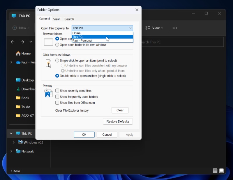
Some people like this behavior, I’m sure. Others, like me, do not. And so, one of the first things I do when I bring up a new Windows 11 PC is to customize File Explorer to my needs. I make the following changes (via Folder options, accessed via See more [“…”] > Options > General):
- I change the default view to This PC.
- I disable the options “Show recently used files” and “Show frequently used folders” (and, in 22H2, “Show files from Office.com”).
I also customize the Quick access/Home section of File Explorer’s navigation pane like so:
- I remove the shortcuts to the Documents, Pictures, Music, and Videos folders, because I do not use these folders. (I leave the shortcuts to Desktop and Download because I do use these folders.)
- I add shortcuts to folders I use regularly like Book (for the Windows 11 Field Guide), To-do (articles I’m currently working on), and a folder representing the current month (2022-07 as I write this) because this is where I move (archive) documents and other files I’m done with.
One of the many things that is probably not obvious about this configuration is that I can still easily access the removed folders that are normally displayed in Quick access/Home. And that’s because, to date, all of the originally pinned Quick access/Home folders can still be found under “Folders” in the “This PC” view that I use as my default.

So if I need to access a screenshot, I simply open File Explorer, open the Pictures folder, and then navigate to Screenshots.
This is true in Windows 10, Windows 11 21H2, and Windows 11 22H2. But it’s not true when you get the File Explorer update that adds tabs. Once you move up to that, the Folders section is no longer available in the This PC view. And since I have removed most of those folders—like Pictures, to stick with that example—it’s no longer possible to get to that location easily.
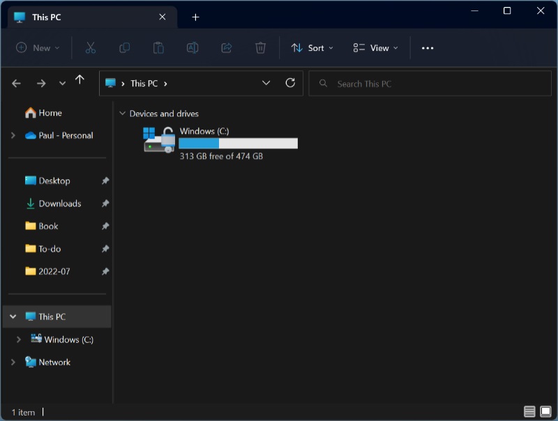
Think about it. I’ve removed Pictures from Quick access/Home, so it no longer appears in the navigation pane. It’s no longer in the Quick access/Home view either. And now that the Folders section is gone from This PC, it’s no longer there either. It’s just gone.
Well, not gone. If you know where to look, you can still find it in File Explorer by navigating to Local Disk (C:) > Users > [your user name] > Pictures. Which is tedious. And … stupid.
(There is another way that’s easier if you know the trick: I can open File Explorer, navigate to the Downloads folder, which is still pinned in Home, and then click the little “>” to the left of the Downloads name in the address bar. Power users will always find a way.)
![]()
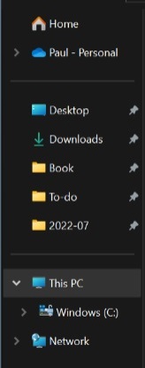
Microsoft has also arbitrarily changed the layout of the File Explorer navigation pane, which I find odd. Before, there was a simple layout with Quick access/Home, OneDrive, This PC, and Network sections. But with 22H2 with the File Explorer tabs update, it’s completely different: Home and OneDrive (now called Paul – Personal) are in a section by themselves at the top, followed by a divider and a section with whatever Home folders you’ve configured (Desktop, Downloads, Book, To-do, and 2022-07 folders, in my case), another divider, and then a section with This PC and Network.
You can customize this view a little bit, but you get the same options as before. (You can see them by opening Folder Options and navigating to View > Advanced settings > Navigation pane. It’s not worth it.)
These changes seem entirely in keeping with the whole vibe of Windows 11. And I don’t like it.
That is, before the File Explorer tabs update, File Explorer let you customize it to display only the folders you used regularly, but it was still easy to access those folders you used less regularly (like Pictures). This was sort of like the relationship between the Taskbar and Start Search/All Apps (or the Windows 11 Start menu’s Pinned section and Start Search/All Apps) in that you had an obvious place for apps you accessed frequently, and another way to access apps you needed less often.
But with the tabs update, File Explorer is all or nothing. And if you want to use a folder like Pictures even infrequently, you’re better off just leaving it pinned in what’s now called Home. Because it’s really tedious to access otherwise. It’s like having to use the Run dialog to access less frequently needed apps.
I find this unfriendly and unwelcome, but I’m also a more technical user who customizes Windows the way I prefer. Most users, and certainly most mainstream users, do not do this. And thus, they will always see the folders Microsoft preconfigured, plus the folders (and files) they frequently access. And so Pictures, or whatever, will always be there. This only impacts people like me.
Which is sort of what I’m getting at: Windows 11 isn’t designed for people like me. It’s designed for mainstream users. People who are beginners and neophytes. I find that alienating and troubling, not because the default view is not what I want, but because I can’t even customize it the way I want without losing functionality that was there before. Windows was always the platform for everyone, power users and beginners alike. But it’s turning into yet another iOS or Chrome OS, a platform for non-technical people who don’t customize things to make them more efficient.
And yes, I know this is a very small example. But I feel like it’s also just one step of many to position Windows 11 specifically for beginners, and only for beginners. And I hope it’s obvious that this is a mistake, and that alienating technical people is not a good strategy. I find it very troubling, and I wonder where we will see similar changes happening next.

Gain unlimited access to Premium articles.
With technology shaping our everyday lives, how could we not dig deeper?
Thurrott Premium delivers an honest and thorough perspective about the technologies we use and rely on everyday. Discover deeper content as a Premium member.