Still Feeling a Little Edgy (Premium)
- Paul Thurrott
- May 18, 2023
-
23
I try to avoid Microsoft Edge as much as possible because the browser doesn’t respect your privacy or choices, and it’s saddled with feature bloat. But I also have a responsibility to understand what’s happening with the browser, and I need to document how it works—and how to bypass or fix its many problems—for the Windows 11 Field Guide.
But this process is complicated by the many, many changes that Microsoft makes to Edge. In the past six months alone—I wrote most of the Edge content in the book last October and November—Edge has exploded with new functionality. Frankly, it’s getting a bit weird.
The first worrying sign of changes I’d need to make in the book came this past February when Microsoft surprised the world by suddenly announcing the AI-based Bing chatbot and two related capabilities in Edge: Chat and Compose. These features were added to the Discover page of the Edge Sidebar, which doesn’t present much of a problem for the book. But Microsoft also added the hideous new blue Discover (Bing) button to the far right side of the Edge toolbar, past the Settings and more (“…”) button. And that presented a problem for the book. A serious problem.
The issue here is that this is a major visual change, one that would impact most of the screenshots I took of the browser across the 7 chapters about Microsoft Edge (and in a few other places). So I would need to update literally hundreds of screenshots to account for this change, many of which require specific staging to get just right. Plus, cropping and other editing.
So I looked to see how much work this would entail.
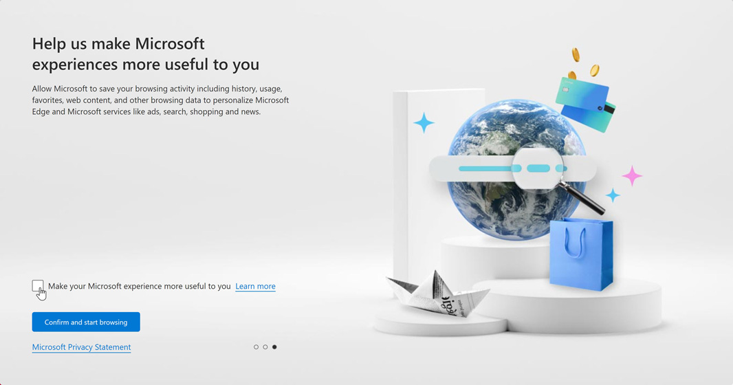
Starting with the first Edge chapter, Set Up Microsoft Edge Correctly, I was surprised to find some other changes. The first being an offensive and problematic stage of initial setup, which Microsoft had titled “Let’s make the web work for you,” and I had correctly noted should really be called “Let’s make the web work for Microsoft” because it’s designed specifically to increase your usage of Microsoft online services and put your eyeballs in front of Microsoft advertising.

It has since been retitled to the less problematic “Help us make Microsoft experiences more useful to you,” though the screen also explains less about what this change does. And so right up front, there was a pause. I would need to rewrite this bit as well. Interesting.
There were a few other changes to the content, but with that out of the way, I turned to the screenshots of the app window in that first chapter. Almost 20 had to be changed, and for the same two reasons: that damned blue Discover (Bing) button and the Sidebar, which had visually changed since I wrote the chapter.
And so I cheated. I’m lazy.
I created a mask of the Edge window at the 1920 x 1080 size I use for most screenshots that includes only the changed bits on the top right (Bing button) and right (Sidebar). Then I went through the chapter and pasted this mask over each screenshot that needed to be changed, re-cropping as needed.

Surprisingly, this worked pretty well. Not perfectly, but well enough. And then I moved onto to the second Edge chapter, Microsoft Edge Basics. This chapter would require some bigger edits because it covers the Sidebar, which has been overhauled with Bing Chat and Compose, plus other new features like Image Creator, Drop, and eTree. It also has over 50 screenshots and, yes, most would have to be retaken or, using my mask technique, edited. So I did the writing first, and then I fired up my screenshot laptop so I could take whatever new screenshots were required for the new content. Thankfully, I hadn’t used my mask technique on any existing shots because when I opened Edge, I saw this.
In case it’s not obvious, this is the new Edge user interface that Yusuf Mehdi hinted at in early May. And I was suddenly reminded of the words he used that day to describe how this change would be rolled out.
“We’re beginning our journey to a redesigned Microsoft Edge,” he wrote. “You’ll begin to see a sleeker and enhanced user interface including a streamlined look, rounded corners, organized containers, and semi-transparent visual elements.”
You’ll … begin to see?
That’s an odd choice of words, it certainly struck me as so at the time. But now I think I’m starting to understand what’s happening. Just as Microsoft is using Controlled Feature Releases (CFRs) in Windows 11 to roll out new features literally randomly to the user base over time, it is doing the same thing with Microsoft Edge. That is, this new feature—the visual redesign—didn’t just appear one day for everyone. It’s appearing randomly. And I proved that by checking for updates in Edge on several PCs. Each of them is on the exact same Edge version/build number. But only one of them has the visual refresh.
F’ing Microsoft.
Fortunately, the only one that offers the new UI is the laptop I use for screenshots: I can at least use this to get the book up to date while Microsoft slowly updates the rest of the world. But this kind of thing is troubling in the Edge for the same reason it is in Windows, and I don’t just mean for people like me writing books. Back in December, Microsoft quietly updated OneDrive with a new Windows 11 user interface too, but that visual refresh wasn’t even accompanied by an announcement post. Worse, it has been applied inconsistently across my many PCs. Some still have the old tabbed-based interface. Some have the new interface but can only backup (really, sync) three folders (Desktop, Documents, and Pictures). And some have the new interface and can backup/sync) five folders (Desktop, Documents, Music, Pictures, and Videos).
My complaint isn’t just about consistency. Many people have two (or more) PCs, and if they rely on that backup/sync feature, not being able to backup/sync the same data on each is problematic. It’s astonishing to me that Microsoft would even do this to the user base. But it does.
There’s more. There’s always more.
Way back in June 2022, I wrote a tip about how you could enable a Windows 11 look and feel in Microsoft Edge. So Microsoft has been working on this refresh for quite a while. But there was a second visual change you could make then that is still an experimental feature that you can enable today as well via edge://flags: it’s called “Make Rounded Tabs feature available.” When enabled, the style of the tabs changes, from this:

To this:

Given that the visual refresh that is starting to roll out now and this visual change to tabs both appeared as experimental features at the same time last year, it’s reasonable to wonder if the latter will soon roll out to stable too. My guess is that it will. As soon as I finish this massive round of screenshot updates, of course.
On and on it goes.
When I wrote the initial Feeling a Little Edgy (Premium) post back in October, I was taken aback by how much crap Microsoft had added to Edge over the previous year or so. And as noted above, it’s added much more since then, some useful, some not. Based on my experiences using Edge again, I’ve been more vocally critical of the browser in the intervening months, here on Thurrott.com, on Windows Weekly, and on Twitter, with the aim of protecting people from this malignant product. And each time, I am always astonished when someone would defend this privacy-problematic and feature-bloated web browser. But people do. Of course they do. What one views as crap, another views with love.
(When I argued that Edge betrays your privacy as badly as does Chrome and sells your information to advertisers, one person on Twitter literally explained that they continue to use Edge because that browser lets you put a History button in its toolbar. I guess typing CTRL + H is hard, but their privacy is immaterial.)
Rather than rehash this argument, let me just leave you with this bit of advice. If you are going to use Microsoft Edge for whatever reasons, install the Privacy Badger and Adblock Plus extensions, both of which I mention in the book. The first is the most effective way to help obviate Bing’s utter lack of tracking protection despite the theater that Microsoft engages in with regard to this functionality. And the second is just common sense.
But seriously, please use Brave.

Gain unlimited access to Premium articles.
With technology shaping our everyday lives, how could we not dig deeper?
Thurrott Premium delivers an honest and thorough perspective about the technologies we use and rely on everyday. Discover deeper content as a Premium member.