Bloat (Premium)
- Paul Thurrott
- May 13, 2024
-
21

Even as a younger man, I sought out apps and services that were simple but effective. The right tool for the job, if you will. 20 years ago or more, I realized that Microsoft Word, arguably the app I’ve used more than any other in my life, was too complex, too much, that I used and needed only some tiny percentage of its feature set. As is the case with so many of the digital tools I use, I then spent the subsequent decades trying to replace it. With something simpler.
The battle between simplicity and complexity is multi-faceted. It’s about trying to find the balance between functionality and usability, the distractions that come from visual overload, and the confusion that comes when an interface is so minimalist you don’t even know where to start. And the problems are compounded by experience. The negative reactions to Windows 11 came almost entirely from a single faction of the user base, those who know Windows the best, the power users, and they were tied to missing functionality they relied on that had been removed in the name of simplicity.
Microsoft’s initial introduction of the ribbon to Office 2007 triggered a similar, equally visceral reaction, and from the same audience. Where many if not most mainstream users simply went about their day using this new software, those who knew it best—the power users—reacted as if they were suffering from phantom limb syndrome. They were particularly uninterested in the data showing that most of the top 10 feature requests for Office were for features that already existed but couldn’t be found, that this new interface surfaced functionality intelligently, often only when needed, and that it was a significant advance over the messy toolbar- and menu-based UIs of the past.
But the ribbon suffered from the same problem as the Central Artery in Boston, an elevated highway erected in 1959 that divided the city in two. Which is this: Almost as soon as it was completed, its makers knew that it would have to be replaced. Boston addressed its Central Artery problem first with baby steps—it immediately canceled the follow-up projects that would have expanded this highway in different directions—and then with the Big Dig over 30 years later. With the ribbon, the rise of even simpler new UIs tied to web and mobile app platforms triggered yet another rethinking, but we’re still living in the era of baby steps in this case. You can see the transition to come in products like the Office apps for iPad and the web, all of which feature simplified ribbons that take up less space and offer less visual overload. And in more modern apps like Loop and Teams that dispense with this kind of UI entirely despite being quite feature-rich.
Simple always wins in the end. But how we get there—and get there without alienating power users—is an open question, one that may be best answered on a case-by-case basis.
I’m going to focus on Office and related productivity tools here, but before moving on, I do want to address something troubling that’s happening today with Windows 11. Windows 11 is an interesting release, and while it’s still not clear where it will land in the scope of the history of this product line, we should at least celebrate Microsoft’s attempts to simplify this product, even if we bemoan certain specific changes. In stripping back the core Windows user interface—the Start menu and Taskbar were literally rewritten from scratch—Microsoft had to know it was going to run afoul of power users and their perhaps too-specific needs. And yet, it went for it. I respect that, to some degree.
The problem, of course, is that we then entered a very familiar cycle in which Microsoft takes away features, customers complain, and then Microsoft adds back the features it took away. The hope is that it can make common-sense changes—bringing a Task manager option back to the Taskbar right-click menu, for example—that don’t muck up the improvements provided by its initial simplicity purge. And that, in the end, we’ll still have a simpler UI than before, with less complex underpinnings, that is more reliable and meets most people’s needs. This hope is in many ways fanciful. But there it is.
But Microsoft cannot stop screwing around. You may have seen the story last week that it’s experimenting with bringing widgets to the Windows 11 Start menu. I think it looks horrible and brings unnecessary visual complexity, bloat, to an interface that is, if anything, overly minimalist and has more pressing usability issues. And that it’s thus a horrible idea, at least in my opinion. But I also recognize the problem Microsoft is trying to solve because it’s the same problem a previous Windows team faced when it added a similar interface called Live tiles to Windows 10: These little at-a-glance components with live updates, whatever they’re called, don’t make any sense if you can’t see them. And when you put them in an interface that users only access fleetingly (the Start menu) or not at all (News & interests in Windows 10 or Widgets in Windows 11) then they have no reason to exist. Developers won’t create them and users won’t use them. It’s a non-virtuous cycle.
The Windows 10/Live tiles issue should be all the evidence that Microsoft needed to know that the Start menu is the wrong place for these components. That perhaps it’s time to consider alternatives like a Widgets pane that stays on screen at all times—shades of the Longhorn sidebar—or allowing users to put these components right on the desktop, just like Mac users do today with that system’s version of Widgets, shades of—wait for it—Active Desktop. Obviously, Microsoft has considered these choices. Indeed, Microsoft seems a bit too eager to experiment with different interfaces in Windows 11 that, to me, seem superfluous. It’s almost as if the company doesn’t realize that we’re here for the apps, and that Windows is just the launcher for those apps.
This widgets experiment is thus offensive on many levels. This model was disproven in Windows 10. It violates the spirit of the simplification push that defines Windows 11. It adds no value for most users. It is, in effect, just wrong, a solution to a problem that few if any customers have. It is the very essence of bloat.
And bloat is an interesting and perhaps intractable problem.
We’ve been told so many lies over the years by well-meaning people who applied logic but without facts to justify product decisions. The most obvious example was the consolidation of the toolbars and menus in the various Office applications in the late 1990s, as that bundle transformed into a more cohesive suite. Both concepts are reasonable but flawed. A bundle is a way to save money by getting multiple apps at a discount, even though most customers only need a small subset of those apps. And a suite is a way to help customers use unfamiliar apps they may end up needing by introducing cross-app capabilities (“better together”) and, as noted, more similar user interfaces.
The lie of the Office suite was that making each app’s user interface more similar—by creating as much commonality as possible in their respective toolbars and menus—would somehow make it easier for a Word user to adopt Excel (or vice versa). This is the type of thing that sounds right. But it wasn’t based on studies or research. And what we discovered, in time, is that it’s not true. Word and Excel are completely different kinds of apps that solve completely different problems, and the availability of similar toolbar buttons in each doesn’t make the adoption of one or the other any easier. More broadly, people aren’t as dumb as the engineers masquerading as user experience experts believed in the 1990s. As it turns out, we can handle different interfaces just fine. A common user interface across different types of tools seems simpler, but it’s not.
This was especially not true of Office, which came up in a world in which it was competing with multiple high-quality alternatives from all corners, first via individual apps and then through integrated suites. To best compete with Borland, Lotus, WordPerfect, and other solutions in the 1990s, the Office apps exploded in functionality, adding almost exponentially more features over time. It is this reality that led to the ribbon—the number of commands in each Office app outstripped their ability to present those commands to the user—and led many, in the press at the time, especially, to begin complaining about bloat. In winning the office productivity wars, Microsoft had pushed itself into a corner. They were like a band that got so popular that its initial fans started to hate it because it was now popular.
Not surprisingly, this comes up in Steven Sinofsky’s excellent Hardcore Software again and again: Sinofsky participated in and then led Microsoft’s Office efforts for many years, and he, like others in those teams, struggled with the backlash. It reached a crescendo with the addition of Clippy to Office 97. This feature was really called the Office Assistant, and while everyone still thinks of it as Clippy, one of the more delightful anecdotes in Hardcore Software is that Bill Gates referred to it by an even better name, that f &^ king clown.
This is how Sinofsky describes an early demo in which the Office team tried to convince Gates that the Office assistant made sense using an Excel demo.
Demo: The Assistant will then appear and offer each step in sequence to create a chart, as the user interface does today. But it will be more friendly and approachable and have easy access to help content.
Bill: So, when I want to create a chart the clown will pop up and say, “I’m here to help” and …
Demo: Not clown, but Assistant.
Bill: The clown pops up and then I’m like clicking on the clown saying clown next, next, clown next, or something just to create a chart.
Demo: The Assistant is just a more approachable and helpful version of the same number of clicks and steps you always had.
Bill: Next … next … next, and pretty soon I just want the f&^cking clown to get out of the way.
(Gates ridiculing the Office Assistant lived on in software code, as the internal implementation of this feature used the Hungarian notation prefix tfc, which of course stood for that f&^king clown.)
Like the toolbar work Microsoft did in Office, the Office Assistant was inherently flawed because it was designed by software engineers, not user experience experts. Oddly, this time Microsoft did try to back up its usability assertions, this time using what Visual Basic creator Alan Cooper called a “tragic misunderstanding of a truly profound bit of scientific research”. Sinofsky notes only that it “formed the early AI efforts in Microsoft Research,” which had been founded in 1991.
That history is fun, but I’ve careened off-track, ironically, by focusing on a specific feature. At a higher level, the issue of bloat in Office came to the forefront just as the product line was vanquishing all its enemies. Paul Andrews of the Seattle Times wrote—at a time when newspaper reviews still mattered—that Office 97 was an early nominee for the non-existent “Bloatware of the Year,” which Sinofsky noted was “a sharp dig in an otherwise positive review” of the product. And The Wall Street Journal went a step further by using the term bloatware in the headline for its own Office 97 review, noting that it “contains 4,500 commands for features both useful and arcane” as a criticism.
“Each of those features meant something we were so proud of and represented real effort,” Sinofsky retorts in his book. “Bloat was a constant conversation with field sales, in the Executive Briefing Center, and with the press. Each time the topic came up, I used my go-to answer, which was that there is a set of features that everyone in Office uses and those are easily understood, such as open, save, print, copy and paste, and a host of basic formatting commands. Everyone nods. Then I would talk about how each application has features that a few people use, perhaps footnotes, financial formulas, or animations in PowerPoint. Most would agree with that.”
The central debate was one I was quite familiar with at the time, and it still resonates today: Put simply, bloat is in the eye of the beholder. In some cases, your bloat is my crucial feature. Or what is normally bloat suddenly becomes necessary that one time each year I need to use it. Critics who alleged that Office was full of bloat didn’t understand how other people used the product, and they would commingle what they assumed was infrequent use with no use.
Flipped on its head, Sinofsky argues, bloat is good, and representative of the significant value proposition of Office. Any person can use whatever features they need in whatever Office apps they use, and any other person will use a different mix of features that they need, and yet this one solution works well for everyone. “Intellectually, people understood” what he meant, he explains, “but they almost always would shrug and still say that the software was ‘bloated’.”
Bloat could—and can still today—be measured by RAM or other resource utilization, by disk space consumed, by visual complexity, and by any other measure one chooses. Some consider crapware shortcuts in the Windows 11 Start menu to be “bloat,” which I understand, while others I agree with less believe that every app shortcut in the All apps list is an affront, not understanding or caring that removing them saves no disk space and doesn’t make Windows run faster.
To me, the real problem with bloat—which was true of Office back in this era and beyond, and is true today in Windows—is tied to that legacy strata of code I discussed yesterday in Complexity, Thy Name is PC (Premium). “Old code, cruft was weighing down” the product, in Sinofsky’s words. This isn’t so much about size, however, or even speed, as it is about security and reliability. At some point, the preponderance of legacy code in a system makes it untenable. Unreliable and insecure. And that’s one reason why Microsoft’s simplification initiative is so laudable, even as we criticize the functional regressions it caused. (We’re about to experience a similar problem across the ecosystem thanks to Microsoft’s new security push: Stuff is going to break.)
To bring this down to earth a bit, consider how I handled “debloating” the user interface in LibreOffice Writer, an open source alternative to Microsoft Word. Which is to say, I did the same thing I would have done in the pre-ribbon world with Microsoft Word: I culled the toolbars down to the bare necessity—I do most things with keyboard shortcuts anyway—going from the disaster at the top of the screenshot below to the relative oasis of calm in the second shot:
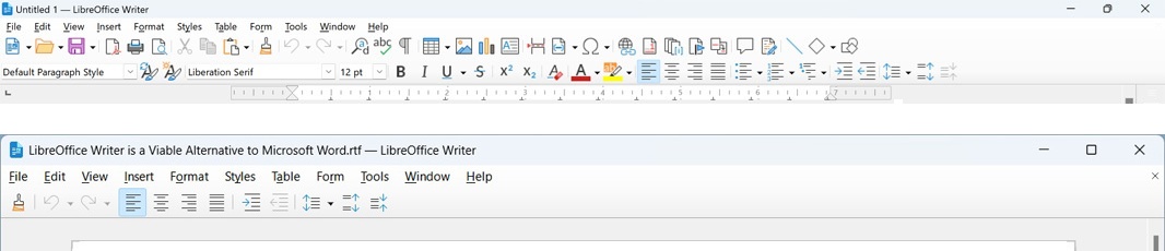
This is a visual simplification or decluttering, and it doesn’t impact the usability of the product in that I’ve not removed any features, just the distractions. As a writer, this is what I’m looking for in my writing tools. And as a person who is perhaps overly sensitive to distractions in general, it’s why I disable most notifications on my PCs and phones, and am always looking for more minimalist systems that, as Microsoft used to say, “get out of the way” so I can focus on what I’m doing. Whatever that is: Reading, writing, whatever.
One of the initial complaints with the ribbon interface when first introduced was that it didn’t support much in the way of customization. For people like me who went to great lengths to minimize the Office user interface, that was a huge problem. And so late in the development cycle, Microsoft introduced a feature by which users could hide the ribbon, displaying only the tab headers at the top and significantly reducing the visual overload. This change was appealing enough that I used Word like that for quite a while, adding just a few commands to the Quick Access toolbar at the very top of the window, as seen here:
(And I would have been happy to keep doing so had Microsoft not enshittified Word with unnecessary, constant pop-up messages to use OneDrive.)
My quest for minimalist, non-invasive writing tools continues, and I use different apps on different platforms, with varying degrees of success and happiness.
A paid Markdown editor called iA Writer is my go-to tool on the Mac, but I can’t recommend this to others—it’s perhaps too minimalist, though I love it—and the Windows version is a pale imitation. I usually use LibreOffice Writer on Windows. I use Typora, a more user-friendly Markdown editor, on ChromeOS (in Linux app form), and I could use that everywhere—it works on Windows and Mac too—but I don’t like how often it prompts me to activate my license. I use Visual Studio Code on Windows, Mac, and ChromeOS, to write my books. And I use Notion across platforms for notes. I use Notion a lot.
Each is in its own way imperfect, but each also solves a problem. None are to my mind bloated, though the LibreOffice entry of course emulates Office and thus shares some of its complexity.
As noted up top, bloat is a cornerstone of a broader debate pitting simplicity against complexity. It varies by person, and so it may be an impossible problem to solve. But I feel like bloat is also like pornography, in that I know it when I see it. And I have spent a lifetime trying to exorcise bloat from the software and services I use. That work is ongoing. And it may never end.

Gain unlimited access to Premium articles.
With technology shaping our everyday lives, how could we not dig deeper?
Thurrott Premium delivers an honest and thorough perspective about the technologies we use and rely on everyday. Discover deeper content as a Premium member.