We Need to Talk About Microsoft Word (Premium)
- Paul Thurrott
- Mar 11, 2023
-
28
Most people find something that works and sticks with it, but I approach things a bit differently, in part because of my chosen career: I continually test alternatives to the products and services I use every day. And every once in a while, something new will come along and replace something I previously relied on. You can see some recent examples in My Favorite New Apps of 2022 (Premium).
Something this process feels like I’m trying to sabotage a relationship, but aside from the work-related impetus, I feel like it’s healthy to routinely ensure that what I’m using works best for me. And there are few tools that are as central to my workflow as Microsoft Word. A product I’ve been trying to replace for decades.
I know. It sounds weird. But Word is too big and complex a tool for my needs, and while it supports deep customization capabilities, nothing I need to customize is saved to my Microsoft account, and so I have to keep reconfiguring the app on every single PC I use. And I use a lot of PCs, because I review them.
Configuration is a one-time thing, of course, and I could document that process pretty quickly. More concerning to me is the unnecessary bloat of the Word user interface and, more recently, the creeping number of more unnecessary changes to the product that have only succeeded in making it harder and more tedious to use.
Let me start with the UI. Word has used a Ribbon-based user interface since Microsoft introduced it with Office 2007. I know the Ribbon has its detractors, but I immediately saw the value in surfacing otherwise hidden commands to users, especially given that most of the top 10 feature requests for Office were for features that Office already included that users simply couldn’t find.
But I’m not just any user: I’m a professional writer, and I’ve been using Word since the 1990s. And what I’ve discovered over the years is that I only need some tiny percentage of Word features on a regular basis and then an equally tiny percentage of additional features every once in a while. I also prefer minimalist user interfaces that get out of my way and let me focus on the work I’m doing. And while the Ribbon UI is many things, what it’s not is minimalist.
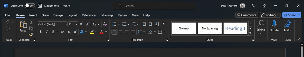
At some point—I don’t recall when, sorry—Microsoft added the ability to minimize the Ribbon, and I immediately saw the value in that and have used Word this way ever since. With a minimized Ribbon, only the Ribbon tab names—Home, Insert, Draw, and so on—appear at the top, cleaning up the UI immeasurably and providing more space for the words I’m typing.
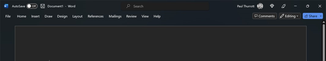
And I can click once on one of those names to temporarily display the Ribbon and access a command I only need once in a while, like Format Painter. It … works OK. But is certainly better (for me) than an always-on Ribbon.
What would be better, of course, is a Simplified Ribbon. Microsoft brought this newer UI to the web versions of its Office apps years ago, and promised it would soon bring this UI to the desktop versions too. It never did that, however, and I actually switched away from Word and to a Markdown editor because it was tedious using different tools for my daily writing (Word) and for the books (MarkdownPad 2). MarkdownPad 2 is not something I can recommend to anyone for a host of reasons, but it’s the type of app I like, with a minimalist UI and the right feature-set. And I used it exclusively for at least a few years.
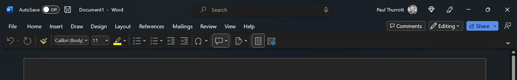
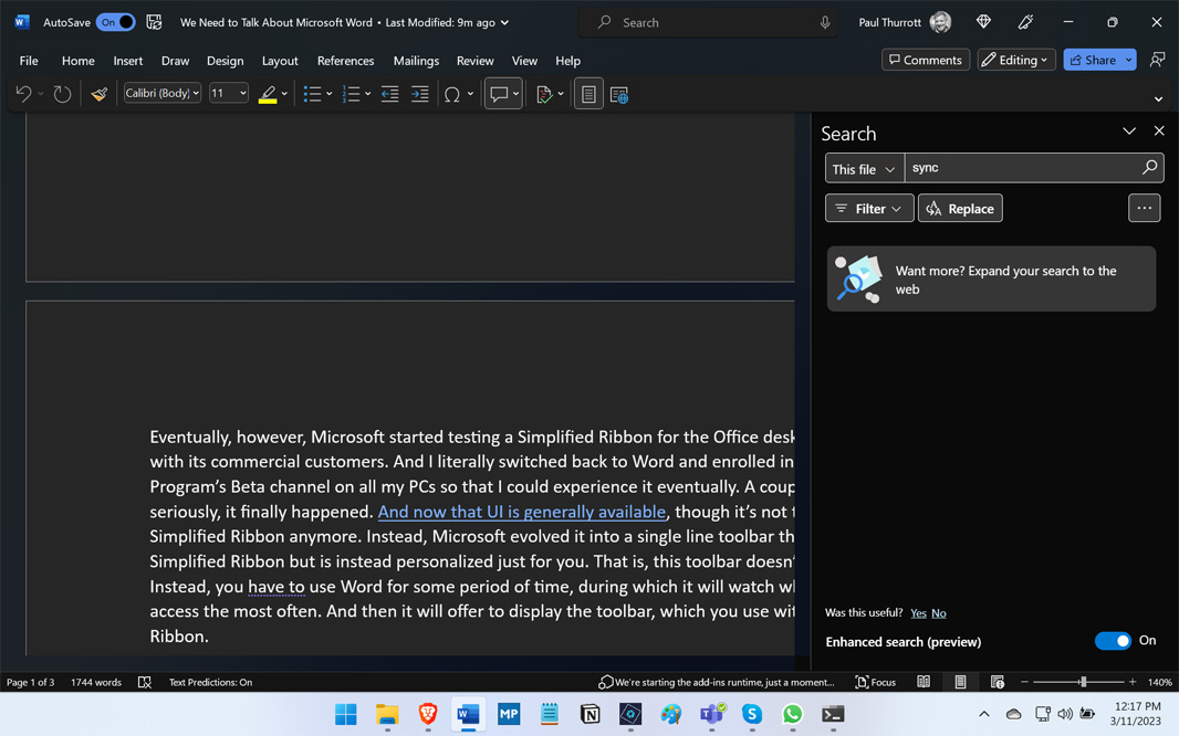
Eventually, however, Microsoft started testing a Simplified Ribbon for the Office desktop apps, starting with its commercial customers. And I literally switched back to Word and enrolled in the Office Insider Program’s Beta channel on all my PCs so that I could experience it eventually. A couple of years later, seriously, it finally happened. And now that UI is generally available, though it’s not technically a Simplified Ribbon anymore. Instead, Microsoft evolved it into a single-line toolbar that looks like a Simplified Ribbon but is instead personalized just for you. That is, this toolbar doesn’t just appear. Instead, you have to use Word for some period of time, during which it will watch which commands you access the most often. And then it will offer to display the toolbar, which you use with a minimized Ribbon.
And … yeah. It works fine. Except for one thing. Like my customized settings, my personalized toolbar is not synced to my Microsoft account. And so every time I use Word again on a new PC—and, again, I use new PCs all the time—Word has to relearn which commands I use. And so I don’t get the toolbar right away. I have to wait. Again and again and again. (The PC I’m typing this on does not yet have the toolbar.)
Given how much I write, this kind of thing is tedious, and it feels unnecessary. After all, Word can sync settings, it just doesn’t for the settings I care about. (Syncing the theme I prefer is apparently no problem. My auto-correct settings or the personalized toolbar, though? Nope.) It’s impossible not to feel that this thing is working against me sometimes.
Word, like Windows, is a mature product and most anyone who uses these things as intended—that is, as the tools they are—will probably agree that any changes Microsoft makes at this point feels almost malicious. But Word, as part of Office, which is part of Microsoft 365 is on this “continual innovation” train that I’m increasingly unhappy with, and that means that it is getting new features all the time and, as bad, UI changes. And some of these changes really get in the way.
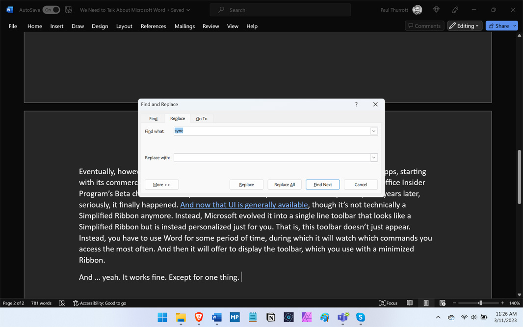
Consider a common task like Find (CTRL + F). When I did this on Word not so long ago, I’d get a floating dialog box that worked as expected, stayed out of the way, and easily controlled—and dismissed–with the keyboard.
But Word was recently updated so that this function opens a large pane on the right side of the app that is unwieldy, covers up some of the text when I’m literally searching through, and can’t be dismissed via the keyboard, as can the old dialog. (Or, can’t in some obvious fashion; I haven’t found a way.) I hate it. I hate it with a passion.
(Toggling that “Enhanced search preview” bit won’t solve the problem: when disabled, Find/Search still appears as a pane, not a dialog. It’s just on the left side, not the right.)
You can still see the old dialog-based UI when you use Find and Replace (CTRL + H), go figure. And seeing this is like an open wound. Why can’t Find be the same? It worked great before.
Again, it’s impossible not to feel that this thing is working against me sometimes.
This past week, we learned that Microsoft is bringing a Paste Text Only shortcut to Word on desktop, a feature so obvious that I suspect most of you assumed it had this feature since the early 1990s. (At least it’s the right shortcut, CTRL + SHIFT + V.) As part of my configure Word yet again ritual, I actually make a configuration change that addresses this need (and no, it doesn’t sync to my Microsoft account either): in Options > Advanced > Cut, copy, and paste, I always configure “Pasting from other programs” to “Keep Text Only” because I never want formatted text from any non-Word source. This coming keyboard shortcut won’t help me per se, but it’s long overdue. Like decades overdue. (Speaking of which, Microsoft Word will also finally get the zoom in/out keyboard shortcuts, CTRL + + and CTRL + -, that browsers and other apps have likewise been using forever. Unbelievable.)
So why do I stick with this pig? One reason: compatibility.
No, not document compatibility, an issue that was so important 20 years ago that Microsoft got into antitrust trouble and was forced to open its formats to competitors. No, I mean compatibility between the thing I’m writing and the place it’s published. And in my case, that’s WordPress, the service that powers Thurrott.com. I need to be able to copy a document from Word, paste it into a WordPress form, and have the result be both perfect from a formatting perspective and clean from a code perspective.
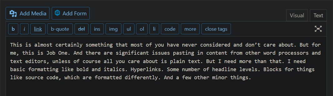
This is almost certainly something that most of you have never considered and don’t care about. But for me, this is Job One. And there are significant issues pasting in content from other word processors and text editors, unless of course all you care about is plain text. But I need more than that. I need basic formatting like bold and italics. Hyperlinks. Some number of headline levels. Blocks for things like source code, which are formatted differently. And a few other minor things.
When I paste that preceding paragraph into WordPress, it of course works fine because there’s no formatting involved. But the more important evidence is when I switch to the text (code) view. It’s clean, too, with no superfluous HTML markup.
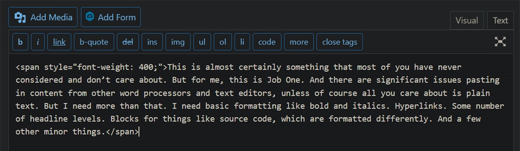
Were I to paste that same paragraph in from Google Docs, however, and look at the text (code) view, you can see superfluous HTML markup that could cause issues down the road if we change themes or fonts or whatever. And it gets much worse when there’s formatting. (Actually, there is formatting here: it hard-coded the font weighting for some reason. Stupid.)
As it turns out, we’re still using an older version of the WordPress editor, and Google Docs does work correctly with the newer block editor we’re not yet using. But we use what we use. And I have issues like this with other apps too.
And so I keep experimenting.
The thing is, most of this experimenting is proactive: it’s not that the tool I’m using is bad, it’s that I want to see how other tools stack up. But with Word, increasingly, it’s getting in my way. And the things that are bad about Word are starting to overwhelm the things that are good. Here, I’m reacting to problems with Word. Problems that are only getting worse.
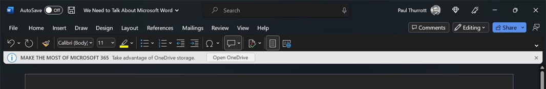
Speaking of which, I get advertisements in Word now too. I pay for this thing via Microsoft 365 Family, and I use OneDrive all day long every day. Which it should know. More to the point, I should be able to turn this off.
Keep pushing me, Word. I dare you.
Look, I’m not really asking for suggestions per se. But I would like to use a writing tool that is simpler than Word, that gets out of my way, and that remembers my customized settings. And it needs to work with WordPress. I’m just tired of this nonsense.

Gain unlimited access to Premium articles.
With technology shaping our everyday lives, how could we not dig deeper?
Thurrott Premium delivers an honest and thorough perspective about the technologies we use and rely on everyday. Discover deeper content as a Premium member.