WinUIpad: Two Steps Forward, Two Steps Sideways ⭐
- Paul Thurrott
- Dec 07, 2025
-
0
An AI-generated Petzold-style Notepad, a new Windows App SDK tutorial, a title bar experiment, and a cleaner text box kept me busy this past week.
Dave’s “un-improved” Notepad
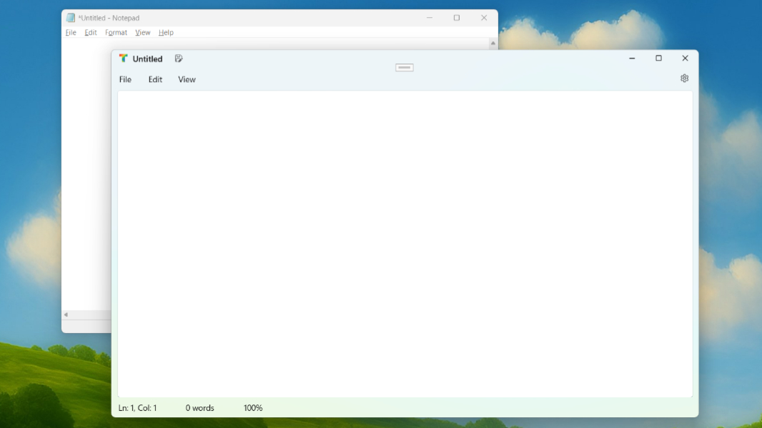
Picking up on the latest outrage over nothing in the Windows community, former Microsoftie Dave Plummer made a video about how he used GPT Codex Max 5.1 in Extra High mode to generate what he calls “a perfect clone of Notepad” as it used to be in the old Win32 days, as opposed to the modern version we have now in Windows 11 with the Fluent UI and multiple tabs. Given what I’m doing with WinUIpad (and, before that, .NETpad) and that I literally wrote a book about the history of Windows app programming over the decades, I was of course interested to see what this was all about.
Depending on your view of these things, this is either exhilarating or deflating. But my key takeaway is that this is pointlessly inflaming a pointless controversy. The modern Notepad is a terrific app that looks and works fantastically. You can remove/disable all of its new behaviors (except for the tabs) using its built-in settings. And if you’re literally pining for classic Notepad, it’s still there in Windows 11 anyway: Just open Settings, navigate to Apps > Advanced app settings > App execution aliases and uncheck “Notepad” to get it back.
Plus, this doesn’t impact WinUIpad. My goal is to create a modern Notepad clone or alternative, not recreate the classic Notepad yet again. (I’ve done that several times.) His version of the app is written in old-school Petzold-style C, so it’s an unreadable and unmaintainable mess. But to give him (or ChatGPT) some credit, it of course does things my apps never did, like handle all the weird text file formatting that Notepad supports. If you’re curious, you can download the code from GitHub and build the app for yourself. But I will just keep going as before.
Experiments with the Titlebar control
Moving back into the 21st century, there’s a decent new Windows App SDK tutorial on Microsoft Learn in which you build an app called WinUI Notes. And because this app is similar to a text editor like the one I’m trying to build, I stepped through it last week. There are some interesting concepts in there that may impact WinUIpad, and I’m still on the fence about using the first one that comes up in that tutorial: It uses a Title bar control that’s still fairly new to the Windows App SDK.
Title bars have come a long way in recent years. If you think about “classic” Win32 apps like the old Notepad, there was a clearly delineated title bar at the top, and then the so-called client area of the window, which usually included a menu bar, a toolbar of some kind, and the rest of the app. The title bar is where the title of the app was usually displayed, but it also included an app icon with a right-click menu and, on the right, the standard Minimize, Restore/Maximize, and Close window buttons.
But apps look different now. Modern apps like the new Notepad conform to the Windows 11 look and feel, with Fluent materials, rounded window and control corners, and a generally modern look and feel in which there isn’t usually a clearly delineated title bar. Instead, there is a title bar “area” at the top of the app window that includes most of/all the previous behaviors for things like repositioning the window and standard window buttons.
Without getting into the full history here, between UWP/WinUI 2 and the Windows App SDK/WinUI 3, one of the biggest issues Microsoft addressed over time was title bar customization so that developers could create modern-looking apps. In short, it went from nearly impossible to a little easier and now, finally, with the Title bar control that debuted in Windows App SDK 1.7, mostly seamless.
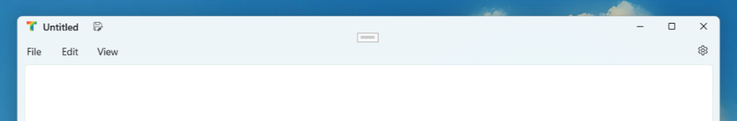
I’m not currently using this control. Thanks to those interim steps Microsoft took to make title bar customization a little easier, you can simply use any control, or a grid of controls, as the title bar area in a Windows App SDK app. Because I was always working toward a tabs-based version of this app that will look like Notepad does today and not have a traditional title bar, I just got used to doing that: I have a grid at the top of the app called TitleBarGrid that I am currently using for the title bar area. And even in the current single-doc version of the app, this makes it easy to do things like add an arbitrary Column containing whatever control(s), which is what I did with the “Needs to Saved” indicator I added in the previous installment.
But … I had to take a look. I like the idea of using native features like this when possible instead of rolling my own approximations. And even if this only made sense for the current, single document version of WinUIpad, it may still be worth doing. I spent the better part of a day on this and got pretty close to what I wanted, but in the end, the inability to arbitrarily add areas of UI, as I am doing now, convinced me to put it aside. I may revisit this. But at the very least, the Microsoft Learn WinUI Notes app inspired me to use a Segoe Fluent Icons-based glyph for the “Needs to be Saved” indicator that I kind of like.
And, as noted, there are some other ideas in there worth exploring. So I will continue working on those as well.
Cleaning up the TextBox
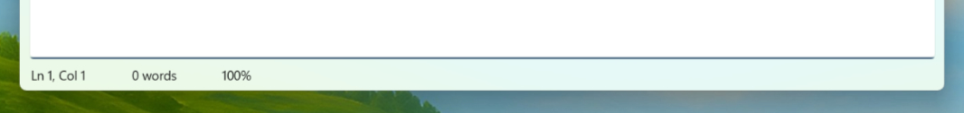
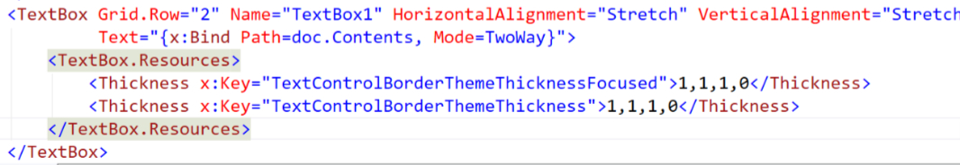
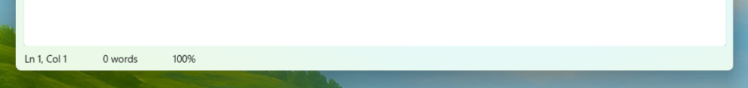
Among the many weirdnesses in the Windows App SDK, the TextBox control displays an accent color at the bottom. And unless I’m missing something—always a possibility, though the difficulty of finding good information about the Windows App SDK remains hugely problematic—there is no way to remove that without hiding the bottom border of the control. That is, the accent color and the bottom border are somehow linked together.
I have no doubt that GitHub Copilot is a crucial and useful tool for most developers. But because I using the Windows App SDK, the available body of knowledge out there is slight at best. And because this code so closely resembles WPF, it’s clear that many of the solutions it gives me don’t work because it confused this project for WPF. Long story, my attempts to fix this with GitHub Copilot were spectacularly unsuccessful.
So I went old school and Googled it. That didn’t generate an exact solution either, go figure. But I found a similar query about MAUI and WinUI 3 and was able to adapt the code from an answer on Microsoft Learn to do what I described above: I can remove that color accent by hiding the bottom border of the TextBox. This is the code.
And it looks … OK. In the sense that many things I do in the Windows App SDK are a compromise of some kind, this is like that. Not perfect. Not what I wanted. But slightly better than just leaving it like it was.
Next steps
This week was mostly about small fit and finish updates and a few side quests, but as I keep hinting, there are some interesting concepts in that Microsoft Learn tutorial that I think will pan out into something useful for WinUIpad. My goal right now is to “finish” this initial single document version of the app by the end of the year or early 2026 so I can then focus on adding more complex new features like multiple tabs and documents, AI-based writing help, recent documents, and more. We’ll see how that goes.

Gain unlimited access to Premium articles.
With technology shaping our everyday lives, how could we not dig deeper?
Thurrott Premium delivers an honest and thorough perspective about the technologies we use and rely on everyday. Discover deeper content as a Premium member.