Microsoft Office Icons Are Getting a New Look

Microsoft’s Office apps are getting a new identity today. As part of the major overhaul of the platform, Microsoft felt the need to give Office apps a new logo to reflect the major changes that have been coming to Office lately.

The new icons are a major step forward from the current Office icons. So far, Microsoft has only been making iterative tweaks to the identity of its Office apps, but this year’s updates actually seem pretty major.

Windows Intelligence In Your Inbox

Sign up for our new free newsletter to get three time-saving tips each Friday — and get free copies of Paul Thurrott's Windows 11 and Windows 10 Field Guides (normally $9.99) as a special welcome gift!

"*" indicates required fields

This field is for validation purposes and should be left unchanged.

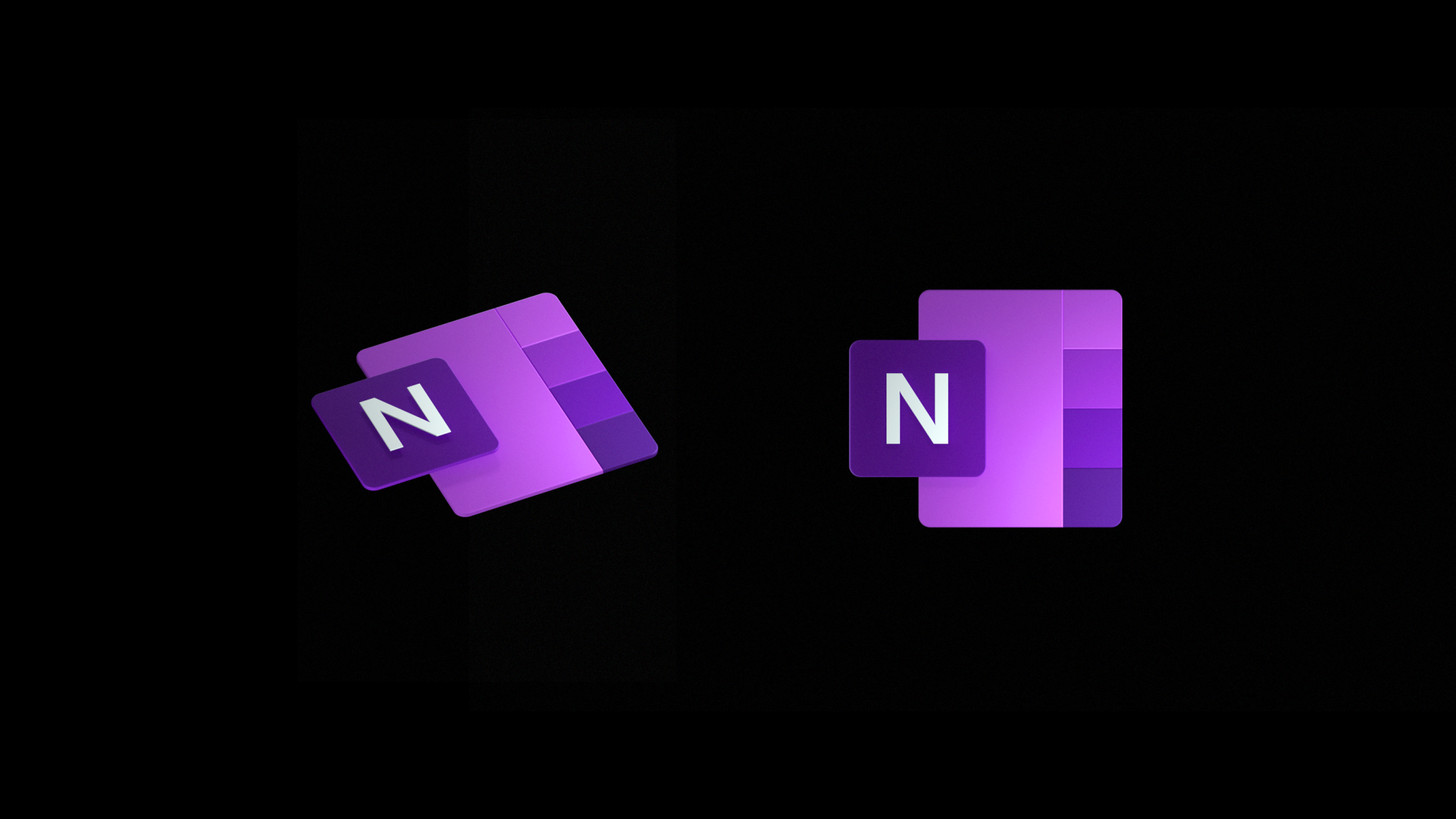
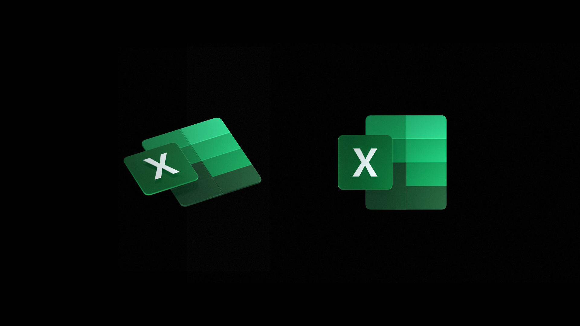
Design wise Microsoft is focusing on making the logos “builder, lighter, and friendlier.” The redesigned icons are pretty neat, too — for example, the Word icon includes two panels, one featuring the letter W, and the other featuring blocks of blue that are supposed to represent text. OneNote, on the other hand, has the notebook tabs, with Excel showing spreadsheet cells and PowerPoint showing charts.

And the new OneDrive icon? It’s just a cloud.

Here’s a video showing off the new icons in action. Interestingly, at one point of the video, Microsoft shows off the new icons on the Windows 10 Start Menu, along with other Windows 10 apps like Mail, Photos, News, Calculator, Calendar, etc. which also could be getting new logos. 

“From the get-go, we embraced Office’s rich history and used it to inform design decisions. Strong colors have always been at the core of the Office brand, and new icons are a chance to evolve our palette. Color differentiates apps and creates personality, and for the new icons we chose hues that are bolder, lighter and friendlier — a nod to how Office has evolved,” said Jon Friedman, the head of design at Microsoft Office, detailing the design of the new Office app icons.

Microsoft will start rolling out the new Office icons starting with mobile and web apps in the coming months, followed by other platforms.

Tagged with

Share post

Please check our Community Guidelines before commenting

Conversation 58 comments

  • dougkinzinger

    29 November, 2018 - 12:27 pm

    <p>I should point out that technically their icon listed for Word 2003 is actually the icon for Word 2000 and XP. Word 2003 actually did have a 256-color version of the 2000 icon. :)</p>

  • skborders

    29 November, 2018 - 12:30 pm

    <p>I like them. </p>

  • Oasis

    Premium Member
    29 November, 2018 - 12:30 pm

    <p> I like it, doesn't look so flat and ugly.</p>

  • tdemerse

    29 November, 2018 - 12:38 pm

    <p>"the powerful simplicity and harmony of the office apps."</p><p>Clearly this narrator hasn't tried to explain the index-match-match function combination to a coworker. ;)</p>

  • Cdorf

    Premium Member
    29 November, 2018 - 12:49 pm

    <p>I like them. </p>

  • will

    Premium Member
    29 November, 2018 - 12:55 pm

    <p>Here come the web apps :)</p>

  • igor engelen

    29 November, 2018 - 1:01 pm

    <p>That's a really cool icon style.</p>

  • bluvg

    29 November, 2018 - 1:33 pm

    <p>Flat icons</p><p>then lickable icons w/gradients and translucency </p><p>then icons with gradients</p><p>then flat icons</p><p>then icons with gradients</p><p><br></p><p>Therefor, next go-around we should see lickable icons w/gradients and translucency.</p>

    • cmdrkeene

      29 November, 2018 - 2:01 pm

      <blockquote><em><a href="#374886">In reply to bluvg:</a></em></blockquote><p>Does "lickable" mean it has a glossy shine effect?</p>

      • bluvg

        29 November, 2018 - 2:42 pm

        <blockquote><em><a href="#374907">In reply to cmdrkeene:</a></em></blockquote><p>Lickable a la OS X buttons/controls when it first came out. They looked like shiny, translucent jelly beans.</p>

        • Jeff Jones

          30 November, 2018 - 8:32 pm

          <blockquote><em><a href="#374931">In reply to bluvg:</a></em></blockquote><p>Lickable. LOL. "Glossy" is probably a simpler adjective to describe that effect.</p>

          • bluvg

            02 December, 2018 - 1:44 am

            <blockquote><em><a href="#375796">In reply to DataMeister:</a></em></blockquote><p>Lickable is much more evocative haha 🙂 Actually, that adjective was pretty commonly used to describe the design.</p>

  • MutualCore

    29 November, 2018 - 1:45 pm

    <p>Next round – icons with smello-vision.</p>

    • bluvg

      29 November, 2018 - 2:50 pm

      <blockquote><em><a href="#374893">In reply to MutualCore:</a></em></blockquote><p>With a 3D House of Pancakes easter egg buried in there….</p>

  • markbyrn

    Premium Member
    29 November, 2018 - 2:16 pm

    <p>Looks good</p>

  • Skolvikings

    29 November, 2018 - 2:24 pm

    <p>The only issue I have with them is I'm looking at the icons and I don't immediately recognize what a couple of them are. That might be confusing to end users, and considering Microsoft's largest customer base is enterprise …</p>

    • lvthunder

      Premium Member
      29 November, 2018 - 4:22 pm

      <blockquote><em><a href="#374926">In reply to Skolvikings:</a></em></blockquote><p>Would you know what they are even if they spelled out the whole name? I bet I don't know what half of the apps when I login to Office 365 do.</p>

      • Skolvikings

        29 November, 2018 - 5:50 pm

        <blockquote><em><a href="#375009">In reply to lvthunder:</a></em></blockquote><p>They have a YouTube video where it shows the names underneath the icons at the 1:09 mark. I figured the "Y" icon was Yammer, but I wasn't sure on the second "S" icon. Turns out it's Sharepoint.</p>

    • Skolvikings

      29 November, 2018 - 5:46 pm

      <blockquote><em><a href="#374926">In reply to Skolvikings:</a></em></blockquote><p>Yes I likely would. :)</p>

  • FalseAgent

    29 November, 2018 - 2:44 pm

    <p>very pretty, and clever use of color in each. I fully expect this idea to be ripped off by other designers soon. The weakest icon is definitely Outlook, that one is going to take a bit of getting used to for me.</p>

    • wright_is

      Premium Member
      30 November, 2018 - 7:06 am

      <blockquote><em><a href="#374934">In reply to FalseAgent:</a></em></blockquote><p>Outlook was the one that really struck out as showing what it was straight away.</p><p>I find Sway is the weakest link.</p>

  • Patrick3D

    29 November, 2018 - 3:13 pm

    <p>The only one I don't like is the Outlook icon, the top edge of the letter square is too close in shade to the color of the background envelope/email.</p>

  • winlonghorn

    29 November, 2018 - 3:41 pm

    <p>Very nice! I like them! For the first time in many years, there is a Microsoft design element that I can get excited about. I really missed those days. I’m glad to have them back </p>

  • Usman

    Premium Member
    29 November, 2018 - 3:41 pm

    <p>I like how they match the Azure devops style of icons</p>

  • chrisrs

    29 November, 2018 - 5:00 pm

    <p>Meh. I like them OK, but this not a high priority to me. It may be to others.</p><p><br></p><p>I think Word is not as successful as Excel, PowerPoint, Outlook and Teams at illustrating the tool. The One Note cloud seems small. Skype doses not seem consistent. Color is important, so I am surprised that 5 icons are blue.</p><p><br></p><p>These will look good on phones. They seem fine on the windows menu, where the printed title is next to them, but I am not sure the smaller size is great stand alone on the task bar.</p><p><br></p><p>We will see.</p>

    • bluvg

      29 November, 2018 - 6:08 pm

      <blockquote><em><a href="#375042">In reply to chrisrs:</a></em></blockquote><p>Maybe that's SharePoint rather than Skype? Teams is taking over for SfB.</p>

      • wright_is

        Premium Member
        30 November, 2018 - 7:05 am

        <blockquote><em><a href="#375071">In reply to bluvg:</a></em></blockquote><p>No, it is Skype. Skype (not for Business) isn't going anywhere and it is a variation on the Skype logo.</p>

  • ianhead

    29 November, 2018 - 6:10 pm

    <p>They look radical. And fresh. And happening.</p><p><br></p><p>I actually really like the look of them. They've been past due for a bit of a facelift.</p>

  • zorb56

    Premium Member
    29 November, 2018 - 6:13 pm

    <p>:O The video has some new icons for calculator, explorer, mail, an calendar too if you look in the Start menu.</p>

  • Xatom

    29 November, 2018 - 8:10 pm

    <p>This is what constitutes innovation circa 2018-pretty pictures.</p>

  • Pierre Masse

    29 November, 2018 - 10:07 pm

    <p>Of course they will never upgrade the look of those icons in all the platforms, so the web apps will have 3 different styles depending of what app you use; Office apps on the Windows Store will stay as they are now; the new icons will arrive for Office 365 for business but not on the legacy apps that they stopped developing etc. And it will look like shit as a whole because they don't give a f… about consistency and design.</p>

  • wright_is

    Premium Member
    30 November, 2018 - 12:10 am

    <p>Meh, another change… They don't look bad, but I've just gotten used to the current ones, but bring them on. Probably the worst were the 2007 series.</p><p>When are they supposed to turn up? My Android phone is still showing the old icons and I just updated my Office 365 on the desktop and that still has the old icons as well. Online alsostill showing the old icons.</p>

  • Divodd

    Premium Member
    30 November, 2018 - 8:30 am

    <p>Why would they do this after they just released a new standalone? I know it's been deprioritized, but for those corps that just got Office 2019 the icons will be instantly dated</p>

    • wright_is

      Premium Member
      30 November, 2018 - 8:50 am

      <blockquote><em><a href="#375333">In reply to Divodd:</a></em></blockquote><p>I think you have just answered your own question.</p>

      • Divodd

        Premium Member
        30 November, 2018 - 10:42 pm

        <blockquote><em><a href="#375335">In reply to wright_is:</a></em></blockquote><p>Yeah it was more of a rhetorical question asked out of frustration </p>

  • generalprotectionfault

    30 November, 2018 - 8:43 am

    <p>Hmm. These are actually pretty good. Much better than the dull, flat style.</p>

  • paulwp187

    Premium Member
    30 November, 2018 - 9:30 am

    <p>Office apps are getting a new identity? We have money inflation. Now it seems we have word inflation. The word icon is obviously too boring. </p>

  • waethorn

    30 November, 2018 - 9:53 am

    <p>What? Still no Live Tiles??</p>

  • waethorn

    30 November, 2018 - 9:55 am

    <p>The new icons look sad.</p><p><br></p><p>(too much blue)</p>

  • Jorge Garcia

    30 November, 2018 - 6:07 pm

    <p>I think they look lovely. Too bad MS's forced updates have finally pushed me over to Linux, though. Solus OS (Mate) is simply wonderful, and it comes with LibreOffice, which is good enough for me, ugly icons and all.</p>

  • Jeff Jones

    30 November, 2018 - 8:27 pm

    <p>I like the new icons, although I wish they would come up with a different color for Outlook. Didn't it used to be yellow a few versions back? What logic is there behind changing it to color match with the Word icon?</p>

    • plettza

      02 December, 2018 - 9:12 pm

      <blockquote><em><a href="#375783">In reply to DataMeister:</a></em></blockquote><p><br></p><p><br></p><p>You're right. I'm sure Outlook 2003 was gold/yellow, maybe Outlook 2007 too. Yellow for the new Outlook icon would break up all the blue they have.</p>

  • chrisrut

    Premium Member
    01 December, 2018 - 12:55 pm

    <p>These are actually brilliant reductions of function to form. Even my snooty Apple-loving brilliant NYC graphic artist sister thinks they're good. </p>

Windows Intelligence In Your Inbox

Sign up for our new free newsletter to get three time-saving tips each Friday

"*" indicates required fields

This field is for validation purposes and should be left unchanged.

Thurrott © 2024 Thurrott LLC