Microsoft Teases Its Next-Generation Productivity UX

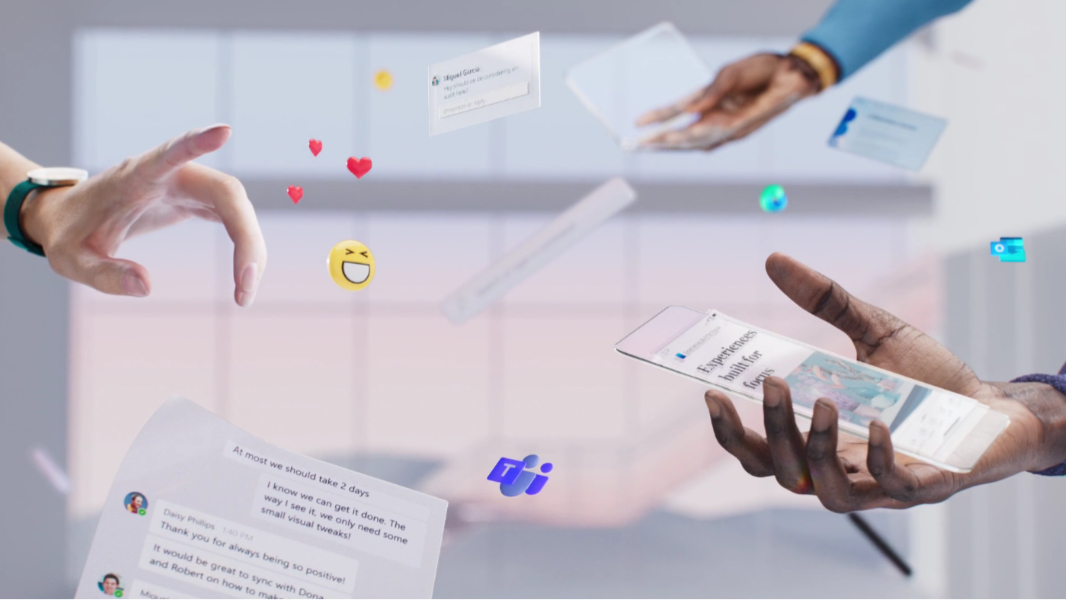
Thanks to the rise of mobile, Microsoft says it is evolving the designs of its Microsoft 365 offerings to look natural on any device type.

“We’ve been on a multi-year design journey to create more focused, immersive experiences, from the single-line ribbon, to Dark Mode, to Fluent,” Microsoft’s Jon Friedman writes. “The next wave of Microsoft 365 UX changes will go even further by fading brand colors from app headers and exploring adaptive commanding. A flexible ribbon that progressively discloses contextually relevant commands at the right time just where you need them.”

Windows Intelligence In Your Inbox

Sign up for our new free newsletter to get three time-saving tips each Friday — and get free copies of Paul Thurrott's Windows 11 and Windows 10 Field Guides (normally $9.99) as a special welcome gift!

"*" indicates required fields

This field is for validation purposes and should be left unchanged.

Since this is mostly nonsense—Microsoft has yet to deliver that single-line ribbon on any desktop applications aside from Outlook—I’ll just quote a few bits of this post and let you process this yourself.

“We’ll further advance our seamless, cross-suite Search to bring relevant information to your fingertips, and myriad forthcoming experiences will leverage Fluid Frameworks. Microsoft 365 will bring the power of Office to wherever you are, ensuring you won’t need to interrupt your creative process to open a different tool.”

“Throughout, we’re grounding everything we build in deep research about the nuances of attention. We’re often presented with a false dichotomy — you’re either focused and in flow or distracted and unproductive — but we traverse a broad attentional spectrum while achieving our goals. Some moments call for lengthy, sustained concentration. Others, such as many mobile scenarios, are optimal for microtasking. By designing for multiple cognitive states, focused experiences throughout the Microsoft 365 ecosystem minimize external distractions, lessen self-interruptions, and jumpstart flow.”

What does this mean to the actual apps we all use every day? It’s impossible to say, based on this one post. But if you’re into animated three-dimensional representations of productivity applications backed by Enya-like music, Microsoft has a nice video for you to enjoy as well.

Share post

Please check our Community Guidelines before commenting

Conversation 49 comments

  • adamcorbally

    21 July, 2020 - 4:09 pm

    <p>I think it means they are making the window bar colours white and maybe rounding some buttons</p>

  • olditpro2000

    Premium Member
    21 July, 2020 - 4:10 pm

    <p>This has nothing to do with the post or the ethereal video…they posted this on Medium? Not complaining, just seems inconsistent when they have the TechCommuntity Blogs.</p>

    • Paul Thurrott

      Premium Member
      22 July, 2020 - 8:46 am

      Please don’t get me started on the “where” of these posts. Microsoft is all over the map with that as well.

  • lvthunder

    Premium Member
    21 July, 2020 - 4:17 pm

    <p>The Outlook desktop app also has a single line ribbon on Windows.</p>

  • hrlngrv

    Premium Member
    21 July, 2020 - 5:09 pm

    <p>As someone for whom roughly 1/4 of my job involves developmenting, documenting and maintaining macro-heavy Excel workbooks with multiple data feeds which other people use, <strong><em>I DON'T WANT A SIMPLIFIED EXCEL UI</em></strong>. I'd really rather prefer to be more productive. You may infer from that my impression of the single-line Excel ribbon <strong><em>SUCKS</em></strong>. [Both Excel UWP and Web Excel have 1-line ribbons.]</p><p>I really don't want to have to use Excel on a PC like I'd use it on a phone.</p><blockquote>deep research about the nuances of attention</blockquote><p>Damn. That's positively Orwellian. Gobbledygook as profundity.</p>

    • wright_is

      Premium Member
      23 July, 2020 - 1:23 am

      <blockquote><em><a href="#555526">In reply to hrlngrv:</a></em></blockquote><p>Our users panic if Office automatically switches to the relevant ribbon tab at the moment, let alone it starts magically appearing and disappearing options.</p>

  • codymesh

    21 July, 2020 - 5:32 pm

    <p>Wild that they could post an entire video with the bits of the purported UI floating around in 3D space, but not an actual f*cking screenshot of it. </p><p><br></p><p>also…eh? i'm damn sure i've seen the single-line ribbon in word.</p>

  • bart

    Premium Member
    21 July, 2020 - 5:35 pm

    <p>Drip, drip, goes the sarcasm :)</p>

    • Paul Thurrott

      Premium Member
      22 July, 2020 - 8:44 am

      Hm. I was shooting for more of a hose-like effect. 🙂

      • madthinus

        Premium Member
        23 July, 2020 - 3:33 am

        <blockquote><em><a href="#555636">In reply to paul-thurrott:</a></em></blockquote><p>Is that Garden hose or Fire hose? ?</p>

  • GCalais

    21 July, 2020 - 6:01 pm

    <p>I hope they don’t remove the green from Excel, the blue from Word etc any further on desktop. I already think Office 2016 looks better than the current versions mostly because of that. </p>

  • nbplopes

    21 July, 2020 - 6:04 pm

    <p>Oh no not another one. Every 6 months or so they launch another UX future. It looks like more internal org marketing …. One department “What are you guys doing lately? I don’t ear much from you guys ” … “hey we are doing something really cool … look at this awesome video … “ … “wow that is awesome” … six months later … repeat. Users ^^</p>

  • sykeward

    21 July, 2020 - 6:15 pm

    <p>The parade of self-indulgent UX-focused videos is pretty tiring at this point. They keep talking about things like Fluent as if they're ubiquitous, but Microsoft has shown zero ability or interest in bringing even basic consistency to the UI of its products much less rolling out new elements. Windows 10 is <em>still </em>a grab bag of seemingly 20 different styles dating back to Windows 9x, but they crow about things like a new settings icon or adding rounded corners to the Start menu.</p><p><br></p><p>Brad made a joke on Twitter during the WWDC keynote that Mac users are getting Fluent design before Windows users are, and he later said that it triggered a raft of angry DMs from MS employees who had their feelings hurt. That speaks volumes to me about how unlikely it is that MS is going to implement any of these ideas they keep touting. They just don't get it.</p>

  • Vladimir Carli

    Premium Member
    21 July, 2020 - 6:27 pm

    <p>“<span style="color: rgb(0, 0, 0);">minimize external distractions, lessen self-interruptions”</span></p><p><span style="color: rgb(0, 0, 0);">Maybe it would be good to remember that we are human and we desperately need these external distractions and self-interruptions. productivity actually decreases without them</span></p>

  • jimchamplin

    Premium Member
    21 July, 2020 - 6:56 pm

    <p>Please MS. Give us a setting for light/dark and for color. I want dark mode and muted header colors. Why does dark mode have to be so damn drab?</p>

  • Pierre Masse

    21 July, 2020 - 7:17 pm

    <p>It's hard to comprehend anything, or even believe, in whatever the Microsoft's design people say these days. Those asses are living in a different world than reality. Just look at your damned apps, for crying out loud! Outlook is no different than 10 years ago!</p><p><br></p><p>And what is worse, those idiots are giving themselves trophies and prices, like Shum, the head design who received whatever award lately. It's ridiculous. What the f*** did he win? Microsoft is the laughing stock of the tech giants, design wise!</p>

  • lilmoe

    21 July, 2020 - 7:28 pm

    <p>Idiots spewing drivel. Was a good laugh though. Clowns make good money at Microsoft. </p>

  • boots

    21 July, 2020 - 8:10 pm

    <p>"<span style="color: rgb(0, 0, 0);">Microsoft says it is evolving the designs of its Microsoft 365 offerings to look natural on any device type."</span></p><p><span style="color: rgb(0, 0, 0);">What looks natural on a phone will not look natural on a desktop, and vice-versa. A single line ribbon is good for a phone or tablet, but for a desktop a multi-line ribbon works better. Why do Microsoft not understand this?</span></p>

    • Paul Thurrott

      Premium Member
      22 July, 2020 - 8:35 am

      I think they meant that the UXs would be different on each device type.

      Of course, it’s impossible to say, given how little they actually show off here.

    • glenn8878

      22 July, 2020 - 3:44 pm

      <blockquote><em><a href="#555565">In reply to Boots:</a></em></blockquote><p>There's no ribbon on a phone app.</p>

  • scottkuhl

    21 July, 2020 - 10:10 pm

    <p>"<span style="color: rgb(0, 0, 0); background-color: rgb(255, 255, 255);">Microsoft has yet to deliver that single-line ribbon on any desktop applications aside from OneNote"</span></p><p><br></p><p>It is available in Outlook as well.</p>

  • martinusv2

    Premium Member
    21 July, 2020 - 10:26 pm

    <p>More UI inconsistencies incoming. Start by fixing the UI in the different Office 365 applications and we will talk. Compared to Apple, you are amateurs Microsoft. </p>

  • rmlounsbury

    Premium Member
    22 July, 2020 - 12:10 am

    <p>It is unfortunate that Microsoft can’t deliver on all their fancy hype videos. The Microsoft UX/UI team conjures up some beautiful works of art. But the almost never get implemented and if so they are cluttered with legacy UI all over. </p><p><br></p><p>I hope they can pull it off but history is not on their side. </p>

  • stmorr82zw5zml

    Premium Member
    22 July, 2020 - 12:14 am

    <p>Cortana, define “word spaghetti”. </p>

  • madthinus

    Premium Member
    22 July, 2020 - 3:05 am

    <p>Excel insights, always triggered by accident, always unwelcome. This is not good news for anyone that has real work to do. I hope Susan in accounting walks across campus and come give these developers an ear full. </p>

  • tallguyse

    Premium Member
    22 July, 2020 - 6:43 am

    <p>I actually prefer Office 365 on the Mac. The ribbons are more compact and I still have access to the menu bar. It’s also gotten much faster and more stable compared to earlier versions. Not a super heavy duty Excel user so YMMV. </p>

  • retcable

    Premium Member
    22 July, 2020 - 7:13 am

    <p>I watched the beautifully done promotional video, but did I miss something? Was any of the new interface actually SHOWN in it? I watched twice but could find nothing. Therefore, I am filing this under the "PR fluff" category, Microsoft can get back to me when they actually have something to show.</p>

    • olditpro2000

      Premium Member
      22 July, 2020 - 11:56 pm

      <blockquote><em><a href="#555616">In reply to retcable:</a></em></blockquote><p><br></p><p>You missed nothing. They showed nothing tangible. Total fluff.</p>

  • Josh

    Premium Member
    22 July, 2020 - 7:33 am

    <p>Reminds me of the longhorn videos – except this time I know not to have any expectations.</p><p><br></p><p>The actual UI of Windows 10 isn't even "lipstick on a pig" deep. Right on the desktop there are glaring inconsistencies. Right clicking on the Start button, a tile on the Start Menu and the desktop give 3 menus rendered differently. For a 5 year old release with so many major updates in that time there is just no excuse.</p>

    • Paul Thurrott

      Premium Member
      22 July, 2020 - 8:29 am

      It’s much fluffier than the Longhorn videos.

  • vigilant

    22 July, 2020 - 8:54 am

    <p>Paul, the video is as incoherent as their description of what they are doing.</p><p><br></p><p>Best I can tell, it looks like they are removing color from the ribbon?</p>

  • blue77star

    22 July, 2020 - 11:39 am

    <p>Microsoft does not know how to design OS. And blaming Win32 for it is just pathetic excuse. </p><p><br></p><p>Windows Vista was well designed, almost perfect and then they messed it up with Windows 7, not to mention 8, 10 etc and never recovered since.</p>

    • Paul Thurrott

      Premium Member
      22 July, 2020 - 11:56 am

      No one has ever made this claim about Vista and 7. Windows 7 is an improved version of Windows Vista.

      • boots

        22 July, 2020 - 11:40 pm

        <blockquote><em><a href="#555712">In reply to paul-thurrott:</a></em></blockquote><p>While 7 was better overall, Vista had some UI niceties that were removed from 7 that I preferred.</p><p>In Vista the "Name", "Date modified" etc. column headings were visible in all icon views, not just in Details view like in 7, 8 and 10.</p><p>Vista had the "Stack by" view that was removed in 7.</p><p>Vista updated XP's horizontal scroll bar in the Navigation pane to an auto-scroll feature. This was removed in 7, but the horizontal scroll bar was not returned. The only way to see sub-folders that disappear off the right side is to resize the Navigation pane. Worse still, if you click the empty area to the left of a folder in the Navigation pane, the folder name will highlight but the main window will not switch to that folder.</p>

        • Salvador Jesús Romero Castellano

          23 July, 2020 - 6:32 am

          <blockquote><em><a href="#555887">In reply to Boots:</a></em></blockquote><p>I also liked how windows were transparent, but when you maximized them, they become dark and opaque, like saying, focus time, no background distraction from other windows.</p><p><br></p><p>This was removed in 7 because people liked transparencies, wrote that in comments on a Sinofsky blog post regarding a Windows 7 beta ("hey, when you maximize, windows stop being transparent, it's a bug"), and they just changed it with no further explanation on why it was that way. They even listed it in a bullet point list as a pending improvement for the next version of the beta.</p><p><br></p><p>Seriously. I was there. I saw it. :-)</p>

          • boots

            23 July, 2020 - 5:57 pm

            <blockquote><em><a href="#555930">In reply to Salvador Romero:</a></em></blockquote><p>Yes, I remember the black Title bar in maximised Vista windows. There was also an option to maximise a window but still show the Sidebar. So the window and Sidebar were side by side.</p>

  • SvenJ

    22 July, 2020 - 12:16 pm

    <p>The difference between this video and a similar one produced by Apple, is at the end of Apple's, Craig Federighi walks over to a Mac and says, 'and I'd like to show it to you now.'</p>

    • Paul Thurrott

      Premium Member
      22 July, 2020 - 12:47 pm

      Exactly.

    • eric_rasmussen

      Premium Member
      23 July, 2020 - 11:50 am

      <blockquote><em><a href="#555725">In reply to SvenJ:</a></em></blockquote><p>After watching this kind of vaporware advertising for so many years, you'd be forgiven for thinking that Microsoft doesn't employ very many actual developers. It's rare to see a company with such massively inefficient use of its talent.</p>

  • Jedi Dwight

    22 July, 2020 - 12:29 pm

    <p>That was a musical paragraph there, but give me scroll bars where they belong.</p>

  • igor engelen

    22 July, 2020 - 1:47 pm

    <p>Sounds ambitious…</p><p>But knowing that the Edge team can't even be bothered to make their top nodge browser follow the Fluent Design principles I have my doubts about the succes of these Microsoft 365 UX changes.</p>

  • wright_is

    Premium Member
    23 July, 2020 - 1:17 am

    <p><em>A flexible ribbon that progressively discloses contextually relevant commands at the right time just where you need them</em></p><p>Oh, please, no! We got enough calls when Microsoft moved the search box in Outlook from the top of the list pane, which it searches, into the titlebar of the Outlook window!</p><p>Having commands appear and disappear, possibly in different positions is only going to increase the number of support calls we get. We had one user call up, because his quick-actions had disappeared last week. All that had happened was that he had performed a search and Outlook had changed the active ribbon tab from standrd to search, he just needed to click back again and there they were.</p><p><br></p>

  • pmeinl

    Premium Member
    23 July, 2020 - 5:40 am

    <p><em>"Microsoft has yet to deliver that single-line ribbon on any desktop applications aside from OneNote"</em></p><p><br></p><p>All my Office365 desktop apps support the single-line ribbon. While I generally dislike the MS UI chaos as a user and as a developer I do like the current Outlook UI. It is clean and information dense. See my UI layout <img src="https://photos.app.goo.gl/vugAZtV5cabLNXsd6"&gt;: https://photos.app.goo.gl/vugAZtV5cabLNXsd6</p><p><br></p&gt;

    • Paul Thurrott

      Premium Member
      23 July, 2020 - 8:12 am

      Only OneNote (for Windows 10, which originated this ribbon style) and Outlook have this type of ribbon on desktop.

      • pmeinl

        Premium Member
        23 July, 2020 - 12:51 pm

        <blockquote><em><a href="#555944">In reply to paul-thurrott:</a></em></blockquote><p>Yes, you are correct my Excel and Word don't have this single-line ribbon style. </p>

  • siv

    23 July, 2020 - 6:22 am

    <p>I was happiest with Office 2010 its been down hill ever since. I hate the Outlook UI in Microsoft 365 so much I have switched to Em Client. I dread to think what else I will have to ditch when this crap comes in.</p>

  • cnc123

    24 July, 2020 - 12:16 am

    <p>So much time and effort perfecting twaddle. How about working on making Teams not slow an entire computer down and not have to wait a half second between every click and action in SharePoint online?</p>

  • behindmyscreen

    24 July, 2020 - 2:40 pm

    <p>I use outlook.office.com exclusively. I wish they would move to that on the desktop. For Excel on line…Make formulas suck less on the web, make the drag and fill functionality less clumsy, and support Javascript/Python for macros.</p>

Windows Intelligence In Your Inbox

Sign up for our new free newsletter to get three time-saving tips each Friday

"*" indicates required fields

This field is for validation purposes and should be left unchanged.

Thurrott © 2024 Thurrott LLC