Microsoft Wants a New Font

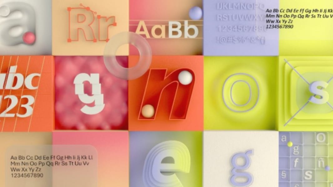
Microsoft this week announced that it would replace Calibri as the default font for all things Microsoft. And it needs your help to pick a successor.

“Calibri has been the default font for all things Microsoft since 2007, when it stepped in to replace Times New Roman across Microsoft Office,” the Microsoft Design Teams writes. “It has served us all well, but we believe it’s time to evolve. To help us set a new direction, we’ve commissioned five original, custom fonts to eventually replace Calibri as the default.”

Windows Intelligence In Your Inbox

Sign up for our new free newsletter to get three time-saving tips each Friday — and get free copies of Paul Thurrott's Windows 11 and Windows 10 Field Guides (normally $9.99) as a special welcome gift!

"*" indicates required fields

This field is for validation purposes and should be left unchanged.

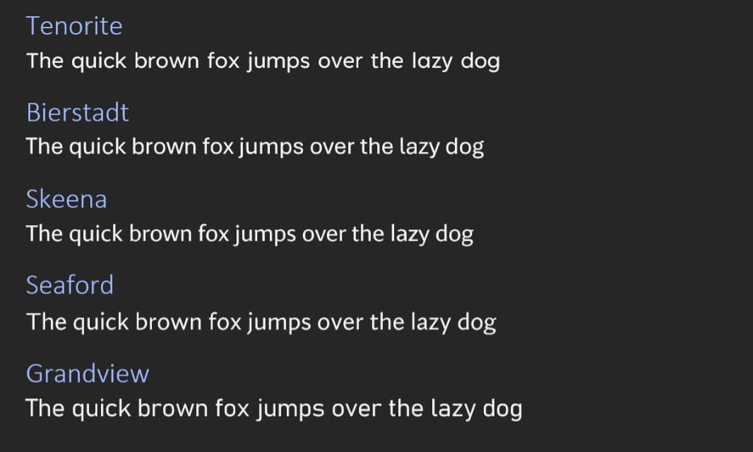
Those five fonts are:

Tenorite

“Tenorite has the overall look of a traditional workhorse sans serif (a font without a serif, or a stroke at the ends, like Times New Roman), but with a warmer, more friendly style. Elements such as large dots, accents, and punctuation make Tenorite comfortable to read at small sizes onscreen, and crisp-looking shapes and wide characters create a generally open feeling.”

Bierstadt

“Bierstadt is a precise, contemporary sans serif typeface inspired by mid-20th-century Swiss typography. A versatile typeface that expresses simplicity and rationality in a highly readable form, Bierstadt is also notably clear-cut with stroke endings that emphasize order and restraint.”

Skeena

“Skeena is a ‘humanist’ sans serif based on the shapes of traditional serif text typefaces. Its strokes are modulated, with a noticeable contrast between thick and thin and a distinctive slice applied to the ends of many of the strokes. Skeena is ideal for body text in long documents, as well as in shorter passages often found in presentations, brochures, tables, and reports.”

Seaford

“Seaford is a sans serif typeface that is rooted in the design of old-style serif text typefaces and evokes their comfortable familiarity. Its gently organic and asymmetric forms help reading by emphasizing the differences between letters, thus creating more recognizable word shapes.”

Grandview

“Grandview is a sans serif typeface derived from classic German road and railway signage, which was designed to be legible at a distance and under poor conditions. Grandview is designed for use in body text but retains the same qualities of high legibility, with subtle adjustments made for long-form reading.”

These fonts are all downloadable now from within any Office application, but here’s a quick preview:

The good news? If the font you prefer isn’t chosen as the next default, all of these new fonts will continue to be available in the font menu alongside Calibri and other favorites.

Share post

Please check our Community Guidelines before commenting

Conversation 104 comments

  • sherlockholmes

    Premium Member
    28 April, 2021 - 10:59 am

    <p><strong>Bierstadt sounds like something Mary Jo would like 😛 </strong></p>

    • anoldamigauser

      Premium Member
      28 April, 2021 - 3:40 pm

      <blockquote><em><a href="#625405">In reply to SherlockHolmes:</a></em></blockquote><p>Or a painter of landscapes of the American West.</p>

      • locust_infested_orchard_inc.

        01 May, 2021 - 6:39 pm

        Article’s quote that’s a verbatim quote from Microsoft, “Tenorite has the overall look of a traditional workhorse sans serif (a font without a serif, or a stroke at the ends, like Times New Roman)…” The Microsoft Design Team who wrote this made a gross error – literally the truest form of a typographical error. The Times New Roman is a serif typeface (with strokes at the end), and NOT “sans serif” as incorrectly stated by the original article, and quoted by Paul.

        • locust_infested_orchard_inc.

          01 May, 2021 - 6:56 pm

          No offence intended to any Germans, but the “Bastard” typeface looks the best IMHO.

          Seriously, that’s my opinion, with the “Grandview” in a close second.

          My dislike for the other typefaces stems from the ascender of the lower-case letter ‘h’ (the part of a lowercase character that extends above the x-height) that is higher than the cap height of the upper-case ‘T’ (the height of capital letters from the baseline to the top of caps).

          A big no-no in my book for general text designed to be read as a lengthy piece of prose and UI elements. I view these typefaces as ornamental.

        • darkgrayknight

          Premium Member
          03 May, 2021 - 12:21 pm

          <p>I think they meant that Tenorite is a sans serif font which is not like the serif font "Times New Roman". Which is how I understood their statement and it makes sense. Though I can also see how it isn’t entirely clear.</p>

  • StevenLayton

    28 April, 2021 - 11:06 am

    <p>Obviously there is a difference as the line lengths vary, but am I the only one who can't really see the difference?</p>

    • Remtiwk

      28 April, 2021 - 11:14 am

      <blockquote><em><a href="#625408">In reply to StevenLayton:</a></em></blockquote><p>I agree. They look extremely close together. Most people won't notice much of a difference I'll bet. </p>

    • michael.dice

      Premium Member
      28 April, 2021 - 11:14 am

      <blockquote><em><a href="#625408">In reply to StevenLayton:</a></em></blockquote><p>Look at the 's' and 'g' characters. Also some of the weights are heavier than others</p>

      • LT1 Z51

        Premium Member
        28 April, 2021 - 11:16 am

        <blockquote><em><a href="#625410">In reply to michael.dice:</a></em></blockquote><p>The l and j also have differences. So does y.</p>

    • jbinaz

      28 April, 2021 - 11:36 am

      <blockquote><em><a href="#625408">In reply to StevenLayton:</a></em></blockquote><p>I'm like you: hard to see – I have to look closely.</p><p><br></p><p>Look at the "a" as well – it's quite different on Tenorite.</p>

    • Jogy

      Premium Member
      28 April, 2021 - 11:43 am

      <blockquote><em><a href="#625408">In reply to StevenLayton:</a></em></blockquote><p><br></p><p>In both Bierstadt and Grandview the lowercase 'l' looks different than uppercase 'i' – that is a big plus for me.</p>

      • skyczy08

        28 April, 2021 - 12:20 pm

        <blockquote><em><a href="#625424">In reply to Jogy:</a></em></blockquote><p>I'll take your word for it that your looking inside office about the uppercase i. That's very useful</p>

    • darkgrayknight

      Premium Member
      28 April, 2021 - 12:36 pm

      <blockquote><em><a href="#625408">In reply to StevenLayton:</a></em></blockquote><p>The differences are small, but they are there. With higher resolution screens, the smaller differences in fonts can be seen more clearly, but then again, the average person is going to just use the default font (or Comic Sans).</p><p>Tenorite is obsessed with the circle – look at q, p, b, d, g, a, o, c, e — they all have the same o circle.</p><p>Bierstadt has pressed the sides of q, p, b, d, but left the o, e, c.</p>

    • boots

      28 April, 2021 - 11:54 pm

      <blockquote><em><a href="#625408">In reply to StevenLayton:</a></em></blockquote><p>The "a", "g" and "l" have obvious differences. The "j", "k" and "y" are less obvious.</p>

    • hrlngrv

      Premium Member
      29 April, 2021 - 6:18 pm

      <p><a href="https://www.thurrott.com/cloud/microsoft-365/249574/microsoft-wants-a-new-font#625408&quot; target="_blank"><em>In reply to StevenLayton:</em></a></p><p>The difference between <strong>b</strong>, <strong>d</strong>, <strong>p</strong> and <strong>q</strong> characters is most apparent between Tenorite and Seaford (I keep reading that as <strong><em>Seafood</em></strong>; maybe not the best choice of name). Is there a notch between the vertical line and the arc of the other part, or is the arced bit exactly horizontal where it meets the vertical line.</p>

  • crunchyfrog

    28 April, 2021 - 11:17 am

    <p>Umm… how about Arial?</p>

    • bluvg

      28 April, 2021 - 1:35 pm

      <blockquote><em><a href="#625412">In reply to crunchyfrog:</a></em></blockquote><p>Ugh… Arial is one of the ugliest fonts for me.</p>

  • jbinaz

    28 April, 2021 - 11:18 am

    <p>I have to really work to see the difference. The g's are really different between Tenorite and Grandview compared to the others. The a on Tenorite is really different. The lowercase l's have some differences, too.</p><p><br></p><p>With a gun to my head to pick one of them, I'd go with Tenorite or Bierstadt, but I could deal with any of them.</p>

  • crunchyfrog

    28 April, 2021 - 11:19 am

    <p>This is what happens when marketing departments have too many executives, they start obsessing about default fonts. Honestly, all they are is a minutely altered version of the one they are replacing with a new name.</p>

    • qaelith2112

      28 April, 2021 - 2:25 pm

      <blockquote><em><a href="#625415">In reply to crunchyfrog:</a></em></blockquote><p><br></p><p>True! At first I was thinking "That one's Arial. No wait, THAT one is Arial. No, THIS one is Arial". And in the end they looked mostly like slight alterations of Arial with different spacing, and I had to look very carefully to see any differences in how any of the letters were shaped. </p>

    • anoldamigauser

      Premium Member
      28 April, 2021 - 3:38 pm

      <blockquote><em><a href="#625415">In reply to crunchyfrog:</a></em></blockquote><p>…and they will be the first against the wall when the revolution comes.</p>

  • StagyarZilDoggo

    Premium Member
    28 April, 2021 - 11:26 am

    <p>One thing I like in Bierstadt and Grandview is that the lowercase L is different. Easier to distinguish from the uppercase I.</p>

  • beckoningeagle

    Premium Member
    28 April, 2021 - 11:27 am

    <p>I thought serif fonts were supposed to be more readable in paragraphs, yet Arial, Calibri and now any of these are sans-serif.</p>

  • glenn8878

    28 April, 2021 - 11:33 am

    <p>Why can't I set my own default font? Why can't I configure Office Word, Excel, PowerPoint to my own preferences more easily. It's just hard to do it each time and for each document over and over again.</p>

    • kennyb

      28 April, 2021 - 11:48 am

      <blockquote><em><a href="#625419">In reply to glenn8878:</a></em></blockquote><p>You can set the default fonts (and all sorts of style settings) but you're right that it should be a lot easier.</p>

    • darkgrayknight

      Premium Member
      28 April, 2021 - 12:25 pm

      <blockquote><em><a href="#625419">In reply to glenn8878:</a></em></blockquote><p>I'm pretty sure you can set your own defaults by editing the Normal.dot template. Saving the normal style with the font you want and saving it to the template will make it that way for every new document you open/start.</p>

    • Paul Thurrott

      Premium Member
      29 April, 2021 - 12:53 pm

      You can change the default font. But I think you have to do it in each app.

  • timewash902

    28 April, 2021 - 11:35 am

    <p>And here I thought the font used in Teams was Segoe</p>

  • Jogy

    Premium Member
    28 April, 2021 - 11:40 am

    <p>I strongly prefer a font in which the capital letter 'i' and the lowercase letter 'l' DO NOT look the same.</p><p>This narrows the list to Bierstadt and Grandview. Of those, I like Grandview better.</p>

    • beckoningeagle

      Premium Member
      28 April, 2021 - 11:48 am

      <blockquote><em><a href="#625422">In reply to Jogy:</a></em></blockquote><p>You just made me a Grandview fan! </p>

    • behindmyscreen

      28 April, 2021 - 12:24 pm

      <blockquote><em><a href="#625422">In reply to Jogy:</a></em></blockquote><p>so…you like a serif font.</p>

      • gedisoft

        Premium Member
        28 April, 2021 - 3:04 pm

        <blockquote><em><a href="#625439">In reply to behindmyscreen:</a></em></blockquote><p>I thought they were all sans serif ?</p>

        • IanYates82

          Premium Member
          28 April, 2021 - 5:30 pm

          <blockquote><em><a href="#625496">In reply to Gedisoft:</a></em></blockquote><p>Behind my screen is joking that the way to really know between lower i and upper L is to use a serif font ?</p>

    • red.radar

      Premium Member
      28 April, 2021 - 9:12 pm

      <blockquote><em><a href="#625422">In reply to Jogy:</a></em></blockquote><p>And the number one. It gets confusing fast when staring at a password manager and your trying to translate the characters </p>

  • rm

    28 April, 2021 - 11:41 am

    <p>I think Grandview is the easiest to read.</p>

    • MikeCerm

      28 April, 2021 - 11:55 am

      <blockquote><em><a href="#625423">In reply to RM:</a></em></blockquote><p>It's the largest, so maybe that's why. Personally, I don't like the flat sides on the letter 'o'.</p>

      • skyczy08

        28 April, 2021 - 12:18 pm

        <blockquote><a href="#625428" target="_blank"><a href="#625423"><em>In reply to Mik</em></a><em>eCerm:</em></a></blockquote><p>Grandview has those slanted L's as well</p>

  • JustinMSalvato

    28 April, 2021 - 11:48 am

    <p>They all look like Segoe UI which is my go to font. Windows Phone 7 changed me. </p>

    • hrlngrv

      Premium Member
      28 April, 2021 - 3:45 pm

      <p><a href="https://www.thurrott.com/cloud/microsoft-365/249574/microsoft-wants-a-new-font#625425&quot; target="_blank"><em>In reply to JustinMSalvato:</em></a></p><p>Picky: the amount of arc in <strong>c</strong> and the rounded parts of <strong>b</strong>, <strong>d</strong>, <strong>p</strong> and <strong>q</strong> differ between these. There's also the exact form of <strong>a</strong> and <strong>g</strong>, i.e., whether one wants something closer to Century Gothic or Times New Roman. Segoe UI splits that difference with <strong>a</strong> like Times New Roman and <strong>g</strong> like Century Gothic. Why?</p>

  • maktaba

    28 April, 2021 - 12:16 pm

    <p>They should make either Helvetica or Frutiger the default font. The former is professional-looking and the latter is extremely readable, even at small sizes.</p><p><br></p><p>That said, the default Calibri was good but Segoe will always have a special place in my heart as it reminds me of the good old days of Windows Phone.</p>

    • locust_infested_orchard_inc.

      01 May, 2021 - 7:33 pm

      Microsoft cannot as the license fee to use it on billions of Windows devices would be enormous (from the font foundries, Haas Type Foundry and Linotype, respectively).

  • skyczy08

    28 April, 2021 - 12:17 pm

    <p>All very similiar but thats the point.</p><p><br></p><p>I Like Skeena size</p>

  • eric_rasmussen

    Premium Member
    28 April, 2021 - 12:21 pm

    <p>I really like how clear Tenorite is. I've got a few monitors here, ranging from 1080p to 8k and Tenorite is the clearest on screen with virtually no fuzziness. However, the fact that uppercase i and lowercase L are identical is a bit annoying. A lot of fonts have that problem though (maybe even the majority of fonts) so in this context I like Tenorite. Grandview would be my second choice, again for its clarity across screen resolutions.</p>

    • hrlngrv

      Premium Member
      28 April, 2021 - 3:31 pm

      <p><a href="https://www.thurrott.com/cloud/microsoft-365/249574/microsoft-wants-a-new-font#625436&quot; target="_blank"><em>In reply to Eric_Rasmussen:</em></a></p><p>Lack of distinction between upper case 'I' and lower case 'L' is one of the main reasons sans serif typefaces generally AREN'T used for anything important. Far worse are the @#$%&amp;*! sans serif typefaces in which the numeral '1' also looks the same as 'I' and 'l', most notably Gill Sans MT. OTOH, all the Bahnschrift variations get this right (leave it to Germans to figure out precision).</p><p>The lack of importance makes a design decision like this exquisitely apt for today's MSFT, which cares not one whit about Control Panel and Settings both still existing and likely both to continue existing for the rest of this decade (I really do figure I won't live to see the final disappearance of Control Panel).</p>

  • behindmyscreen

    28 April, 2021 - 12:23 pm

    <p>Asking the internet? Do you want comic sans as the default? because that's how you get comic sans as the default. /s</p><p><br></p><p>*Yeah…I know it's not in the list but cut me some slack. I needed to make the Archer joke.</p>

  • ianw789

    28 April, 2021 - 12:27 pm

    <p><strong>If I and l can be easily distinguished</strong>, it will be a win. (That's a capital "i" and a lower case "L" for those who lack the ESP required to read this font.</p><p><br></p><p>The purpose of fonts is to convey information. Indistinguishable characters within a font is a triumph of style over design. </p>

    • ronh

      Premium Member
      28 April, 2021 - 1:25 pm

      <blockquote><em><a href="#625441">In reply to ianw789:</a></em></blockquote><p>Well said</p>

    • hrlngrv

      Premium Member
      28 April, 2021 - 2:47 pm

      <p><a href="https://www.thurrott.com/cloud/microsoft-365/249574/microsoft-wants-a-new-font#625441&quot; target="_blank"><em>In reply to ianw789:</em></a></p><p>In all seriousness, who uses sans serif typefaces for anything important?</p><p>With respect to consoles/terminals, don't sensible persons use monospace typefaces?</p><p>Sans serif typefaces are for marketing BS, so information transmission isn't really an objective.</p><p><strong><em>ADDED:</em></strong> I agree that for monospace typefaces it's essential to be able to distinguish lower case 'L' from both numeral '1' and upper case 'I', something which IMO only Lucida Console gets right due to no bottom serif on lower case 'L' making that much more distinct compared to numeral '1'. Pity Windows doesn't come with any monotype typefaces in which the numeral '1' has no bottom serif and lower case 'L' has no upper serif and only a bottom tail to the right.</p>

  • bluesman57

    28 April, 2021 - 12:34 pm

    <p>Grandview</p>

  • scovious

    28 April, 2021 - 12:42 pm

    <p>Tenorite is the best. Bierstadt and Grandview are alright. Seaford is the worst.</p>

  • truerock2

    28 April, 2021 - 1:20 pm

    <p>I use Courier New a lot because I do a lot of technical writing and I need a non-proportional font so that letters line-up with each other. Also, Courier New eliminates confusion regarding similar looking characters such as I and l.</p><p><br></p><p>I use Arial Narrow a lot to put as many letters on as short of a line as possible.</p><p><br></p><p>I use Times New Roman a lot because it provides a comfortable reading experience for long documents. Also, it looks more professional. </p><p><br></p><p>In regard to how fonts should be implemented in applications (I know this is obvious) – previously used fonts should be displayed at the top of a font-selection-drop-down-list. Also – obvious – it should be easy to specify the desired default fonts at the top of a font-selection-drop-down-list.</p><p><br></p><p>Additional obvious font design criteria:</p><p><br></p><p>l and I and 1 should look different and be easily distinguishable.</p><p><br></p><p>0 and O and o should look different and be easily distinguishable.</p><p><br></p>

    • bluvg

      28 April, 2021 - 1:45 pm

      <blockquote><em><a href="#625460">In reply to truerock2:</a></em></blockquote><p>I wish I and l and o and O and 0 and any other ambiguous characters could just be tossed and redone from scratch. Accuracy is too important. </p><p><br></p><p>In the same way, could we also just toss pronouns in favor of proper nouns? So much ambiguity and imprecision, and sometimes abused deliberately. Wordplay would suffer, though. </p>

    • hrlngrv

      Premium Member
      28 April, 2021 - 4:34 pm

      <p><a href="https://www.thurrott.com/cloud/microsoft-365/249574/microsoft-wants-a-new-font#625460&quot; target="_blank"><em>In reply to truerock2:</em></a></p><p>Subjectivity plays a role.</p><p>For me, Lucida Console provides greater distinctions between numberal '1' and lower case 'L' than Courier New.</p><p>FWLIW, I use Deja Vu Sans Mono with Linux as my monospaced typeface. I avoid sans serif for technical writing.</p>

  • longhorn

    28 April, 2021 - 1:27 pm

    <p>Making a new proprietary font for MS Office can be a selling point because it locks professionals into MS Office. For example Calibri has had a free version since 2013 (Arial and Times New Roman already had metric-compatible fonts in the Liberation font family):</p><p><br></p><p>"In 2013, Google released a freely-licensed font called Carlito, which is metric-compatible to Calibri, as part of Chrome OS. Carlito's metric-compatibility ensures ChromeOS users can correctly display and print a document designed in Calibri without disrupting its layout."</p><p><br></p><p>Another reason could be ClearType. I think MS dropped ClearType in Windows 8 from the main UI and use greyscale instead of sub-pixel rendering (not sure if MS dropped ClearType from Office).</p><p><br></p><p>"Calibri is part of the ClearType Font Collection, a suite of fonts from various designers released with Windows Vista. All start with the letter C to reflect that they were designed to work well with Microsoft's ClearType text rendering system, a text rendering engine designed to make text clearer to read on liquid-crystal display monitors."</p><p><br></p><p>So there could be both competitive (now Google needs to create 5 new metric-compatible fonts or license them from Microsoft) and technical reasons (ClearType) for this change.</p><p><br></p>

    • ebraiter

      28 April, 2021 - 2:40 pm

      <blockquote><em><a href="#625462">In reply to longhorn:</a></em></blockquote><p>Some applications to use a font when another isn't on the system. An example is CorelDraw [ya I know]. If you open a file that uses the "Seafood" font and it's not on the system, it will ask you to choose a font to replace it, temporarily or permanent. I think most or all Office apps do that as well but just choose without asking.</p>

      • longhorn

        28 April, 2021 - 3:53 pm

        <blockquote><em><a href="#625490">In reply to ebraiter:</a></em></blockquote><p>Yeah, but you need a metric-compatible font otherwise your formatting will be screwed. You won't find metric-compatible fonts for these new fonts. I assume Google will create one for the font that gets chosen. Or simply license it. If Google is serious about productivity they must do it.</p><p><br></p><p>I liked Calibri by the way.</p><p><br></p>

  • MichaelDarby

    Premium Member
    28 April, 2021 - 1:33 pm

    <p>Tenorite or Grandview. Skeena is too small, and the others have that weird g.</p>

  • Christopher Spera

    28 April, 2021 - 1:40 pm

    <p>They all look exactly the same… Exactly the same. I don't get it; but maybe that's the point. Same-same is same. </p>

    • ebraiter

      28 April, 2021 - 2:37 pm

      <blockquote><em><a href="#625469">In reply to chrisspera:</a></em></blockquote><p>Some subtle differences. Look at the "L". The "h" is higher on some than others but yes, they're close.</p>

  • rickeveleigh

    Premium Member
    28 April, 2021 - 1:46 pm

    <p>Just tried each in an existing Word doc (which is currently in Segoe UI), they feel a bit different to the samples above. I prefer Seaford. Tenorite &amp; Grandview don't look like document fonts, they look like 'special' fonts for posters or presentations. Bierstadt's OK, it's a bit like Univers (HP LaserJet '90s throwback).</p>

    • locust_infested_orchard_inc.

      01 May, 2021 - 7:09 pm

      One could say the ‘Bierstadt’ typeface is ‘Univers Bastardised’.

  • gbrother

    Premium Member
    28 April, 2021 - 1:51 pm

    <p>Why?</p>

  • skramer49

    Premium Member
    28 April, 2021 - 1:56 pm

    <p>I like Grandview in Word, but can't find it in OneNote.</p>

  • codymesh

    28 April, 2021 - 2:07 pm

    <p><span style="color: rgb(0, 0, 0);">Seaford and Bierstadt look good to me.<span class="ql-cursor"></span></span></p><p><br></p><p><img src="https://i.imgur.com/ssIOVJL.png"><img src=""></p>

  • RobCannon

    28 April, 2021 - 2:20 pm

    <p>Students all over the world want Grandview, because it takes up the most space on the page.</p>

    • bkkcanuck

      28 April, 2021 - 5:54 pm

      <blockquote><em><a href="#625481">In reply to RobCannon:</a></em></blockquote><p>Most of my teachers gave a word count requirements – not space… otherwise I would just have used something like 24 point fonts</p>

  • qaelith2112

    28 April, 2021 - 2:24 pm

    <p>I feel surprised at myself. I'm usually pretty terrible about preferring the odd thing out when it comes to design. I like Grandview, personally, and expected to see everybody else liking something else, but now I'm feeling vindicated in noticing that this one is widely liked here. </p>

  • payton

    Premium Member
    28 April, 2021 - 2:31 pm

    <p>Shouldn't that say "<span style="color: rgb(0, 0, 0);">These fonts are all downloadable now from within any Office </span><strong style="color: rgb(0, 0, 0);">365</strong><span style="color: rgb(0, 0, 0);"> application" above? Maybe I missed it, but it doesn't look as if they can be downloaded by the local Office apps.</span></p>

    • Jogy

      Premium Member
      28 April, 2021 - 6:41 pm

      <blockquote><em><a href="#625486">In reply to Payton:</a></em></blockquote><p>I had no problems using all the new fonts in my local Word installation, so I could try them.</p>

  • decommissaris

    28 April, 2021 - 2:31 pm

    <p>Whatever the choice, please, please make the zero character a slashed zero!</p>

    • rmac

      28 April, 2021 - 10:12 pm

      <blockquote><em><a href="#625487">In reply to decommissaris:</a></em></blockquote><p>and a barred 'I' unlike the one posted here!</p>

  • hrlngrv

    Premium Member
    28 April, 2021 - 2:40 pm

    <p>Given the level of seriousness this sort of thing deserves, Wingdings would be apter.</p><p>Being as serious as this subject deserves, are typefaces in which the lower case 'L' has a tail to the right, such as Bierstadt and Grandview, truly sans serif? OTOH, better to be able to distinguish lower case 'L' from upper case 'I". FWIW, Trebuchet MS also has tails on lower case 'L'.</p><p>Perhaps more to the point, I have 181 items in my C:\Windows\Fonts directory of which I only added 2: one for chess pieces and another for APL. The Fonts folder is already arguably a source of bloat which 5 new typefaces will only exacerbate.</p>

    • boots

      29 April, 2021 - 12:05 am

      <blockquote><em><a href="#625489">In reply to hrlngrv:</a></em></blockquote><p>"the lower case 'L' has a tail to the right, such as Bierstadt and Grandview, truly sans serif?"</p><p>You could say the same thing about the "t", it almost always has a tail.</p>

      • hrlngrv

        Premium Member
        29 April, 2021 - 2:06 am

        <p><a href="https://www.thurrott.com/cloud/microsoft-365/249574/microsoft-wants-a-new-font#625593&quot; target="_blank"><em>In reply to Boots:</em></a></p><p>How many people older than 7 print, and for those who do, how many write t as a simple cross?</p><p>Or why dot j's? For that matter, g's with closed lower loops and top-right tails? FWLIW, most sans serif fonts put a '1' on a pedestal.</p><p>Pure tangent: my mother's typewriter, vintage late 1940s, lacked a 1 key. It was assumed one would use lower case 'L'. As for exclamation points, apostrophe-backspace-period.</p>

    • locust_infested_orchard_inc.

      01 May, 2021 - 7:05 pm

      You most certainly require a font manager that deals with font overload. I personally use Enfocus Suitcase Fusion.

  • George Coll

    Premium Member
    28 April, 2021 - 3:01 pm

    <p>Does anyone simply get dizzy trying to sort this out? I have to get back to work</p>

  • cwfinn

    Premium Member
    28 April, 2021 - 3:14 pm

    <p>Has everyone in Redmond lost their collective minds? Fix Windows 10's &amp;*^% lack of consistency and stick your fonts where…</p>

  • richfrantz

    Premium Member
    28 April, 2021 - 3:44 pm

    <p>To my untrained eye, Grandview reminds me of Segoe so that is the one I would choose if Segoe goes away. Otherwise, I really don't care.</p>

  • clutem1987

    28 April, 2021 - 4:00 pm

    <p>Wingdings naturally. </p>

  • clutem1987

    28 April, 2021 - 4:01 pm

    <p> I once had a boss that insisted I use century schoolbook for all my messages to him. </p>

    • Paul Thurrott

      Premium Member
      29 April, 2021 - 12:29 pm

      No need to tell us where you buried the body. But … he had it coming, obviously.

    • hrlngrv

      Premium Member
      29 April, 2021 - 11:27 pm

      <p><a href="https://www.thurrott.com/cloud/microsoft-365/249574/microsoft-wants-a-new-font#625519&quot; target="_blank"><em>In reply to clutem1987:</em></a></p><p>Century Gothic would be worse.</p><p>I had too many children's books which used it or something damn near equivalent. OTOH, exactly how primary schools want 6-year-olds to print letters.</p>

    • locust_infested_orchard_inc.

      01 May, 2021 - 7:27 pm

      I’d like to know what were the repercussions of sending an e-mail not in the preferred ‘Century Schoolbook’ ?

      I personally would have deliberately written an e-mail in Linotype’s ‘New Century Schoolbook’, to see whether your boss is as eagle-eyed as he appears to sound.

      BTW, there are subtle differences between the two typefaces ‘Century Schoolbook’ and ‘New Century Schoolbook’.

  • rmac

    28 April, 2021 - 4:17 pm

    <p>It's difficult to assess without seeing all the weights, condensed, italicised and extended families together, but based on the above, Tenorite looks to me to be the most balanced.</p><p><br></p><p>Is it just me or could that abstract tiled picture in the article header effect a nicer style for the start menu flyout in W10?! No borders between the icons, graphics nearly filling the boxes – does this fix another problem?!</p>

  • JerryH

    Premium Member
    28 April, 2021 - 4:56 pm

    <p>If ever there was a time to crowdsource the names so we would get "<strong>Fonty McFont Face</strong>" this would be it. It will be interesting to see what happens with this. I remember a few years back our IT folks were told by our central standards people that we had to change the default email font back to the old one after Microsoft changed it to Calibri. Why? Because that older font was "required". </p>

    • red.radar

      Premium Member
      28 April, 2021 - 9:15 pm

      <blockquote><em><a href="#625541">In reply to JerryH:</a></em></blockquote><p>Was there a good reason? Or did some bureaucrat just have a personal vendetta ? </p><p><br></p><p>that kind of thing leaked out where I work and everything that guy would get would be in comic sans </p>

  • stupdcat

    Premium Member
    28 April, 2021 - 6:08 pm

    <p>The problem I have with most Windows fonts is the difference between an uppercase "I" and and a lowercase "l" is almost impossible to distinguish. As you may see here, the heights are slightly different. This is particularly annoying in a password manager where you are trying to view a password so you can type it in elsewhere. Verdana is one font that displays and obvious uppercase "I", but letter spacing is much wider than Segoe UI. With that, I'd vote for Bierstadt or Grandview.</p>

  • Tiny

    Premium Member
    28 April, 2021 - 8:52 pm

    <p>I don't much care about the font. I just wish they would adjust the darkness of it so I don't have to change the contrast on my monitors. ClearType doesn't make it easier to read for my old eyes.</p>

    • Paul Thurrott

      Premium Member
      29 April, 2021 - 11:44 am

      Try the new dark mode in the Office apps. Eye-saver.

  • red.radar

    Premium Member
    28 April, 2021 - 9:11 pm

    <p>Tenorite sounds exciting…. But perhaps I am confusing it for Tannerite. </p>

  • mmcpher

    Premium Member
    29 April, 2021 - 12:51 am

    <p>It matters. It's hard to find a sweet spot that screen-displays and prints equally well, particularly if you are subject to character-size and/or page length limitations. Aesthetics, clarity and uniformity.</p><p><br></p>

    • locust_infested_orchard_inc.

      01 May, 2021 - 7:20 pm

      Spot on. It’s refreshing to know that you really value the complexity of what a typeface is supposed to encompass, with the elegance and simplicity captured in the visual beauty of the Latin alphabet in both print and on-screen. ??

  • whistlerpro

    29 April, 2021 - 1:54 am

    <p>If Xbox’s new font is any indication, Grandview has it in the bag. And I’m a bit biased too because I used to love watching Who Wants To Be A Millionaire and enjoy the design of German road signs.</p>

  • sabarrett

    Premium Member
    29 April, 2021 - 10:39 am

    <p>Times New Roman. Every time I change the default style back to 12pt Times New Roman.</p>

    • Paul Thurrott

      Premium Member
      29 April, 2021 - 11:24 am

      Gross.

    • locust_infested_orchard_inc.

      01 May, 2021 - 7:15 pm

      The ‘Times New Roman’ typeface is a corruption of the original ‘Times’ serif typeface.

      It has to be said the ‘Times’ typeface is the font to use for reports, dissertations, etc.

  • hrlngrv

    Premium Member
    29 April, 2021 - 11:16 pm

    <p>For the heck of it, most of the proportional sans serif fonts plus some monospaced fonts on my system sorted by length of common text.</p><p><img src="https://i.postimg.cc/RZp6jqL7/fonts.png"></p><p>Ticks in the left column indicate some difference between the upper case letter between H and J and the lower case letter between k and m. All the new fonts are wider than Calibri.</p><p>Gotta ask: what's wrong with Tahoma or Trebuchet MS? OK, Tahoma isn't purely sans serif, which is a GOOD thing.</p><p>Tangent: WTF with Kartika? A proportional typeface damned near as wide as monospaced typefaces! Apparently due to double wide space characters.</p>

  • sandy

    01 May, 2021 - 6:03 pm

    It appears instead of actually creating fonts which work on screen and in print, there are two separate versions (e.g. Bierstadt & Bierstadt Display).
    This is disappointing, and quite bizarre for Microsoft Office apps which for so many years were about preparing on-screen & then printing.
    Which variant should we be looking at?

    My initial impressions aren’t great for any of these fonts.
    Like some others I’d prefer to reduce confusion (1Il, 0O, etc.), but it’ll be just bizarre if Microsoft Outlook & Word start defaulting to text like German roadsigns; I can’t take that option as a serious contender.

    Perhaps Seaford? But none of these options seem better than, or even as nice as Segoe UI, nor Calibri.

    PS: Arial is the worst font in common use. It may have metrics compatible with Helvetica, but where Helvetica is clean & stylish, Arial is a crime against design.
    I wish that (at least) Arial weren’t listed at the top of font menus (it should never have been a default & have been named to start with a letter near the end of the alphabet).
    If Microsoft wants to do humanity a service, don’t bundle Arial any more. Remove it from Office & Windows (maybe leave it as a cloud-download).

    • sandy

      01 May, 2021 - 6:05 pm

      I wonder where my returns/blank lines went..hmm.

Windows Intelligence In Your Inbox

Sign up for our new free newsletter to get three time-saving tips each Friday

"*" indicates required fields

This field is for validation purposes and should be left unchanged.

Thurrott © 2024 Thurrott LLC