Programming Windows: Reimagining Feedback (Premium)
- Paul Thurrott
- Apr 25, 2022
-
20

With the Windows 8 Developer Preview, the Windows team had finally gone public with its plans to abandon .NET and pursue a mobile and touch-first strategy. The reaction was, to put it kindly, mixed. And not just with developers: Its indefensible Windows 8 design decisions had ironically put the Windows team on the defensive.
Those decisions—which included removing the Start button and the Start menu, creating a new mobile environment in which apps could only be run full-screen, and then pushing that environment on top of the Windows desktop that everyone well understood—were objectively wrong and not in the best interests of the billion-plus customers who used Windows on traditional PCs. But what made them all the more intolerable was that they were made by a team that incessantly touted the benefits of telemetry data and feedback, two things it utterly ignored in designing Windows 8.
Given another year, Microsoft could have fixed Windows 8 and created a platform that would appeal to all users, regardless of the types of PCs they preferred. But instead of taking the time to respond to the reasonable concerns that they were hearing from customers—and, increasingly, from its PC maker partners and internal critics—Steven Sinofsky and his team dug in their heels. And in a seemingly endless parade of wordy “Building Windows 8” blog posts, they simply defended what they were doing and made no substantial changes at all.
In the beginning, these arguments were hard for Windows 8’s critics to refute. After all, the Windows 8 Developer Preview, which Microsoft had shipped in September 2011, wasn’t feature-complete and it was missing key elements of the final user interface. And so the Windows team could simply argue, hypocritically, that the complaints it was hearing were based on incomplete data.
And that’s exactly what they did.
“Discussing user interface is something a lot of people want to do, but doing so through static images very quickly misses the point,” Sinofsky opined in early September 2001. “Very much like zooming in too far with a microscope, the big picture is lost. It also surfaces the least actionable sorts of feedback to wade through of the ‘love it’ / ‘hate it’ variety.”
“To me the most interesting feedback has been about the visual overhead,” he added in a lengthy follow-up post the next day. “The role of Metro came up and how we should use a lighter graphical treatment and also just expose fewer commands because people want minimalism now. Obviously we all want less—fewer exposed features means less surface area which means less code to write, test, maintain. Minimalism is not hiding features or making useful things hard to get to. Minimalism is about stripping things down to fundamental features. The question then is really defining that set of features. Our approach to minimalism is to avoid layers of commands or hidden pockets of features (those mechanisms themselves become conceptual and code overhead—bloat can come from UI itself, not just what UI exposes), and to reduce the number of mechanisms in the UI. In doing so, we aim to present the capabilities of the product in one manner. We also know that minimalism is not about doing less stuff, especially in light of all the feedback over features people want to see added to explorer.”
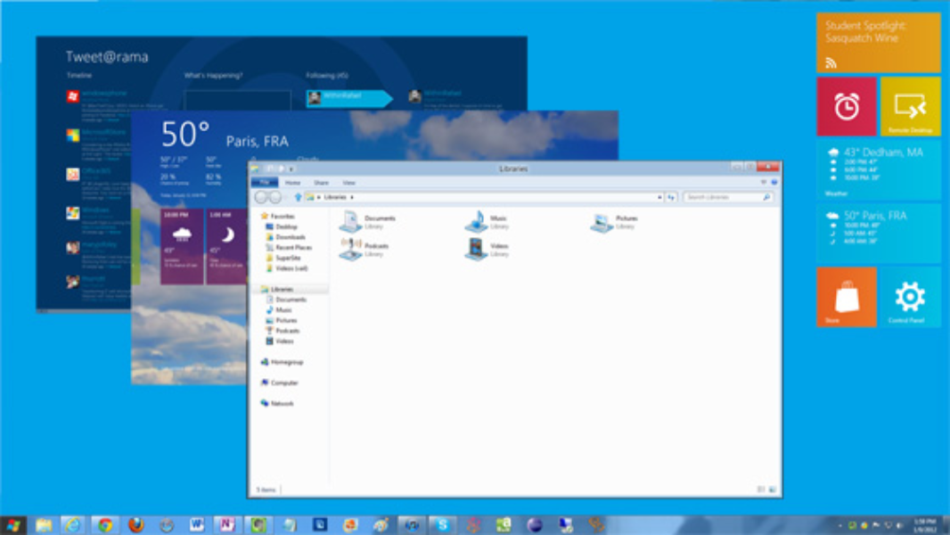
This is an astonishing passage given what happened with Windows 8. The Metro interfaces in Windows 8 weren’t just minimalist, they literally did less. And Windows 8 was full of hidden user interfaces: the Charms and many other new Windows 8 UIs were both hidden and non-discoverable.
In the wake of two massive posts about the Windows 8 Start screen in early October—they were 3100 and 3900 words long, respectively—the Windows team dressed down all the complainers with an incredible 9200 word (!) follow-up that included, among other things, charts, a discussion about the differences between human spatial memory and muscle memory, and a mathematical formula that was somehow related to mouse/touch hit targets in UI. But it is astonishing how blithely the team handled obvious and understandable complaints.
Consider the following reply to the new Start screen being less efficient than its predecessors. Which, of course, it was.
“We do have to assert that efficiency, that is, time to accurately complete a task, is of paramount importance in design. We never say ‘most important’ because we consider a broad range of attributes in designing how a feature works (resource utilization, reliability, accessibility, localizability, security, training, discoverability, and so on). As we work to improve our products, both in terms of efficiency and usability, we consider several factors for user interface approaches, such as mouse mileage, target size, loading time, parsing time, and mouse click counts (among others). It’s likely that in any change, there are efficiency gains and sometimes efficiency losses, but we take great pains to achieve a net gain in efficiency when all of these are considered.”
The reply then goes on for another 3600 words, concluding with an agreement to make two tiny changes to Windows 8 in the name of efficiency. It would navigate the user to All Programs when they clicked Search in the desktop, and it would increase the number of rows of Start screen tiles that one could see on large displays “so that you can fit even more of your favorite apps closer to your mouse and make it faster to launch apps than before … Our intention is to build on the unprecedented transparency we provide in building Windows and to bring you inside the development of the product … We simply love the dialog we’re having with you, and the opportunity to describe the depth of the work we do to bring you Windows.” What the team was not interested in doing, of course, was making major changes: Windows 8 would barrel forward according to the team’s original design.
Taking exception to this policy, I opined in December that there was a better way.
“Full-screen doesn’t work on a real PC,” I noted among several other suggestions. “This works fine on a tablet, but it is completely unacceptable on a real computer … Microsoft needs to enable a ‘truck’ mode where the Start screen and its apps can be accessed via separately floating windows on large screen displays. It’s that simple.” (That “truck” bit was a reference to a Steve Jobs comparison of tablets and PCs, which he described as cars and trucks, respectively. The idea being that most people needed a car, not a truck.)
When Sinofsky stated publicly in September that he was serious about reimagining Windows, few understood how serious he was. With Windows 8, he would rid Windows of as much of the past as he could, replacing it with new systems and interfaces that were designed by his own team. The removal of the Start button and Start menu were part of this work, as was replacing the traditional and .NET programming environments, and seizing control of this work from the Developer Division.
But other examples would appear over time. For example, Windows 8 would do away with the Aero Glass desktop interfaces that Microsoft had struggled to ship for years, replacing it with a less technically demanding flat interface that looked a bit less jarring when compared to the Metro UIs. And in early January 2012, he announced that the Windows team was even prepping to rid itself of NTFS, the file system that the original NT team had created almost 20 years earlier.
“NTFS is the most widely used, advanced, and feature rich file system in broad use,” Sinofsky explained. “But when you’re reimagining Windows, as we are for Windows 8, we don’t rest on past successes, and so with Windows 8 we are also introducing a newly engineered file system. ReFS (which stands for Resilient File System), is built on the foundations of NTFS, so it maintains crucial compatibility while at the same time it has been architected and engineered for a new generation of storage technologies and scenarios. In Windows 8, ReFS will be introduced only as part of Windows Server 8, which is the same approach we have used for each and every file system introduction. Of course at the application level, ReFS stored data will be accessible from clients just as NTFS data would be.”
In early December, Microsoft hosted a special event in San Francisco to preview the Windows Store for Windows 8. It would offer the same 70/30 revenue split that Apple employed in its App Store. But “successful apps”—those that earned $25,000 or more in revenue—would then begin enjoying an 80/20 revenue split. Apps could be priced from $1.49 to $999.999, and developers who were interested would need to join a developer program that cost $49 per year for individuals, or $99 for companies. The Store would support in-app purchases or alternative transaction services, but not both. And developers were free to use Microsoft’s advertising platform or any third-party ad platform.

On January 9, 2012, Microsoft CEO Steve Ballmer gave his final Consumer Electronics Show (CES) keynote address, ending an era. The event was co-hosted by media personality Ryan Seacrest for some reason, and it featured a gospel “tweet choir,” also for some reason. There was little in the way of news: after a long Windows Phone segment—Windows Phone 7.5 “Mango” had just launched in late September 2011—Ballmer turned to Windows and the impending release of Windows 8, noting that there were then 1.3 billion Windows PCs in use globally.
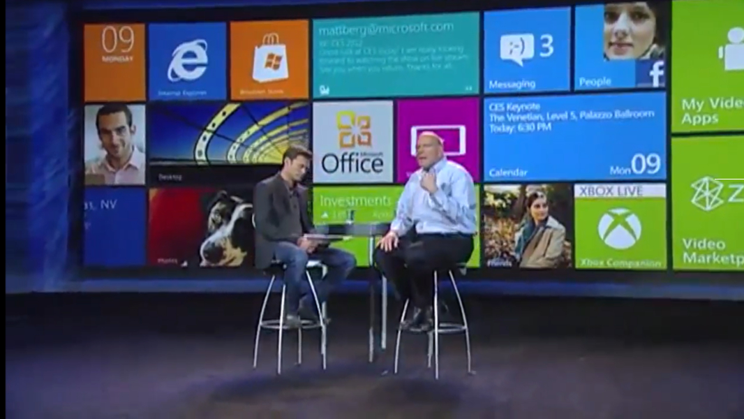
“The Windows PC has evolved,” he claimed. “Really, with Windows 8 we’ve reimagined Windows, all the way from the chipset through to the user experience. And it will deliver a no-compromise experience. The best of the PC, and the best of the tablet, we kicked that off last year at CES, and we’re even more excited this year.”
With that bit of marketing repetition out of the way, Ballmer and Seacrest ceded the stage to Windows chief marketing officer Tami Reller, who discussed what Windows 8 would mean to consumers. She was a much more confident speaker than Julie Larson-Green, who normally handled Windows demo duties in this era.

“Windows 8 … brings together the potential of a tablet with the power of a PC,” Reller said. “Windows 8 is going to give customers the power, the mobility, and the familiarity to effortlessly move between, not only what they want to do, but what they need to do. And the flexibility of Windows makes this possible.”
The positioning was obvious enough. Apple had successfully introduced the iPad two years earlier, kicking off a successful new product category that sat somewhere between the smartphone and the PC. Microsoft was pushing Windows Phone as an innovative and unique alternative to the iPhone in the smartphone market. And with Windows 8 it was offering to close the gap between the tablet and the PC by releasing a single platform that could handle both duties. A new generation of Windows 8 tablets and convertibles would even allow customers to use a single device, rather than have to buy two.
Theoretically, this isn’t a horrible idea: a single device that can replace two devices is a holy grail of sorts in personal computing. The problem is that such products are rarely successful. And so where Steve Jobs had positioned the iPad as a device that could perform certain tasks better than a smartphone or a laptop, Microsoft had to come up with a single platform that would work as well for traditional PC users as it would for those who preferred tablets and touch-first interfaces.
Microsoft would not be successful either: Windows 8, as originally envisioned, put far too much emphasis on tablet and touch-first interfaces while making the experience worse for those with traditional PCs. But the marketing was compelling: it would offer a “no compromises experience,” Reller claimed. And it would magically offer a richer experience as users installed more and more apps.
Reller demonstrated Windows 8, showing off new features that hadn’t yet been available in the Developer Preview, including the Windows Store, Microsoft’s new mobile app store. She also showed off some new PC and tablet PC designs that were being announced at CES and would ship later that year alongside Windows 8.

When Ballmer and Seacrest returned to the stage, the Microsoft CEO made his final sales push for Windows 8.
“You know, Windows 7 is the best-selling operating system of all time,” he started. “Five hundred million users on the planet for Windows 7. We’re licensing about seven new copies a second … Every Windows 7 PC will be ready for Windows 8 on day one. So, the 3 million people who have already come to our website and downloaded the Windows 8 preview, boom, they can do it from any Windows PC ever made.”
Wrapping up his final appearance at CES, Ballmer also revealed that the next Windows 8 milestone, the Consumer Preview, would arrive in late February.
“There’s nothing more important at Microsoft than Windows, and delivering the kind of no-compromise experience with the dynamic Metro user interface that Tami described,” he said. “Metro will drive the new magic across all of our user experiences. In the new math at Microsoft, Metro means that one plus one really does equal three. So, in 2012 what’s next? Metro, Metro, Metro—it’s all right, I’ve got you—and, of course, Windows, Windows, Windows.”
(Microsoft later confirmed that it would launch the Consumer Preview at Mobile World Congress in Barcelona on February 29.)
In early February, Sinofsky penned an epic 8750-word post explaining Microsoft’s plans for Windows 8 running on the ARM architecture, a product that was now called Windows on ARM (WOA).
“WOA is a new member of the Windows family, much like Windows Server, Windows Embedded, or Windows Phone,” he explained. “As with those products, WOA builds on the foundation of Windows, has a very high degree of commonality and very significant shared code with Windows 8, and will be developed for, sold, and supported as part of the largest computing ecosystem in the world.”
Unexpectedly, WOA would utilize the same dual interface as would Windows 8, with a Metro-style Start screen and the familiar desktop environment.
“Some have suggested we might remove the desktop from WOA in an effort to be pure, to break from the past, or to be more simplistic or expeditious,” Sinofsky wrote. “To us, giving up something useful that has little cost to customers was a compromise that we didn’t want to see in the evolution of PCs. The presence of different models is part of every platform. Whether it is to support a transition to a future programming model (such as including a virtualization or emulation solution if feasible), to support different programming models on one platform (native and web-based applications when both are popular), or to support different ways of working (command shell or GUI for different scenarios), the presence of multiple models represents a flexible solution that provides a true no-compromise experience on any platform.”
But WOA would not be as full-featured as the Intel and AMD (x86/x64) versions of Windows 8. It would support all Metro-style apps, but no third-party desktop applications at all, making it impossible to do things like download and install an alternative web browser. What would work, however, were most of the same desktop apps that came bundled with Windows 8, along with the desktop versions of four Office 2013 apps, Word, Excel, PowerPoint, and OneNote. (But not, crucially, Outlook.) There was no option for emulating x86 apps on WOA, and x86-type drivers would not work; Microsoft said that WOA device drivers would be made available through the Windows Store, Microsoft Update, or Windows Update.
Sinofsky wasn’t done remaking Windows. On February 18, Microsoft confirmed that it was reimagining the logo for Windows 8 as well, and moving to a flatter, angled design with none of the colors of previous Windows logos.
![]()
Anticipating the complaints, it even made the specious claim that there was a precedent for this logo: the original Windows logo, from 1985, was somewhat similar.
![]()
But few remembered that product or that logo, and for those that did, neither had positive connotations. That such a thing would be lost on the Windows 8 team wasn’t surprising. After all, they were not listening. And this inability to read the room was about to doom them and the product they were creating to ignominy.

Gain unlimited access to Premium articles.
With technology shaping our everyday lives, how could we not dig deeper?
Thurrott Premium delivers an honest and thorough perspective about the technologies we use and rely on everyday. Discover deeper content as a Premium member.