Modernizing .NETpad: (More) Dialog about Dialogs (Premium)
- Paul Thurrott
- Aug 16, 2024
-
0
It’s been a frustrating week for the .NETpad modernization project. Some of it was self-inflicted. And some was Microsoft’s fault.
I take exception
Let me address the latter first, as it’s a quicker conversation: Earlier this week, Microsoft made three related developer announcements over two days that I addressed in one post: It released Visual Studio 2022 version 17.11, it released .NET 9 Preview 7, and then it released Visual Studio version 17.12 Preview 1. This seemed straightforward, and since I had been using the pre-release version of Visual Studio 2022 version 17.11 with each preview version of .NET 9 in turn, I dutifully upgraded each on the several PCs I’ve been using for the project.
As expected, updating the preview version of Visual Studio meant I went from version 17.11 to 17.12. And not that it matters too much, but this is now the baseline for coding to .NET 9: Now that it’s in stable, you can’t target .NET 9 with Visual Studio 2022 version 17.11 anymore. Not a big deal.
Unfortunately, once I upgraded, nothing worked. The new .NETpad project and all my .NET 9-based side projects would throw an exception when I tried to run them, tied to the weird XAML-based incantation we have to make for now to get .NET 9 working.
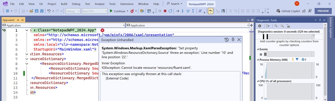
Curious. And frustrating. And I was seeing the same error everywhere. I Googled it, of course, but only found results based on the error message generally: What I’m doing is so new and rare there’s just not a lot of information out there. So I scoured the announcement posts, and the comments in the announcement posts, to see if I had missed something. My understanding was that the Microsoft had made a single WPF update during the entire .NET 9 development time so far–back in Preview 4 in May–and so it wasn’t clear what was happening. And then last night, I saw confirmation that I wasn’t the problem: In the GitHub announcement for .NET 9 Preview 7, someone described the exact problem I was seeing. Then, a member of the .NET team created a separate issue for that problem. It wasn’t resolved when I went to bed, but I figured (and hoped) it would be in time. I had already lost a day and half to this.
This morning, I opened each of the laptops I’ve used recently, hoping to find one I hadn’t upgraded. And I did, thankfully, so I put that aside, knowing I could use that to keep working if Microsoft didn’t fix the issue. But then I checked my email and found some good news: There was and answer to this problem, and it was a simple fix.
Back in May, when Microsoft announced the return of WPF, it explained that one had to add several special lines of XAML code to the App.xaml file in any .NET 9 project that would use the new Windows 11 theming functionality. The key line was:
pack://application:,,,/PresentationFramework.Fluent;component/Resources/Fluent.xaml
And this was, of course, the line that was triggering the exception: Visual Studio couldn’t find the resource referenced by that line of code. As I hoped, the fix is simple. You just need to change one word–Resources to Themes–in that code. So it now has to look like so:
pack://application:,,,/PresentationFramework.Fluent;component/Themes/Fluent.xaml
Microsoft never mentioned this change, but it has since updated the very light documentation it provided back in May for .NET 9 Preview 4 to include it. All is well that ends well, I guess.
Moving on.
Round and round I go
I feel strongly that software development is like golf in that you can’t just dabble in it, you need to practice, and work at it, every single day, or at least as much as possible. But I hadn’t been doing that before starting this project, and I often can’t when life gets in the way, as it does. When it comes to this topic, I dabble, I’ve forgotten more than I’ve learned, and I didn’t know that much to begin with.
That means I make mistakes, head in the wrong direction for some period of time, and then have to step back and start over. This has happened many times this summer as I worked on the .NETpad modernization project. And that’s fine: It’s how I learn. But this is also why I’ve not yet provided much in the way of source code: it would have been a mistake to present my work to date publicly as it were in any way final or complete. Because it’s not: I keep changing things.
Case in point, the various dialog boxes (sub-windows) that this app, like Notepad, needs to pop up for routine functions. Early on, I had identified three primary dialogs–Save confirmation, Find/Replace, and Go to line–that I had previously implemented as custom dialogs (“input boxes”) in the original version of .NETpad. I noted that I’d like to minimize or even eliminate my use of custom dialogs, for what felt like reasonable reasons at the time. I created some pane-based alternatives using XAML grids that were OK looking but non-standard. And then I had a breakthrough, or so I thought, in which I used those pane-based dialog alternatives as the basis for more native-looking floating panes that look almost identical to the similar UIs in Notepad. I thought I had cracked it.
Nope.
In the several days since then, I scoured a couple of WPF books I have on Kindle looking for the secret to unlocking a style/theme-related issue I’ve encountered with tabs, especially (briefly described in the recent project update). In doing so, I came across a discussion about custom dialogs, written 20-ish years ago, that triggered a latent memory and a digression: I Googled a few things about WPF and then started a few more experimental side projects in Visual Studio to test a few ideas. And I had the sudden realization that I was doing this all wrong. I could, in fact, implement the Save confirmation, Find/Replace, and Go to line interfaces as custom sub-windows. Not only that, but I realized I should do so. Had to do so.
This was a major change in thinking for me, but it wasn’t a complete reset: I was able to use the code I’d created for those original pseudo-dialogs (really, floating panels or panes), which saved a lot of time and effort. This also allowed me to take advantage of the code quality improvements I had made at that time as well. Better still, I made further refinements to the XAML and C# code while making this shift. So it’s a sort of glass half full, glass half empty thing. As I write this, I am in many ways back where I was weeks ago with regards to the Save as confirmation interface (half empty). But it’s also completely different. And better. And it’s formed a solid foundation for some related improvements I’ll explain below (half full).
I feel good about this. But it’s sobering to remember that I felt good about the two previous feints I made in this direction, too. So let’s see how this one goes.
Here’s what happened.
Dialogs, take 3
The book Programming WPF: Building Windows Ui with Windows Presentation Foundation by Chris Sells and Ian Griffiths dates back to the dawn of the WPF era, and the latest edition, the one I own, is from 2007. It’s quite good, and while reading up on WPF data binding, I noticed it had a small section on custom dialogs, which is key to what I’m doing. So I took a look. The book explains that WPF supports two types of dialog boxes, modal and non-modal (now called modeless, I guess). I am familiar with this concept, of course, and .NETpad (like Notepad) uses both types of dialogs. A modal dialog is like a prompt or alert where the user has to deal with it before they can continue using the app normally; a save confirmation dialog is a typical example. A non-modal dialog meanwhile, doesn’t prevent you from interacting with the main app window; the Find/Next dialog is non-modal.
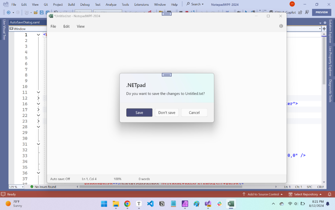
What I’d forgotten was that you can configure a modal dialog with WPF to appear in the middle of the app window, vertically and horizontally, and not appear as an icon in the Taskbar (which isn’t as much of an issue in Windows 11 because it combines an app’s Taskbar buttons and hides labels by default). As important, you can configure a dialog to automatically size itself to match the content it displays, and this was something I had wanted to figure out for the save confirmation dialog, which might be normally sized if the prompt reads, “Do you want to save the changes to Untitled.txt?” but quite wide if it reads, “Do you want to save the changes to This is a very, very, very, very, very, very, very, very, very, very, very, very, very, long filename.txt?”
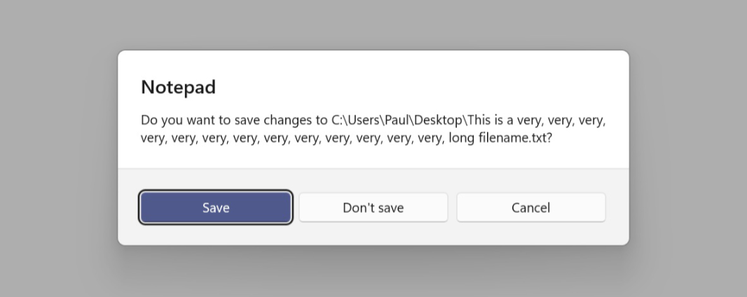
I don’t expect anyone to remember any of this nonsense, but I had previously recreated the look and feel of the Notepad save confirmation dialog as a floating panel that appeared above the main application window and looked like what the user sees in Notepad. Because this panel (“dialog”) was really part of the main app window, the two were tied together, were one. But to make this work, I had had to recreate the look and feel of the original dialog using a mix of custom XAML and styles that, among other things, imitated the curved corners and shadows you get with real Windows 11 windows for free. It was a lot of code, and I’d have had to create similar mountains of code for the other “dialogs” I needed.
What if I could use just some of that code in a real dialog and just take advantage of the things that Windows 11 gives you for free, like the curved windows and shadow? It would be less code, but it would also be … real. I had wanted to minimize my use of secondary windows (dialogs) … for some reason. But if this worked out, I would likely end up creating multiple secondary windows. And I needed to find out if this made sense. I felt like it did.
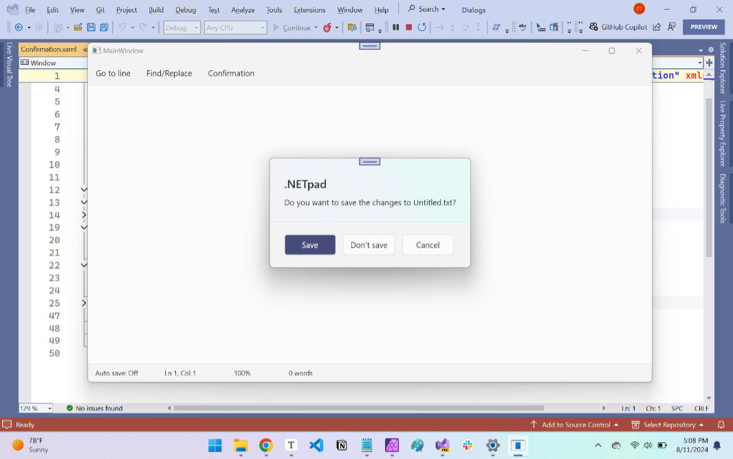
So I started a new side project. I created a simple version of .NETpad with a top-level menu, a text box, and a status bar. I renamed the “File,” “Edit,” and “View” menus to “Go to line,” “Find/Replace,” and “Confirmation” to match the three dialogs I hoped to create. And then I pulled code from my save confirmation panel (“dialog”) in the real app into a new Confirmation.xaml file in the side project that represented a standalone sub-window or dialog.
This is a bit difficult to explain, but to create the effect of a sub-window/dialog using a pane/panel, I had had to wrap all the code in a WPF Border control so that I could style it with rounded corners. (Border supports this attribute, but Grid does not.) I had also added custom styling to create a shadow under this thing that was not a window.
But now that it is a window, none of that was necessary. I still needed to figure out how to configure this new sub-window–Confirmation.xaml–so that it was visually and functionally locked to the main app window. But that came together quickly: My first attempt was visually almost identical to the similar dialog in Notepad, though it lacked a few niceties, like dynamic sizing (for longer file names, etc.). The curved corners and shadow were perfect. Because they’re native. And that was very appealing to me.
For this to really make sense, though, it had to work for all (or most) of the sub-windows I’d now make. Go to line, for starters. Find/Replace, of course, though that one is unique because it’s a non-modal/modeless window. And maybe even for a custom Message Box that looked native, unlike the one I get from WPF. Hm.
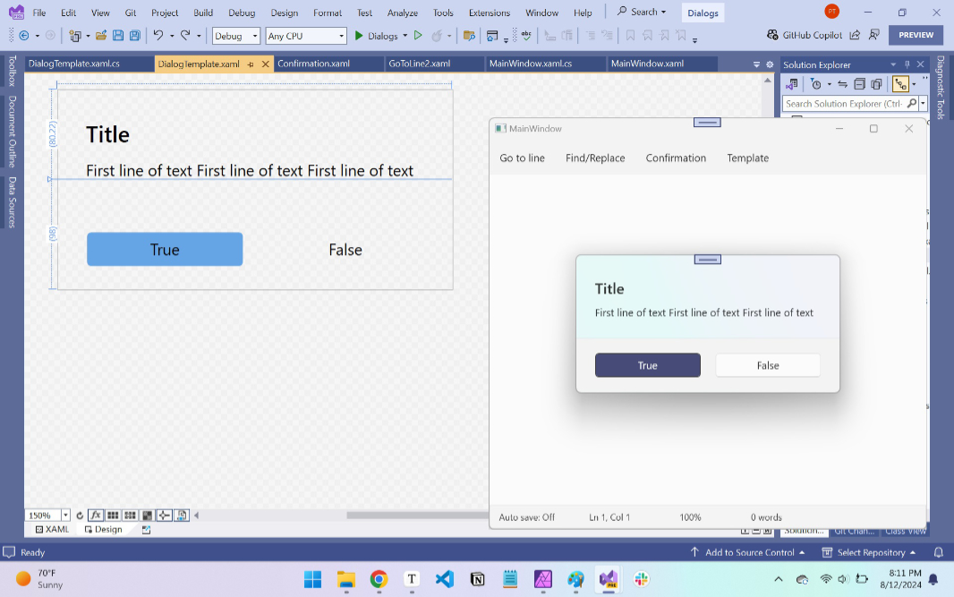
I first experimented with Go to line and Find/Replace, and while they both looked great, I realized that the key here was to create a single prototype dialog in XAML that would make sense for any and all of the dialogs I’d need. Consider these three examples.
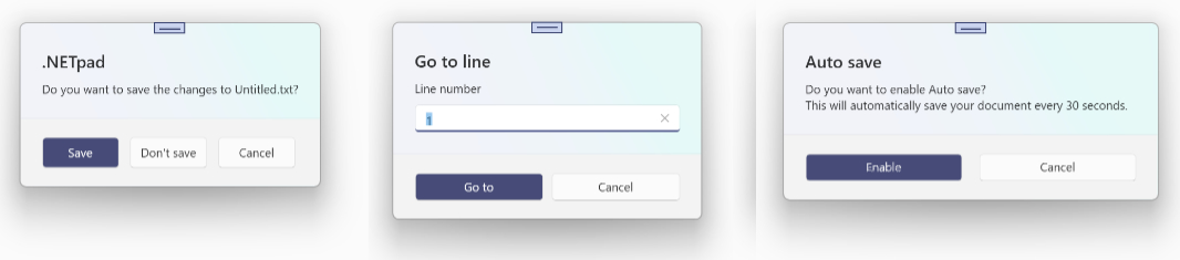
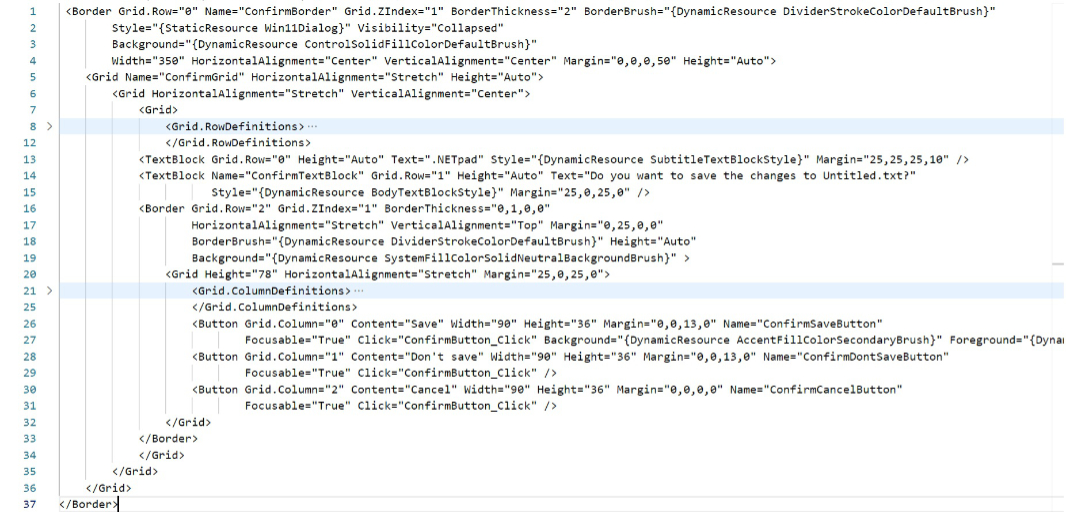
There are obvious similarities in each. The dialogs are divided vertically into two sections, one at the top with a title, one or two lines of text, and, in one case, a textbox. And then a bottom section with buttons and a darker background color. But there are differences, too. The dialog has to auto-size based on the height and width of the content it contains. (Within limits, too; if one of the lines of text is too wide, that needs to auto-span into two lines of text.) Two or three buttons, with only a “Cancel” button being common to them all. And the width of those buttons needs to auto-size too. But again, within limits.
To make that work, I created a second version of the save confirmation dialog in my test project with few hard-coded widths or heights. Some things do need to be specific sizes, of course, but some need to auto-size; for example, you may want the buttons to always be the same height, but to size between different ranges (a minimum width and then a maximum possible width. To make sure this was working correctly, I temporarily changed the text displayed by each control to be longer, then shorter, and then longer, again and again, until I was sure that each part of it that needed to was resizing correctly.
The other issue here is that these windows are unadorned. That is, they don’t have a title bar with an app icon, a title, and the three standard window buttons (“Minimize,” “Restore”/”Maximize,” and “Close”). WPF lets you style windows this way, and because they can’t be moved or resized by the user, there’s not much other work to do.
Most of this is just XAML code ,which is more design than coding. But it can be quite verbose. Maybe a more visual approach makes more sense.
The basic structure of this dialog template is easily understood. There’s a top half and a bottom half, which is implemented with two top-level rows in a grid. And within each, there’s padding on the left, a larger area for content in the middle, and then padding on right, so there are three top-level columns within each top-level row.
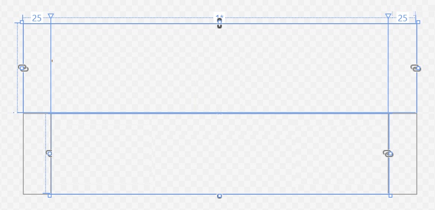
In both halves of this grid (top and bottom, respectively), the padding columns on the right and left are hard-coded to 25 dips (device independent pixels) so they match the dialogs in Notepad (and elsewhere, I’d imagine). But the middle columns on each are flexible and will size according to their contents. That said, each also has a minimum width (100 dips) and a maximum width (700 dips). These, too, are based on what I see in Notepad, but it’s likely the maximum width value is off a bit.
The top half contains a title and one line of text, each of which is implemented as a text block. It can optionally contain a second line of text or a textbox for entry (as needed by Go to line). This is pretty straightforward: I use the system style SubtitleTextBlockStyle for the title and BodyTextBlockStyle for the lines of text and/or text box and vertically offset the title accordingly so it matches the look and feel of the native dialogs.
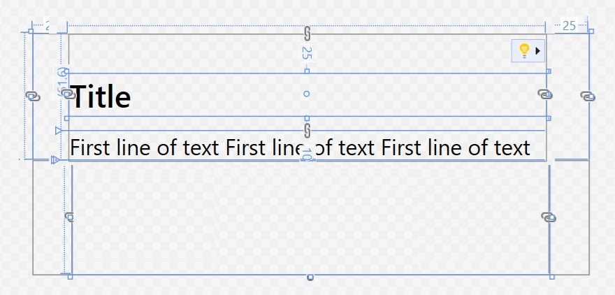
The bottom half contains a border that’s styled to be a dark system color–again matching the native dialog–with an offset at the top and then a row of two or three buttons. The buttons are equidistant from each other and each will size as required by the width of the content.
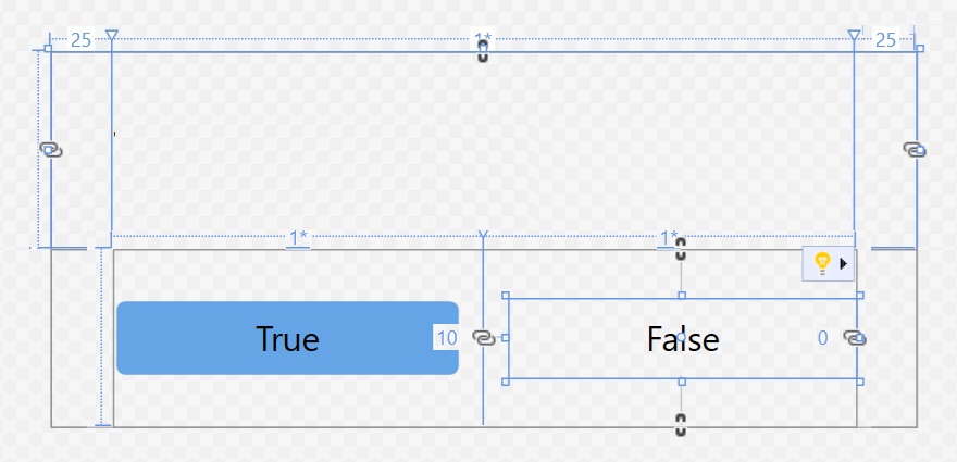
The two-button version is shown above. The optional text block and text box in the top half, and the optional third button in the bottom half are commented out in XAML so they can be added when this template is used for dialogs that need any of those controls. But the stock version of the window created by the template looks like so.
I may make some small changes still, but I’m pretty happy with the XAML I wrote to make this work. And it led to three dialogs so far:
Save confirmation. This is the custom dialog I’ve worked on the most. In its current form, it’s very close to the original in Notepad, and it will adjust its width according to the length of the filename it has to display.
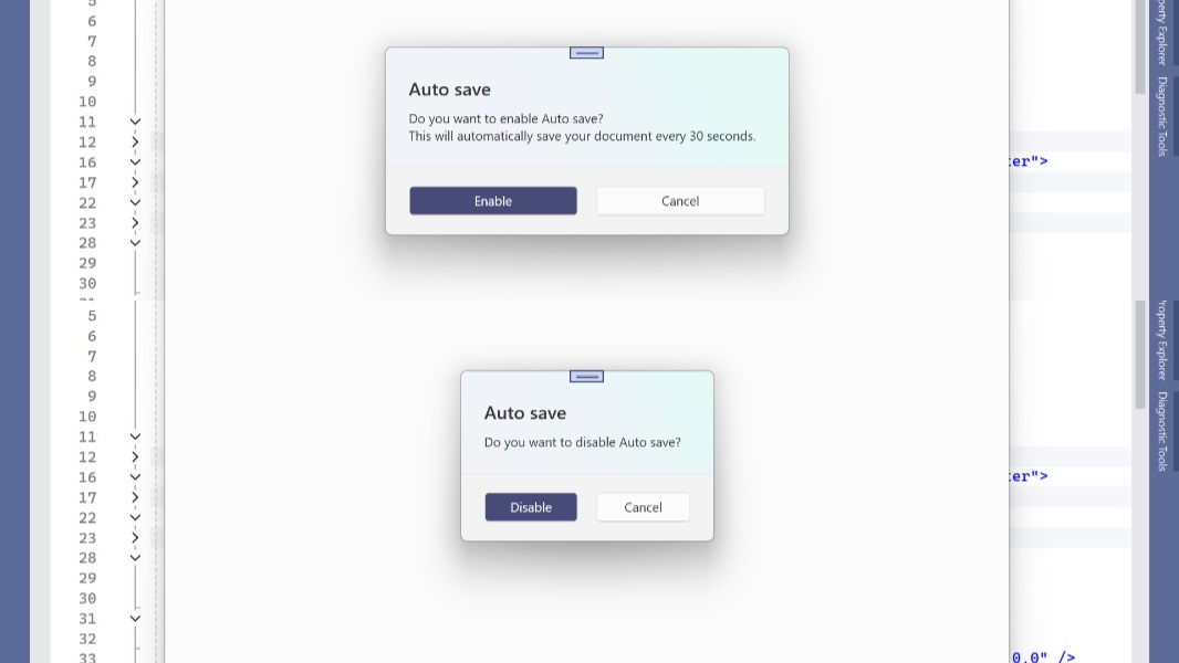
Auto save enable/disable confirmation. This was previously an old-school Message Box, which looked out of date. Now, it’s fully customized, and it dynamically changes its appearance depending on whether you are enabling or disabling Auto save:
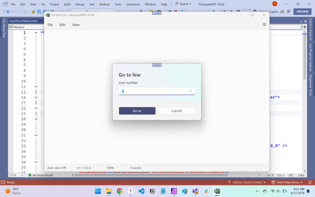
Go to line. This one still needs some fine-tuning as it’s the only one with a text box and I’ve not correctly sized it yet.
This template won’t help with the Find/Replace dialog because that one is so different from the rest. And I’m still working on that, though the earlier work I did when this was going to be a pane will be a good starting point. In fact, I may stick with that pane-based design for several reasons. And there are other issues: I’m chipping away on some styles/themes/resources problems that are minor for the dialogs, but major for the tabs, and that has to work.
But as always, this is getting too long, so I’ll another look at those things soon.

Gain unlimited access to Premium articles.
With technology shaping our everyday lives, how could we not dig deeper?
Thurrott Premium delivers an honest and thorough perspective about the technologies we use and rely on everyday. Discover deeper content as a Premium member.