Modernizing .NETpad: Late Breaking Structural Changes (Premium)
- Paul Thurrott
- Dec 23, 2024
-
2
I sometimes have trouble focusing. No, that’s not exactly right. Sometimes, the problem is that I focus on the wrong thing. And that’s happened a bit since Microsoft released .NET 9 back in November. This is the .NET version that brings initial support for Windows 11 theming to WPF, the Windows Presentation Foundation, a 20-year Windows app framework that Microsoft brought back from the dead earlier in 2024.
Over five or six months, I worked to modernize the WPF version of my .NETpad app using this new theming support, describing the highs and lows in real-time, as I learned, in a series of over 25 articles (so far) what was possible and, annoying, what was impossible or, in some cases, non-optimal. The goal was two-fold: I wanted to make it more like Notepad, which has evolved dramatically in the Windows 11 era with new features, and I wanted to fix previous mistakes I had made in my app via coding and design.
I can obsess over these things. And while I am not a professional developer, a real developer, I’m still proud of the work I’ve done, and, maybe more to the point, feel that I am in some ways pioneering in any area where I just don’t see a lot of other work. I keep hoping a professional developer will better document the issues in WPF’s support for Windows 11 theming and, even better, explain how to work around those issues. But I’m alone out here, from what I can tell.
Left to my own devices–and held back by my limitations as a developer–I still did pretty good, I think. My silly little app isn’t so silly or little anymore. I’ve modernized it inside and out, meaning it is better looking and the code quality is stronger. But I keep obsessing over the two related, major features it’s missing, mostly because these features are the most obvious change(s) in Notepad. (This is actually two different things, but I feel like that’s lost on mainstream users.) Those features are the tab-based user interface and title bar customization that give Notepad its modern look (and feature set) in Windows 11.
What’s missing
Tabs is obvious enough, it’s right there in your face. But tabs are difficult to implement because doing so requires adapting an app that previously handled and maintained state for a single document into an app that handles and maintains an essentially unlimited number of documents. That’s a lot of new code, and all the resulting testing and whatnot. But there are also untold user interface issues to address, including how to handle the user opening so many new documents (tabs) that they can’t be displayed in the app window. In this, I am constrained doubly. First by the limits in WPF. And then by my own limits. I have a lot to learn.
Title bar customization is, in its own way, just as complex. You can learn more about this topic on Microsoft Learn, but the short version is that developers using the Windows App SDK, a modern app framework for Windows, can customize the top of their app windows so that there’s no traditional title bar. This is what Microsoft did with Notepad, and with File Explorer and other apps. But when you do that, you have to replace the features the title bar provided, and there are several. The Windows App SDK makes this possible, but not easy, and a coming 1.7 version seeks to address that problem. But WPF is 20+ years old, and while it has always provided the basics for this work, it’s buggy and incomplete, and even if you get it working, you have to make functional and user experience trade-offs. Compromises. It won’t be perfect.
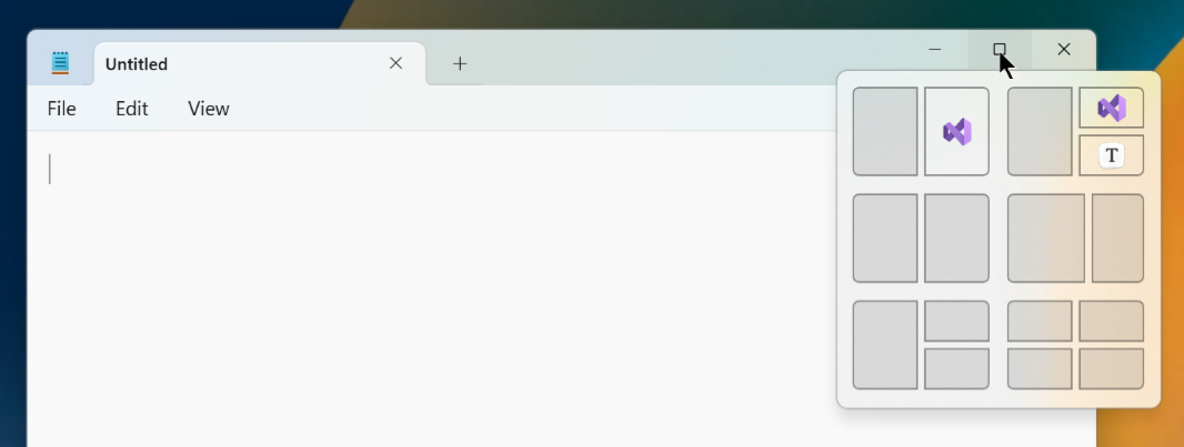
Looked at a certain way, I suppose there are three features from Notepad that .NETpad doesn’t currently support. Because the tabs and title bar customization are commingled–it is the tabs that replace the title bar in Notepad (and in File Explorer too). And that means you can’t do tabs without doing the title bar customization. It would look ridiculous. It would look (something) like this. (I threw this together quickly.)
No bueno.
But I’ve been working on it. First in isolation. And then, as I’ve made progress, together. I’ve done this alongside the work I should be doing, which is cobbling together a “final” version of the current version of .NETpad, the version that came out of this past year’s modernization work. My goal is to use that as the foundation for a 2025 version that will finally add the missing features. Even if it means compromising somewhere. And it will.
To be fair to me and my attention span, this isn’t about procrastination. What’s happened is that I essentially had two separate code bases for the 2024 version of the app, the version I first made (which was itself one of many iterations, some restarted from scratch), and then the version I (re)made while writing about how I did it. This is a key part of my approach to programming, just as it is writing about technical topics for books and articles. It’s not enough to do it once. It needs to be repeatable. If it’s consistently repeatable, it works.
And so this version of the app I’m working on now is yet another new version of the app, created from scratch. I identified a few places in which the code bases of the two other versions differ–I made some changes, hopefully improvements, in the second one–and I want to make sure the “final” version takes the best from both. But as I do this work, comparing code blocks between multiple versions of the app, I am constantly reminded of those missing features. And of the DocumentTab C# class work I wrote about in .NETpad 2025: Looking Ahead, Feeling a Little Tabby (Premium) and have since expanded on. And I wonder. Does it make any sense to incorporate some of that work in the current (2024) version of the app? The goal, as always, is to make it as good as I can make it. Would any of this work make the app better now? Is it enough if it just better sets up the app for the coming changes?
Some of what’s missing was found
I’ve been busy with other things, of course. But over the past three weeks, I’ve made enough progress on these interim changes that I got distracted from what I should be doing. If you’re waiting for that “final” code, which I’ll publish on GitHub, apologies. That’s still happening. But I think this change will be worth the wait. And will better set up the app code base for the 2025 improvements too.
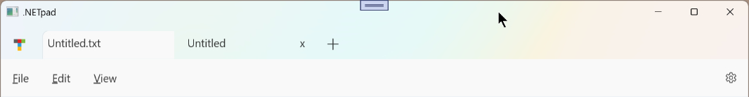
I almost went nuts on this. I worked up a basic version of the app that supported a single tab–and thus still only worked with a single document–as a more advanced interim step than what I’m presenting here. I even wrote over 3,000 words describing that change, which I will not publish as-is but will poach from as needed below. That version looked like so.
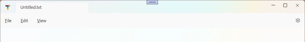
This works fine, and it looks OK. But you can see in this one of the many problems with Windows 11 theming and the TabControl control in WPF: I can’t style it like Microsoft does in Notepad because it hasn’t been updated properly to support that. So what I arrived at was one of those compromises I mentioned. It looks good, but it doesn’t look exactly like Notepad:
This version of the app has tabs–well, “a” tab, but the basis for tabs, including the underlying coding changes to accommodate multiple documents–and the customized title bar. That latter bit introduces a second compromise. Because I removed the standard title bar, what Windows and WPF refer to as the “non-client area” of the app, the bit that the system manages for the app, I had to recreate the user interfaces and behaviors that it supplies. That’s an interesting little brain teasers, especially if you’re using WPF. (Again, it’s a bit easier in Windows App SDK, and will soon be even better.) The compromise is that it’s not possible–or at least is non-trivial–to replace everything that the system gives you for free when you stick with the stock title bar.
The compromise
I suspect this is something most have never considered.
Consider this basic app title bar. There’s more going on here than is immediately obvious.
![]()
From left to right, this system-provided title bar gives you:
Window button. This typically displays the app icon, and it provides access right-click (and Alt + Space) access to the window menu, which in turn provides options for Remove, Move, Size, Minimize, Maximize, and Close. It’s a vestigial reminder of Windows’ past, as it was originally designed to work fully using a keyboard with no mouse. But even modern apps that don’t have a title bar still provide that menu, even when the button is missing. Open virtually any app and type Alt + Space. It’s still there.
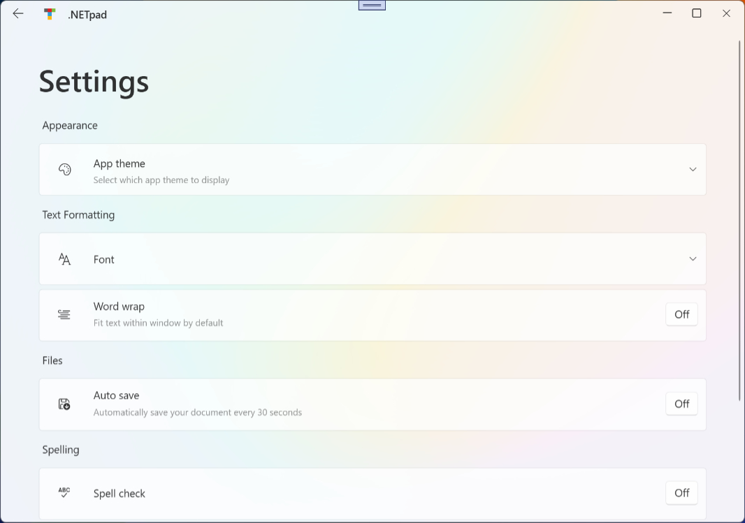
App title. OK, the app has to supply this, but a key aspect of the title bar is that it can display text. And that text is usually the name of the app, the name of the document (if it’s a document-based app), or both. Modern apps like Notepad and File Explorer no longer display this name by default, but you can see the Notepad title when you view settings. More on that in a bit.
Title bar. Aside from displaying text, the title bar is used to drag the window to a new location, and you can double-click it to toggle the window between its floating (restored) and maximized states. You can also resize the window from the top edge (and from other edges).
Minimize window, Maximize/Restore window, and Close window buttons. These three standard buttons are familiar to all Windows users and their respective functionality is handled by the system. In WPF, you can respond to the button click events, but you don’t need to worry about drawing the buttons or any other housekeeping tasks. Interestingly, these legacy buttons were updated in Windows 11 to support Snap layouts: When you hover the mouse over the Maximize/Restore button, a pop-up appears providing the user a choice of window layouts based on whatever other apps are also running at the time.
Removing the title bar is easy with WPF, you can do that in a single line of code. The trick is recreating all the stock title bar user interface and functionality you still want to use. The compromise is that it’s not possible to do it all (at least not that I’ve found, easily). So there’s a trade-off to this change. Recreating some of the stock functionality is difficult. Some is basically impossible.
I’ve been working on this for a long time. I worked on it on and off all year, really. It’s a thing I keep coming back to. That and the tabs. Over and over again. And then a pause. And then over and over again.
A structural weakness
As noted, I was ready to implement this new UI, a version of the app with a customized title bar and a single tab, and the underlying code changes it would require. I started writing it up. And then I ran into an interesting problem. An interesting structural problem. This was the ah-ha moment, maybe, I needed to take a step back and move forward more slowly. It occurred to me that while implementing tabs without the custom title bar was impossible, the reverse is quite possible. I can implement the custom title bar, but not the tabs. The main app window won’t look that different from the current version–thanks to the Windows 11 styling, the system title bar is still there but effectively hidden because its transparent and visually bleeds into the menu bar below it–but it will be different structurally. And that will make it easier to add tabs into that space later.
And as a side benefit, this change will let me easily “fix” a little issue with the .NETpad settings interface and make it look identical to that in Notepad. It’s a small thing–more on that in a bit–but it makes me happy.
But first, that structural problem.
I keep saying that .NETpad is a simple app, but it’s starting to get more complex from a structural standpoint. At its heart, its main app window has long consisted of three rows of UI–menu bar, text box, status bar–from top to bottom. Simple.
When I add tabs and customize the title bar, as Microsoft did to Notepad in Windows 11, the app will then have four rows of UI–tabs/title bar area, menu, text box, and status bar–from top to bottom. Also simple, at least from a structural perspective.
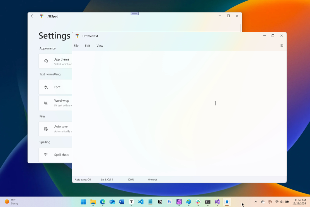
But there’s more going on. This past year, I added two major new UI elements, both of which are hidden by default. There’s a Settings interface, which I’ve implemented as a UI column, and a Find/Replace bar, which I’ve implemented as yet another UI row in the main app window. So the current version of the app really has five UI rows from top to bottom: Tabs/title bar, menu, find/replace, text box, and status bar. And that UI is on the left side of a two column outer UI that also include a (hidden by default) right column for Settings. When I display Settings, I hide the rest of the UI. When I back out of Settings, I display normal main app UI and hide Settings.
If you’re still following this, congratulations. I live in this app, but you don’t, and I hope this makes sense. Mostly because it’s about to get more complex. Again.
To properly implement tabs, or for now, the basics of what will become tabs, I have to customize the title bar area of the window, which removes the system-provided title bar. I have to replace that with something, and in this case that something was at first similar to what you see at the top of Notepad, and what I described above. A thing that included a tab but also still worked like a title bar (with drag/double-click) and has window buttons. And I made that thing. It seems to work.
But then I noticed something that, in hindsight, should have been obvious. The main app UI looked fine. But when I displayed the Settings interface, the customized title bar area–which had a basic tabs UI–disappeared. And because that tabs UI is the title bar area of the app, and was customized to support things like dragging the window, double-clicking the title bar area, and displaying the app icon and the three window buttons, none of that was available when viewing Settings. The app window looked like this.
It still worked fine. I could change settings and so on. And when I clicked the Back button, everything went back to normal. But I couldn’t move the window or use the window buttons in Settings (without resorting to keyboard shortcuts that no one knows).
Huh.
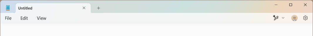
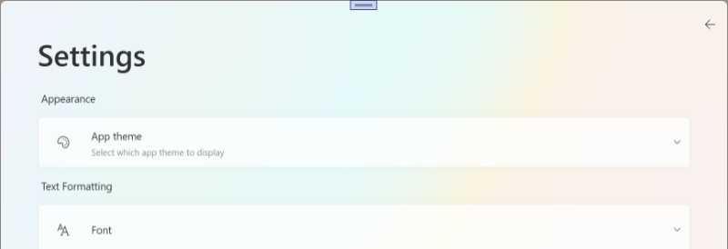
Seeing this, I of course, opened Notepad to see how Microsoft handles this shift. Normally, Notepad displays an app icon, one or more tabs, a New Tab button, an empty space, and then the three window buttons at the top of the app window. But when you open settings, it displays a Back button, an app icon, the name of the app, a blank space, and then the three window buttons.
So I needed to implement that in .NETpad. And I realize that, in doing so, I could move the Back button to the correct location. This is the little issue I could fix by making the coming structural change: Because I wasn’t customizing the title bar area in .NETpad, I had to originally put my Back button in settings in a different place.
This structural problem is, at least, something I know how to solve. Finally.
That said, it’s a little hairy: I had to move what was a row of the main app interface up into the containing outer grid in XAML, so that it’s visible in both the main app display and in settings. And then I had to change what displays in this row based on which UI is being used, the main app display or the settings. And that’s doable. Hairy. But doable.
Structural correctness
When I started this work, the app was still going to have that single tab in the main UI. But as I went through it, I once again had doubts. It seemed wrong to add complexity this late in this phase of the project, I time I should be cleaning up existing code, not writing new code. But these changes would come eventually, and as noted, I keep running into places in the existing code where I know what’s coming and would like to at least lay a foundation.
Here’s what I’m going to do.
I will make the structural change to the XAML that adds the new outer UI row for the tabs, but it will just be used to customize the title bar for now, with no tabs. Because there are no tabs, I don’t need to style the menu bar, and that means the (customized) title bar area and menu will both be transparent and will still bleed into one another. It will look basically identical to the current version of the app, but I will recreate the window button, the title bar with its text and drag/resize capabilities, and the Minimize, Maximize/Restore, and Close window buttons. These will mostly work normally and as before but the big missing piece is that Snap layouts pop-up. It won’t work. This isn’t ideal, but I feel like almost no one uses it anyway. It’s a compromise.
When you switch to the Settings interface, .NETpad will now more closely resemble Notepad, with the Back button where it belongs, in the upper-left corner, in the customized title bar area, and the name of the app. But thanks to the underlying changes, adding tabs into the app structure is now straightforward. (Minus all the complexities of actually implementing tabs).
The most significant change will happen under the covers. I am going to add the DocumentTab document management class to this version of the app, and update code throughout the app to accommodate that. This is a lot of work, but it again lays the foundation for the changes I’ll make with tabs and multiple documents next year. It just feels right.
I will also describe the code I’m adding to implement these changes. There are three big buckets:
XAML. The structure of the app is evolving to include two outer grid rows, for the custom tab/title bar area and the rest of the app. The rest of the app will structurally resemble the previous version of the app, with two outer columns, one for the main app display and one for settings, the latter of which is hidden by default. The main app display will consists of four rows: Menu, find/replace (hidden by default), text box, and status bar. When Settings is visible, the main app UI disappears, but the custom tab/title bar area remains, though it displays different controls, like Notepad.
DocumentTab. This is the C# class I added to management multiple tabs, the documents each contains, and related state information. The app will only support a single document as before, but the code will be there to support multiple documents in the future.
C# throughout. Code will need to be updated throughout the app to handle this shift from app-level document state management to object-base document statement (that will, again, later support multiple documents).
Worth it? I think so. But I’m about to make sure that’s true. More soon.

Gain unlimited access to Premium articles.
With technology shaping our everyday lives, how could we not dig deeper?
Thurrott Premium delivers an honest and thorough perspective about the technologies we use and rely on everyday. Discover deeper content as a Premium member.