.NETpad 2025: Thinking About Layout (Premium)
- Paul Thurrott
- Feb 08, 2025
-
0
I’ve made remarkable progress on the important, low-level code to manage multiple tabs and documents in .NETpad. But there are many problems, too. Key among them is my lack of sophistication when it comes to harnessing some key WPF innovations, like data binding and the MVVM design pattern, which would make this implementation more sophisticated and manageable. I think so, anyway. I haven’t figured out any of that yet.
So I plow forward, dividing my time between raw work and what I think of as research and experimentation, during which I try to grok how I can use those elusive WPF capabilities. In doing so, I’ve confronted my technical limitations again and again. It’s uncomfortable. Sometimes, I return to a complex block of code–that … does something–that I wrote and have stared at it for long seconds trying to understand it again. This work requires peak brain power, and it’s just not always there.
Which is why I took a break the other day, opened Notion, and looked at my .NETpad to-do list for 2025. Perhaps there was a smaller task I could take on, an intermezzo of sorts, that would be easier on my brain and give me a needed win, even if it was a small one. The result was the partial solution to the custom dialog resizing issue I wrote about this past week. I checked that one off the to-do list, though I also added a sub-to-do, “Try to fix the mouse cursor issue too.” One step forward, one step back.
That’s OK, I needed it. But making that change also required me to go back to the public source code for .NETpad 3.0 for Windows 11, which is available to everyone on GitHub. The version of the app I’m working on now (I suppose I’ll eventually call it .NETpad 4.0 or whatever) is a different beast entirely. It’s much more complex. Much more.
It may be too complex. Seeing the cleaner, simpler .NETpad 3.0 code again was eye-opening in its own way. There are many problems with this code, don’t get me wrong, and I am eager to fix them. (Some of the changes I’ve been making so far this year actually do address issues, go figure.) But compared to what I’m doing now, that code is simple and easily understood. I miss it.
So maybe this was a wake-up call of sorts. I feel pretty good about some of the work I’ve done, conceptually, related to managing multiple tabs and the associated documents and state. I create TabItem controls dynamically, in C# code, and can open and close them arbitrarily, and it basically just works. I’m happy with a lot of it. But it is, by nature, a mess, too. It’s early days. I’m figuring it out.
Seeing the public source code again at least inspired me to take a step back and think about some of the other issues I will need to address. And some of those issues are tied to layout. That is, the app has to support one or more tabs. There can be any number of tabs. As the user adds new tabs, and closes tabs, all the tabs should resize if needed to accommodate the width of the app window. This needs to happen in a specific space, the tabs can’t overrun the window control buttons, for example. And it there are too many tabs to display them all side-by-side, there has to be some kind of “overflow,” a way to access hidden tabs. (In addition to just typing Ctrl + Tab to cycle through them.)
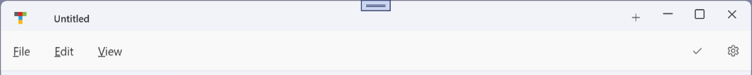
Consider Notepad, as always. It is the inspiration, after all. Here, you can see Notepad with three open tabs. There are no layout or overflow issues because there is enough room in the app display to accommodate all the necessary controls.
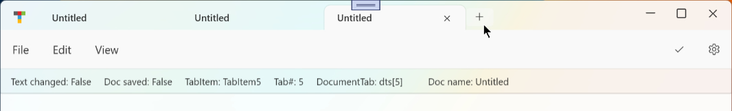
As you add tabs, each tab gets smaller so that you can still see each of them at the top of the app window. For example, here is Notepad with 5 open tabs.
And then 8.
This is where Notepad hits its limit: At this app window width, when I add a new tab, Notepad adds two little black arrow controls at the left and right side of the tabs.
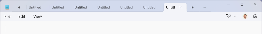
There are 7 tabs visible, so two are hidden. If you scroll all the way to the right-most (last) tab, the right arrow control is grayed out. Ditto if you go all the way to left, with the left arrow button.
So that’s one potential UI for tab overflow. It’s not “natively” available to me using WPF: The TabControl control that contains the TabItems does not offer this capability. I could cobble something together using Button controls, perhaps. I have to do something.
That is, for now, a problem for another day. But each journey starts with a single step. And with an eye on resting my brain from the terribleness of dynamic tab/document management but also exercising it just enough to keep it in the game, I figured I might take that first step in figuring out the tab layout issues that also on that to-do list. It has to happen sometime.
There are several tab layout issues to solve. Off the top of my head:
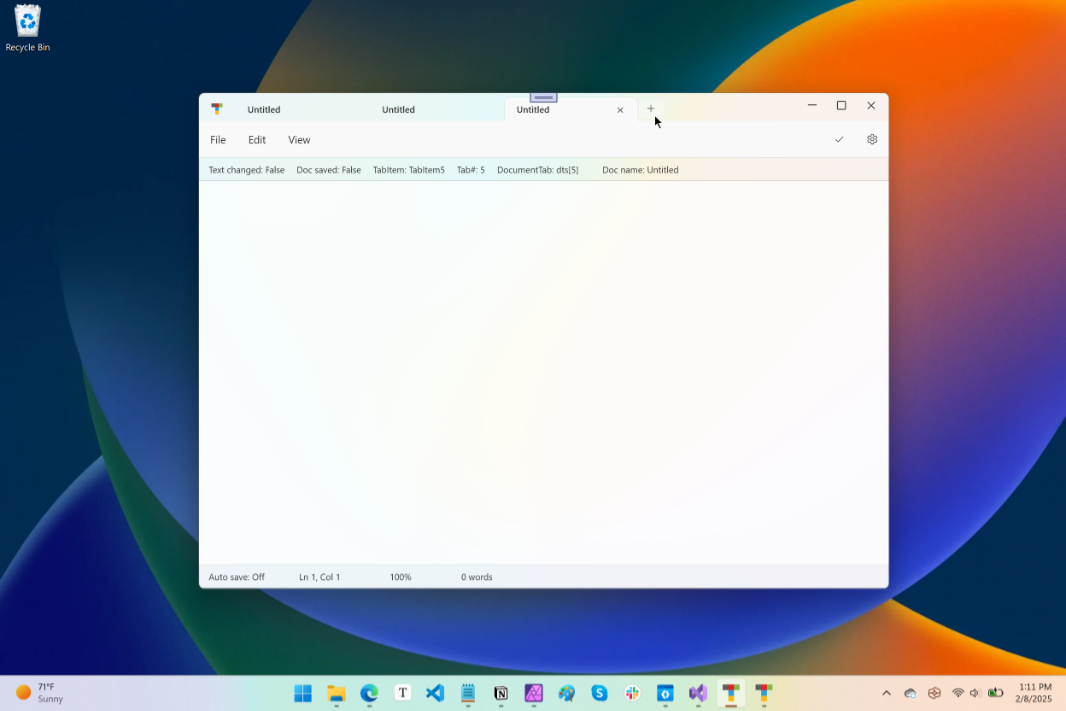
- TabControl. The TabControl control that contains each TabItem sits in the top row of the main app window user interface. To its left is an app icon, and its right, there is an Add tab button, some amount of empty space (based on the app window width and the number of open tabs), and then the three window control buttons (Minimize, Maximize/Restore, and Close). The app icon and all four buttons are fixed width. But the TabControl and the empty space are dynamically sized. The TabControl needs a minimum width, enough to accommodate a few small tabs. And I guess it requires a maximum width that is essentially the width of the app window minus the collective widths of the other controls. (The empty space can simply disappear if needed.)
- TabItems. Each TabItem control (each “tab”) should resize dynamically when the app window width changes or when the user adds or closes a tab. So they should support minimum and maximum widths, and I can use Notepad as my guide there. But this all requires some set of rules I need to figure out, and then there’s that ugly overflow problem. Which I will continue to procrastinate on until all the other smaller first steps are complete.
- Document name. In the public version of .NETpad 3.0, I display the document name (minute the path and file extension) in the app title bar, but this will move to the relevant TabItem header in the new version. Because the TabItem width is limited and can change, I need to limit the display of the document name to the space available, it can’t overrun the Close tab button, for example. This I’ve already figured out: Even in the current version of the app, the document name display truncates as needed to match the available width of the control displaying it. So I can use the same solution in the TabItem header.
There is also a lot of busy work to consider, including making sure that when the user does type Ctrl + Tab (or Ctrl + Shift + Tab), they cycle through the available tabs/documents in (visual) order. That will require a bit of management of its own, but since I’m already doing all kinds of housekeeping as tabs are opened and closed, that can happen as part of those processes. There’s always more to do.
To work through these issues, I’ve done what I always do. I bring up a new clean copy of the public version of .NETpad 3.0 and screw with it. I experiment. I start over, repeatedly, and try different things.
The complex tab/document code that I’ve been working on this year is mostly dynamic C# code, and that won’t change. But for these experiments, I’ve created simpler XAML-based layouts so I can more quickly and easily see what works and what doesn’t. This required a bit of reverse engineering. I had never used C# to dynamically create complex controls like the TabItem controls I’m using, which have multi-element headers, and I was pretty proud when that started working correctly. For this, however, I had to create those same TabItem controls in XAML. So I went in the opposite direction.
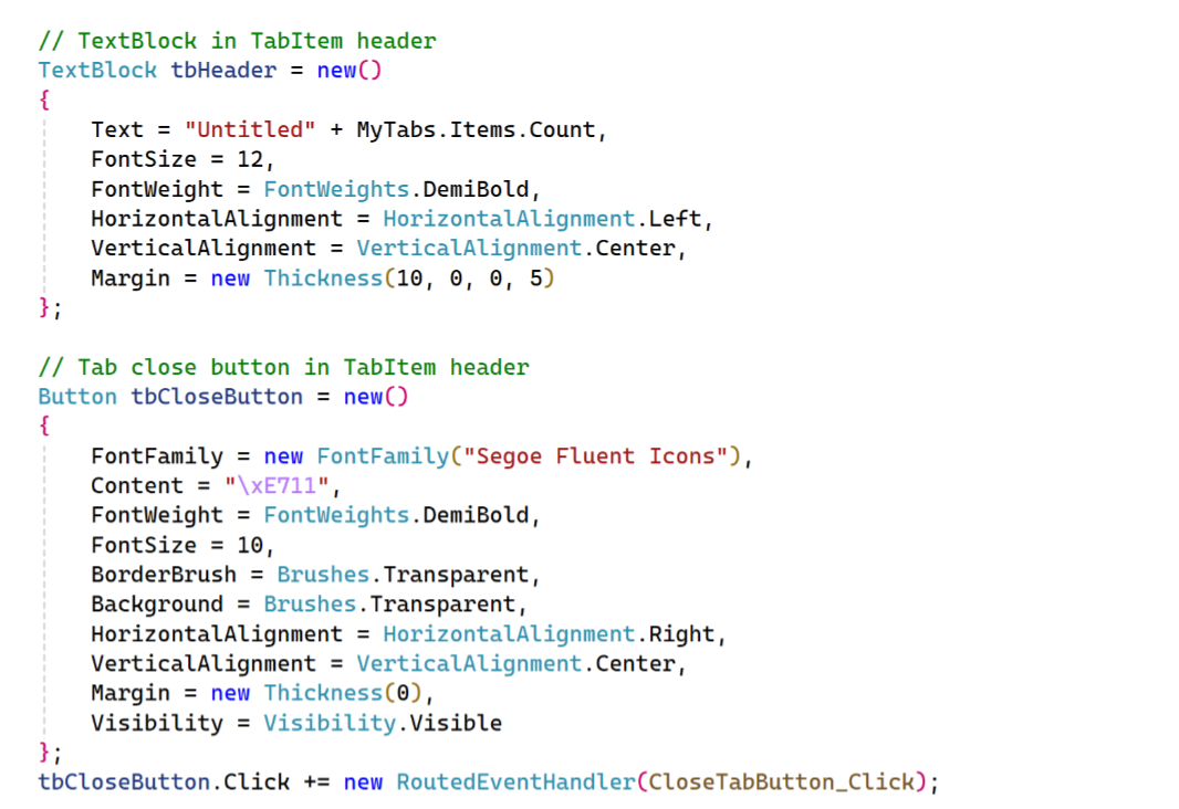
Consider the following (partial) C# code blocks, which are used to dynamically create the TextBlock that displays the document name and the Close tab button in a TabItem header.
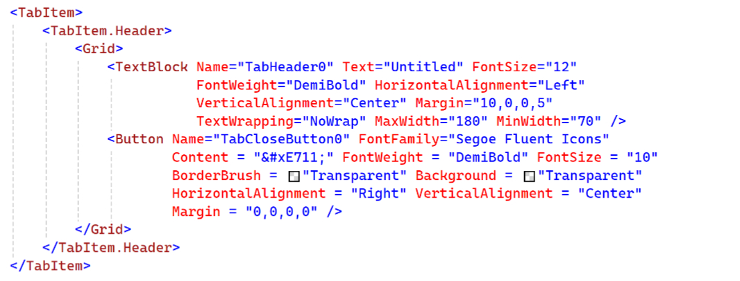
The (incomplete) XAML to accomplish the same looks like so.
With this in place, I can start small. And the document name is the simplest.
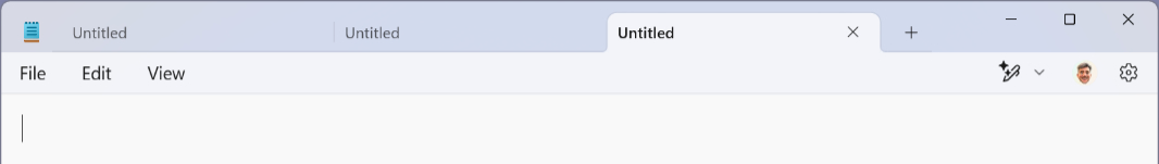
The key to truncating the document name that’s displayed in the TextBlock is that the control must have some width limits. When the document name is short enough (like “Untitled” as per the hard-coded example name here), it fits fine.
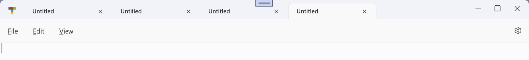
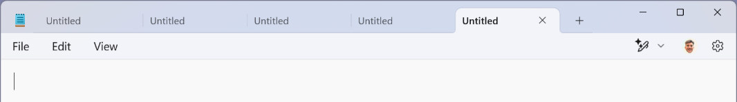
But if the document name is long enough (like “Untitled Untitled Untitled Untitled” or whatever), its display can overrun visually and, in this case, cover up the Close window button.
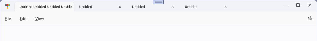
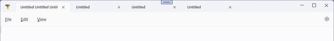
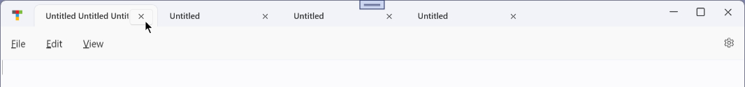
That’s obviously not acceptable. So we can use the TextBlock control’s MaxWidth property to limit how wide it is. And with a bit of experimentation, I can see that setting MaxWidth to 120 has the desired effect. The document name doesn’t intrude into the Close tab button display, even when I mouse-over it and it displays a border.
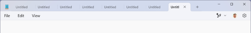
But that’s only true at this TabItem width. In this experiment, the hard-coded TabItem controls are all the same specific width. They will need to resize dynamically. And so the width of the document name display will need to change with it. The TabItem is 185 DIPs (device independent pixels) wide, so perhaps the right value is the width of the TabItem minus 65. Whatever, it will need to happen on the fly as the layout changes.
But what about the TabControl?
Limiting the TabControl width is key here. Keeping it from overrunning as the user adds tabs is another interesting problem, and this is one I’m hoping to solve at a high level in XAML. As noted, the top row of controls in this app consists of five static (non-sizable) items–the app icon, Add tab button, and the three window control buttons–and two dynamic items, the TabControl, which will grow or shrink as the user adds and closes tabs, but only to a point–and the blank space that represents the title bar.
This seems like a problem XAML can solve. I use the Grid control almost exclusively in my XAML layouts because it’s simple and usually works as I expect it to. And it seems like a good choice here. I just need to arrive at the right layout. The static, non-sizable elements are easy enough. But having two dynamic elements is potentially tricky.
In XAML, I can express this user interface row as a Grid with several columns, from left to right. Each column is assigned a Width. Which can be a number (in DIPs), “Auto,” which auto-sizes to its contents, or * (star), which is used for dynamic elements that will take up any remaining space (in this case, horizontally). For example, I might define these columns like so.
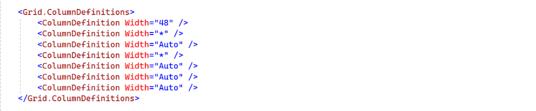
In this case, I am hard-coding the app icon to 48 DIPs. The TabControl is dynamically sized with *. The New tab button is automatically sized to its width. The empty space is dynamically sized with *. And the three window control buttons are all automatically sized to their respective widths.
And yeah, sort of. The problem is those two * (star) columns. I don’t want the TabControl and empty space to be equal widths I want the TabControl to take up all the space it needs until there is no more space. And I want the empty space to take up the rest, if there is any. So perhaps the empty space should be set to Auto.
That won’t work. In that layout, the Add tab button is all the way over to the right, next to the window control buttons. The TabControl is just eating up space.
OK. So what about a Grid within a Grid? It’s a little hard to conceptualize, but this is XAML and I only need to do this once. Instead of the TabControl in that row, I could use a Grid, and that Grid would be set to Auto width. (And the empty space would again be a * width.) That second Grid would have a single row and column of its own, and that would contain the TabControl and …
Ugh.
It’s possible I don’t need the empty space. This is complicated by the custom title bar I’m using, as the empty space is really a Separator control and I use it for window drag and double-click window maximizing. But that could work with the underlying window easily enough. Hm.
There are Width, MaxWidth, and MinWidth properties to consider. The code to dynamically resize each TabItem based on the available space. And probably more. Once again, my head is starting to hurt. I’ve done some experiments in which new tabs (TabItem controls) do not overwrite other controls but don’t appear if the window is too small to display them. I can tab over to them, and the appear when the window is bigger or when I close some tabs. So it’s getting there. But each step forward is met with another challenge, another situation to consider and account for.
One step forward, one step back.
I’ll keep working on it.

Gain unlimited access to Premium articles.
With technology shaping our everyday lives, how could we not dig deeper?
Thurrott Premium delivers an honest and thorough perspective about the technologies we use and rely on everyday. Discover deeper content as a Premium member.