Assessing Apple’s and Microsoft’s Earnings Visually (Premium)
- Paul Thurrott
- Jan 31, 2019
-
22

It occurred to me that there might be an interesting visual way to compare how Apple and Microsoft make money. Doing so highlights Apple’s tenuous position, despite its much higher revenues today, while highlighting why Microsoft’s more diverse business is the safer long-term bet.
The impetus for this is similar to that I employed last November in Missing the Point with Charts (Premium). Then, as now, Apple and its followers seem a bit over-eager to buy into the fantasy that the firm’s rapidly-rising Services business will in some way counter the negative impact of lower iPhone sales. This sounds plausible only if you’re trying to dupe the public or simply don’t know what you’re talking about: Apple’s Services business needs to grow many-fold, and quickly, before it will ever compete with iPhone, revenue-wise. And that growth is already slowing.
But you don’t need to take my word for it. Here’s a pictorial representation of Apple’s major business units, by revenue, with year-over-year comparisons so you can more easily gauge the real impact of the iPhone fall-off and Services growth.
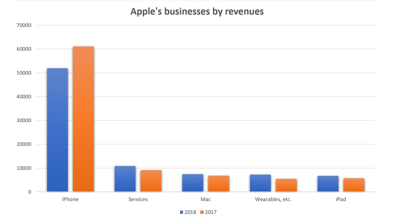
More to the point, the Services business is entirely dependent on iPhone. Like Apple Watch, but unlike Mac or iPad, Services is almost entirely dependent on a healthy iPhone business. Meaning it pretty much wouldn’t exist—or would at least be tiny—without iPhone. Health can be measured in many ways, of course. And it is fair to point out that the iPhone user base is huge (900 million users) and that Apple still sold approximately 63 to 68 million iPhones in the most recent quarter, second only to Samsung.
That said, what this chart really shows is how dependent Apple is on a single business, iPhone. Were this business to continue falling off, quarter after quarter, Apple would be in trouble: Its other businesses combined are only about one-third the size of the iPhone business.
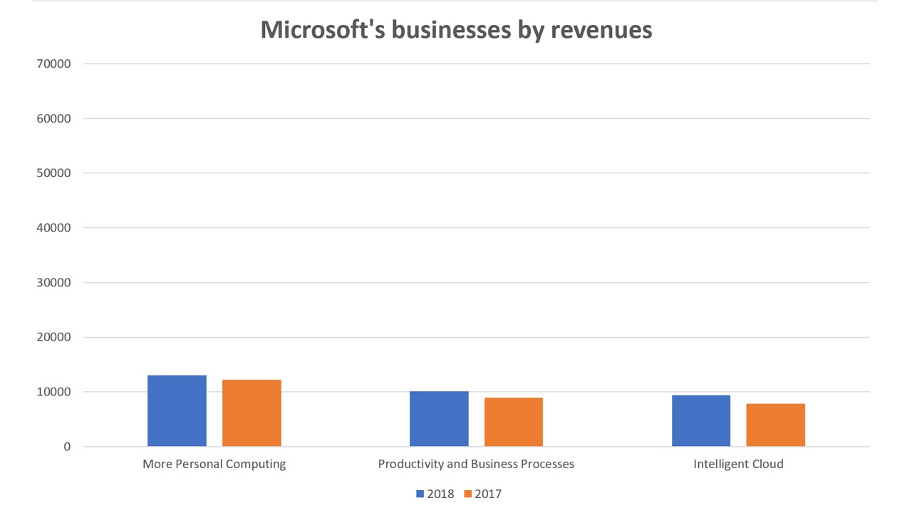
Compare this to Microsoft.
Microsoft has only three primary business units—More Personal Computing, Productivity and Business Processes, and Intelligent Cloud—but they each contribute nearly-identical revenues each quarter, and each is made up of several major products.
A couple of notes.
I made sure the Microsoft chart used the same revenue range as the Apple chart, both so you could see the relative sizes of each company’s revenues by business and to ensure the scale of the Microsoft business unit revenues wasn’t skewed in some ways.
Apple’s revenues are much higher than Microsoft’s. Indeed, iPhone all by itself is significantly bigger than all of Microsoft by revenue.
And most people, looking at that delta, would rather be in Apple’s shoes than Microsoft’s. But that’s for the short term: Apple’s reliance on a single product could doom the company unless it figures out another hit. By comparison, Microsoft’s business is far more stable, and it could sustain a single major product death more easily. There is almost no reliance on a single big product, as is the case with Apple.
Speaking of which: None of those Microsoft business units aligns with just a single product, as do Apple’s. If you look at More Personal Computing, for example, you will see that it is made up of Windows (both consumer and commercial), Surface, Xbox, and more. If Microsoft split up its business units as Apple did, there would be dozens of them.
One final note: To give Apple’s Services business its due, I will point out that it is now bigger than Microsoft’s Productivity and Business Processes unit. That means that Apple Services—which again, exists almost solely to serve iPhone users—is bigger than Microsoft 365/Office 365, Office (commercial and consumer), LinkedIn, and Dynamics combined.
Interesting stuff.

Gain unlimited access to Premium articles.
With technology shaping our everyday lives, how could we not dig deeper?
Thurrott Premium delivers an honest and thorough perspective about the technologies we use and rely on everyday. Discover deeper content as a Premium member.