Hands-On with Android Q Beta 4

When Google announced the first Android Q Beta back in March, I installed it on my Pixel 2 XL to see what was new. Since then, the Android Q beta has proceeded on a very regular schedule, with Beta 2 released in April and Beta 3 arriving in May.

But concurrent to this, Google also announced the Pixel 3a and Pixel 3a XL handsets in early May. So I decided to buy a Pixel 3a XL, and to make the purchase even more affordable, I traded in my Pixel 2 XL, and for a reasonable $263, by the way. I really like the Pixel 3a XL, but with the Pixel 2 XL gone, I needed to figure out which handset to use with the Android Q Beta.

Windows Intelligence In Your Inbox

Sign up for our new free newsletter to get three time-saving tips each Friday — and get free copies of Paul Thurrott's Windows 11 and Windows 10 Field Guides (normally $9.99) as a special welcome gift!

"*" indicates required fields

This field is for validation purposes and should be left unchanged.

I would have installed Beta 4 on my Pixel 3 XL last week, but there was apparently some kind of an install blocking issue. So I un-enrolled that device after a few days of waiting and then enrolled my Pixel 3a XL, which I brought with me on this week’s trip to Washington D.C. And sure enough, I got the install prompt Wednesday during Windows Weekly. So, I finally installed the latest Android Q beta and can now check out all of the new features.

The biggest change, I think, is the new gesture navigation system, which, as many have noted, is identical to gesture navigation on home button-less iPhones like the X, XS, and XR.

I’m not sure that I like it. And it’s not a lack of familiarity: I’ve used this navigation system across a few iPhones already and think it works well on that system. But I also prefer the two-button navigation system that Google introduced in Android 9 Pie. Fortunately, both will be options in Android Q.

Google calls the new system fully gestural navigation and, sure enough, it relies entirely on gestures instead of virtual buttons (as in the traditional 3-button Android navigation bar) or some combination of virtual buttons and gestures (as with two-button navigation). If you know how newer iPhones work, it’s not just similar, it’s identical, with one major addition tied to the Android All Apps screen.

You can tell you have fully gestural navigation enabled because there are no on-screen navigation buttons. Instead, you see a subtle horizontal line, similar to on the iPhone.

To go Home, display the Overview (app switching) screen, or display All Apps, you swipe up from the bottom center of the screen to different degrees. That much overloading can be confusing, and it is. But I suppose it’s like anything else: Use it enough and it becomes familiar.

Even more confusing, at least at first, is that you go back by swiping to the right from the left edge of the screen. This, too, will etch itself in my brain soon enough, but on more than one occasion, I’ve found myself at some dead-end in an app like Facebook, with no visible, onscreen way to go back to the previous display, just staring at it in confusion.

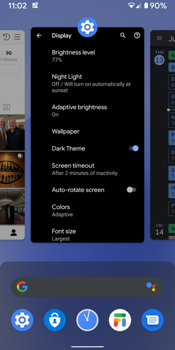
The second major change in Android Q is the formal, system-wide support for a Dark Theme. As you might expect given the timing, it’s a bit of a mixed bag at the moment. Most system interfaces—the search box on Home, the Google Discovery feed, Settings, and so on—are correctly dark-looking.

But most apps, including some of Google’s, don’t yet support Dark Theme. Gmail doesn’t, though Google Calendar does. Messages does, but you have to set it manually. You get the idea.

Beyond those two major features—fully gestural navigation and Dark Theme—I’ve only noticed a few other new features so far.

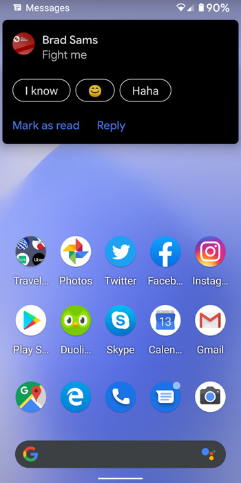
For example, notifications now provide suggested replies and actions. For Messages, shown here, the suggested replies are the same options you’d see in the app itself, which is nice.

And the Share pane now uses a new underlying technology and is faster than before. It’s not instantaneous, but it is definitely faster.

That’s all for now, but I’m sure I’ll uncover more as I keep using it.

Tagged with

Share post

Please check our Community Guidelines before commenting

Conversation 19 comments

  • JacobTheDev

    Premium Member
    13 June, 2019 - 11:39 am

    <p>I've been running the Q since Beta 3, using the fully gestural navigation full time. I generally like it, but I agree that the edge swipes to go back are problematic. I actually do like the feature, but at the same time, I find it incredibly annoying in apps which have a pull-out menu, as it makes it difficult to access those menus. In Beta 4, they improved this by allowing developers to set "dead" edges to maintain compatibility with their app drawers, but it's not ideal.</p><p><br></p><p>Personally, I'd much rather have the back gesture work only on the bottom 25% or so of the screen — this would allow app drawers to mostly work as they historically have, but still provide a means to go back.</p><p><br></p><p>I'm also not a fan of Google's implementation of "dark mode" in the system UI. They're using solid black in places like the notification shade and the settings app. I wouldn't mind the settings app really, but the notification shade looks overbearingly dark in my opinion. Wish they'd go back to the Android P "dark" shade instead.</p><p><br></p><p>Hoping to see some improvements in these as we move closer to release.</p>

  • rbwatson0

    Premium Member
    13 June, 2019 - 12:03 pm

    <p>How much different is this gestural navigation from OnePlus' implementation?</p>

    • Paul Thurrott

      Premium Member
      13 June, 2019 - 2:58 pm

      <blockquote><em><a href="#435113">In reply to rbwatson0:</a></em></blockquote><p>The swipe up gestures for Home and Overview are very similar. OnePlus uses a weird gesture for app switching (swipe up from bottom center, swipe right, release) for Switch to previous app, and another weird one (swipe up from the left or right bottom of the display) for Back.</p><p><br></p><p>I think Google's/Apple's scheme makes more sense. </p><p><br></p><p>But with stock Android and OnePlus, you can at least choose three-button and two-button navigation instead if you prefer that.</p>

  • Pbike908

    13 June, 2019 - 12:07 pm

    <p>Hmmm….call me a luddite, however, give me nav buttons at bottom of screen…I am always outside, cycling, skiing, hiking, walking the dog, etc. Swipe navigations sucks unless one is sitting in a chair — especially single handed. </p><p><br></p><p>This is also why I like under 6" inch screen — current phone Galaxy S8</p>

    • Winner

      13 June, 2019 - 1:20 pm

      <blockquote><em><a href="#435115">In reply to Pbike908:</a></em></blockquote><p>Currently using Android P and frankly I prefer the old 3 buttons as well. The multitasking was easier and the screen splitting was easier as well. It's a shame Google thinks they need to copy all of Apple's worst features.</p>

      • Paul Thurrott

        Premium Member
        13 June, 2019 - 2:53 pm

        <blockquote><em><a href="#435123">In reply to Winner:</a></em></blockquote><p>The good news is that this navigation style is still available. </p>

        • pcdoeswhat

          13 June, 2019 - 7:49 pm

          <blockquote><em><a href="#435184">In reply to paul-thurrott:</a></em></blockquote><p>Thanks for the tip, Paul. I’m installing the beta on my Pixel 3a just to get those buttons back!</p>

        • Winner

          13 June, 2019 - 8:41 pm

          <blockquote><em><a href="#435184">In reply to paul-thurrott:</a></em></blockquote><p>I had read that wasn't the case on the Pixel 3's. I have a Pixel 2 so can't verify that.</p>

  • Matt Kelly

    13 June, 2019 - 10:51 pm

    <p>Brad’s message in the screenshot hahahaha</p>

  • David Guillaume

    14 June, 2019 - 4:18 am

    <p>I've not used a pixel or iPhone gesture navigation, but really like the Samsung, it's so simple. Just swipe up from the bottom middle to go home, bottom left to switch and bottom right to go back. </p>

    • wright_is

      Premium Member
      14 June, 2019 - 10:20 am

      <blockquote><em><a href="#435260">In reply to David Guillaume:</a></em></blockquote><p>I like the Huawei version as well.</p><p>Swipe up from the bottom middle goes to the home screen, swipe up from bottom and hold opens the task list and swipe from left or right goes back.</p>

    • bill_russell

      17 June, 2019 - 12:56 pm

      <blockquote><em><a href="#435260">In reply to David Guillaume:</a></em></blockquote><p>I have only used iPhones with the home button, (pre-X) but they still have in-app 'back' by just swiping in from the left edge which I like. If the phone supported 3d touch you could also pop up the recents by pressing hard on the edge but it was hit or miss.</p>

  • Jeremy Turnley

    14 June, 2019 - 12:24 pm

    <p>After using the gesture system for a month before I went to the beta, and I say I really didn't like it. It adds extra steps to do things, rather than simplifying them. The entire point of a good UX is to not get in the users way, and that's exactly what the two-swipe method to get to your apps does. It became even more clear once I upgraded to the beta, and it mercifully switched me back to the nav buttons. Every function that I needed was back to a single tap or swipe away, as it should be, while still keeping the (actually pretty nice) improvements to the app drawer and the app switcher. The core of good UX design is one that a person can just intuitively use. Hiding the apps behind a two-swipe system is not intuitive, guys, nor is a gesture system that does different things depending on what is on the screen.</p><p><br></p><p>I know there's a big temptation to follow whatever the other guy is doing on phones, but sometimes the other guy just got it wrong. Following Apple (who still have not decided to bless their customers with a back button) on UX is usually a decision that you want to think through a bit more. A lot of Apple's decisions in that regard are made purposely arcane, so that if a customer tries to switch to a different platform they get confused and come back. You don't need to do that when your OS has 70% of the market, Google.</p>

    • Eric Dunbar

      16 June, 2019 - 6:05 am

      <blockquote><em><a href="#435315">In reply to illrigger:</a></em></blockquote><p>"Big temptation to follow… Sometimes the other guy is wrong"</p><p><br></p><p>I'm not at all fond of the app switcher gesture in full gestural navigation, however, that's an easy fix. The gesture with the two button nav bar is just right. Simply copy that behavior. Why Google hasn't done that i don't understand.</p><p><br></p><p>Apple's back gesture is almost perfect compared to the mess that the back button is in Android. The back button is on its last legs as are hardware buttons (or even buttons for that matter). Every manufacturer puts its back button in a different place and each app behaves differently (I suppose that's because for us Android users we're an afterthought to developers so they build for iPhone and then port).</p><p><br></p><p>I've barely ever used an iPhone that had the back gesture (I switched to Android from an iPhone 4s) but the few times that I've used an iPhone with that gesture it felt like a fantastic implementation. What makes it great is the animation and that it's 100% intuitive. Swipe from left to right to go back. Swipe from right to left to go forward. I do not understand why Google has the same action for both edges of the screen in Android Q 10.</p>

  • Slepr

    Premium Member
    14 June, 2019 - 3:25 pm

    <p>Seems very similar to Oxygen OS on my OP6. I hid the navigation buttons months ago and really love the all gesture control. </p>

  • peterh_oz

    15 June, 2019 - 10:37 am

    <p>For those of us using the Microsoft launcher, do you notice many differences? How do those navigation changes play out with the MS launcher, on a phone with actual buttons (Nokia 6.0)?</p>

  • bill_russell

    17 June, 2019 - 12:49 pm

    <p>I believe the 2 button system (with the 'pill') is not going to be an option in the final version of Q, just the classic 3 button and new one. </p><p><br></p><p>I don't like the 2 button system because it seems like you never know what two apps are going to toggle intially, making that important action end up unused by me. Some apps gain focus just by being displayed and other ones you have to have touched into first.</p>

  • kdjones74

    Premium Member
    17 June, 2019 - 10:55 pm

    <p>Isn't there a new "desktop" mode? I'm very curious to see if it'll give a good enough desktop experience when connected to something like the Sentio Superbook (I have one).</p>

  • jaydowg23

    21 June, 2019 - 10:48 pm

    <p>Can someone who has the beta installed on a pixel 2 or 3 tell if Google has lifted the dumb setting of the phone only using the bottom speaker when ringing or notifications?</p>

Windows Intelligence In Your Inbox

Sign up for our new free newsletter to get three time-saving tips each Friday

"*" indicates required fields

This field is for validation purposes and should be left unchanged.

Thurrott © 2024 Thurrott LLC