Google Rolls Out Play Store Refresh
- Paul Thurrott
- Aug 21, 2019
-
8
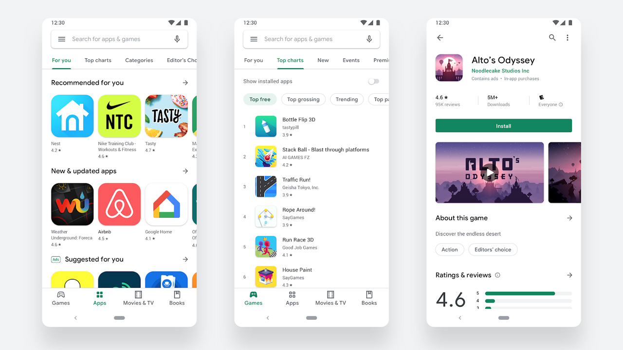
The Google Play Store on Android and Chrome OS received a visual redesign this week with a new look and new navigation.
“The Google Play Store has over two billion monthly active users coming to find the right app, game, and other digital content,” Google’s Boris Valusek writes. “To improve the overall store experience, we’re excited to roll out a complete visual redesign. Aligning with Material design language, we’re introducing several user-facing updates to deliver a cleaner, more premium store that improves app discovery and accessibility for our diverse set of users.”
Here’s what’s new.
Material design. Like Google’s other recently-redesigned apps, the Play Store now features a minimalist, white-heavy design that uses color to call out “action” items.
New navigation. On Android phones, there is a new navigation bar on the bottom of the screen with Games, Apps, Movies & TV, and Books items. On tablets and Chrome OS, it’s on the left.
Updated store listings. When viewing an app or game in the Store, you’ll see a new layout with richer information at the top and more prominent Install (and similar) buttons.