Hands-On with Android 12 Beta 1

At Google I/O 2021 this past week, Google announced that Android 12 would launch with a major new UX refresh for the first time in years. It also made Android 12 Beta 1 available for developers and other customers to test, and while it doesn’t have all of the visual goodness Google promises for the final release, it’s still an exciting enough update that I’ve installed it on my Google Pixel 4a and Pixel 4a 5G.

Here’s what I’ve seen so far.

Windows Intelligence In Your Inbox

Sign up for our new free newsletter to get three time-saving tips each Friday — and get free copies of Paul Thurrott's Windows 11 and Windows 10 Field Guides (normally $9.99) as a special welcome gift!

"*" indicates required fields

This field is for validation purposes and should be left unchanged.

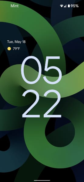
First, I hope you like rounded rectangles: As we’re seeing on other personal computing platforms, Google is softening the look of major UI components by rounding their corners. And it’s the first thing I noticed, literally: When the Pixel rebooted following the Android 12 Beta 1 install, a rounded “Finishing system update” dialog appeared over the refreshed lock screen.

That new lock screen and the related always-on screen are particularly nice-looking, I think, with the clock more centered on-screen and using a large, easily readable font. Curiously, the date and weather are correspondingly tiny, however.

Because the phone had to reboot to install the update, the next step is to sign in with a PIN, since the normal fingerprint-based sign-in method is unavailable. Here, too, we can see some pleasant new UI in the form of a larger, new PIN number pad with round buttons.

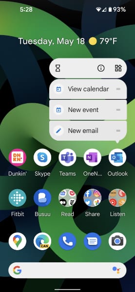
After signing in, the phone displayed the home screen, which hasn’t changed in any obvious way. Here, you can see my old Android 11-based home screen on the left and Android 12 on the right.


But if you start navigating around and opening apps, the differences start stacking up. For example, when you press and hold on a blank area of the home screen, the menu with Home settings, Widgets, and Styles & wallpaper options, is a rounded rectangle.

So, too, are the menus that appear when you press and hold on any home screen icon.

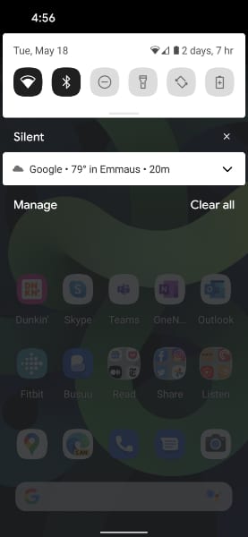
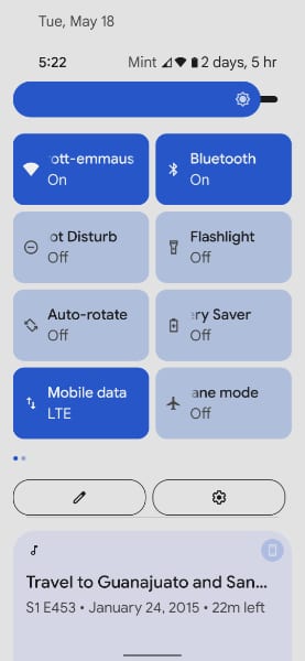
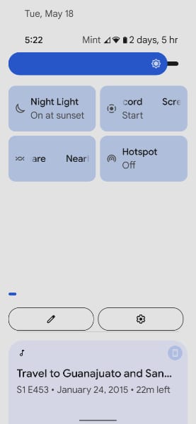
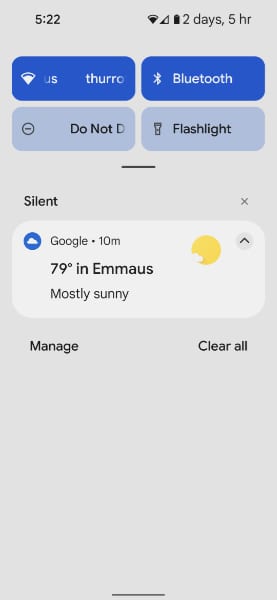
Pull down the notification shade, and you’ll see some major changes. The Quick Settings area, which used to consist of a grid of roughly square icons, now displays only four options by default, since the icons are rounded rectangles large enough to support only two icons per row. Here, again, is Android 11 on the left and Android 12 on the right.


Pull down further and the notification shade, and Android 12 will display 8 Quick Settings icons, two per row, and you’ll get your first peek at the new Android 12 slider control, which is used here for the Brightness slider at the top. This UI, like that for volume and other similar controls, is now much larger and more easily accessed with a finger. Again Android 11 (left) and Android 12 (right) compared:


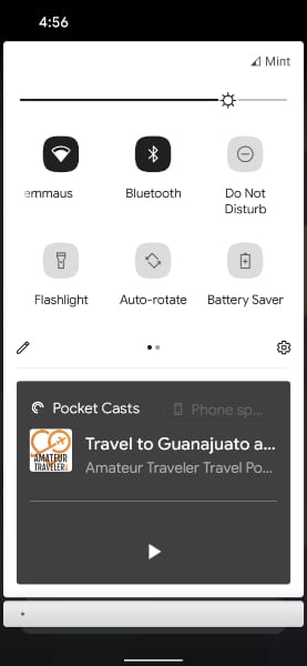
I should mention that one of Android 12’s key new UX features, a dynamic theming capability that lifts colors from your home screen wallpaper and applies them across the UI, is not available in Beta 1. So all of the controls are styled with a medium blue color, at least on my handset. Dynamic theming is coming in a future beta release.

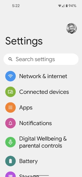
There are other changes. Settings has a much cleaner look but because I had configured my phone with the largest possible font size, they looked a bit large the first time I did so. (I’ll need to bump down the font size with Android 12, I guess.) Here, again, is Android 11 (left) compared with Android 12 (right):


And when you launch apps, they now display a large app icon in the middle of the display before transitioning to the app itself. I guess we can view this as a splash screen of sorts for those apps that don’t have one already.

I really like the rounded rectangle look in notifications, which you can see on the home screen/always-on display, in the notification shade, and when they pop up while you’re doing something else. There are subtle gaps between the different areas of these notifications, as is the case with pop-up menus too, through which the background peeks. And they seem to offer more padding, which takes up more space but is more visually appealing as well.


You can see the larger new UI elements at work in other places, too, including the Volume pop-up that appears when you change the volume.

Obviously, there are more visual changes to come. In addition to the aforementioned dynamic theming, Android 12 will provide much prettier on-screen widgets, similar to those Apple first shipped in iOS 14, and, yes, they will be styled as rounded rectangles and squares as well. These together constitute what I feel is a major and most welcome change to Android. And they will provide Android users with a more modern and visually attractive UI that is similar to what Apple did with iOS 14 and macOS Big Sur. And hopefully what Windows 10 users will see with the “Sun Valley” update whenever that comes together.

More soon.

Tagged with

Share post

Please check our Community Guidelines before commenting

Conversation 22 comments

  • ben lee

    22 May, 2021 - 12:11 pm

    <p>I gave it a quick look on my Pixel 4, though two of my most used apps didn’t work so had to roll back after, couldn’t live without my banks app. I was very impressed with it though, it really felt more responsive and fluid while navigating too. I loved the subtle little stretch and bounce you get when reaching the end of a scroll. Overall the new design language feels more thought out, welcoming and comfortable to use. </p>

    • ben lee

      22 May, 2021 - 12:14 pm

      <p>I am actually exited by an android release again. With Windows Sun Valley, plus this year should be a major update to iPad OS, this year is looking pretty great for interesting new OS releases.</p>

      • veermaharaj

        24 May, 2021 - 4:52 pm

        <p>I can’t wait for Windows to no longer be a mishmash of (some) Luna/Royale + Aero + Metro + Fluent garbage.</p>

  • matt11to5

    Premium Member
    22 May, 2021 - 12:43 pm

    <p>It reminds me a lot of OneUI. At least like the settings page does.</p>

  • wright_is

    Premium Member
    22 May, 2021 - 12:57 pm

    <p>Lock screen from the HTC devices from 2010, the rounded buttons on the pin screen from current Samsung phones.</p><p>Rounded rectangles from early 2000s Linux. </p><p><br></p><p>A bit strange, that you have rounded rectangles everywhere, but the settings is completely free of formatting. I think the Samsung settings in 11 are now consistent with the 12 look and feel than Google’s 12 settings. </p><p><br></p><p>The volume control is also reminiscent of the Samsung control. The same with the rounded notifications. </p><p><br></p><p>All in all, I find the look better than standard 11 and it has taken the best bits from other systems and mashed them together in a cohesive look and feel. </p>

    • Jeremy Turnley

      22 May, 2021 - 2:32 pm

      <p>I got that impression as well – it’s like a less refined version of OneUI 3. I guess considering they are working closely with Samsung on the WearOS update, it makes sense that if you want to have a consistent UX experience that they would need to be based on the same design language. </p><p><br></p><p>Samsung sells at least an order of magnitude more phones than Google, so working with them is probably a good idea from a business perspective. They futilely tried copying Apple, but there’s no way that you are luring a meaningful number of people from the Apple camp to the Pixel, maybe they can steal some of Samsung’s customers instead – Android users aren’t nearly as brand-loyal after all.</p>

  • mikefarinha

    22 May, 2021 - 1:12 pm

    <p>I usually don’t care about design but I’m having this weird feeling of disgust with this design. </p><p><br></p><p>Reminds me of the fisher price design of windows xp, in a bad way. </p>

  • scovious

    22 May, 2021 - 1:19 pm

    <p>Can users fix the lock screen clock so it’s horizontal instead of vertical, or is that strange perspective forced?</p>

    • godsack

      Premium Member
      22 May, 2021 - 4:58 pm

      <p>I believe if you have updates enabled on the lock screen it will reorient the clock to horizontal on the top. At least that’s how my Pixel 4 XL behaved.</p>

    • veermaharaj

      24 May, 2021 - 4:53 pm

      <p>It only took 10 years, but they are now copying Sony.</p>

  • greenloco

    22 May, 2021 - 1:31 pm

    <p>This looks a horrible UI change.</p>

  • Pulagatha

    22 May, 2021 - 2:10 pm

    <p>I do not like the UI design.</p>

  • bhatech

    22 May, 2021 - 3:46 pm

    <p>I’m loving it as well on my Pixel 5. And they have more changes coming fall, Pixel 6 looks awesome this year and excited for this fall </p>

  • codymesh

    22 May, 2021 - 5:11 pm

    <p>I decided to go back in time and search for Android 8 screenshots…</p><p>…and I swear to god, I think Android 8 still has the cleanest quick settings design.</p>

  • bigginge

    23 May, 2021 - 3:12 am

    <p>Oh how I miss Windows Phone….. </p>

    • Paul Thurrott

      Premium Member
      24 May, 2021 - 8:40 am

      Windows phone never looked this good.

  • kjb434

    Premium Member
    23 May, 2021 - 12:29 pm

    <p>Now just to wait until it’s get re-worked as part of GraphenOS.</p>

  • crunchyfrog

    24 May, 2021 - 9:55 am

    <p>Google sure takes good care of Android which is why I keep a Pixel around. I sure wish they’d take good care of so many of their other products and services instead of letting them wither on the vine and cutting them loose.</p>

  • eeisner

    Premium Member
    24 May, 2021 - 12:26 pm

    <p>How’s performance? Tempted to put this on my S20, though I don’t know if I want to have my daily driver be a beta.</p><p><br></p><p>Not a huge fan of the UI change on the settings menu or the quick controls in the dropdown. Everything else looks really, really nice though. </p>

  • swish41

    24 May, 2021 - 1:10 pm

    <p>Iv been running it for about 2 months was on the developer preview also alot of great things google has done. They have came along way!</p>

  • ianhead

    25 May, 2021 - 5:20 am

    <p>Hmmmm, I… don’t like it. </p><p><br></p><p>Honestly, in all the side-by-side comparisons, I just think the older version looks so much smarter, more functional, more informative and more professional. Aesthetically I’m just not digging it. The extreme roundness of everything and Google’s font choice nowadays is too much for me. I get the want to make it look more friendly and inviting, but it’s an overcorrection from the harshness of the Holo design days. Maybe it comes together better in motion, like Metro used to do on Windows Phone.</p><p><br></p><p>The new sliders seem like a good change, though, as does the notion of taking up most of the top portion of the screen with the heading in some of the settings panels – makes good sense in the context of one-handed access on a tall screen.</p>

Windows Intelligence In Your Inbox

Sign up for our new free newsletter to get three time-saving tips each Friday

"*" indicates required fields

This field is for validation purposes and should be left unchanged.

Thurrott © 2024 Thurrott LLC