Chrome OS 104 Finally Brings Dark Theme to Chromebooks
- Paul Thurrott
- Aug 05, 2022
-
2
Google this week began rolling out Chrome OS 104 to the stable channel. Among other things, the release adds long-awaited Dark theme support.
I wish Google was more upfront about these releases: the only publicly available Google post about Chrome OS 104 doesn’t even mention any new features but instead references a list of bug and security fixes.
Worse, when you upgrade to Chrome OS 104 on a Chromebook, the Explore app provides a short list of new features, but it doesn’t mention the two biggest changes I can see, support for Dark and Light themes, similar to what we see on macOS and Windows 10/11, and a new windowed Launcher experience that no longer takes up the full screen as before. (And makes Chrome OS look more like it originally did, a sort of Windows 7 clone, albeit with more modern visuals now.)
Anyway, based on what I see, what the Explore app does explain, and a few third-party blog posts, here are what I believe to be the biggest new features in Chrome OS 104.

Dark and light themes. This works exactly as expected, in that it can be toggled between the two modes as needed and can work automatically on a schedule. Unfortunately, Google hasn’t killed off the glaring and stark white look that dominated Chrome OS before; instead, many windows are still white in Light mode. So it’s a bit like how this works in Windows 10/11, meaning it’s inconsistent but better than nothing. Also, a new Wallpaper & style app helps you switch between the Light and Dark themes and customize your wallpaper.

New visual style. Speaking of inconsistent, those UI elements that are impacted by the new themes now feature rounded corners like we see in Windows 11. But many elements, like windows still have squared off edges. That’s too bad, and the new look is very nice.

New windowed Launcher. Chrome OS’s version of the Start menu finally moves from an unwieldy full-screen experience back to a window or pane, and it’s very much like the Windows 11 Start menu in that it has rounded corners and is floating, but it’s over on the left as in Windows 10. It’s also still just a dumb grid of icons.

Improved photo experience in Phone Hub. The Chrome OS Phone Hub is a bit like Windows 11’s Phone Link except that its integrated into the Shelf (Chrome OS’s Taskbar) and appears as a small flyout. With Chrome OS 104, you can now see recent photos in Phone Hub along with other phone functionality like Enable hotspot, Silence phone, Locate phone, and Recent Chrome tabs. (I’m not seeing photos yet for some reason.)
Improved screen capture. Chrome OS has always provided a way to take screenshots, but now the integrated screen capture utility supports voice and video recording too. (A previous update added the ability to change where screen captures are stored.)
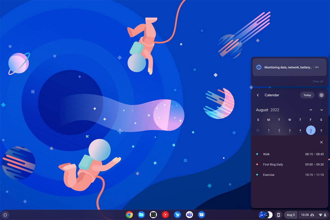
New Calendar flyout. In Chrome OS 104, the date and time display are now separated. And while clicking on the time still opens the Quick settings panel as before, clicking the date opens a new interactive Calendar pane. You can click on any date to see whatever Google Calendar events you have that day, and you can click any of those events to open it in Google Calendar in a Chrome window.
I’m sure I’m missing some things, but even this list makes for a pretty impressive upgrade.