For the Love of Dynamic Island (Premium)
- Paul Thurrott
- Oct 15, 2023
-
16
When Apple announced Dynamic Island with its iPhone 14 Pros in September 2022, I literally laughed out loud. Apple had, to this time, burdened its users with a large, screen-occluding notch for years, and instead of just moving to a hole punch in-screen camera like its competitors, it seemed to be doubling down on the stupid by removing some of the top border area from around the notch and creating a floating, pill-shaped occlusion that was in some ways even more distracting. But that’s not all. Apple was also drawing even more attention to this curious on-screen mote by creating an animated user interface around it.
As Daffy Duck used to say, “It is to laugh.”
The Dynamic Island, as I saw it, was classic Apple, a passive-aggressive “f#$% you” response from a thin-skinned company that can’t handle negative feedback from reviewers or users. And rather than reverse course, it would prove the naysayers wrong, a strategy that, incidentally, did not work with its Butterfly keyboard previously. This feature was, I claimed, the iPhone version of the MacBook Touch Bar, a bizarre thing to foist on its pro users, one it would surely walk away from belatedly and silently, and with nary a word of apology.
Well, I was right about one thing: The Dynamic Island is classic Apple, albeit not in the way I’d imagined. But I was wrong about everything else. In fact, Dynamic Island is so useful that I’m going off the deep end in the opposite extreme: I think this UI will survive past the point where Apple can remove the camera hole and can finally hide its TrueDepth camera below the screen. Hell, I expect to see it appear on other Apple devices, too, like the iPad and the Mac, and to be copied by competitors. It’s that good.
If I can defend myself a bit, I will point out that this isn’t as basic as me having to use something to realize its value; I’d like to think that I’m more sophisticated than that. I mean, who wouldn’t? Instead, I will simply point out that the initial use cases for Dynamic Island were limited in nature and wrapped in the usual Apple marketing drivel. A year ago, it seemed that for this feature to truly make sense, it needed to be adopted by a wide range of third-party apps, and in unique and useful ways. And that basically never happened with the Touch Bar, which was the inspiration behind my initial comparison.
But it has happened with the Dynamic Island. And maybe the difference this time around is due to the dedication of developers to the iPhone, a dedication that isn’t quite so universal on the Mac. Or maybe it’s something else. Maybe Dynamic Island was always a great idea. One that just needed a little love from third-party developers to truly shine. And maybe a little less marketing drivel.
We can speculate. And if you want to believe I was mindlessly casting shade last year on a company I frequently criticize, that’s fine. I will survive this.
The thing is, Dynamic Island addresses one of the weakest parts of the iPhone user experience without even addressing the underlying issues. I am referring, of course, to notifications, which have become so complex and varied that I suspect most users don’t even understand all the ways that they can appear and all the ways in which they can be customized.
I don’t want to get off track here: A full description of the problem with iPhone notifications would be a lengthy digression. But let’s tackle this from a high level.
Mobile platforms and the apps that run on them have introduced many useful user experience conventions to the world of personal computing, ideas that are so good that they have made their way into ostensibly more complex and powerful desktop systems like Windows and the Mac. (Steve Jobs once described bringing ideas from iOS into the Mac as a virtuous cycle.) And among these conventions are such things as background processes and push notifications and how they are specifically implemented on mobile. There’s an app and it wants to tell you something. The system needs a way to allow this, and it needs a formal system to let the user view this information and, when needed, respond in some way.
Email is the canonical example here. You’re doing something. Your email app isn’t even running. But thanks to background processes, the app has been alerted to one of those somethings, in this case a new email arriving in your inbox. And if you allow such a thing, it would like to tell you about it, even if that means interrupting whatever it is you are doing.
In the early days of the iPhone, Apple offered developers only one way to tell you about this and other somethings: They could add a red dot overlay that Apple calls a badge over the top right corner of their app’s home screen icon, alerting you that something had happened. And the only way you could find out what it was—and therefore remove that icon badge—was to open the app and look. It was better than nothing, just not much better.
Over time, Apple—and Google, with Android—offered more sophisticated ways to notify users when something happened. And today, the two systems are generally similar, including the degree to which users can configure the behavior of these notifications on an app-by-app basis. I just find Android to be easier and more obvious.
Both systems still display app icon badges, of course. But in the most egregious possible configuration, an email app (to continue the example) can deliver notifications in large UI panes to the lock screen, notification center/shade, and home screen, and they can be configured to remain on screen persistently, forcing the user to deal with them. These notifications can also optionally play a sound (annoying!) and display rich information about the underlying event—again, a new email message—so the user can learn more without having to even open the app.
This is all very nice, but what the user wants to do, especially if they’ve allowed this app to annoy them so much, is deal with that underlying event, the new email message. And Android and the iPhone both offer various ways to do that from the lock screen and notification center/shade pull-down over the home screen. Again, I find Android’s capabilities here to be usable and obvious. And on Pixel, you get an additional nicety, as you can also more easily reach the Android notification shade: Where Apple requires you to swipe down from the very top edge of the screen, which can be a bit of a stretch, Pixel lets you do so from anywhere while on the home screen; this is much easier, and I miss it when I move to the iPhone.
(Apple, I’m begging you. Let users swipe down from the middle/left of the screen for notifications and on the right side for Control Center. It will transform your users’ lives.)
Both systems also provide in-line ways to deal with notifications without even opening the app: Just tap and hold on a notification in the notification center on iPhone and an inline UI will appear; on Android, a Reply option is on-screen alongside Archive, no secret incantation required. On the iPhone, you have to swipe the notification to find these types of options. It’s an extra step, but the capabilities are similar. Except that “clearing” a notification doesn’t tell the underlying app you’re done with. (When you press and hold on Android notifications, you can configure how notifications for the underlying app are delivered, which is nice.)
Anyway, it was into this complex mess that Apple first introduced Dynamic Island. Yes, it’s yet another way for apps to notify you, in some cases, though it does more than that as well. We’ll get to that. The important point for now is simply that there is nothing in Apple’s history with mobile notifications to suggest that there was a genius idea waiting to emerge. I was just hoping they’d manage notifications as obviously as is the case on Android.
They have not done that, at least not with traditional notifications. What they have done, inexplicably, is create something new, something that is both complementary to and better than traditional notifications. And here, my email example falls flat. I’m sure there’s an email app out there that does use the Dynamic Island to great effect. (Gmail does not.) But that’s not really what it’s for. A little envelope animation, or whatever, inside of a pulsing Dynamic Island would be gratuitous.
No, Dynamic Island is more sophisticated, and it addresses another interesting problem on mobile devices that’s related to multitasking (which, granted, also has its own traditional and similar user interfaces in both Android and iPhone). And so I will need to use different examples.
Consider an app like Uber. You use it to find a driver who will take you to a particular location, and while some will sit there in the car with the app open during the trip, others will start reading, playing games, texting, or do other things, and perhaps across a wide variety of apps. If the Uber app needs to contact you for some reason—perhaps the car hasn’t moved in a while because of traffic and the service is checking to see if you’re OK—a standard notification banner would likely suffice. But if you need to get back to Uber, perhaps because you’re suddenly aware of your surroundings again and want to know how much time is left, getting back to Uber can be tedious. You can’t easily swipe to it if it’s far back in the app history.
There are solutions to this, of course. You could just find the Uber icon again on your home screen, though many have multiple screens and/or folders that can make that difficult too. And apps like Uber tend to use that persistent notification type noted above, meaning it will always be available in the notification center. But this is all on the user: You need to know how the iPhone works pretty intimately, which is something a lot of technical people probably don’t understand isn’t the case for many mainstream users.
What if there was a more subtle way for the Uber app to indicate what was happening? And as good, what if you could get back to Uber much more easily than using the more traditional UI and navigation methods, using a UI that was—get this—always on-screen, even when you’re using other apps?
That is just one of the advantages of Dynamic Island: An app like Uber can display a little icon or graphic in Dynamic Island that indicates the identity of that app, of course, but also perhaps some status information. It can animate and resize to catch your eye when something happens. It’s always there on-screen, no matter which app you’re using. And it’s interactive: You can tap that graphic and return to the app, in this case Uber, at any time, and no matter what you’re doing. But you often won’t need to because it displays how much time is left in your ride. Which you can see from any other app (or the home screen). You can also tap and hold to expand its display in place, and in many cases, that’s enough. You can do what you need right there.
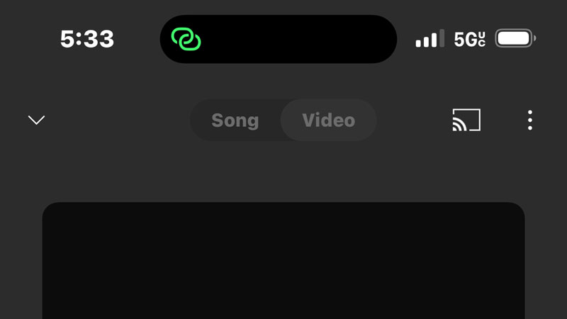
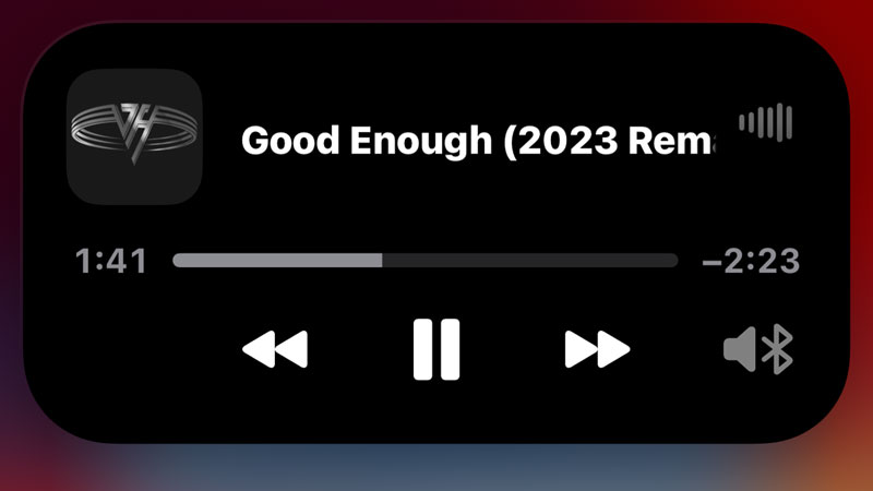
A music app like YouTube Music displays the album art for the currently playing and a little waveform-type animation so that it’s clear audio is playing, which can be important if you can’t hear it.
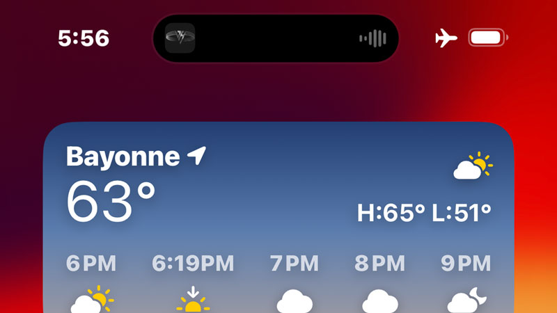
Likewise, when you’re sharing your Internet connection, a Personal Hotspot icon appears there as a reminder that you might be eating up your data, something you might otherwise not realize since the normal method for communicating this is a tiny status bar icon many would miss.
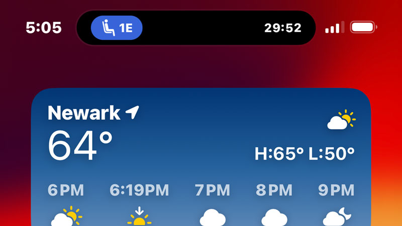
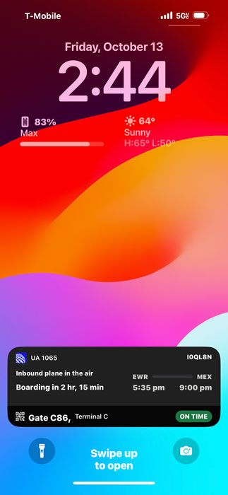
That’s all pretty obvious, but the United app is an even more impressive example of what this UI can do. In the hours leading up to our flight to Mexico City, for example, it displayed little status icons that indicated whether the flight was on time and how long we had to go. When we arrived at the airport, there was a graphic of a person walking with the gate number displayed so I knew where to go. And when it was time to board, it displayed my seat row and number.
More impressively, it also offered to display live activities via a large, banner-sized overlay that appeared over the home screen or whatever app I was using. This pop-up UI—which is a persistent version of the UI you get when you tap and hold on the Dynamic Island—provided a rich set of information about my flight without requiring me to open the underlying app.

I hate to even write this, but this while Android and iPhone widgets provide some semblance of the Windows Phone live tiles functionality, this feature comes the closest to mimicking the essential core of that feature. Because it’s a more modern take on a similar idea and is, I think, all the more useful. To see a live tile, you needed to not just be on the home screen (not in an app) but in a particular part of the home screen. If that live tile was unviewable, it was useless. With this, it’s wherever you are. Including the lock screen.
I should point out that even basic Dynamic Island implementations offer this functionality at your request. In addition to tapping the album art there to return to YouTube Music, for example, I can press and hold on it to expand Dynamic Island into an in-place version of the media playback tile in the notification center that overlays the screen and offers playback controls. It doesn’t force you to navigate away from an app and to some other place—the notification center or the app—to access that functionality. You can do what you need to do and then get back to whatever app you were using.
The possibilities are, as they say, endless. Sport scores. Weather. Timers. Camera or microphone access indicators. Fitness routine reminders. Wallet/credit card transactions. Whatever.
I can’t stress enough the disconnect I feel knowing that this magical interface was created by the same company that made non-actionable icon badges and the current complex notification system. It’s like watching a baseball player strike out repeatedly only to hit a grand slam in their final at-bat. It’s unexpected, yes, but somehow also all the more fascinating as a result.
Which, sure. May be a cute way of me once again trying to rationalize my initial response to this feature. I see that too. Whatever: Where traditional notifications are almost always annoying, Dynamic Island-based alerts are almost always delightful. And that’s magical.
Now I wish that Google would just copy this feature in Android. It’s something I will miss when I’m not using an iPhone.

Gain unlimited access to Premium articles.
With technology shaping our everyday lives, how could we not dig deeper?
Thurrott Premium delivers an honest and thorough perspective about the technologies we use and rely on everyday. Discover deeper content as a Premium member.