Microsoft Could Miss an Opportunity with Windows 11 (Premium)
- Paul Thurrott
- Jul 12, 2021
-
82
I like Windows 11. A lot. And I write that knowing that this system was designed for the masses and not for technology enthusiasts like myself. But now that I’m on my third build of the new platform—after a single leaked build, the first official build, and then the first revision via a cumulative update—I can already see the old Microsoft, and the old Microsoft problems creeping in. And while it’s not too late for the software giant to avoid disaster, I feel like it’s going to fall into the same old trap of trying to please everyone. And that’s a shame.
What Windows 11 should be is a mulligan, a do-over, not so much for Windows 10 but rather for the combined and often superfluous additions that Microsoft made to Windows over several releases. In the past, I’ve compared Windows to an architectural dig, where new layers of technology sit on top of older layers of technology that themselves sit on older-still layers of technology. It’s easy to find Windows Vista-era user interfaces in Windows today, and there are even Windows 95-era bits in there if you dig long enough.
And that’s both good and bad, of course. The promise of Windows is that what you use and need will work, whether it’s hardware or software, and almost regardless of age. Microsoft didn’t drop support for 16-bit software, which debuted in the late 1980s, until it released the 64-bit (x64) versions of Windows (and that code still works in 32-bit versions). And it won’t drop 32-bit versions of Windows until Windows 11 ships in October; the first 32-bit version of Windows, called Windows NT 3.1, arrived in 1993. So 32-bit versions of Windows will exist and be supported for well over 30 years by the time Windows 10 support dries up in 2025. Incredible.
We often compare Microsoft’s focus on backward compatibility with Apple’s far more aggressive policies, mostly because the two firms couldn’t approach the same problems more differently than they do. Apple released Mac OS X in 2001, for example, the same year that Microsoft shipped Windows XP, and it shifted that platform fully to 64-bits with Snow Leopard in 2009; Microsoft won’t make that same transition with Windows until later this year with Windows 11, in 2021. But Apple also dropped support for 32-bit apps in macOS Catalina in 2019. When will Microsoft drop support for 32-bit apps? Based on history, never.
Which approach is “better” is a matter of debate, but I feel like there’s a happy middle ground between Microsoft’s overly conservative approach, which I liken to the company being unable to say no to the needs of any customer, and Apple’s overly-aggressive approach. If there’s a platform out there that adopts this centrist viewpoint—Linux?—I’m unaware of it. But that doesn’t matter. Windows and macOS have each evolved differently and on separate paths.
Another matter of debate, and this is what I’m more concerned about today, is the equally different approaches that Microsoft and Apple take when it comes to the user interfaces provided by their respective desktop platforms. This is an over-simplification, but I’ll condense the thematic differences down to this: Apple typically provides only one way to accomplish any given task while Microsoft provides multiple paths, one for mainstream (non-technical) users and one or more for technical users.
With Windows 11, the early indication was that Microsoft was going to try and close that gap with macOS. And that means biting the bullet, so to speak, on user interface proliferation in ways that it has been unable or unwilling to do with backward compatibility. In other words, Windows 11 should generally reduce the number of ways in which the user can accomplish tasks, ideally providing a single way to do any given task.
The problem with this approach is obvious. Microsoft has never forced its users, which it has argued are both voluminous and individualistic, to adopt a single way to do anything. And so the transition to a simpler user interface could be most problematic for more technical users, those Windows experts that mainstream users typically rely on for help. Why? Because when you whittle down multiple approaches to solving a problem, the one you leave in there is the one that most users will be able to discover and successfully accomplish. The weird side-effect of this change is that Microsoft’s “best” customers—as opposed to “most” of its customers—are the ones who will need to adjust.
And while I sort of don’t like this for personal reasons, but I accept it. And so when I right-click on the Windows 11 taskbar and get just one option—Taskbar settings—in the resulting context menu instead of the 16 or so I get with Windows 10, I just sigh quietly, knowing that I will adjust and find other ways to accomplish a task that used to be second nature to me but is now, perhaps temporarily, something that requires additional tasks or steps.
But again, I’m just three builds into the Windows 11 era—two builds if you only count the official releases—and we’re already seeing signs of Microsoft backtracking. I’ll mention two, one that is honestly fairly innocuous and one that is perhaps more problematic.
In Windows 10, when you right-click on the desktop, you see 10 items in the resulting context menu. In the initial Windows 11 build to the Insider Program, build 22000.51, there were 7, including 6 that pretty much mapped to common Windows 10 options, and one, “Show more options,” that opened a weird Windows 10-style menu that duplicated the old choices from that platform for some reason. Fine, I thought. They’re trying to simplify things.
The only option missing from Windows 10 that I do use somewhat regularly was “Refresh.” But there are few reasons to even need this option; it’s most useful when something has gone wrong, like when you copy or move a file to the desktop and it hasn’t visually appeared for some reason. So you could refresh the desktop and it usually showed up.
I use Windows enough to know that you can simply click the desktop with the mouse and then hit F5 to refresh it, and since this worked/works in Windows 11, I was good. I could have also used that weird vestigial “Show more options” menu to access the Refresh command from Windows 10, but that’s too many steps for me. Whatever. I can adapt.
Except that now I don’t have to: In that second official build, Windows 10 build 22000.65, Microsoft added back the “Refresh” option to the desktop’s right-click context menu. For some reason. (There was literally no explanation.) I don’t believe that normal/mainstream users need this option much, frankly, and of course I’m semi-happy to have it back since I do use it. But I’m slightly worried that Microsoft will slowly bring back all the UI clutter that it originally exorcised because someone—some customer—complained. And that we’ll end up with a Windows 11 version in a year or two that’s just as cluttered as was Windows 10.
I know. That one is not a big deal. But a similar and hasty step-back from the complexity cliff has me a bit more worried. I am referring, of course, to Start search.
Windows has long had a Search option in Start, but it added what we now call Start search in Windows Vista in 2005. When you opened the Vista Start menu, you would see a search box at the bottom, and you could select this box to type a search query and find files, email, and more. But the secret behind Start search, so to speak, was that you didn’t need to select the search box. Instead, you could simply open the Start menu and start typing: You would instantly begin a search query. This was great for people like me who prefer to keep their hands on the keyboard since you could just tap the Windows key and start typing and you never needed the mouse.
Start search has persisted since that time and it’s still a feature in Windows 10 and 11 today. But with Windows 10, Microsoft decided to move the Start search UI from the Start menu to the taskbar, presumably to make it even more discoverable. By default, Windows 10 displays a real estate-hogging Search box on the taskbar right next to the Start menu, but you can configure it to appear as a button instead. Even better, as I explain in the Windows 10 Field Guide, you can remove it altogether and save even more space on the taskbar for pinned apps and websites you actually need. And that’s because Start search never stopped working as it did before: You can simply open Start and start typing.
In Windows 11, Microsoft initially took a step back from this cliff by making the taskbar-based Search function a button, with no way to configure it as a Search box. But the secret remained: If you clicked the Search button on the taskbar, you would simply initiate a standard Start search action. It’s not a separate UI, and if you open the Windows 11 Start menu and just start typing, voila, it works exactly as before.
Having a Search button on the taskbar is OK because Start search isn’t discoverable: You have to know this feature is there to use it. But the nice thing about this system, and this was true in Windows 10 too, is that more technical or experienced users who do know about Start search can simply remove the taskbar and save space. And those that don’t have an obvious place to start, ahem, a search.
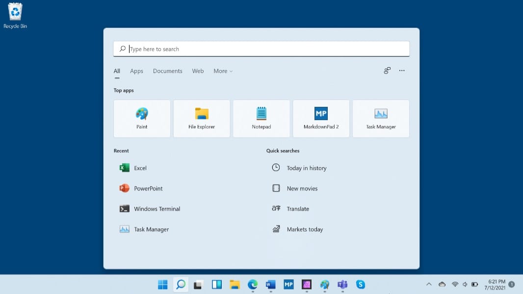
But in the second official Windows 11 build, Microsoft jumped the shark. In addition to the taskbar-based Search button, it has for some reason added a second and superfluous interface for users who wish to perform a search. This option appears as a Search bar at the top of the Start menu. That means that Windows 11 users will have three ways to initiate a search even though all three of them trigger the same Start search interface: The taskbar-based Search button, the Start-based Search bar, and the typing-based shortcut to Start search.
(Actually, it’s worse. There’s a fourth way to trigger Start search: Right-click on the Start button and choose Search from the Quick Access menu that appears. Yes, that is the name of that menu.)
This is unacceptable. Instead of whittling away at the redundant UIs in Windows 10, Microsoft, in Windows 11, is actually adding yet another way to trigger a Start search.
Microsoft, please. This flies in the face of the stated goals of Windows 11, a system that was “crafted” to free both fresh and familiar. And I’m sure Windows 11, as originally envisioned, would have been such a thing. But over time, more cooks are getting their hands in the pot. And it’s becoming what Windows has always been. A mess of different ways to do the same thing.
This may seem picky to some. I get it. But if we extrapolate these two minor features out to all of the commands and other actions that Windows provides to its users, you can see the makings of a big problem. You can’t just try to be as aggressive as Apple is with macOS, you have to actually do it. And while I am among that crowd that will be the most displaced by this kind of streamlining, I’m OK with it. I want it. Demand it, really. I want Windows to be better than it is today. And making it simpler is an important step towards that goal.
I’ll be watching with some trepidation to see what other steps that future builds take in the wrong direction. And who knows, maybe Microsoft will surprise me. After all, one could argue that some of the original cuts in Windows 11 were too deep and that there should naturally be a period of listening to feedback and maybe adding back some things that were lost. Maybe. But I’d rather see Microsoft make the hard decisions correctly now, and I don’t mind adjusting to accommodating that. After all, it’s all for a good cause.

Gain unlimited access to Premium articles.
With technology shaping our everyday lives, how could we not dig deeper?
Thurrott Premium delivers an honest and thorough perspective about the technologies we use and rely on everyday. Discover deeper content as a Premium member.