Almost 25 years ago, I created the SuperSite for Windows so we could discuss “the future of Windows … today.” Here we go again.
Sign up for our new free newsletter to get three time-saving tips each Friday — and get free copies of Paul Thurrott's Windows 11 and Windows 10 Field Guides (normally $9.99) as a special welcome gift!
"*" indicates required fields
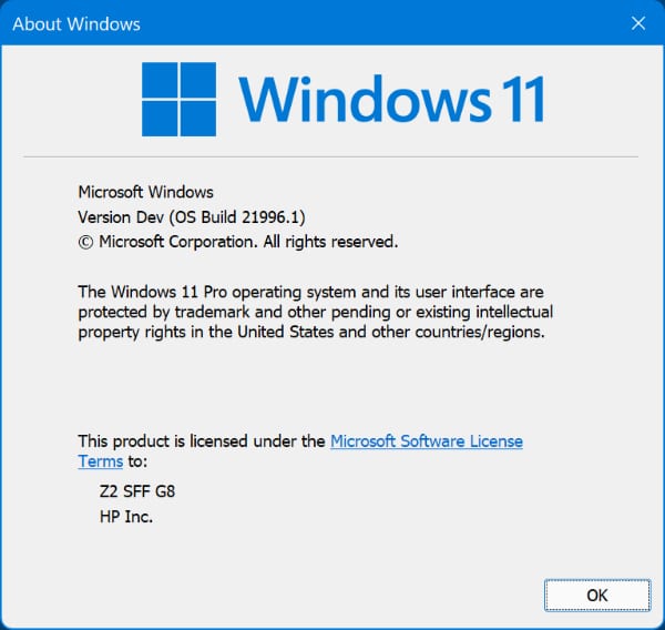
Thanks to a leak of Windows 11 build 21996.1, we now have our first peek at the surprise Microsoft was hoping to unveil next week. And it’s pretty much exactly what I expected: A new version of Windows 10 with a slightly revised user interface that features rounded window corners and the new icons we’re familiar with from the Windows Insider Program.
I’ll be installing this build on other PCs in a variety of scenarios, but for the first install I decided to upgrade my daily-use desktop PC of the moment, an HP Z2 SFF G8 Workstation I’m currently evaluating.
The upgrade experience, as you might expect, closing mimics that of Windows 10, and I’ll be surprised if I see any major changes when I do a clean install later today. The only real difference is some animations during the end of the Out Of Box Experience (OOBE), when it displays messages like “Hi” and “This will only take a few minutes” before taking you to the desktop.
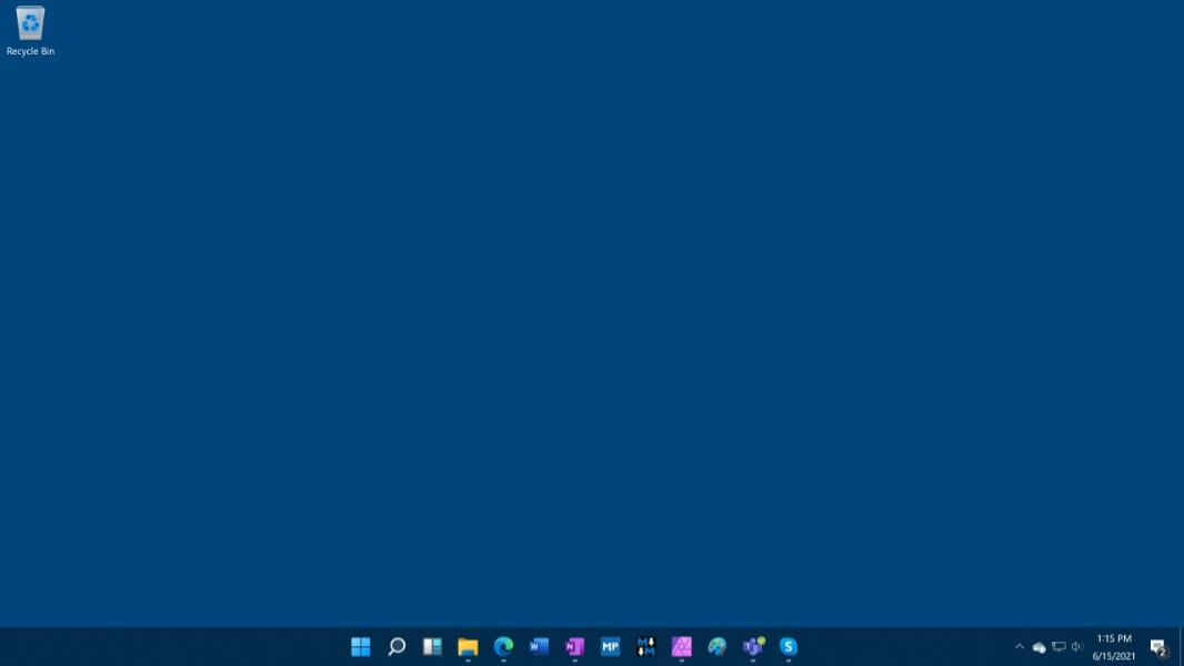
As for the desktop, nothing really new here other than the no longer angled Recycle Bin icon.
The Start menu will be familiar to anyone who was paying attention to Windows 10X, and as I had conjectured before, it looks fresh and new in “Big” Windows too.
Note that live tiles are gone, which is perhaps overdue. And that when you select the “All apps” link, you get something very similar to the All apps view in the Windows 10 Start menu.
As noted, window corners are rounded. This effect is mostly OK, but it will take some getting used to.
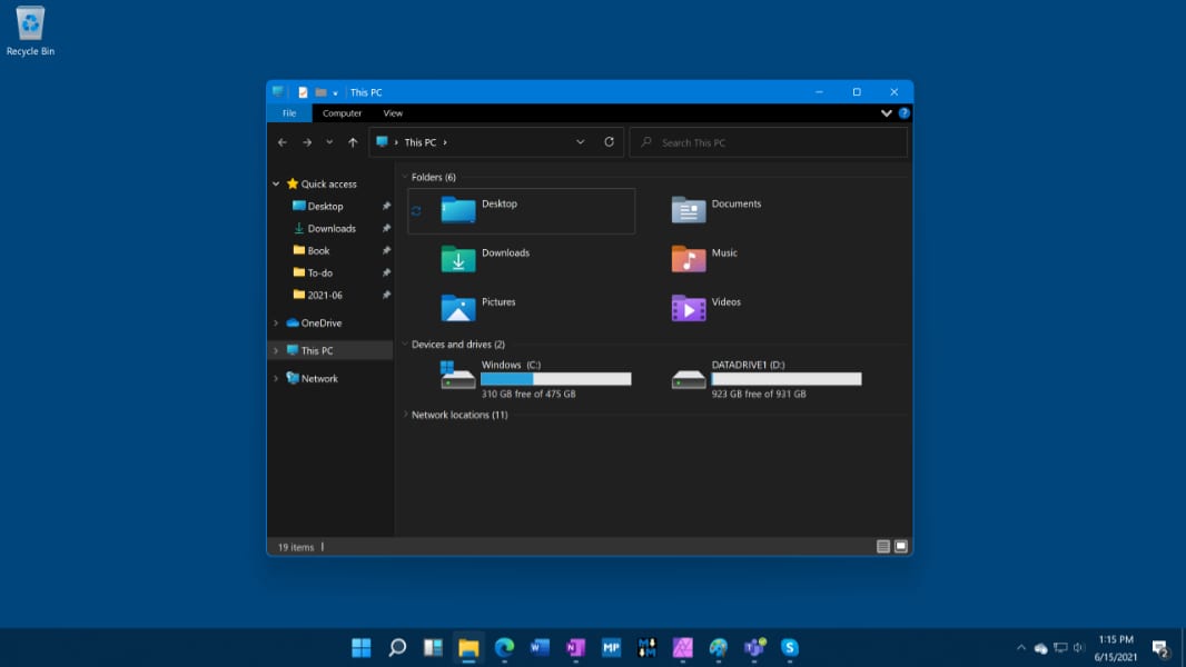
Some windows look better than others. File Explorer is … a bit busy.
On the taskbar, you’ll see some new icons, including Search, which is at least familiar, and Widgets (!), which, when selected, displays a new version of the news and interests feed, it looks like.
Settings is unchanged in this build, but my understanding is that it will be dramatically updated at some point.
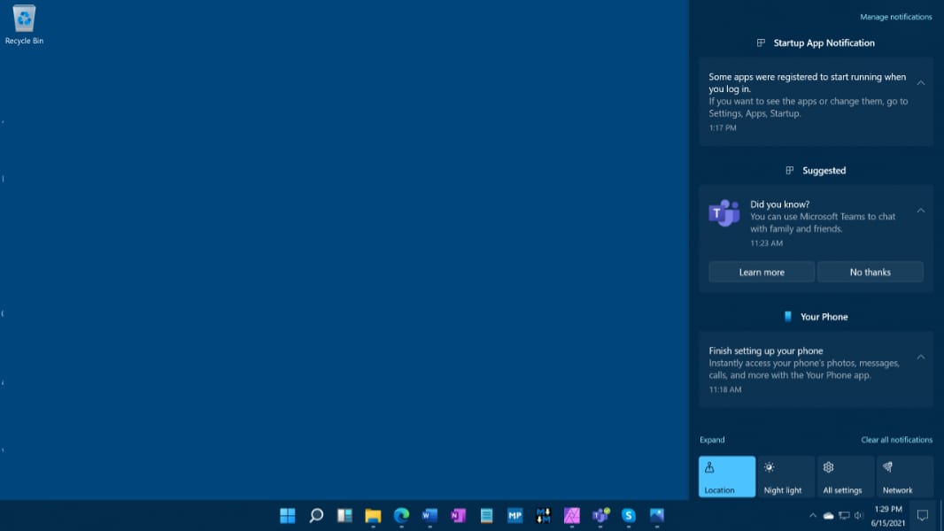
All the tray area pop-ups are likewise identical to Windows 10, but the Action Center, of course, has rounded rectangles everywhere.
Time for some more spelunking. More soon.
maktaba
<p>That’s a horrible place for the Start button. Hard to click.</p>
fishnet37222
Premium Member<p>According to comments I’ve seen on other articles, the items on the taskbar can be moved to the left side if so desired.</p>
stijnhommes
<p>If only the entire experience could be turned off. I don’t need rounded corners, colorless start menu icon backgrounds or the crappy new toddler-designed flat icons. My icons work just fine the way they are. Users should get to choose and not have to plan an evening to fix them all because Microsoft decided to act as if they know better.</p><p><br></p><p>I want the correct Dutch weather in Celsius in a live tile without being forced to use a widget that can’t get my news interests right as well.</p><p><br></p><p>When do they learn this sort of thing needs to be OPTIONAL!</p>
allwynd4
<p>Calm down your e-pants…</p><p><br></p><p>When was this question about optional when Windows 8 came out with the ugly flat design. The ugly and boring sharp corners as opposed to the beautiful rounded corners of Windows 7? The beautiful Aero Glass with the gloss and the blur and the gradients?</p><p><br></p><p>Even now in 2021, most of Windows 10’s ugly, flat, rectangular and monochrome UI still looks like a temporary placeholder for a pre-Early Alpha Tech Demo.</p>
pwingert
<p>SO no sharp corners and no rounded corners and no raised icons and no flat icons. Got it. So that leaves us with….. Hexagons, Everything will now be hexagonal! in a 3d spatial format in preparation for holographic displays. All right I was just joking. We will rewrite it to the Star Trek LCARS interface design. But only if you get warp technology working reliably. simple and fair right?</p>
anderstone
<p>Dang! I was reading your list and I realized that I need all of those things. :-)</p>
anoldamigauser
Premium Member<p>Agreed, but that is why there is a Windows key.</p>
Paul Thurrott
Premium Member<p>You can move it to the left if you prefer.</p>
bluvg
<p>…unless something else is going to use that valuable, infinitely-large-UI-target lower left corner.</p>
mattbg
Premium Member<p>Agree – even if you can left-shift everything, it’s hard to see why they didn’t keep the Start button at left and just center the app icons, though I imagine they’ve focus-tested that and came to the conclusion that this was better.</p>
Intrepid00
<p>The start button to the left was placed there on old 4:3 monitors when it was still basically center to vision. They didn’t keep it left because on wide and even more so on an ultra wide it is awful. Like downright sucks being there. </p>
hrlngrv
Premium Member<p>Which raises the question whether it should default to centered on wider than 16:9 displays but default to left side on 3:2 and narrower displays.</p>
mefree
<p>? I truly don’t understand why you say it ‘sucks’ having it on the left using a widescreen monitor??? I have a quad monitor setup and ALL are widescreen. I really don’t want it in the center.</p>
hrlngrv
Premium Member<p>You really believe the company which rolled out Windows 8 without a Start button at all pays attention to focus groups? Putting this differently, would a company with a proud tradition of NEVER admitting mistakes have any mistakes it could learn from?</p>
Paul Thurrott
Premium MemberDifferent Windows org, different company.
hrlngrv
Premium Member<p>Same allergy to clear public communication.</p>
stijnhommes
<p>It’s hard to see why they don’t just ask the user what they want instead of forcing changes that don’t work.</p>
Usman
Premium Member<p> I currently use taskbar x to get my icons in the center since I’ve got a 32:9 ultrawide, but it doesn’t move the start button. So I actually welcome this.</p><p><br></p><p>Plus you can move it to the left if you want.</p>
pwingert
<p>SO if you move it to the left does your political viewpoint change too? ??</p>
owenm
Premium Member<p>I reckon we’ll become used to it being centre fairly quickly</p>
stijnhommes
<p>Why? It’s not a tablet. There is no benefit to moving it and relearning a 25 year habit. New isn’t always better.</p>
gamingdevil
<p>You don’t just press the windows key? I don’t remember the last time I clicked the button.</p>
mefree
<p>Agreed, I hate the centered icons in the task bar (copying MacOS, really????) and hate the new start menu. Horrible.</p>
thretosix
<p>This and the curved edges.. </p>
behindmyscreen
<p>It’s common for both Chrome and Mac OS. the XFCE Desktop on Linux too.</p>
John Dunagan
Premium Member<p>As long as there’s a setting to put it on whatever side (mine’s on the left), I can deal with it.</p>
spacein_vader
Premium Member<p>Spelunking? Is that an American term I’m unfamiliar with?</p>
fishnet37222
Premium Member<p>A spelunker is one who explores caves.</p>
spacein_vader
Premium Member<p>Thanks both, makes sense now! </p>
gregsedwards
Premium Member<p>It means exploring, particularly like the kind of exploring you’d do a cave.</p>
bkkcanuck
<p>If in the UK it would be referred to as potentially potholing… (Caving / Cave Exploration)… </p>
matthewitt
Premium Member<p>So much for that Big Sur style update. This looks like the same ol Microsoft. Bring on Windows 12. </p>
shark47
<p>I mean, it’s a Microsoft OS, so it makes sense that it would look like one, right?</p>
Paul Thurrott
Premium Member<p>Yeah. But it does seem a bit unrefined.</p>
lvthunder
Premium Member<p>Well it is a leaked pre-beta build afterall.</p>
matthewitt
Premium Member<p>My word choice was poor. I think I was just hoping (not expecting) that they would really dig deep and give this thing the attention to detail it deserves. All of the "Paint the back of the fence" stuff Steve Jobs use to talk about. If Windows was a fence, this thing would have 10 layers of paint and you would be able to see all 10 layers chipping through. </p><p><br></p><p>"Do a crap job adding paint to cover up the last crap job you did adding paint to cover up the last crap job you did adding paint."</p><p><br></p><p>I hope it’s a free upgrade and doesn’t rock the service schedule boat too much. It doesn’t look / seem different enough to suggest otherwise. It definitely doesn’t seem worthy of a name change. They should call it the Windows 10 Rounded Rectangles Update.</p>
lvthunder
Premium Member<p>I think they are just following Apple here. Apple stayed with OSX for over a decade and decided last year to go to MacOS 11. And this year I think it’s 12. I think Microsoft decided to do the same thing. It makes more sense than trying to figure out which version of Windows 10 you have. Maybe part of this announcement will be a change to a once-a-year release cycle like everyone else does.</p>
rbgaynor
<p>To be fair macOS 11 marks the beginning of the transition to Apple Silicon and supports the release of the first generation of Apple Silicon Mac hardware. The idea that the macOS version will change annually, like iOS, also suggest that users will see annual noticeable bumps in processor/gpu performance – something that has been sorely missing from Intel. This Windows update isn’t in the same league. More 10.1 than 11.</p>
bkkcanuck
<p>The current chips as rumoured have some likely significant improvement in performance for the GPU and CPU in the next generation of Macbook Pro devices. Assuming a semi-linear improvement in performance the 32 core GPU would come in at around 50% – 60% more raw performance (likely more than that because of lower latency on chip) than my Vega 64 eGPU. (I am not saying it will be – just potential based on top-line estimations). I don’t think it is out of the realm of possibility to implement a two chiplet M1X solution that would be able to go into a laptop (assuming advanced cooling along the line of what is available in some 6800M laptops). That is all theory or conjecture or outright dreaming though… we will have to see what is actually implemented, but I think generationally they have a lot of headroom thermally to play with — especially as it drops down to 3nm TSMC silicon. </p><p>I think what we will see is some major differentiation based on the on device use of the neural engine… that could be a game changer for end-users. It is amazing how a period of 5 years can see what was seen widely in the Mac community a malaise to a lot of potentially exciting changes coming. </p>
bkkcanuck
<p>There are lots of changes that ‘should’ be made to Windows — both in the UI and in the plumbing beneath the surface (APIs). They should be taking some of the telemetry data, identifying what individuals were trying to do (e.g. Connect to local wifi), writing up all the ‘stories’… then having users videoed as they try to make the changes. They should be trying to identify these stories, try to figure out if they are trying to change them through different places – identify if it is muscle memory from older versions or other OS — then teasing out what people would naturally expect it to be. They should be trying to figure out what confuses users… and from that identify core changes to the UI and possible changes that could be made…. This should be continuously done through refinement, but basically, they should have a group that is dedicated to identifying scenarios and potential solutions… They also need a common design language an some of that is identifying the emotion felt while using it (different designs will evoke potentially subtly different feeling – i.e. calm vs not etc.). </p><p><br></p><p>They have to identify the core OS and figure out where they want this core to be in 3, 5 years… API changes have to be mapped out, changes to things like the file system, core ML, a long term replacement to UI APIs etc. </p><p><br></p><p>It is hard to figure out if this is just sticking lipstick on a pig or whether there is some real changes that are planned… I unfortunately think it is another issue with MS culture and last minute we will make this changes to the UI to catch up to what they are seeing elsewhere rather than real long term and strategic planning on the future. </p>
ringofvoid
<p>I’m more impressed than I thought I would be. That’s a very clean look</p>
Lauren Glenn
<p>Kind of glad to be rid of the straight square boxes. That didn’t look good even with Metro.</p><p><br></p><p>But… as long as it’s a free upgrade from Windows 10 and doesn’t break Zune and other apps, I imagine it will be fine. Just make sure my files are where I left them.</p>
Yaggs
<p>Hoping this is just an early build that doesn’t have all the changes in it… I can’t believe they would do a Windows version update like this and leave something like Windows Explorer looking untouched. </p>
kevin_costa
<p>I really hope you are right. The changes are welcomed, but so far are little to none in the huge scope of UI/UX. It would be a mistake call this Windows 11… I really want a complete (and consistent) dark mode, consistent icons across the system, and improvements to the existing stuff. All of these can be done.</p>
stijnhommes
<p>Why does everyone else have to put up with this crap because you want new icons and an already existing dark mode. Then implement it and leave my system alone.</p>
Paul Thurrott
Premium MemberYou’re taking this out on the wrong person.
behindmyscreen
<p>"grr hiss, change bad"</p>
hrlngrv
Premium Member<p>For consistent icons, MSFT can only ensure they’re consistent for MSFT’s own products. On my system, more than half the icons are from 3rd parties over which MSFT has no control.</p>
shark47
<p>Based on this, it looks like it’s a pretty small update: new start menu and new icons. </p>
rbgaynor
<p>More 10.1 than 11</p>
gregsedwards
Premium Member<p>My sentiments exactly. What makes this Windows <em>11</em>? I mean, with each prior new release, Microsoft at least added something that warranted a version bump, even if the kernel wasn’t technically new. And there was an upgrade cost. Windows 10 has been delivering free, incremental updates for the past 6 years; I don’t see this latest "visual refresh" as being any more significant than some of those. So is the takeaway here that we’re just going back to version numbers? Will there be 6 more years of semi-annual updates to Windows 11, and then Microsoft collectively decides it’s Windows 12?</p>
davidjhupp
Premium Member<p>My guess is they’ll just start incrementing version number every six month from now on.</p>
rmlounsbury
Premium Member<p>Pretty much what we are all expecting out of this update. I’ll be curious to see if there are new experiences that might not be evident just poking around the build but it seems unlikely. </p><p><br></p><p>I just hope you can pin the start button to the left side of the taskbar. My users will lose their minds if that can’t be accomplished via a GPO setting I can push out. Also, I don’t entirely get the idea of moving the start button anywhere else on the taskbar. Simple, but the darn thing has lived on the left side of the taskbar since it was introduced in Windows 95.</p>
Paul Thurrott
Premium Member<p>You can.</p>
Elan Gabriel
<p>Hmm.. Won’t lie, I don’t like much, but even if I did it wouldn’t have mattered. It is what it is and such is life. I want to believe these changes are backed by thousands of telemetry and surveys regarding what’s best for most users.</p><p><br></p><p>Goodbye Live Tiles, the clicked that you saved me all this years will be forever remembered.</p><p><br></p><p>Windows OSX, here we come.</p>
Greg Green
<p>Win 8.0 was also ‘<span style="color: rgb(0, 0, 0);">backed by thousands of telemetry and surveys regarding what’s best for most users’…at least Sinofsky seemed to have a report or study for nearly everything he did.</span></p>
olditpro2000
Premium Member<p>I don’t understanding the centering either. I suppose macOS started the "trend" 20 years ago, but only recently have Chrome OS and (now) Windows jumped on board.</p>
bschnatt
<p>I actually like (and use) live tiles. I will be very disappointed if they get rid of that. Glad to see widgets, and an easier way to shut down, but I like my tiles!</p>
hrlngrv
Premium Member<p>| <em style="color: rgb(0, 0, 0);">I will be very disappointed if they get rid of that.</em></p><p><br></p><p><span style="color: rgb(0, 0, 0);">Welcome to the club.</span></p><p><br></p><p><span style="color: rgb(0, 0, 0);">MSFT used to include options to revert to at least the previous version’s launcher, at least through XP, maybe Vista (but I never used it). I doubt any 3rd party would be coming out with a Live Tiles utility.</span></p>
Slvrgun
<p>They are hideous. </p>
rm
<p>I don’t want my start menu location to be centered, is my first reaction, but I will give it a try. Hopefully there is a setting to change that so it is in the corner if you want it to be. I’m guessing it changes location depending on open programs.</p>
bschnatt
<p>My biggest disappointment with this (so far) is File Explorer. Still no tabs, Microsoft? Really? I *still* have to keep popping open a million windows to manage my files?</p>
shark47
<p>Paul, is the touch experience better than Windows 10 or just as bad?</p>
shark47
<p>Gah. That wasn’t supposed to be a reply.</p>
Paul Thurrott
Premium Member<p>I’ve installed it on a convertible PC to find out.</p>
wright_is
Premium Member<p>If I have more Explorer windows open, it is usually to copy files from one location to another. Tabs aren’t really of much interest in this instance, but I can see that it would be useful to some.</p>
Alex Taylor
<p>Yeah, tabs are a common request, but dual panes are infinitely more useful. </p><p><br></p>
MikeCerm
<p>It would be useful in your case. Hypothetically, you drag files up to the tab bar (or push Ctrl+Tab), that tab activates, and then you drop them where you want.</p>
hellcatm
<p>Just get Groupy, it works well and it’s not that expensive.</p>
hrlngrv
Premium Member<p>If you’re going to get 3rd party software anyway, why not a 3rd party file manager?</p>
mattbg
Premium Member<p>I guess it’d be a nice option, but what’s so hard about opening two Explorer windows and WIN+Left Arrow the first, WIN+Right Arrow the second, and just get on with it?</p>
bschnatt
<p>I usually have 5 (or sometimes more) Explorer windows open. That’s a pain in the ass to manage. I have 3rd party file managers on my machine, but they’re not as easy or convenient to use as File Explorer. More powerful, yes, but more dense and harder to fathom sometimes. I want File Explorer with tabs, plain and simple. Yes, I could buy Groupy (Groupie?), but I’m a cheap bastard…</p>
crunchyfrog
<p>You can also try a third party utility that tabs Windows called Groupy by Stardock. It’s cheap and it can be customized.</p>
thretosix
<p>With Stardock there’s no reason for Windows OSX.</p>
thretosix
<p>Sorry no edit, I meant Windows OSXI..</p>
wright_is
Premium Member<p>For anyone who has used Linux in the las 20 years will be familiar with rounded window corners.</p>
boots
<p>Or XP, Vista or 7.</p>
hrlngrv
Premium Member<p>Is there any Linux desktop environment which doesn’t accept some themes with rounded corners and other themes with sharp corners? Does Windows 11 come bundled with a theme which provides sharp corners?</p><p><br></p><p>Windows may be more customizable than macOS (and a GOOD THING!), but it’s no longer anywhere near as customizable as Linux.</p>
stijnhommes
<p>Even if it is customizable, U shouldn’t have to change anything. Windows should ask my preferences and stick to them.</p>
igor engelen
<p>Reading all your comments I’d say you would be better of with a Linux bistro instead of Windows.</p>
wright_is
Premium Member<p>I use Windows, Linux, iOS, Android and iPadOS on a daily basis. That makes comparison easy. Each has their strengths and weaknesses and are better at some tasks and worse at others.</p><p><br></p><p>I need Windows, because some of the software doesn’t run elsewhere. I use Linux for a lot of open source software and server tools etc.</p><p><br></p><p>I like the new look, but it is very reminiscent of old Linux GUIs from just after the turn of the century. That doesn’t make it good or bad, it is just an observation.</p>
james.h.robinson
Premium Member<p>Good job, Mr. Thurrott!</p>
tobiulm
<p>If this should be the Windows.Next Version and the new glorified UI => Bäh, Yuk, Shocking.</p><p>The Icons look like there from a cartoon or kids operating system.</p><p>The Start Menu is awful and on the first looks way to big and unproductive</p><p>Nice wallpaper and Start Up Sound. Thats the most interesting things so far.</p><p>No optimization for touch or surface devices so far.</p><p>It will be really interesting if this should be the near final result.</p>
tobiulm
<p>I Have to correct me on one point: It seams that there are indeed optimizations for touch devices. There’s a new four finger gesture for switching tasks and desktops.</p><p>Other things that are still a bummer for me is the stupid search window. Way to big and to many entries on startup. Should really be more like spotlight or the search ui of albert on gnome. </p><p>It would be nice to customize the new start menu. I don’t want to see this Recommendations or TimeLine feature, i wanna have a app launcher where I can see my programs (sorry äpps for the younger among us) </p>
truerock2
<p><strong style="color: rgb(0, 0, 0);">“All apps” link, you get something very similar to the All apps view in the Windows 10 Start menu.</strong></p><p><br></p><p><span style="color: rgb(0, 0, 0);">What is the "All apps" link or "All apps" view? I don’t have one on my Windows 10 Start Menu</span></p><p><br></p><p><span style="color: rgb(0, 0, 0);">Thanks</span></p>
Paul Thurrott
Premium Member<p>It’s the list of all of the apps that’s right in the Start menu to the left of the tiles.</p>
truerock2
<p>Thanks…</p><p><br></p><p>So currently we have the "<strong>Show apps list in Start menu</strong>" option in Settings, Personalization, Start.</p><p>Does that option exist in Windows 11?</p><p><br></p>
Paul Thurrott
Premium MemberNo.
dougkinzinger
<p>And Paul, I expect rounded corners on <em>every</em> screenshot from now on! :D</p>
Paul Thurrott
Premium MemberUnlikely. 🙂
dnationsr
Premium Member<p>won’t install on my pc..clean install or hyper-v</p>
dnationsr
Premium Member<p>says my pc doesn’t meet minimum requirements</p>
navarac
<p>So. Lipstick on a Pig then. I’ll give it a go on the one remaining Windows machine, but Linux is calling. It depends on what fights against "muscle memory".</p>
hrlngrv
Premium Member<p>The lipstick has been there for years. This adds mascara.</p>
winner
<p>Looks very superficial. Did they even clean up the ancient old windows like Device Manager or My Computer>Manage?</p><p>If not, a minimal effort. New lipstick, not even a full face lift.</p>
bettyblue
<p>Let’s be completely honest. It is Windows 10 and they took the GUI from the failed Windows X project and slapped it on Windows 10 and called it Windows 11. This is a pure PR stunt to drive hype and excitement.</p><p><br></p><p><br></p>
Paul Thurrott
Premium MemberThis was happening even if Windows 10X continued. It’s not a stunt, it’s an attempt to modernize the system. We can debate whether it works and/or is attractive, etc.
waethorn
<p>Gnome 40 is pretty much the same.</p>
scovious
<p>Where is the New Desktop selector for people who have multiple Desktops? (Task View)</p>
Paul Thurrott
Premium MemberIt’s there, you have to type WINKEY + TAB. (There’s no taskbar button.)
jlmerrill
<p>Why? Just because?</p>
hrlngrv
Premium Member<p>| <em>Just because?</em></p><p><br></p><p>No.</p><p><br></p><p>Because MSFT.</p>
theotherguy
<p>Hmmm, for all the furore that Windows 8 brought with the start screen, now we have this dopey looking new menu that plops right in the centre of the screen. Thankfully MS has the decency to allow us to return the menu and taskbar buttons to their rightful places.</p><p><br></p><p>I can’t say i’m impressed with what they’ve come up with. I was hoping this design would be relegated to the recycle bin when they announced 10X was being cancelled. I’ll live with it, but i can’t really say i like it. And the fact that it seems it’s still not a decent try at cleaning up all the annoying bits and bobs.</p>
Slvrgun
<p>Hoping for native Bash in Windows Terminal.</p><p><br></p><p>Better file renaming…search and replace…add characters before or after file name</p><p><br></p><p>Better settings/control panel.</p><p><br></p><p>screenshots look decent. </p><p><br></p><p>I don’t use Windows button enough to care about placement.</p><p><br></p><p><br></p><p><br></p>
boots
<p>"<span style="color: rgb(0, 0, 0);">Better file renaming…search and replace…add characters before or after file name"</span></p><p><span style="color: rgb(0, 0, 0);">Try Bulk Rename Utility.</span></p>
hal9000
Premium Member<p>I had low expectations, yet they were undercut.</p><p>The file explore desperately needs a radical overhaul, and that lonely recycle bin is dying to be moved to the taskbar where it belongs since ages.</p><p>Let’s see what they show off in the official event…</p>
stijnhommes
<p>Don’t be ridiculous. The trash can needs to be where the user wants it. I.e. where I put it. Microsoft should stop moving stuff around without permission.</p>
hrlngrv
Premium Member<p>| <em>lonely recycle bin is dying to be moved to the taskbar where it belongs since ages</em></p><p><br></p><p>The value of 3rd party utilities, in this case something called <strong>minibin</strong>, which has been around for ages.</p>
ZeroPageX
<p>Did they forget they already tried hiding the All Apps view behind a link in Windows 8 and everyone hated it?</p><p><br></p><p>Is it possible to get rid of pinned and recommended apps on the Start menu, and just show All Apps?</p>
adamstaiwan
<p>I don’t like it that live tiles are gone. While I don’t need the ‘live’ part, I have used the menu as a replacement to putting icons on the desktop. It’s much better to popup a well laid out list of apps then to minimize all windows to get to the desktop. Maybe I’ll have to make my own. Would be nice to have a single overview of all apps, maybe on an auto-zoomable canvas.</p>
jgraebner
Premium Member<p>Assuming the name really is Windows 11 and the leak wasn’t a red herring, I really hope Microsoft’s marketing team throws as much money as necessary to Christopher Guest to have him officially announce the name.</p>
SvenJ
<p>Let’s throw in a little Windows, a little ChromeOS, a little iPad, some Mac, stir and see what comes out. Of course we aren’t sure about it, so you can opt to change things back…but not everything. Like live tiles. We kind of let those whither anyway, so they died.</p>
veermaharaj
<p>Windows Explorer needs a complete UI rewrite.</p>
hrlngrv
Premium Member<p>Note that the ever lingering Control Panel uses the same ‘window’ as File Explorer. Put a link to Control Panel on your desktop, open File Explorer, navigate to Desktop, then double-click on Control Panel.</p><p><br></p><p>As long as Control Panel continues to exist, I wouldn’t hold my breath expecting any substantial changes in File Explorer.</p><p><br></p><p>Tangent: if you have 7zip, you have a 2-pane file manager.</p>
Daekar
<p>So, I don’t really have an opinion on whether this is good or bad…. I can get used to anything. But I am not really seeing much innovation here. Isn’t this basically Windows XP with dark mode?</p>
sentinel6671
Premium Member<p>I can’t wait till the 24th to see how Microsoft spins this thing.</p><p><br></p><p>I find it immensely sad that they are clearly so out of ideas.</p><p><br></p><p><span style="color: rgb(0, 0, 0);">I think I’m going to ride out the Windows 10 life cycle to 2025 and then fully convert to macOS.</span></p>
bettyblue
<p>I am already moving down that path. I will not go out of my way to upgrade my 1 remaining Windows computer….if it happens, as in in my face and I click yes, then yes. All this hype for nothing. </p>
hrlngrv
Premium Member<p>Still in denial, eh?</p><p><br></p><p>Someday in the future MSFT may release another phone OS, but it won’t have <em>Windows</em> in its name, and it won’t share much of its code base with MSFT’s desktop OS. And the only things which would spur MSFT into doing so would be either Apple AND Google screwing up iOS AND Android, or EU regulators going after both of them to destroy their respective walled gardens.</p>
martinusv2
Premium Member<p>Oh wow, start menu look like a mode in Start10 from Stardock</p>
bettyblue
<p>So just like I thought. 99.999999999999% Windows 10 with the GUI of the failed Windows X. Was hoping for so much more.</p>
waethorn
<p>So the Windows logo is changing, again?</p><p><br></p><p>I guess OEM’s have to re-silkscreen all their keyboards too.</p>
Paul Thurrott
Premium MemberThat’s the Microsoft logo.
javial
Premium Member<p>More smartphone UI for a desktop OS. </p>
dallasnorth40
Premium Member<p>I like it. Looks really good so far.</p>
falonyn
<p>My discouragement so far, when looking at these images, is the lack of consistency throughout the UI. I understand this is an early build, but I am not confident that this will change. I love the changes I see, I just want them to extend to everything in the OS. </p><p><br></p><p>For example, File Explorer still does not match the Fluent design with the blurred, translucent side bar. The tabs at the top of File Explorer do not look like they have gotten the design overhaul either. </p><p><br></p><p>Another example are the icons in the Settings app and in the system tray have an older design language. Update that too.</p><p><br></p><p>As Paul has pointed out in one of the articles, context menus within apps, including File Explorer, do not always match the system theme when in dark mode. I think the key thing from just a design perspective is that this is more akin to putting a fresh coat of paint on the front of the house, but everything else is still the same. I would like to see that fresh coat of paint extend to all context menus, all icons, and the same consistency with the blurred, translucent side moved throughout the OS, even to the Control Panel. Even if that is old and they don’t want to spend a lot of time with that, at least update the appearance a little. </p><p><br></p><p> If you want a huge reveal of this new version of Windows, with this new look and feel, then make sure that the experience is complete.</p><p><br></p>
davidjhupp
Premium Member<p>IIRC there’s a new fluent Files Explorer that leaked previously, I guess it’s just not in this build.</p>
nbplopes
<p>Why is MS doing this just now after WWDC 3 weeks ago or so. I mean, common one can say that Apple hasn’t done much to the advancement of say macOS or iOS this time (which I would disagree) … but coming out with this is embarrassing.</p><p><br></p><p>This should have never been “leaked”. I say in quotes becomes its kind of within the time of competing announcements. I guess someone got really excited or wanted to break the radio waves a bit.</p>
covarr
<p>I’ve heard there’s a way to move the entire taskbar contents back to the left as on previous versions of Windows, but I’m crossing my fingers for a left-aligned start button and centered everything else. That, I think, would be a good middle ground between the easy targetability of corners (which only the leftmost button can benefit from anyway) and the attractiveness and visibility of the rest the icons.</p>
ruivo
<p>What I truly wanted was for customization to come back. Well, the kind of customization we could get with XP and unlocked "uxtheme.dll". So wouldn’t matter if I am a true luddite that wants the Win 2000 look, a crazy person that loves the Windows 8 look (and I am), or a Apple stan that thinks MacOS is the best UI ever – everyone would be happy, with the bar on the top, sides, flat start menu on the center, on the right, missing…</p><p>Just make the damn thing stable and consistent, and let us download whatever theme we feel more comfortable with.</p>
Alastair Cooper
<p>Oddly I’m not seeing the rounded corners on mine. It’s installed under KVM on Linux, but I doubt it’s that unless maybe it’s something to do with whether graphics are hardware-accelerated?</p>
singingwolf
<p>Correct – seems you need good graphics cars for it to trigger which means the rounded corners are not native, but an overlay.</p>
xcln
<p>Curious to hear</p><p> 1/ how fast(er) it runs on standard intel chips </p><p> 2/ how much space it takes for a clean install (getting rid of that 80% never used code) </p><p> 3/ how well they address the recoverability issue (system imageing – why always having to depend on third parties .. Ghost and others ) </p><p> 4/ how well it runs on AMD new chips </p><p> 5/ any indications re Microsoft getting in the chip arena, they are losing lots vs Apple </p><p> 6/ how well does the Android phone emulator /sync work</p><p> 7/ how well you can run it *without* accepting the Microsoft trying to enforce UserID logging/ spying </p>
Singingwolf
<p>I assume then that 21H1 will be the last "Windows 10" build. I’m OK with that but as an insider, I hope I am given a pathway to move back to this release without have to blow away my complete install. I hope our only way forward is not Windows 11. </p><p><br></p><p>I commend Microsoft for trying, but as with Windows 8, people are not ready for their cheese to be moved. And although I was one of the 5 people that thought Windows 8 was the best thing ever, Windows 11 looks like another "Vista" where it will be avoided. I find every second release MS do is a dud, but then they get it right on the release after. So… Windows 12 will be the best Windows ever…</p>
singingwolf
<p><strong>"</strong><strong style="color: rgb(0, 0, 0);">Almost 25 years ago, I created the SuperSite for Windows so we could discuss “the future of Windows … today.” Here we go again."</strong></p><p><br></p><p><span style="color: rgb(0, 0, 0);">Thanks for making me feel old Paul </span><strong style="color: rgb(0, 0, 0);">?</strong></p><p><br></p><p><br></p>
bluesman57
<p>Looks good to me. I’ve never used the ridiculous live tile start menu, I just hit he windows key and start typing the program I want, if I don’t have it pinned to the taskbar. I used to go to great lengths in Windows XP to dock a shortcut toolbar on the side of my desktop, but Windows 8 forced me to do what I do now. Much better. </p>
SYNERDATA
<p>Why? Why keep changing things? Why keep cutting corners?</p><p>All I want is for Windows to stop mutating.</p>