.NETpad 2025: Settings Auto Flow (Premium)
- Paul Thurrott
- Jan 12, 2025
-
0
Looking over the to-do list for .NETpad in 2025, I decided to start small and make one of the easier changes to the app first. That change? Settings auto-flow.
What to do, what to do
I realized after posting .NETpad 2025: What Comes Next (Premium) that I had left out some of the known issues I noted in Modernizing .NETpad: New App Version is Now Available on GitHub (Premium) and on the project’s GitHub page. So I combined the two lists into a single to-do list in Notion. Which looks like so:
.NETpad 2025 to-do
[ ] Remove App theme button when Microsoft fixes WPF bug
[ ] Add Snap layout flyout support to Maximize window button
[ ] Disable document actions (Open, Save, etc.) when viewing app settings
[ ] Prevent custom dialog resize
[ ] Prevent black selection rectangles from appearing app-wide
[ ] App session state
[ ] One document
[ ] Two documents
[ ] Any number of documents
[ ] Settings layout auto-flow per Notepad
[ ] App window minimum heights and widths
[ ] Tabs
[ ] Tab item header customization in C#
[ ] Add tab button w/proper layout
[ ] Two tabs
[ ] Any number of tabs w/proper layout and overflow solution
[ ] Autocorrect per Notepad
[ ] AI-powered Rewrite per Notepad
Some of these are in progress and some are for the future, but it’s nice to make progress, so I started thinking about which of these items could be completed quickly. And settings layout auto-flow seemed like the easiest.
Settings layout auto-flow
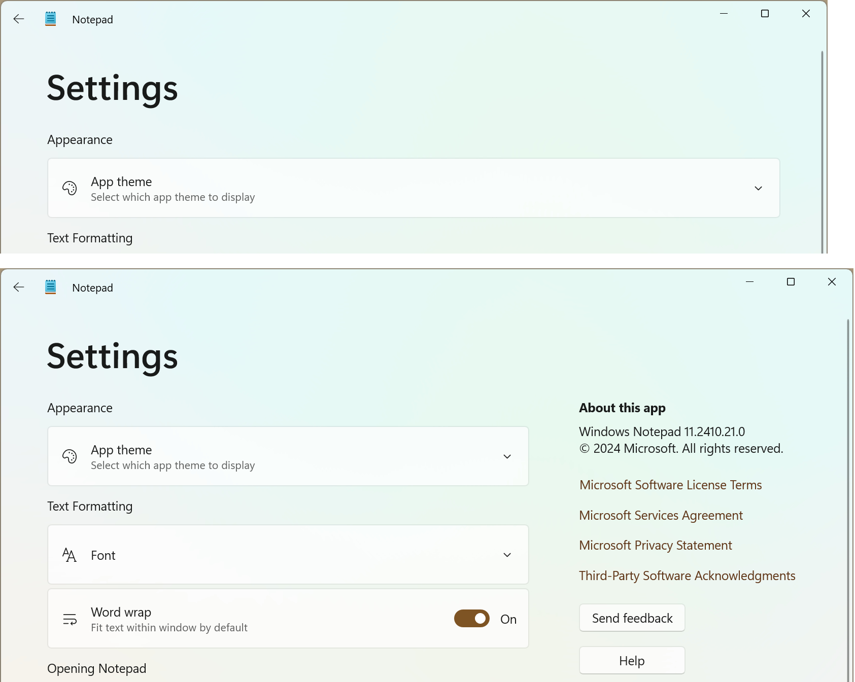
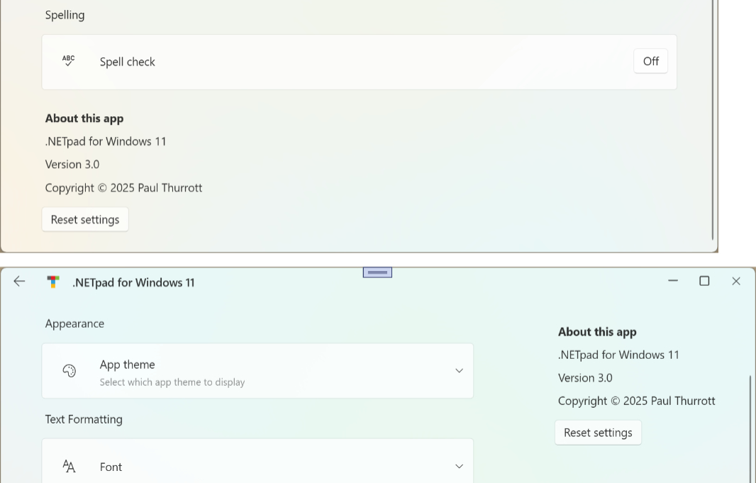
If you look at the settings interface in Notepad, you can see that there’s a single layout auto-flow effect. If the app window is thin enough, all the content appears in a single column. But if you resize it to be wide enough, the bottom block of content, “About this app,” reflows into a second column on the right.
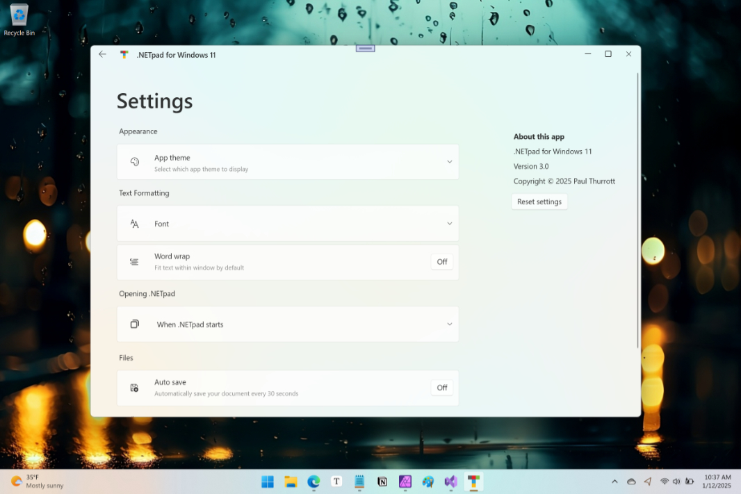
.NETpad doesn’t do this. No matter how wide the app window is, all the settings content appears in a single column.
Testing the change
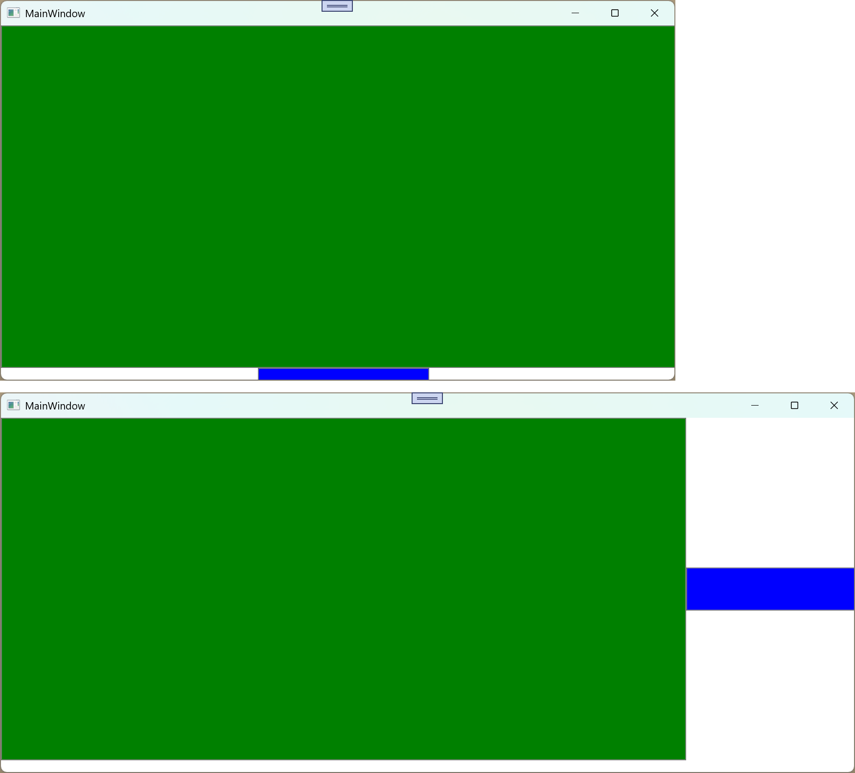
To test an auto-flow update, I created a new Visual Studio project and roughed out some simple XAML with a grid with two rows and two columns, each with a colored button. By default, the two buttons appear on top of each other in the same column.
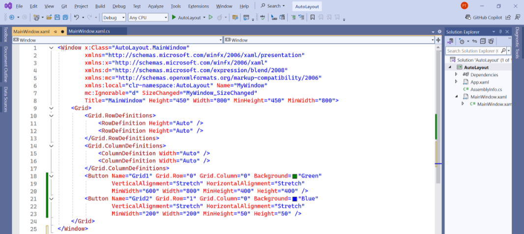
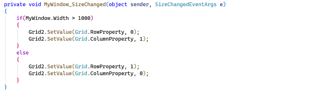
Then, I created a SizeChanged() event handler for the app window and researched how to change the grid row and column assignments for the two buttons. Then, I picked an arbitrary width and changed the values accordingly. If the window is 1000 or fewer device-independent pixels (DIPs) wide, the buttons will appear above each other in a single column. If it’s wider, they will appear side-by-side in two columns.
That seemed to work fine, but the reflow effect happened a bit abruptly, and I assumed that Notepad used a simple animation of some kind to address that.
But in looking at Notepad, I noticed that wasn’t the case. It looks/works exactly like the example I had created. So there was no need to go down that rabbit hole.
Implementing it in .NETpad
I was pretty excited when I was able to recreate the Notepad settings UI in .NETpad last summer, and by how quickly it came together. Since then, I’ve only touched the XAML code behind that design once: In very late 2024, I customized the app’s title bar area in anticipation of the coming tabs-based UI, and that let me restyle settings so that the Back button was located where it is in Notepad, in the upper-left of the window.
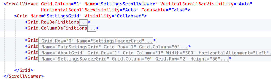
But I figured this change could be added easily enough. Without getting into the nitty-gritty of the XAML code changes, the settings UI was a single grid wrapped in a ScrollViewer control that displays scroll bars as needed. At first, I just pulled the “About this app” code block out of the main settings grid, making it its own grid, one that could be laid out side-by-side with the original grid as needed. But in testing that, I realized the settings grid would need four sub-grids:
- A header that never moves or changes
- The main list of settings, which are mostly Expanders
- The “About this app” grid, which will reflow to the right as needed.
- A spacer that will add some room at the bottom of the main list of settings when “About this app” is on the right
It looks like so.
The C# code that reflows the “About this app” grid looks and works like it did in the test project.
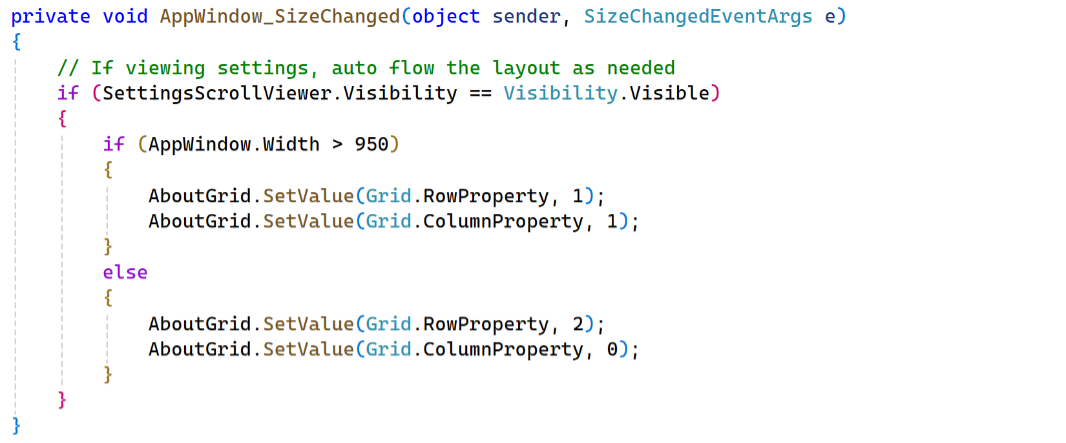
I settled on a 900 DIP width for the reflow based on how Notepad does it. And it seems to work OK. It uses a normal single-column layout when displayed at a width of 900 DIPs or less, and it moves to a two-column view when it exceeds that width.
So there you go. Nothing major, but a small step forward.
I may tweak the layout just a bit–I feel like the gap between the two columns is a bit wide–and I will keep testing it while I work on other changes. But I’ll add this change to the GitHub repository soon.

Gain unlimited access to Premium articles.
With technology shaping our everyday lives, how could we not dig deeper?
Thurrott Premium delivers an honest and thorough perspective about the technologies we use and rely on everyday. Discover deeper content as a Premium member.