Modernizing .NETpad: Unexpected Design Progress (Premium)
- Paul Thurrott
- Jul 15, 2024
-
1
This past weekend, I got much further than expected, and more quickly than expected, in modernizing the design of .NETpad for Windows 11. There’s still so much more to do, but I’m surprised to discover I’ll be able to do more of this work in WPF than I had any right to hope.
In Modernizing .NETpad: Next Steps (Premium), I described the quick and dirty method I used to get a minimally modernized version of my app up-to-date. To be clear, there are more sophisticated ways to do what I did—for example, I should be using resource dictionaries to handle control styles/colors—and doing that correctly is definitely on my to-do list. But this is also in some ways an interesting real-world look at the challenges developers face with their legacy apps, and what one can do to modernize them. Anyway, as I left it at the end of that article, .NETpad was mostly where I wanted it visually. It supports Windows 11 theming and all of its user interfaces look right in Windows 11. The app is functionally unchanged, but it’s been brought into the Windows 11 era.
I’ve been thinking about, and researching, what I could do beyond the basics. From what I could tell, adopting certain new features in the modern Windows 11 version of Notepad would likely require a new version of the app based on the Windows App SDK and WinUI 3. But I wanted to see how much I could do with just WPF, too. Ideally, using native controls when possible. But I’m not above kludging something together, either.
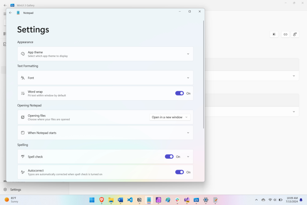
When you compare Notepad in Windows 11 to .NETpad, there are two major visual and functional differences. The biggest, of course, is that Notepad supports multiple documents through tabs, whereas .NETpad still requires multiple windows. And the second biggest is its new, modern Settings pane, an interface that takes over the main application window.
You can implement tabs in WPF, and I’ve been experimenting with that. The issue there is whether it can look anything like it does in Notepad, as that app was updated with a new Windows App SDK/WinUI 3 user interface façade that takes advantage of modern new title bar hiding techniques that are not available (natively) in WPF. We’ll see: That work continues.
The Settings interface seemed like the simpler choice from an implementation perspective. First, I would create the menu bar-based Settings (gear) icon and link it to the About box, work I had completed previous to publishing that earlier article. Then, I would create a Settings window in XAML, wire up all the features it would need to offer, and then I’d look into ways in which I could transform that window into a view that would replace, or sit on top of, the main application window and visually recreate what you see in Notepad.
I went down numerous rabbit holes, examining WPF constructs like frames, navigation interfaces, pages, user controls, and more. I was thinking about how I had implemented the Settings slide-in pane for the UWP version of .NETpad and whether that work might somehow translate to WPF. And that’s when it hit me: I’m not sure how Microsoft implemented the Settings pane in Notepad, but I was sure that I could use WPF to create a layout in XAML that included both the main app display and the Settings pane in which I hid or displayed certain items programmatically. Which is basically what I had done with that UWP app, only this time the Settings interface would need to replace the entire app window.
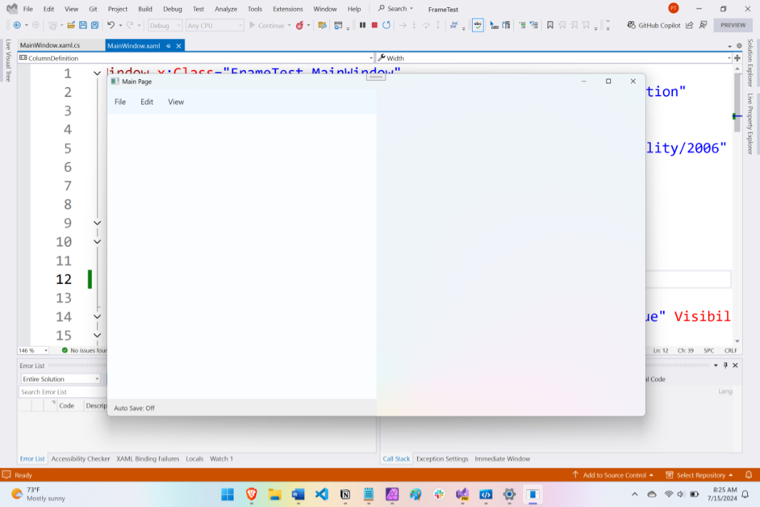
As always, I started off with a blank new app so I could experiment more easily: The WPF version of .NETpad has over 150 lines of XAML code for its main app window alone, making it difficult to even conceptualize this kind of change. I recreated the basic .NETpad UI—a grid with three rows of UI for the menu bar, textbox, and status bar—and then I made that grid one of two grids, each set to 50 percent of the width of the window, side-by-side. On the left was the app (the menu bar, textbox and status bar), and on the right was a blank area that represented the future Settings UI. The goal? To programmatically display only one of the two grids at a time, and then provide a button or whatever so I could switch between them.
The original app structure is simple. There’s a window and it contains a grid. That grid contains the three top-level UI elements (again, menu bar, textbox, and status bar).
This couldn’t be simpler. In XAML, it looks like so:
<Window>
    <Grid Name="MainGrid">
        <Menu />
        <TextBox />
        <StatusBar />
    </Grid>
</Window>
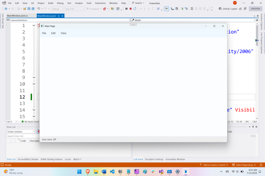
My idea was to enclose that grid (MainGrid) in an outer grid (OuterGrid). OuterGrid would have two columns, side-by-side. MainGrid would go in the left side. And then a new grid (SettingsGrid) would go on the right. In XAML, it looks like this:
<Window>
    <GridName="OuterGrid">
        <Grid Name="MainGrid">
            <Menu />
            <TextBox />
            <StatusBar />
        </Grid>
        <Grid Name="SettingsGrid">
        </Grid>
</Window>
That was easy enough to cobble together.
Then, I just had to hide SettingsGrid. Also easy: I just set that grid’s with to 0. Voila! Now, the app looks normal, but the Settings grid is lurking in there, invisible.
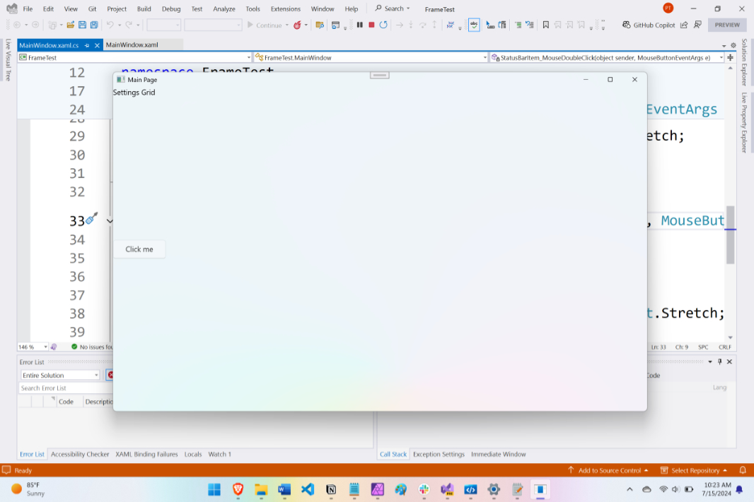
To display SettingsGrid (and hide MainGrid), I created an event handler for the “Auto save” item in the status bar: When you double-click this item, its MouseDoubleClick() event handler fires. Then, I just needed to add code in there that would hide MainGrid and unhide SettingsGrid. I also had to put a button in SettingsGrid that would do the reverse (“go back”) and hide SettingsGrid while unhiding MainGrid.
I spent a bit of time on this and then surprised myself when I made it work.
The MouseDoubleClick() event handler for that status bar item clears the outer grid’s column definitions (as they were hard-coded to display MainGrid across the entire app window and hide SettingsGrid), hide AppGrid, set SettingsGrid to now display to the full width of the app window, and then unhide Settings Grid. The code looks like so:
private void StatusBarItem_MouseDoubleClick(object sender, MouseButtonEventArgs e)
{
    NewGrid.ColumnDefinitions.Clear();
    AppGrid.Visibility = Visibility.Hidden;
    SettingsGrid.HorizontalAlignment = HorizontalAlignment.Stretch;
    SettingsGrid.Visibility = Visibility.Visible;
}
Simple. And … it works. When I double-clicked that status bar item, the proto Settings pane appeared, replacing the main app window display, just as in Notepad.
I then create a similar block of code for that button’s Click() event handler, reversing the changes above. That, too, worked.
Huh.
What I should have done at this point is followed the plan: Create the Settings UI using a window in XAML and then later integrate that code into the real app. But I was so excited by this breakthrough, simple as it is, that I pushed forward. I implemented this change into .NETpad directly. It worked fine from the get-go, and so I started working on the Settings user interface, sure that I’d have to make some compromises when it came to native controls.
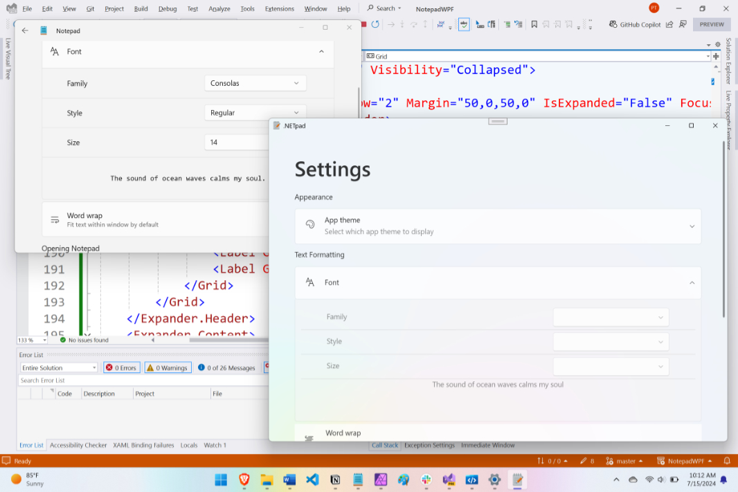
But here, again, I was surprised. There is a lot of fit and finish work to do, and I still haven’t wired up any of the code that will actually implement this functionality. But I was able to cobble together something that very closely approximates the Notepad settings UI in .NETpad. This was a wonderful surprise.
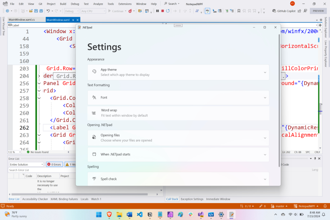
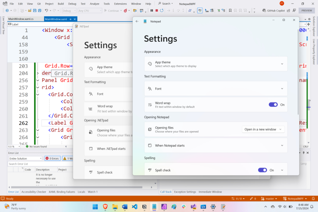
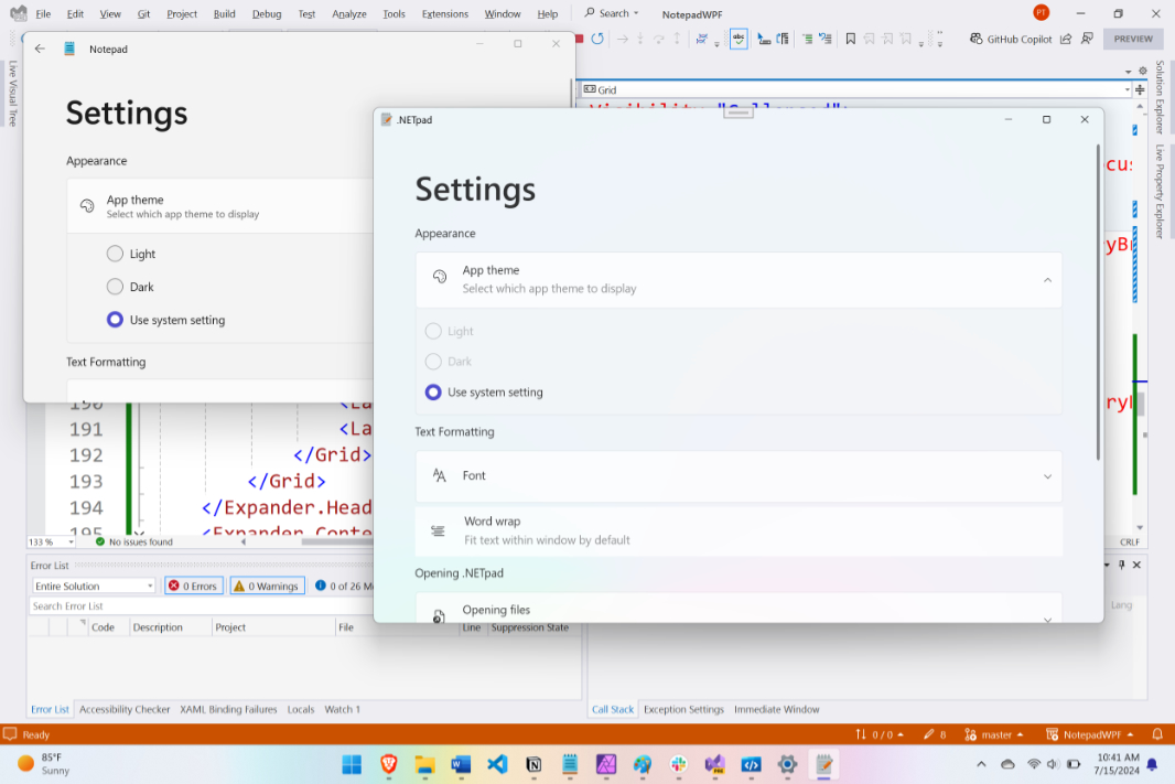
Here’s what it looks like compared to Notepad settings:
How I did this is a bit difficult to explain, though it’s all just XAML layout work. (Which, frankly, I’m probably more qualified to do than actual coding.) And I haven’t yet explained how I implemented the Settings gear icon in the menu bar, a feature WPF does not support natively. So it’s time to step back for a second and look at that first.
As originally implemented, the WPF version of .NETpad features a standard menu bar at the top of the app, with File, Edit, Format, View, and Help items. This emulated how Notepad used to look, before Microsoft modernized it for Windows 11.
But now Notepad has a simpler menu, a centralized settings interface, and that new Settings (gear) icon. I will look at the .NETpad menu later, but early on, I began examining what it would take, or whether it would even be possible, to implement an icon over to the right of a menu bar in WPF. Long story short, it’s not possible. But thanks to the XAML layout capabilities of WPF, I was able to work around that. In fact, my solution is very similar to the app/settings layout I note above. That is, I used a grid.
Above, I noted that the main app window is basically just three elements—menu bar, textbox, and status bar—each in its own row from top to bottom. My idea was to swap out the menu bar row for a grid. And that grid would be divided into two columns, from left to right, with the menu bar inside the leftmost column in the grid and a Settings button in the rightmost. The menu bar would be aligned to the left, while the Settings button would be aligned to the right. Simple.
The high-level XAML view now looks like so:
<Window>
    <Grid Name="OuterGrid">
    <Grid Name="MainGrid">
            <Grid Name="MenuGrid" />
            <TextBox />
            <StatusBar />
        </Grid>
    </Grid>
    <Grid Name="SetingsGrid">
    </Grid>
</Window>
And if you include the menu bar and Settings button, it looks like this:
<Window>
    <Grid Name="OuterGrid">
    <Grid Name="MainGrid">
            <Grid Name="MenuGrid">
                <Menu />
                <Button />
            </Grid>
            <TextBox />
            <StatusBar />
        </Grid>
    </Grid>
    <Grid Name="SetingsGrid">
    </Grid>
</Window>
I’ve mentioned the WPF Gallery Preview and WinUI 3 Gallery apps before, and they’re relevant here too: Each offers an Iconography section that describes the Segoe Fluent Icons font that ships with Windows 11 and how Microsoft uses them in its apps, as can third-party developers. That Settings (gear) button in Notepad is implemented using one of the icons in that font. And that means we can use it in .NETpad too. So I did.
To get there, I encased the <Menu> block in MainWindow.xaml, which was previously the item in the first row of the MainGrid <Grid>, within a new <Grid> called MenuGrid. So now MenuGrid is the item in the first row of MainGrid (item 0). And the MainMenu <Menu> is inside it.
MenuGrid has three columns from left to right: The original MainMenu <Menu>, which is otherwise unchanged; a <Separator> that I’ve configured to be invisible and am using as a spacer; and then a second <Menu> named SettingsButton that uses the “Settings” Segoe Fluent Icon.
The XAML code looks like so:
<Grid Grid.Row="0" Name="MenuGrid"> <Grid.ColumnDefinitions> <ColumnDefinition Width="Auto" /> <ColumnDefinition Width="*" /> <ColumnDefinition Width="Auto" /> </Grid.ColumnDefinitions> <Menu Grid.Column="0" FlowDirection="LeftToRight" HorizontalAlignment="Left" HorizontalContentAlignment="Left"> … </Menu> <Separator Grid.Column="1" Visibility="Hidden" /> <Menu Grid.Column="2" > <MenuItem Name="SettingsButton" Click="SettingsButton_Click" FontFamily="Segoe Fluent Icons" Header="" HorizontalAlignment="Right" FlowDirection="RightToLeft"> </MenuItem> </Menu> </Grid>
And when you run the app, it looks like so:
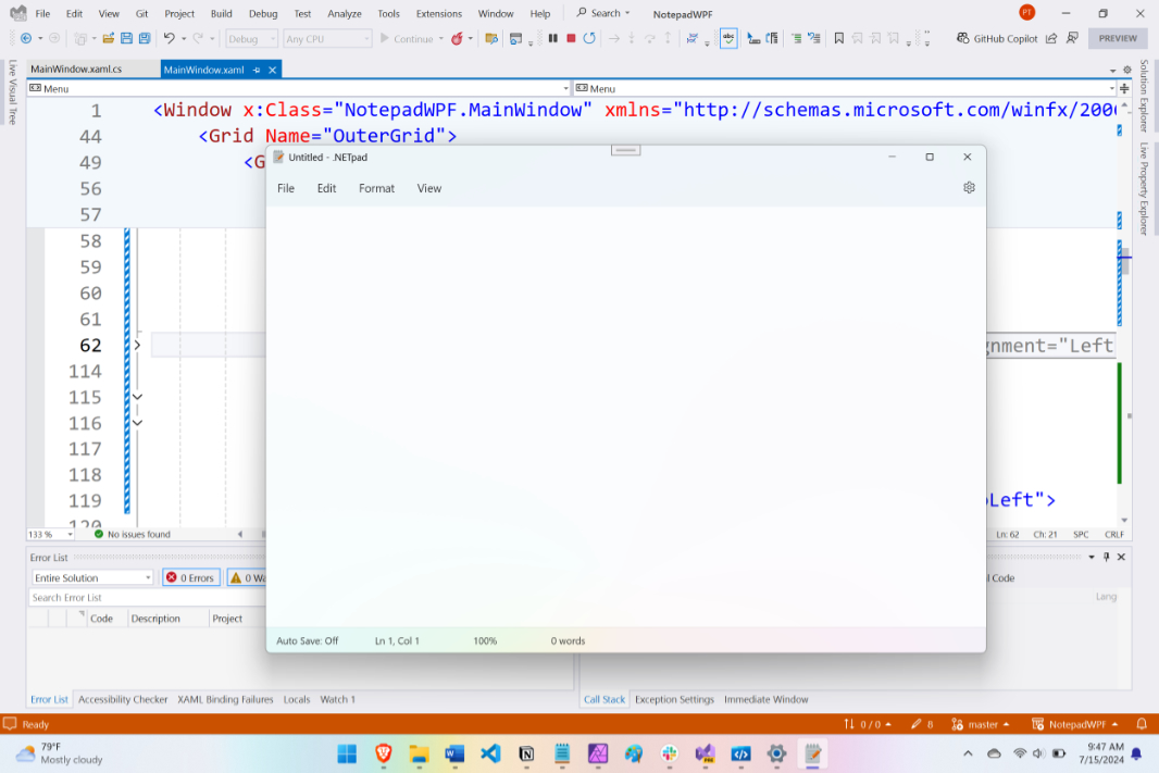
Very much like Notepad, in other words. Very nice.
When I first implemented this change, I hooked up its Click() event handler to launch the About box. But with the changes noted above, I switched it to display the Settings pane as per my previous test app. Initially, this Settings pane basically duplicated the About box, but within the window. And I did some light testing to make sure that moving back and forth between an open document and the settings didn’t screw anything up. It works fine, but I will need to implement some code to correctly display the name of the document and its save status, if either or both is necessary, when you return from settings. That’s a problem for a later day: My next steps were all about implementing the Settings UI. And that, as noted previously, is just user interface involving XAML, WPF controls, and layout detail work.
I’ve enjoyed this quite a bit.
Comparing the Notepad settings interface to the typography information in WPF Gallery Preview and WinUI 3 Gallery, I can see that the “Settings” text at the top of this interface is a particular style (“TitleLargeTextBlockStyle”), though I later discovered that it changes size as you make the window smaller. (I will need to look at that bit later.) The rest of that UI appears to be a sequence of text labels, which are easy enough, and then some Expander controls. And then some more text.
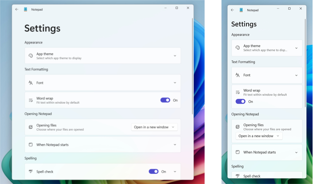
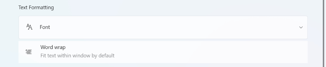
These are all available to WPF developers, somewhat surprisingly, and with Windows 11 theming enabled, the Expander controls look like their counterparts in Notepad. I spent most of my time so far just figuring out the layout, and one thing I’m still working on as I write this are the elements like Word Wrap, which look like an Expander control but aren’t: These elements don’t expand, but they visually resemble the Expanders used elsewhere in this UI.
To emulate the Expanders for the Word Wrap item (and a few others like it), I’m experimenting with using a StackPanel. It took a while to get the layout of that thing right—i.e., matching the layout of the Expanders above and below it—but it’s pretty much there: I just need to add rounded corners and a subtle outline. And that ToggleSwitch control, of course. It will get there.
As I built out the interface, I realized that it wasn’t scrolling and that the elements lower on the page would be unavailable unless I resized the window. This felt like a familiar problem, and so I wasn’t surprised to discover that the solution was indeed familiar: I just had to wrap the SettingsGrid <Grid> block inside of a <ScrollViewer> block like so:
<ScrollViewer Grid.Column="1" VerticalScrollBarVisibility="Auto" HorizontalScrollBarVisibility="Auto" Focusable="False">
    <Grid Name="SettingsGrid" Visibility="Collapsed">
    …
    </Grid>
</ScrollViewer>
So now the ScrollViewer that contains SettingsGrid is the second column (“1”) in the OuterGrid <Grid> (where MainGrid is the first column, or item 0). Easy.
Before getting too far into this UI, and without evaluating which features I can actually implement, I tested the top Expander (the “App theme” item under “Appearance”) to see whether it would expand/contract properly in-line with the other UI elements. And so I implemented the same three radio buttons you see there in Notepad, though I pre-selected the correct item and made the other two inactive for now. It works fine (as do the other Expanders).
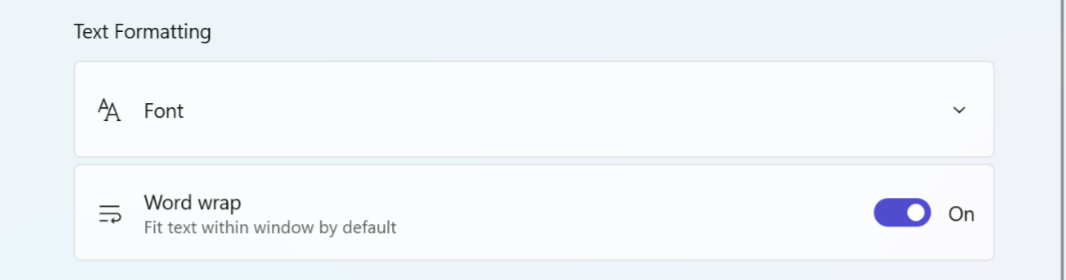
These Expanders also each require a lot of layout work. They’re comprised of a Segoe UI Icon-based glyph on the left and one or two lines of text to the right of the glyph (each a different style when there are two lines). And then some have other controls off to the right. The “Word wrap” item, as noted, has a ToggleSwitch. The “Opening files” item has a DropDownButton. And so on.
And that’s just the headers: Expanders also support a content area that displays when the item is expanded. And those have further UIs, sometimes pretty complex. Here’s some early work I’m doing on the font interface, for example.
It will get there. But this all required a lot of detail work in XAML. And I’m still not completely there, so that work is ongoing. But each Expander header uses a specific grid layout. As does each Expander content area. And then I’m still working through the non-expanding items like “Word wrap.” But I can tell that it will happen. I’ll get this done.
Once I’m happy with the Settings UI, I’ll implement the settings features I can implement—I’m not sure about App theme yet or some other features, but the fonts and word wrap options should be straightforward. And then I’ll adapt the .NETpad menus to more closely resemble those in Notepad. And then … well, then I’ll need to figure out the tabs. That’s the big one. But as noted, I am working on that separately as well. I am hoping for a breakthrough there, we’ll see.
Anyway, I wasn’t expecting to provide an update this quickly after the previous post. But I made so much progress yesterday that I just had to share it. I may as well use my ADHD for good.
More soon.

Gain unlimited access to Premium articles.
With technology shaping our everyday lives, how could we not dig deeper?
Thurrott Premium delivers an honest and thorough perspective about the technologies we use and rely on everyday. Discover deeper content as a Premium member.