Microsoft Details the New Windows 11 Start Design
- Paul Thurrott
- May 10, 2025
-
9
Windows 11 arrived with a new Start menu design, but like the rest of the system, it came with functional regressions and little in the way of customization, and it felt like a step backward. I liked that Microsoft was taking on the impossible task of simplifying the Windows UI, but the actual design was unsophisticated. To this day, for example, if you delete every shortcut in the Pinned section of Start, you’re left with a gaping hole: The Windows 11 Start menu isn’t even smart enough to auto-fill that empty space.
The following year, we found out why Windows 11 Start is so terrible: The people who designed this user interface clearly never used Windows and didn’t bother trying to figure out what made Start so important. And since then, Microsoft has made small, mostly meaningless updates to Start, though the Phone Link integration that’s only now rolling out is a pretty big change.
A month ago, we discovered that Microsoft was secretly testing a new Start menu design. I enabled it on my Surface Laptop 7 to check it out, and I was delighted to discover this was a meaningful update and one that many users would view favorably. (As with anything subjective, opinions will vary, of course.) And this past week, Microsoft went public with the new Start menu and several other new features that I assume are tied to the yet-to-be announced Windows 11 version 25H2. In fact, they appear to be tying this change to the new Phone Link integration, which is apparently called Phone companion now.
The timing Microsoft mentions confirms my 25H2 suspicions: It said that this and the other new Windows 11 experiences would be made available first to Windows Insiders “over the coming month.” That could have happened as soon as yesterday, but didn’t: The Windows Insider Program tweeted Friday that the expected new builds would hopefully arrive early next week instead.
Microsoft’s description of the new Start menu this past week was a bit vague, and though there was an accompanying video, it focused on Phone companion and barely shows the new Start menu design.
“Start is getting personal, with more options to customize and organize your apps,” the announcement post explains. “The new all apps category view automatically sorts based on the apps and categories you use most, so you can quickly access all your favorites. And now with the phone companion in Start, your connected Android or iOS device is only a click away.”
This downplays the changes, in my opinion, but I knew we’d be getting new Insider builds with this new Start soon, and so the details would come eventually. But then I was surprised to see that Microsoft Design–which, yes, feels like an oxymoron–wrote up how it arrived at the new Start menu. And unlike that insipid video from 2020, this one actually feels, dare I say, thoughtful.
The Start menu is “redesigned” and “refreshed,” but it also continues the “wider Windows 11 philosophy of calm, human-centered technology.” But more to the point, it was created with the right intent: Users asked Microsoft to help them my their apps more quickly and customize Start to their needs.
The Microsoft Design post highlights some prototypes it explored for Start, which is interesting, and it actually engaged in user feedback before implementing the new design. It also “tested and tweaked” the design on a variety of screen sizes, from “a Surface Go to a 49-inch ultrawide.” It even did performance optimizations, which was sorely needed.
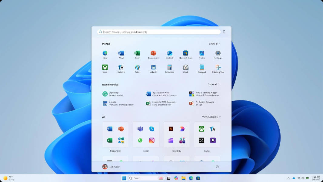
Where today’s Start is simple but a mess, with pinned app shortcuts at the top and a bizarre Recommended section in the bottom that mixes recently installed apps, app suggestions, recent documents, and more. But the new design brings All apps–which is a sub-view of Start now–to the main menu display, as it was in Windows 10. There are three All apps views, the default of which is a weird Categories view that it eerily similar to the App Library screen in iOS. This is, well, by design, as it is “reminiscent of your phone,” with no more “marathon scrolling.” (There are also Grid and List views.)
For customization, you can now switch between “More pins” and “More recommendations” in place, instead of digging into the Settings app, and you can expand, collapse, or hide the Pin, Recommended, and All sections now. You can also hide suggestions, as before. And there is a “slim phone sliver”–also described as a “phone panel”–on the side if you want it there, the Phone companion. There’s a small Phone icon in the upper right if you want to toggle that on the fly, too.
This looks good to me. And I appreciate the explanation, even more so given how terribly the Windows team communicates. I’m looking forward to learning more, especially around the schedule/timing.