iOS 26 Beta 3 Tones Down Liquid Glass Redesign
- Laurent Giret
- Jul 08, 2025
-
4
Apple released the third developer beta of iOS 26 yesterday, and the main change is that the company’s big “Liquid Glass” redesign has been significantly toned down. Liquid Glass is also coming to iPadOS 26 and macOS 26, it looks like Apple has been listening to feedback to improve the readability of several UI elements.
Since the release of the first iOS 26 beta on June 9, many testers have complained that Liquid Glass, which takes some inspiration from the translucent “Aero” design from Windows Vista, made a lot of things harder to read. The second iOS 26 beta released in late June had already made some improvements to Control Center with a more pronounced background blur effect.
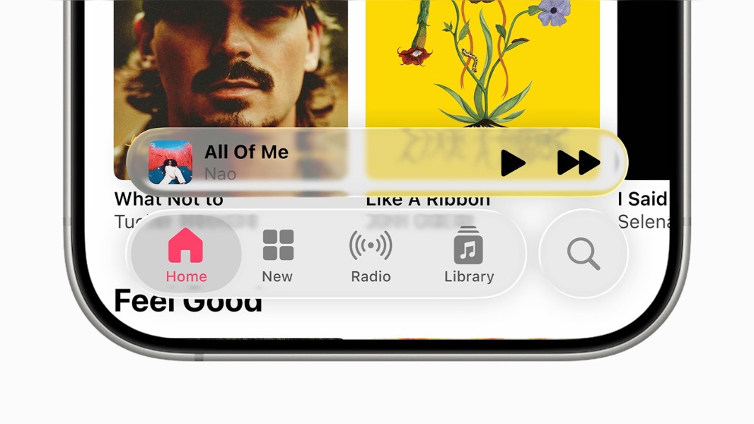
Now, the third iOS 26 beta tweaks translucency effects on notifications and the bottom navigation bar in inbox apps like Apple Music. The change is especially noticeable in dark mode, where this bottom navigation bar makes menu items much more readable.
In Dark Mode, iOS 26 Beta 3 offers better readability. pic.twitter.com/1GleToHRzP
— Beta Profiles (@BetaProfiles) July 7, 2025
iOS 26 will be the biggest visual redesign coming to the platform following the launch of iOS 7 back in 2013, which is when Jony Ive’s team moved away from the previous skeuomorphism aesthetic in favor of a flat design. The new design language was also heavily criticized at the time, and it’s no surprise that Liquid Glass is now getting the same treatment.
Liquid Glass was one of the main highlights of Apple’s WWDC developer conference this year, which also reflected the fact that Apple had very little to show on the generative AI front. It will be interesting to see if the company continues to tweak Liquid Glass in upcoming betas. Anyway, there are already lots of jokes on social media about Liquid Glass turning into “frosted glass.”