The iPad is a Nearly-Perfect Laptop Now. There’s Just One (Small) Problem ⭐
- Paul Thurrott
- Sep 15, 2025
-
22
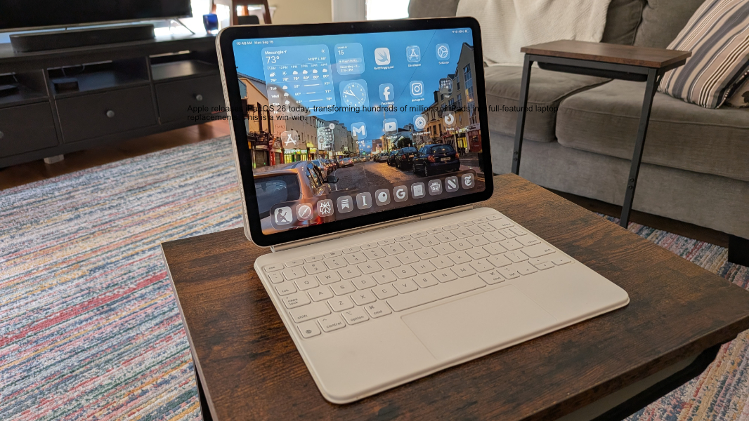
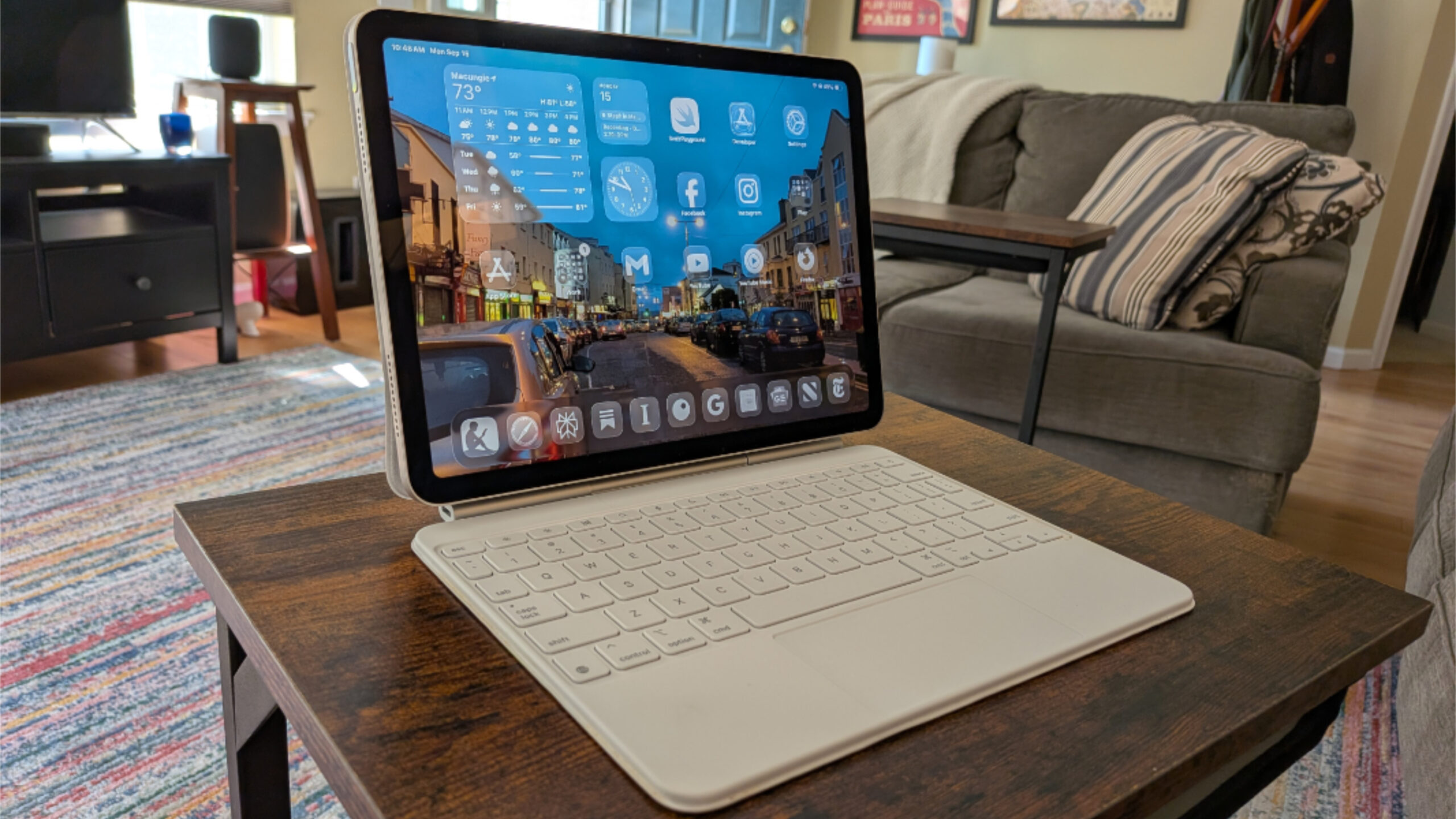
Apple released iPadOS 26 today, transforming hundreds of millions of iPads into full-featured laptop replacements. This is a rare win-win with no meaningful compromises: If you prefer the iPad as it’s always been, the user experience remains the same. But if you’re looking for a simpler, safer, and saner way to get work done, iPadOS 26 delivers on that as well.
No software is perfect. But iPadOS 26 is nearly perfect, and it finally unlocks all the power lurking in modern iPads, making this platform a superior alternative to Windows PCs, Macs, and Chromebooks for most people. This success cannot be overstated or denied.
But with this success comes the nitpicking. And it says a lot about how good iPadOS 26 is that we’re even having this conversation. But we no longer need to harp on the big picture issues that dogged previous versions, like the lack of background processing or full-featured multitasking functionality. And so the more we use the iPad to do more, if you will, the more we notice smaller user experience issues. These issues are not in iPadOS itself. They’re in the apps we use every day, from Apple and from third parties. And they can be summarized with a single word.
Inconsistency.
The problem is somewhat ironic: With iPadOS 26, Apple brought true Windows/Mac-style productivity capabilities to the iPad while retaining its touch-first simplicity. But it is that emphasis, that focus, that makes the iPad a little bit frustrating when used like a laptop.
All iPad apps were written specifically with this touch-first emphasis in mind, of course, and that will continue. And to date, some apps have been updated to explicitly accommodate the mouse and keyboard capabilities one expects from traditional desktop productivity apps, and more will be updated in time. But this is happening inconsistently. That is, each app has its own user experience, with frustrating differences in things like in-app navigation. And these differences are amplified when you use the iPad with a keyboard/touchpad as on a Magic Keyboard.
I switched to iPadOS 26 immediately, on the day that Apple released the first developer preview. I’ve been using my 11-inch iPad Air M3 with iPadOS 26 and a Magic Keyboard ever since, and though I was worried about not using reading apps in portrait mode with this setup, I adapted pretty quickly. And so I use the iPad the way I use a Mac and, in those rare cases where the touchpad works well enough, a Windows PC. Meaning, I use touchpad gestures. A lot.
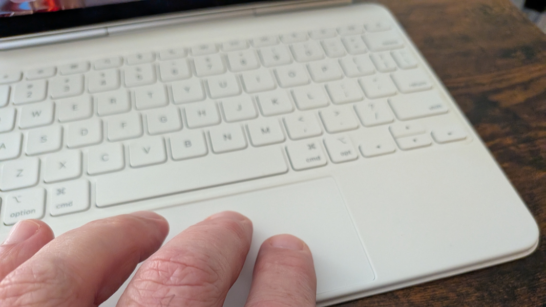
At the system level, iPad touchpad gestures work as they do on other platforms. It supports two finger scrolling, which may be the most common multi-finger gesture. It supports two finger pinch gestures for zooming, as with a touch screen, which is useful when reading articles with fixed column widths. And it supports three-finger gestures for switching between apps (left/right) and navigating back to the Home screen (up). There are more, but you get the idea. These gestures are familiar and consistent and they work as well on an iPad (Magic Keyboard) touchpad as they do on a Mac. Plus, you can use the keyboard as well. For example, Cmd + Tab for app switching and Cmd + Space for Spotlight search.
It’s when you get into individual apps that things get squirrely.
Consider a typical morning for me. I get up, make a cup of coffee, sit down in the living room, open the iPad in its Magic Keyboard and start to read.
I usually start with The New York Times and its default Today view. Here, navigation works as expected. I can scroll down this page with a two-finger gesture. I can tap on an article headline to open it, and scroll through it just like I do with the Today view, of course. And when I want to go back, in this case to that Today view, a two-finger gesture (to the right) on the touchpad works exactly as expected.
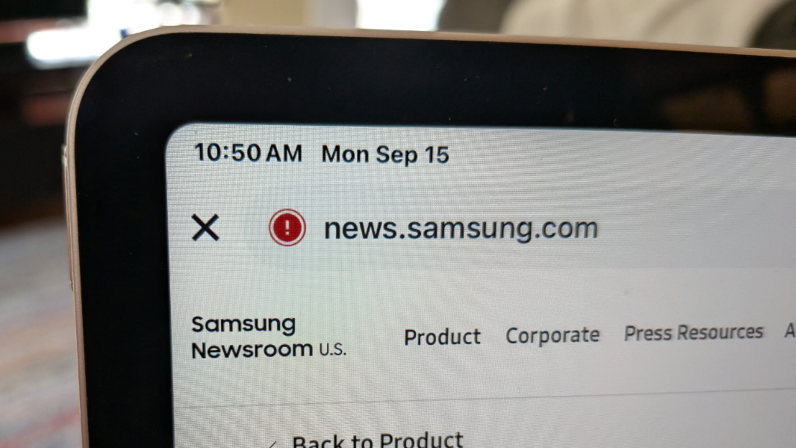
So that’s good. From there, I head to Apple News. And this is where the first inconsistency turns up. Apple News also has a Today view. You can scroll this view using two fingers. You can tap on an article title to read it, and you can scroll through the article as expected. So far, it’s the same. But when you want to navigate back, you can’t: A two-finger gesture (to the right) instead displays another article. The previous article in that Today view, in this case.
Um. What?
So how does one go back in Apple News? You have to use the mouse pointer. When you move your finger around on the touchpad, the pointer appears. Then, you have to scroll the article to display the app’s on-screen controls. Then, you need to move the cursor up to the top left of the display and click the Back (“<”) button. That’s a lot of steps. And this is an Apple app.
Curious about this, I tried to discover whether Apple had rules or guidance for in-app navigation. On its support site, you can see a list of touchpad gestures for iPad, but “Back” is not one of them. And if you look at the Apple Developer website, you can see that Apple leaves what it calls the “app navigation pattern” up to developers. Its page about gestures notes that “people need simple, familiar ways to navigate and perform actions” and that apps can offer a “shortcut gesture” in addition to displaying a Back button. But its page about pointing devices says that the expected behavior for a “swipe between pages” gesture should do what Apple News is doing and “navigate forward or backward between individually displayed pages.” It doesn’t say that this is a two-finger gesture, but I would take Apple’s use of this in News as “correct.” It’s just that it’s wrong, in my mind, and cannot be customized.
(For whatever it’s worth, you can tap the Esc key on the keyboard to close an article in News and return to the Today view, or whatever view you were in before.)
Next, I read the Technology page in Google News. This typically requires me to navigate to that view and then “refresh” it to get the latest stories, but that’s the app’s issue. Here, navigation works as expected: You can scroll the view, tap into an article, and scroll through an article normally. But the two-finger gesture doesn’t navigate in any way, it displays a weird bottom toolbar that I never want. To display and then access a Back button, I need to scroll up, as with Apple News. But tapping Esc does nothing.
From there, I head to Feeeed, an iPhone/iPad-only news feed app I really like because of its minimalist UI and distraction-free article views. Navigation works as expected and as above. But that two-finger “Back” gesture I always want to use works fine, too. So this app works as I expect it to. Meaning that by the time I get to this app, I’m two for four on navigation consistency and three of the four apps I’ve used have different navigation gestures/keyboard shortcuts. Great.
Next, I check out the Google app (which is the Discover feed in Android and Chrome). This app works exactly like Google News, which makes sense. But it also means that it’s less efficient on the iPad with a Magic Keyboard. So I’m now at two for five. (This app also has a months-old bug in which scrolling stops working correctly and the top toolbar with a Back button becomes inaccessible. But that’s on Google.)
From there, I head into Inoreader, which is the same feed reader I use on the PC. This app is a bit unique in that I typically Ctrl-click on articles in Windows to put them in a new tab, and so navigation inside the app is of less interest. But on the iPad, you can click on a title to view an article, scroll normally, and so on. But when you view an article, it displays as it does in Google News and the Google app, so I have to manually move the cursor up to the top left to click a Back button. Two for six.
If I still have time to read, I will then go into Instapaper, Substack, and/or the Kindle app. These are all unique in their own ways, but Instapaper does support the two-finger back gesture (three for seven), as does Substack (four for eight). I won’t count Kindle in this tally since one doesn’t navigate between books while viewing a book and the two-finger gestures here make sense: Left/right changes to the previous/next page as one would expects.
These inconsistencies are tough on muscle memory. It would be nice if they all worked consistently given how similar each app is otherwise. I would appreciate it if this were customizable, I guess on an app basis. But there are other little niggling issues related to consistency too.
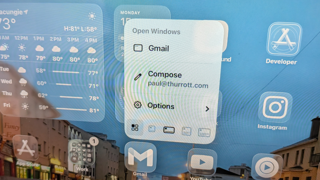
With iPadOS 26, Apple also brings a Mac-like system menu to the iPad. But it’s not on-screen by default, which I think makes sense on this platform, even for those of us who lean heavily into the productivity features. Instead, you can move the mouse cursor up to the top edge of the screen to display the menu. And that works mostly as expected. But not entirely: It won’t appear on the Home screen for some reason. Doy.
iPadOS 26 also adds Mac-like window control buttons for Close, Minimize, and Maximize/Restore. These appear to the left of the menu as familiar (if you’re a Mac user) red, yellow, and green circles. They’re tiny by default, but as you move the mouse cursor over them, they magnify so they’re easier to click. (With your finger, you instead touch the mini buttons to magnify them and then tap the button you want.) This works obviously enough that most should adapt quickly, I think.
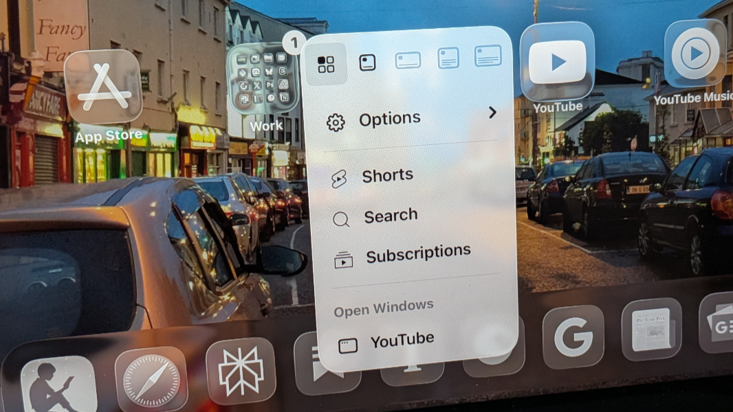
The menu/window buttons are optimized for touch, like everything else on the iPad, but it’s not usually a problem with a touchpad. But if you click into one app from another and want to go back to the previous app. For example, maybe there’s a YouTube video embedded in an article. You can view it in the embed, usually, but you can also click inside to view it in the YouTube app. When you do so and want to go back, you can use that three-finger gesture. But there’s also a little “< App name” shortcut in the top left of the YouTube app. And it is a pain to click accurately: If you move the mouse cursor to the top of the screen, it disappears unless you accurately move right to it. If you overshoot it by a few pixels, even.
But the oddest one to me, in some ways, is right-click consistency. If you’re coming to the iPad from a Windows PC or Mac, and you are, you’re almost certainly familiar with how right-click works. Here, the most common gesture is to press with two fingers. And this does work on the iPad. Except where it doesn’t. And this one is one Apple.
Let’s say you want to customize the Home screen. If you’re holding an iPad and using touch, this works like it does on an iPhone, just tap and hold on an empty area of the screen. But tap and hold is analogous to right-click (or what Apple and others now call secondary click). And while you can right-click an icon on the Home screen normally (displaying a menu a below), you cannot right-click the screen itself. It doesn’t work.
What you have to do in this case, for some reason, is click and hold with the touchpad using just one finger. What the frick is that? That’s an illogical and (to me) unfamiliar gesture. Why would this work one way on Home icons and another way on the Home background?
That’s rhetorical. I’m sure there’s a reason and I’m sure that reason makes sense to some people. But it’s inconsistent and it’s not how Windows works, and so it feels off to me. Also off: If a right-click/tap and hold action displays a menu, that menu displays in a different place on-screen depending on how you trigger it. Weird.
If you’re reading this and not understanding why any of this is an issue, I get you. I pointed out up top that this is mostly nitpicking and that iPadOS 26 is so good that this is all we can complain about. But this isn’t about complaining to complain. In making the iPad so elegant for laptop-type computing, Apple has also raised the bar on the expectations of those who want such a thing. And these little inconsistencies hurt the user experience. I start out each day with some frustration because each app I read with has a slightly different navigational experience. This should be consistent, especially for the same types of apps.
But it’s OK. Like many, I waited and waited for years for Apple to fulfill the promise of the iPad. And while I did expect it to get here eventually, I figured it would do so as it always does, in a piecemeal fashion, with small changes over many years. Instead, iPadOS 26 is an explosively powerful step forward, one that turns this toy into the powerful multitasking and productivity marvel it can be. And this all happened in a single release. It’s astonishing.
Back in August, I wrote that the iPad might just be the perfect computer. That’s true. The iPad is the perfect computer for most people most of the time. It’s a better choice than a Windows PC, a Mac, or a Chromebook for most people. And it will only get better from here as more and more developers update their apps to support this new functionality. Hopefully, Apple will examine all the feedback it gets from developers and users alike and make some small tweaks to address the inconsistency issues.
But that’s a minor issue. And I love that this is where we’re at.

Gain unlimited access to Premium articles.
With technology shaping our everyday lives, how could we not dig deeper?
Thurrott Premium delivers an honest and thorough perspective about the technologies we use and rely on everyday. Discover deeper content as a Premium member.