WWDC 2025: The Subtle, the Silly, and the Sublime (Premium)
- Paul Thurrott
- Jun 10, 2025
-
31
We were told to lower our expectations heading into WWDC 2025. But the pundits were wrong. Apple delivered a confident and upbeat keynote address. And as importantly, the improvements it announced to its many platforms will benefit its humongous user base greatly.
No, not all of them: Apple’s long history of hyperbole was also on full display Monday. But I came away more impressed with the announcements than anticipated. Enough so that I figured it was worth sorting through the noise and seeing what really matters.
F1
Only Apple would open a developer conference with a video preview of a movie that it is distributing through its video streaming service. That was silly. And self-serving. Yes, Tim Cook’s attempts at self-deprecating humor are less than successful, but I can’t dislike Craig Federighi and the recurring hairstyle humor.
For the Microsoft faithful, these videos are also the modern equivalent of the goofy videos Steve Ballmer and Bill Gates used to make together and show at the software giant’s events over two decades ago. Kudos for that.
And kudos, too, for the use of Ratt’s Round and Round. Yes. Always, yes.
Verdict: Silly but also sublime
Addressing the Apple Intelligence elephant in the room
Conventional wisdom–as voiced by shrill critics who believe that today’s Apple can’t get anything right and is somehow on the verge of an extinction moment–has it that the company overpromised and under-delivered on Apple Intelligence last year. And that the embarrassment from that would trigger a head fake moment this year in which Apple would pretend it all never happened and try to distract us with hand-waving.
Nope.
After the goofy F1 sequence and a brief intro from Tim Cook, Craig Federighi appeared and dove right into the fray by discussing “two things that are foundational to [Apple’s] platforms,” the first of which is Apple Intelligence. And I hope you all had that one on your WWDC 2025 Bingo card, because it came up again and again during the keynote.
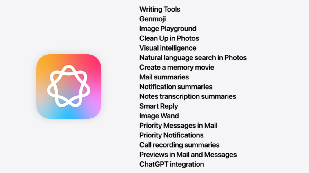
Federighi explained how Apple took its first steps with Apple Intelligence last year when it introduced the brand and, more importantly, all the functionality it delivered. It’s a long list: Writing Tools, Genmoji, Image Playground, Clean Up in Photos, Visual intelligence (yes, that one has a small “i” for some reason, though the names were all consistently capitalized), Natural language search in Photos, Create a memory movie, Mail summaries, Notification summaries, Notes transcription summaries, Smart Reply, Image Wand, Priority Messages in Mail, Call recording summaries, Previews in Mail and Messages, and ChatGPT integration. This was all done while preserving user privacy, he highlighted, thanks to Private Cloud Compute. “No one else can access your data,” he said. “Not even Apple.”
He also addressed the Siri drama.
“We also introduced enhancements that make Siri more natural and more helpful,” he started. “And, as we’ve shared, we’re continuing our work to deliver the features that make Siri even more personal. This work needed more time to reach our high quality bar, and we look forward to sharing more about it in the coming year.”
Before that could settle in, he plowed forward by noting that this year, Apple was dramatically expanding the languages supported by Apple Intelligence, making the AI models that power Apple Intelligence more capable, and expanding Apple Intelligence features across its ecosystem. He then said that we could expect to see new Apple Intelligence features throughout the coming presentation, as Apple moved from platform to platform. And that is what happened. In fact, the constant drum beat on Apple Intelligence is one of the biggest takeaways from this show. Apple is not backing away from this, as many had suggested.
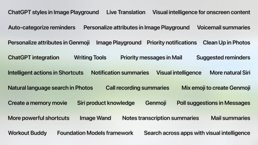
Federighi saved the biggest Apple Intelligence news for last. Apple is opening up access to its AI models so that any developer writing any app can use their on-device capabilities too. Developers can access a new Foundational Models framework to use these features, which work offline, of course, and preserve user privacy. He highlighted a couple of third-party apps that one assumes had early access to these APIs and the unique capabilities their developers created with them. Smart, offline, private. It’s a good message.
So. What are we to make from the conversational Siri delays? Not much. Yes, Apple over-promised, but it wanting this thing to meet a high quality bar is credible, as is Federighi addressing the issue head-on. Conversational Siri is the only Apple Intelligence feature that Apple hasn’t fully delivered on since last year’s WWDC. I don’t see this as a huge failing. But I do see them getting it right.
Verdict: Sublime
Liquid Glass
Described as “the kind of project that only comes along about once per decade,” Liquid Glass is the third “major” iOS user interface design style, after the original skeuomorphic design from 2007 and the flat iOS 7 design from 2014. Compared to the flat UI we’ve seen for the past decade on the iPhone, Liquid Glass is a minor visual refresh and its usability changes don’t rely on the look. But Liquid Glass is also the “broadest” user interface design revamp Apple has ever implemented because it will be used on so many platforms. Not just iPhone, but also iPad, Apple Watch, Apple TV, and Mac. (It’s already on Vision Pro, or perhaps I should say it was inspired by Vision Pro.)
Making its numerous (screen-based) platforms visually consistent makes some sense. And jumping ahead for a moment to my hands-on experiences with the developer betas for iOS 26, iPad OS 26, tVOS 26, and macOS 26, I can see that Apple has, as expected, kept each platform true to itself. That is, it’s not making the Mac more toy-like or the iPad too computer-like. There is restraint here.
The new design isn’t all that new. It’s mostly subtle, with the type of light source and shadows on controls that Microsoft brought to Windows 95 in 1995. It also harkens to Windows Vista and the Aero Glass user interface, though Apple is not using glass effects to make windows (as on Mac or iPad) transparent or translucent, as Microsoft did. Instead, this is about visually emulating the effect of glass in 2D software. And from a subjective standpoint, I can’t say I’m impressed. The previous flat style, subtly different though it is, still feels more modern to me. And again, the new features do not “require” Liquid Glass. Put more cynically, it’s just lipstick on a pig.
As with the design that debuted in iOS 7, Liquid Glass will get better over time. Perhaps Apple will scale back the weird text effects that make the Lock screen time look like Mylar balloons. And maybe it will come to understand that the light source stuff just looks hokey and fake, like the pretend windows that Microsoft used to use in Windows Setup. We’ll see. For now, this will be divisive. To me, it looks and feels unnecessary, as when a subtle glass effect appears under my finger on a tiny control; I can’t see it unless I look at the thing from an angle because the control is so small. These changes don’t make any sense. They don’t “put more focus on your content,” they distract.
But OK. Getting past the glassy stuff, there are some interesting ideas in there, as there often are when Apple works its weird, Apple-y magic (as it does with the Dynamic Island on the iPhone, for example). Whether these new designs, like the pop-up and expanding/contracting toolbars and icons it’s starting to use, having staying power is an issue for the future. For now, we have some new things. And we’ll see what happens.
Verdict: Liquid Glass is the perfect combination of subtle, silly, and sublime. Your mileage may vary.
Version number consistency
Apple isn’t just making its platforms more visually consistent with Liquid Glass, it’s also aligning the version numbers of iOS, iPadOS, watchOS, macOS, and VisionOS as previously rumored. It’s not clear what the Chicken and Egg are in this equation, but whatever. Apple is “unifying its version numbers” starting with its Fall 2025 platform releases that will “power [Apple] through the year 2026” will be version 26. Left unsaid is that Apple is also rumored to be staggering some hardware releases, mostly notably of the upcoming iPhone 17 (26?) lineup, and that likely played a role in the timing on this too.
But that’s for later. Today, this is mostly uneventful. At least Apple is really using the new version numbers, too. Where the previous macOS was called “Sequoia,” but was really version 15.5, the new one is called “Tahoe” and is really version 26, not 15.6 or 16 or whatever.
Verdict: Subtle
iOS 26
Looking past Liquid Glass, there are many changes coming in iOS 26 that will make our iPhones better. That’s as expected, but as are the visual updates that I don’t want to spend too much time. Apple has extended its support for home and lock screen styles to include a new Clear style in addition to Default (“normal”), Dark, and Tinted, and I’m sure the 6 people who leave that enabled will be delighted with it. But there are more impressive changes, like the new spatial mode for photos on the lock screen, where objects in the foreground move separately from those in the background as you rotate the iPhone in your hand. It’s honestly pretty impressive. Not “useful.” But impressive.
Apple is also addressing many of my long-time complaints about the iPhone–as it is doing on the iPad, too–and that is far more meaningful to me. Key among them and in order of importance:
Call Screening. When you receive a call from an unknown number (by default, you can change this), iOS 26 finally delivers a Call Screening feature that will use on-device AI to (try to) determine whether a call is potentially important or just spam. As we’ve had on Pixel for years, Call Screening answers calls from these numbers automatically (and silently), records the response it gets, if any, and then shows you a transcript so you can choose to answer or ignore. (There is also a new Hold Assist feature similar to what Pixel has also had for years. And a nice unified default view that I find particularly attractive.)
Screen new senders. Tied to the above, Apple is also taking its first meaningful steps to prevent spam in Messages with a new feature that silences and sidelines unknown text senders by default. Until you approve one, it will remain silent and mostly hidden. (There’s a small notification dot on an icon.) (There are other Messages updates I don’t care about, like Polls and so on.)
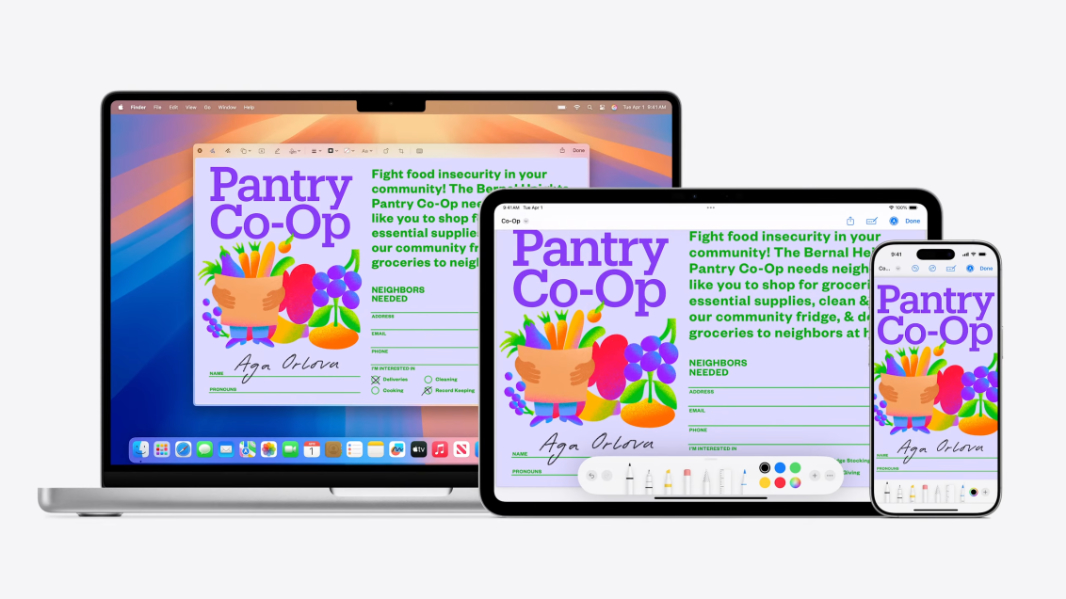
Simpler Camera experience. The iPhone Camera app, like many long-lived apps, has suffered from creeping feature-ism over time, getting more and more complex. But it jumped the shark with the pointless (to most) and difficult to use (for all) Camera Control button last year and the horrific update it made to Photographic Styles. No, iOS 26 doesn’t “fix” either of these specific problems. But it does include a simpler new Camera app that should at least hide the complexity most of the time. The UI is simplified and streamlined by default, with just the “Photo” and “Video” modes that almost everyone wants. You can swipe left and right to get at all the other modes. And you can swipe up to reach major settings like Flash, Timer, Aspect ratio, and, yes, Styles.
Photos improvements. Tied to the above change, Apple went a bit too far in simplifying its Photos app last year, so the iOS 26 version brings back a toggle (tabs) for both Library and Collections right from the home view. And yes, that was the only change to Photos that Apple announced in the keynote.
Live Translation. Facetime, Messages, and Phone are all getting this critical feature in iOS 26. And while other phones have had sometime similar for a year or two, whatever. It’s necessary and appreciated, and developers can add it to their own apps too.
Visual intelligence updates. Apple is integrating Visual intelligence into the screenshot capabilities on the iPhone so you can learn more about things you see anywhere on-screen. I’ve already used this, and it’s impressive: When I screenshotted a social media photo, I learned more about that location, accurately, using Google Search. And when I took a screenshot of an add, it found the product online without its name being present. Who knew that AI-based screenshots tools could be so useful? Ah. Right.
There are many more changes, of course, and many seem useful. For example, I like the idea of the “full-screen” Safari view of web pages in which the toolbar and controls minimize and then disappear as you scroll, giving precedence to the content you’re viewing. And the CarPlay updates I will never experience unless I can convince my wife that we need a new car.
There are also many superfluous and unnecessary features, of course. Genmoji updates and the like. As always.
Verdict: A little of everything, but the big updates I note above make this release both sublime and overdue.
watchOS 26
The major new changes to Apple Watch are, to me, mostly superfluous Workout Buddy is cringe. But the Smart Stack updates seem useful, as are the wrist flicks. There’s a new Notes app. New APIs for developers.
I don’t know. Apple Watch is pretty great, but this doesn’t seem to move the needle that much. It’s a pretty small list of changes.
Verdict: Mostly silly, but the useful changes are most subtle.
tvOS 26
Apple TV is my choice for living room streaming–it’s what TV is to my wife and me, I guess–and I’m looking forward to new hardware. But with tVOS 26, Apple is adding some mostly subtle user experience updates related to Liquid Glass, a terrible new Karaoke feature in which iPhone users can use their devices as microphones and sing along to music, and … yeah, that’s it. Apple spent more time talking up new Apple TV+ content than it did the device itself. Whatever.
Verdict: Subtle, though the Karaoke feature is silly.
macOS 26 “Tahoe”
Craig Federighi came back with another humorous intro video, which earns Apple points. But the new features in Tahoe are, of course, far more important. And there are some nice changes coming there, including:
New Continuity features. Apple’s cross-device experiences are a double-edge sword of usefulness and monopoly maintenance, but its users only care about the former. And here, things just keep getting better with two great new features. Live Activities integrates with the Dynamic Island-based Live Activities on your iPhone so that the live notifications appear on the Mac and can be interacted with: If you click a live notification, that app opens on the Mac in iPhone Mirroring. Apple is also bringing the Phone app to Mac (alongside Messages and Facetime) so you can make and receive calls. Yes, a feature we’ve had in Phone Link in Windows 11 for a while now. But terrific.
Spotlight updates. Spotlight is perhaps my favorite macOS user interface, a combination launcher and search utility with an easy to remember keyboard shortcut (Cmd + Space) that’s been copied (twice, now) by Microsoft’s PowerToys for obvious reasons. In Tahoe, Spotlight works a bit more like Windows Search, go figure, by offering dedicated Applications, Files, (Shortcuts) Actions, and Clipboard views via dedicated buttons, and the Applications results can include apps on your iPhone. Actions now support parameters in Spotlight for more control. And when you’re using an app, Spotlight can show you results for in-app options; developers can expose specific app features as individual Actions now, too. There’s also a new Quick Keys feature, so you can type a little (“sm”) to access something specific (“Send Message,” using the Messages app).
Shortcuts. Apple’s Shortcuts app helps you automate tasks across multiple actions (steps), using multiple apps when necessary, and it’s a key part of any Apple power user’s toolkit. And Tahoe adds key updates to this utility, with both time-based and action-based (saving a file to a particular folder, connecting to a display) automations and more powerful shortcuts called Intelligent actions tied to Apple Intelligence features like text summarization, creating images, and the like. There’s a Private Compute Cloud action so you can privately combine your personal data to get a query result, and you can optionally use ChatGPT if you want to “tap into its broad world knowledge.”
There are even some good updates related to Liquid Design, oddly. On macOS, the new sidebars are more visually distinct and have a nice floating look to them that I really like. And the glass styles from iPhone look pretty sweet on the Mac too, go figure. Maybe this consistency thing is a good idea.
Less useful but prettier, the menu bar is transparent for some reason, not that apps can move below it and use that space. There are folder colors, of course, but also folder emojis if you like wasting time.
Verdict: Subtle, as should be the case on a legacy desktop system. It’s respectful, and the approach I wish Microsoft would take with Windows 11. Come to think of it, that makes it sublime. Nicely done, Apple. Nicely done.
visionOS 26
This space intentionally left blank.
Verdict: (Almost) no one cares. Call me when you figure out smart glasses that don’t look like a face hugger from Alien.
iPadOS 26
I already wrote up what’s happening with iPadOS 26 from a productivity and multitasking standpoint in Hands-On with iPadOS 26: They Finally Really Did It, and let me just cut to the chase and state that those changes are sublime, just really well-done.
But there’s more going on here, of course. There are useful audio input controls, local capture controls, studio quality vocals support (via AirPods), and voice isolation capabilities for creators. And Live Activities (that are more like on iPhone, with background tasks being the key example). It’s all good.
Verdict: Sublime.
Final thoughts
It’s perhaps too easy to criticize Apple, given that the hubris and hyperbole are self-inflicted and painfully obvious. But being objective, the WWDC announcements are collectively pretty impressive. In some cases with particular products, like the iPad. But also broadly, and especially for those who use multiple Apple devices.
With the 2025 developer season now drawing to a close, I look back on Build as a freakish, weird outlier, and Google I/O as a tsunami of powerful, but chaotic new AI features. But WWDC was cohesive, fresh, and upbeat, which is spectacular and unexpected given all the negative pre-show buzz.
Nicely played.

Gain unlimited access to Premium articles.
With technology shaping our everyday lives, how could we not dig deeper?
Thurrott Premium delivers an honest and thorough perspective about the technologies we use and rely on everyday. Discover deeper content as a Premium member.