Facebook Has a Brand New Logo for the Company
- Mehedi Hassan
- Nov 04, 2019
-
6
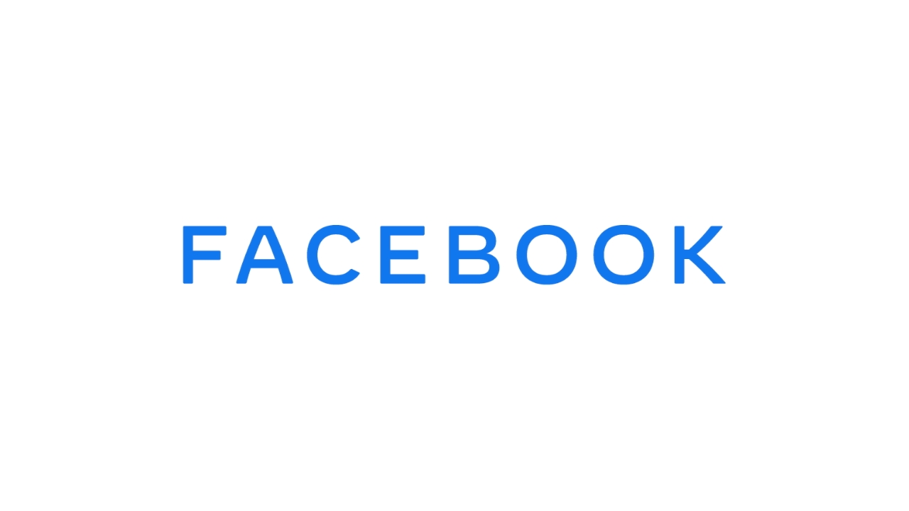
Facebook has a brand new logo. And no, there’s no reason to freak out. Facebook, the app, will continue to have the iconic logo we have come to see for years. Instead, Facebook–the company–is getting a new logo.
Facebook will soon have its own new logo for the company itself, one that will be represented across its other products like WhatsApp and Instagram. The entire point of the new logo is to distinguish Facebook as a company from the Facebook app.
Windows Intelligence In Your Inbox
Sign up for our new free newsletter to get three time-saving tips each Friday — and get free copies of Paul Thurrott's Windows 11 and Windows 10 Field Guides (normally $9.99) as a special welcome gift!
"*" indicates required fields
The new logo itself is actually pretty good looking for a corporate logo. It represents the color of all Facebook products, designed with custom typography. “Today, when people hear “Facebook” they think of the Facebook app. This posed a unique design challenge. We needed the wordmark to establish distinction from the Facebook app and allow for a clearer connection to the full family of technologies. The new brand system uses custom typography, rounded corners, open tracking and capitalization to create visual distinction between the company and the app,” said Facebook.
Facebook will soon start showing this new logo across Instagram and WhatsApp, and possibly its other products like Oculus, Workplace, Portal, and Calibra (its digital wallet app for the Libra cryptocurrency). The company will introduce a new “from Facebook” logo on the sign-in screen for Instagram and WhatsApp, and the same logo will appear within the settings for the apps to let people know that the apps are built by Facebook.

