Microsoft is Improving Font Rendering in Edge

Today, Microsoft detailed some font rendering improvements that it is making in its Edge web browser in a coming version upgrade.

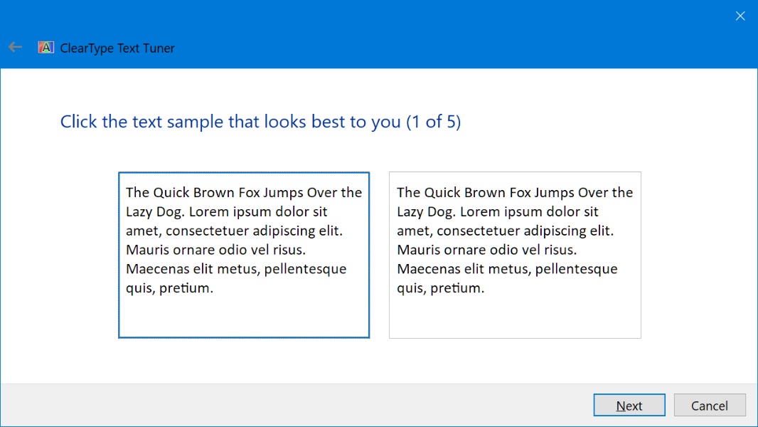
“We have improved the contrast enhancement and gamma correction to match the quality and clarity of other native Windows applications,” the Microsoft Edge Team writes. “Font rendering will also now respect user ClearType Tuner settings when applying text contrast enhancement and gamma correction.”

Windows Intelligence In Your Inbox

Sign up for our new free newsletter to get three time-saving tips each Friday — and get free copies of Paul Thurrott's Windows 11 and Windows 10 Field Guides (normally $9.99) as a special welcome gift!

"*" indicates required fields

This field is for validation purposes and should be left unchanged.

Support for applying the system settings for contrast enhancement and gamma correction of text is available now in the Edge Canary channel. To experience it, you need to enable the edge://flags#edge-enhance-text-contrast flag. Then, you can use the Windows 10 ClearType Text Tuner (Start search for “Adjust ClearType text”) to see how the changes you make are applied in Edge (which will need to be restarted after each change).

For those curious why this is necessary, Microsoft explains that the new, Chromium-based Edge renders text differently than did Legacy Edge.

“Legacy Microsoft Edge utilized the DirectWrite framework to render glyphs to the screen,” the firm says. “Chromium, by contrast, only utilizes DirectWrite for part of the text-rendering pipeline: font enumeration, glyph information retrieval, and glyph bitmap generation; it handles its own text shaping, layout, and rendering. This enables code reuse across platforms, but on Windows, the results are typically different than the rest of the system’s text rendering.”

Microsoft expects to have the new font rendering enabled by default by the time Edge 92 hits stable. And it hopes to contribute the changes back to Chromium so that all Chromium-based browsers on Windows can benefit from it.

Share post

Please check our Community Guidelines before commenting

Conversation 8 comments

  • paradyne

    02 June, 2021 - 5:09 pm

    <p>Legacy Edge DID have better text rendering than Chromium does with many pages looking like dark grey text instead of the black it should be. When then new one came out I made side by side comparison captures and kept reporting it for a while, but nothing happened. I’m pleased it’s finally reached the top of their list!</p>

  • kdjones74

    Premium Member
    02 June, 2021 - 5:54 pm

    <p>I really like font rendering in Firefox – I hope it looks that good in Edge.</p>

  • wright_is

    Premium Member
    03 June, 2021 - 3:28 am

    <p>The big question is, why didn’t Chrome/Chromium have this in the first place? Isn’t it automatically applied to most applications?</p>

    • MikeCerm

      03 June, 2021 - 9:14 am

      <p>It says right in the article, "this enables code reuse across platforms," which is the answer, but it still leaves the question of how can Google be so lazy as not to bother optimizing Chrome for the platform with the largest number of users? Like, 90% of Chrome desktop users are using Windows, why not make it good? (Probably because 90% of people inside Google are on Mac/Linux, so they don’t care about Windows.)</p>

      • chuckop

        Premium Member
        03 June, 2021 - 9:44 am

        <p>Exactly. I say this all the time. Software – particularly UX – designed on Macs works best on Macs. I hate with a passion those black-turtleneck-wearing UX folks who produce graphics, wireframes, and user flows on Macs for Windows software. Most UX folks and many many current developers have no idea about how rich the font rendering in Windows is. </p>

        • MikeCerm

          03 June, 2021 - 10:54 am

          <p>Really, the font rendering thing is just a difference of philosophy. Chrome’s blurry font rendering is done the same way that Mac OS handles font, where the accurately representing the shape of the font is prioritized over sharpness and legibility. Cleartype hews much more closely to the pixel grid, making text sharper, but at the cost of fidelity to the font designer’s intent. Before Macs had Retina displays, fonts always looked fuzzy, just like Chrome.</p>

  • mikegalos

    03 June, 2021 - 9:48 am

    <p>And the late Bill Hill would be pleased to see this. Now if only Amazon would revise Kindle to use his OSPREY readability technology…</p>

  • MikeCerm

    03 June, 2021 - 10:37 am

    <p>Chrome’s blurry fonts used to be a big problem and it was one of the major reasons I never really switched away from Firefox when everyone else did. The difference was really noticeable when 10 years ago when low-res screens were the everywhere. These days, if you’re using a high-DPI display (with 200% scaling), Chrome’s blurry font problem really isn’t a problem at all. That being said, there’s still lots of cheap 768p laptops out there, so this is good news.</p>

Windows Intelligence In Your Inbox

Sign up for our new free newsletter to get three time-saving tips each Friday

"*" indicates required fields

This field is for validation purposes and should be left unchanged.

Thurrott © 2024 Thurrott LLC