What I Learned Porting .NETpad to … UWP? (Premium)
- Paul Thurrott
- Feb 17, 2020
-
54
The Universal Windows Platform (UWP) isn’t particularly well-suited to traditional productivity applications. Naturally, I was curious how hard it would be to recreate my .NETpad application using this environment, given my previous efforts porting it to C# and then to WPF.
As I write this, I’ve only made a few basic first steps; this isn’t a fully functioning and complete application, as is the C# version (which utilizes Windows Forms, just like the original Visual Basic version). Nor is it as polished and far-along as is the WPF version, which I’ve stopped working on, at least for now.
Instead, this started as an experiment to determine whether the layout capabilities of UWP would let me recreate the Notepad user interface, albeit in a version that would seamlessly adapt to different display resolutions and dot-pitches, a key problem with the initial WinForms versions of the apps. Too, I was curious about UWP’s ability to adapt to dual-screen devices, as I’m planning an app-based version of the Windows 10 Field Guide that will work properly on Surface Neo and, perhaps, Surface Duo.
Anyway. I started really playing around with UWP for the first time recently.
And it is a mess.
Granted, UWP wasn’t designed to work well with an app like .NETpad. If you ever experimented with Store-based text editors during the Windows 8 or Windows 10 eras, you know that there are/were a lot of low-quality apps out there with giant, fingertip-friendly round buttons in giant toolbars and minimal configuration options. What I wanted was something recognizably Notepad, with a standard menu at the top and a status bar at the bottom. I just wanted it to adapt better to different display types and on-the-fly changes to the resolution, DPI, and orientation. Something that would work properly in Light mode or Dark mode. Something that respected Tablet mode. And so on.
And the basics are possible. Like WPF, UWP offers a variety of layout options via XAML (pronounced “Zammel”), the declarative XML-like markup language that Microsoft developers use to construct device-independent user interfaces. After experimenting with a few different layout panels, I ended up going with the simplest of all, the grid, which supports both multi-column and multi-row layouts.
Technically, I just need three rows: One for the menu bar, one for the text box, and one for the status bar. (I’m also using three columns, just to quickly space the items in the status bar for now.) UWP has MenuBar and TextBox controls, so those were easy enough. And while there’s no status bar, I figured I could roll my own using other controls. For now, I’m just using TextBoxes for the “status bar”-like bottom of the app as placeholders. The basic XAML (I’ve stripped a lot out) looks like so:
<Grid>
    <Grid.ColumnDefinitions>
        <ColumnDefinition Width="1*" />
        <ColumnDefinition Width="1*" />
        <ColumnDefinition Width="1*" />
    </Grid.ColumnDefinitions>
    <Grid.RowDefinitions>
        <RowDefinition Height="Auto" />
        <RowDefinition Height="*" />
        <RowDefinition Height="Auto" />
    </Grid.RowDefinitions>
    <MenuBar Grid.Row="0" Grid.ColumnSpan="3"></MenuBar>
    <TextBox Grid.Row="1" Grid.ColumnSpan="3"></TextBox>
    <TextBox Text="Auto Save: Off" Grid.Row="2" Grid.Column="0"></TextBox>
    <TextBox Text="Ln 1, Col 1" Grid.Row="2" Grid.Column="1"></TextBox>
    <TextBox Text="100%" Grid.Row="2" Grid.Column="2"></TextBox>
</Grid>
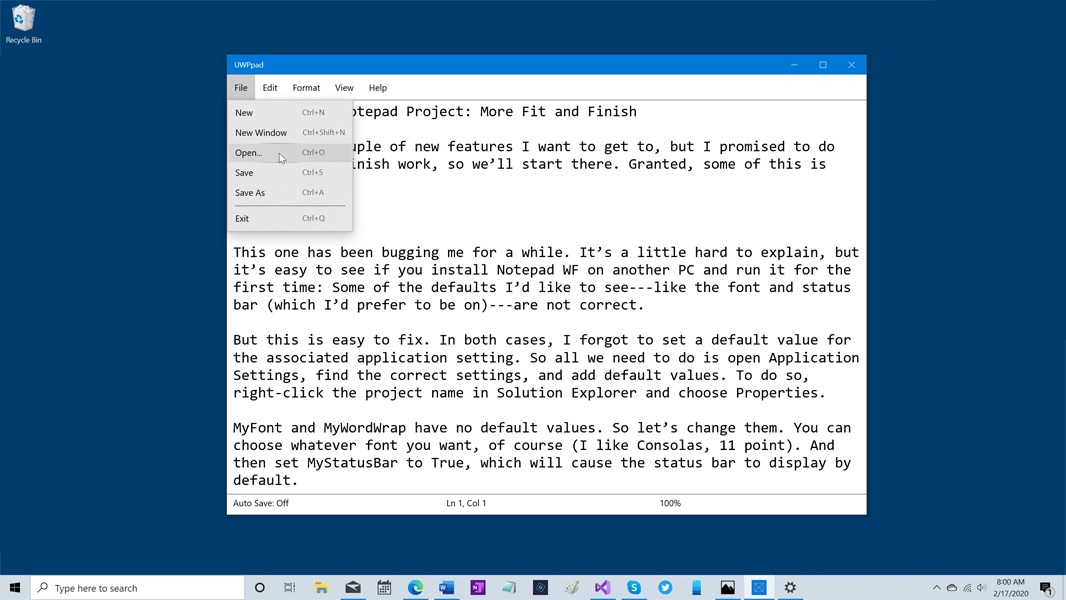
And if you don’t do too much with it, it seems to work mostly OK. Here’s what it looks like with Dark app mode.

The problem, and it’s a big one, is that UWP overthinks things and it doesn’t provide an easy or obvious way to override default control behaviors. And those behaviors can be bizarre, especially if you’re just trying to make a basic productivity app. The issue, from what I can tell, is that UWP is a mobile platform, and it’s designed to do everything it can to be touch-friendly and preserve battery life (among other things). So in addition to app-wide behaviors, such as automatically suspending apps that aren’t being used, UWP also does things like provide animations and color changes to indicate that controls can be touched, or were touched, or whatever.
Let me be more specific, since this is hard to explain (and, to me, makes no sense).
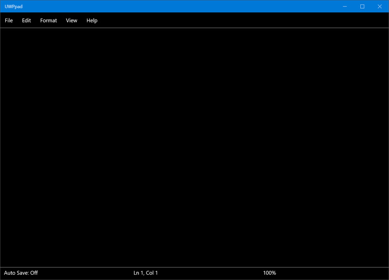
That decent-looking application I showed you above only looks like that when the text box is selected. If you select anything else—another control in the application or anything outside of the application—that text box is colored black (by default). It looks like so:
You would think that there is some sort of property that might control this but there is not. Or perhaps that you could override an event, related to losing the focus, in code, but you cannot. The fix is just not obvious.
As bad, when you open the menu over that text box, the text it is displaying disappears. Finally, any attempt at coloring any of the controls—the menu bar, the text box, or the “status bar”—is overridden by some weird default behavior that I couldn’t seem to even find, let alone fix.
After hours of Googling this, I finally call in the expert. I Skyped Rafael and asked him if he knew what the problem was.
He did. The problem is that UWP is indeed defining some default control behaviors as I expected. But that the bigger problem is that the way you fix this is ridiculous, meaning that it is both non-sensical and non-discoverable. And this is the type of problem that any beginning UWP developer—like me—will run into, and will not be able to fix. Many will simply give up.
To “fix” this, you need to figure out how UWP defines control resources and which events each responds to. Then, you have to create a resource dictionary—either at the app level, which will impact each control of that type, or at the control level if you just want the changes to impact a single control—and override each event manually.
This involves adding hundreds of lines of code to your project simply so you can find the events that a single control is responding to, plucking out the resource definitions twice (for both Light and Dark mode) and then recreating those lines with the values you want. You can then delete all of the lines of code you imported.
(I may not be explaining this completely correctly, but no matter: I’m simply trying to demonstrate how difficult this and how insurmountable a problem this would be for most.)
In short, I was previously defining the main text box in XAML like so:
<TextBox Name="TextBox1" AcceptsReturn="True" Grid.Row="1" Grid.ColumnSpan="3" BorderThickness="0,1,0,1" TextWrapping="Wrap" ScrollViewer.VerticalScrollBarVisibility="Visible" FontFamily="Consolas" FontSize="24"></TextBox>
To override the weird default UWP behaviors, I needed to change this to the following:
<TextBox Name="TextBox1" AcceptsReturn="True" Grid.Row="1" Grid.ColumnSpan="3" BorderThickness="0,1,0,1" TextWrapping="Wrap" ScrollViewer.VerticalScrollBarVisibility="Visible" FontFamily="Consolas" FontSize="24">
<TextBox.Resources>
    <ResourceDictionary>
        <ResourceDictionary.ThemeDictionaries>
            <ResourceDictionary x:Key="Light">
                <SolidColorBrush x:Key="TextControlBackgroundDisabled" Color="White" />
                <SolidColorBrush x:Key="TextControlForegroundDisabled" Color="Black" />
                <SolidColorBrush x:Key="TextControlBackgroundFocused" Color="White" />
                <SolidColorBrush x:Key="TextControlBackground" Color="White" />
                <SolidColorBrush x:Key="TextControlBackgroundPointerOver" Color="White" />
                <SolidColorBrush x:Key="TextControlForegroundPointerOver" Color="Black" />
            </ResourceDictionary>
            <ResourceDictionary x:Key="Dark">
                <SolidColorBrush x:Key="TextControlBackgroundDisabled" Color="White" />
                <SolidColorBrush x:Key="TextControlBackgroundFocused" Color="White" />
                <SolidColorBrush x:Key="TextControlForegroundDisabled" Color="Black" />
                <SolidColorBrush x:Key="TextControlBackground" Color="White" />
                <SolidColorBrush x:Key="TextControlBackgroundPointerOver" Color="White" />
                <SolidColorBrush x:Key="TextControlForegroundPointerOver" Color="Black" />
            </ResourceDictionary>
        </ResourceDictionary.ThemeDictionaries>
    </ResourceDictionary>
</TextBox.Resources>
</TextBox>
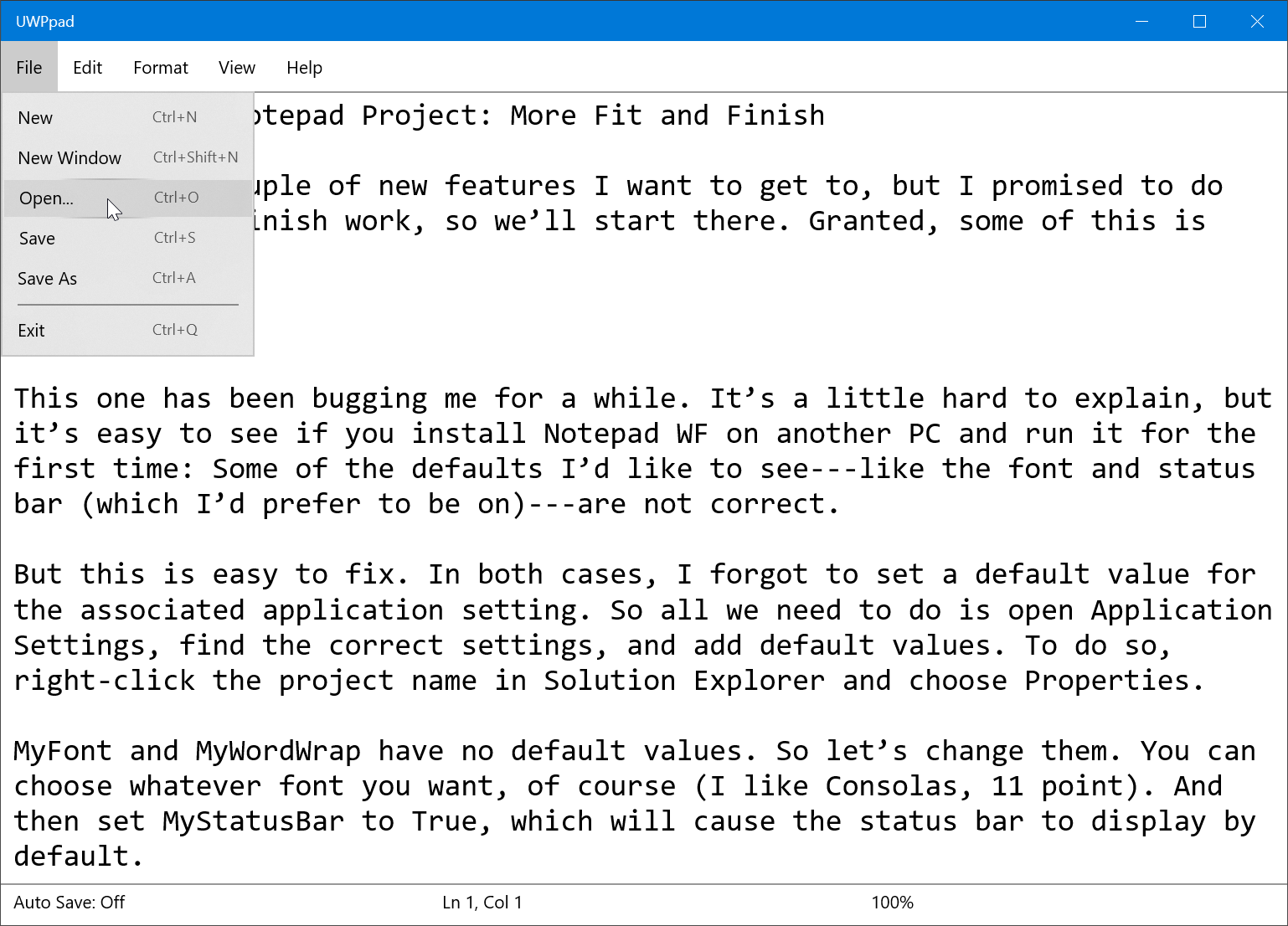
There are still some issues with the Dark app mode implementation, I realize this morning, but Light mode works correctly all of the time: The text box stays white whether it has the focus or not, and the text inside it does not disappear when you open a menu. Like so:
With that out of the way, I was able to get to some of the meat of the applications, like file open and save, leading me to believe that a basic Notepad clone in UWP is indeed possible. But the default behavior stumbling block is one I would not have been able to overcome. And now that I know how to do, I’m bewildered that there isn’t an easier way. It literally makes no sense. Just figuring out which events to override, let alone how, is problematic.
Still, I’m kind of intrigued by the notion of a display/resolution/dot-pitch independent version of the app. It looks pretty cool in tablet mode too.
This further gives me hope that an app version of the book is possible as well. I’ll get there eventually.

Gain unlimited access to Premium articles.
With technology shaping our everyday lives, how could we not dig deeper?
Thurrott Premium delivers an honest and thorough perspective about the technologies we use and rely on everyday. Discover deeper content as a Premium member.