The UWP Files: A Quick UI Update (Premium)
- Paul Thurrott
- Apr 04, 2020
-
4

After going down a few rabbit holes, I think I’ve finally arrived at a UI that makes sense for the UWP version of .NETpad. If you’re familiar with UWP productivity apps, there’s nothing groundbreaking here, per se. But I’ve tried to rethink the app UI for the underlying platform and am moving further away from the traditional Notepad interface while retaining its simplicity.
At least that’s what I’m telling myself.
The other day, I discussed my rough goals for this new UI. Since then, I restarted with a new project as the old one, with both menu bars/status bars and command bars, plus some secondary windows, was getting a bit convoluted. At first, I figured the Font dialog would be remade into a command bar button flyout of some kind. But after working on that for a little while, I realized there was a better approach.
And that better approach is helping me realize a secondary goal for this new UI: A division of the available commands between the visible and hidden (menu-based) parts of the command bar and an app settings pane. This is a bit harder than it sounds because even this Notepad clone has a long list of commands that need to be accommodated in the UI somehow. And there’s only so much space for buttons in the main command bar, where buttons that can’t be shown on screen are pushed aside into its “See more” (“…”) menu.
As I’m sure you know, the original Notepad and my previous WinForms and WPF versions of .NETpad implements all of the application’s commands via menu items. But for the UWP version, I’ve decided to eliminate the menu entirely. So there are four basic places I can put commands:
- The main command bar (at the top), which provides both primary and secondary buttons. Here, I’ll put the most often-needed commands.
- The main command bar’s “See more” menu, which provides overflow for primary buttons plus a section of secondary buttons/commands.
- The status bar at the bottom, which is currently created using a second command bar, though that may change. This area is normally read-only, but I am tinkering with putting all of the zoom commands (Zoom In, Zoom Out, Restore Default Zoom) here at least.

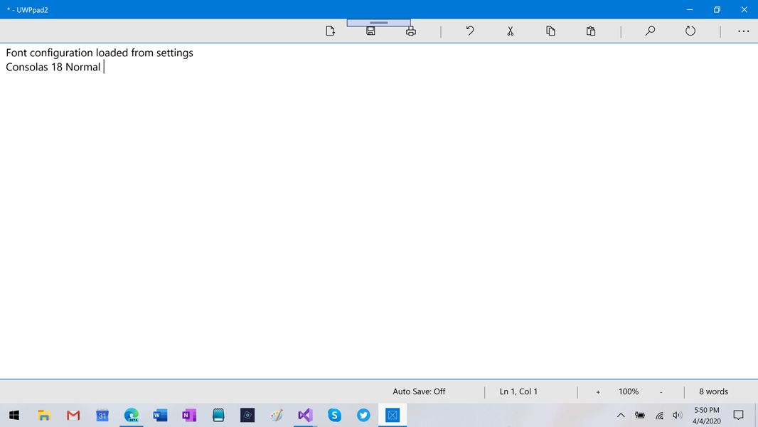
- A Settings pane, which is accessed by navigating to See more > Settings. This pane will house commands that aren’t needed as you’re working: Font configuration, plus toggles for Word Wrap, Status Bar, and Auto Save, and an area to display the information that would normally appear in the About box.
For this to work, I needed that Settings pane to work first, and I did quickly figure out a slide-out pane that seemed to work well enough. After that, I created yet another new project in Visual Studio so that I could work on just the design of the Settings pane, unencumbered by the rest of the application. I came up with this simple interface:
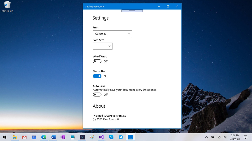
Once that was basically where I wanted it, I added it back to the main project, and it seems to look pretty good and mostly work. (I’m still working on that Font size bit, and the status bar toggle currently hides, but does not un-hide, the status bar.) It slides in from the right over the rest of the app UI, and it slides away when you select anywhere outside of it.

It adapts pretty well to different window sizes, too. If the window is too small to show the whole pane, scrollbars appear.

There are lots of rough bits, really, but it’s early. I’ll figure out a shadow for the Settings pane at some point and make sure I have a place for all the commands. And I have to design one or panes for all the Find/Replace commands as well. I’m thinking something that slides in between the top command bar and the text box will work nicely. But even still, I’m pretty happy with where this is heading.
More soon.

Gain unlimited access to Premium articles.
With technology shaping our everyday lives, how could we not dig deeper?
Thurrott Premium delivers an honest and thorough perspective about the technologies we use and rely on everyday. Discover deeper content as a Premium member.