Modernizing .NETpad: Next Steps (Premium)
- Paul Thurrott
- Jul 13, 2024
-
0
We’re still months away from the release of .NET 9, but there’s no reason not to fully modernize WPF for Windows 11 now to the degree that’s currently possible. That is, there are changes I can make using WPF’s new .NET 9-based capabilities. And some changes I’d like to make that just aren’t possible.
You can see the sharp divide between WPF and WinUI 3 capabilities by examining Microsoft’s WPF Gallery Preview and WinUI 3 Gallery apps. I appreciate what’s possible with WPF in .NET 9, but only WinUI 3 offers the full range of modern Windows 11 controls and capabilities. I could probably hack together something pretty close to the modern Notepad included now with Windows 11 in WPF, but some of its features are only possible natively with WinUI 3.
That’s fine. At the very least, it helps clarify the situation. There are things I can do with the existing (WPF) app. And things that will require a new (Win UI 3/Windows App SDK) app.
For now, I will focus mostly on the existing app. And in thinking about what it means to modernize this app given the capabilities that Microsoft is making available starting with .NET 9, it’s pretty clear that the work I need to do can unfold in a logical series of steps.
I completed the first of those steps back in June when I updated the app to the .NET 9 preview, enabled Windows 11 theming support, and fixed the sizing and basic look and feel of the main UI components in the main app window.
But there’s more to do. This change breaks some of the app’s functionality, most notably its built-in support for its own themes. And there are further sizing and look and feel fixes to make to the app’s other windows, which include Font, Input box (for Find, Find/Replace, and Go to line), and About box. Fixing these issues is the next set of steps. That is, fixing these issues and just delivering the current app, as-is, but with the Windows 11 look and feel, is the initial milestone for this modernization project. And I can get that all done right now.
And so I will.
But first, I want to quickly think about the next steps to come. A more modern version of .NETpad should adopt as many of the new features that have appeared in the original Notepad in Windows 11 as possible. And it should optionally continue to outdo Notepad in certain areas, as it does now with its unique scaling and auto save features.
The single biggest new feature in Notepad is its support for tabs. You can create tabs with WPF, but I’m not sure yet whether it can be as elegant and modern-looking as is the case with Notepad, and so I’m experimenting with that now. It’s possible that tabs support will require a new app, but we’ll see.
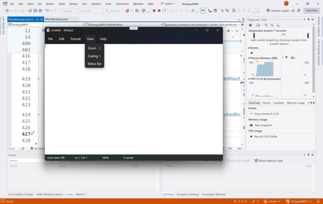
Beyond tabs, most of the recent improvements to Notepad have been related to modernization. It no longer uses secondary windows of any kinds, most obviously, but instead uses modern app patterns to supply that functionality. There’s a Settings page that replaces the app window, for example, and provides access to App theme, Font configuration (currently a secondary window in .NETpad), Word wrap (also a menu item toggle), and other options. Each option (or set of options) is in what’s called an expander (like you see all over the Settings app), some of which can be expanded and contracted, and that’s not available natively in WPF.
The Find and Find/Replace interfaces in Notepad, which do resemble windows, are implemented as flyouts, not windows. Flyouts are available to WinUI 3/Windows App SDK, but not in WPF. And there’s no About box in Notepad: That information is in the Settings page.
The way you access Settings is also new in Notepad: There’s a Settings (“gear”) icon to the far right of the menu bar in the app window. You can’t implement that interface using a menu bar in WPF, but I figured out a way around that. But the app window itself has been customized to accommodate the tabs, too: There’s no title bar area, a capability provided in WinUI 3/Windows App SDK that is likewise not available in WPF.
The things I can and cannot do make for an interesting mix. I can update—modernize—the WPF version of .NETpad in some ways. But not in others, at least not with really frigging around. I want to keep this as native as possible, so we’ll see where it lands. But some form of a Settings page—even if it must be a window—that emulates what we see in Notepad seems about right. And however the Settings interface is implemented, I will create a Settings (gear) icon, just as in Notepad, to access it all.
We’ll get to that later. For now, let’s do the minimum and clean up the app we have.
I’ve already described—twice, actually—how I took the original WPF version of .NETpad, which is available to everyone for free on GitHub, updated it to support the .NET 9 preview, enabled Windows 11 theming, and fixed the sizing and look/feel of the textbox and status bar in the main app window. With that out of the way, there are several more changes to make.
The biggest involves the app’s built-in support for “themes,” which has nothing to do with the light and dark app theme support that Microsoft first added to Windows in Windows 10: My themes are simply combinations of foreground (text) and background colors in the app’s text box that I created because it was impossible, at the time, to support Windows themes in WPF.
Thinking about this logically, I could carry this feature forward. And I still might: Once the app has been modernized to match Notepad as much as possible, I do want to think about unique new features I could add to continue differentiating it. But for the short term, this feature just gets in the way. What I want is what I get in Notepad—native OS theme support in which everything looks correct no matter which OS theme you choose—and this will be easier to test without worrying about my own silly themes.
So the next step in modernizing .NETpad is to remove this feature.
The themes feature uses two settings found in the project’s Settings.settings file, MyForegroundColor (#FF000000 by default) and MyBackgroundColor (#00000000 by default). Each time the app runs, it reads the value of each and applies them to the appropriate TextBox1 properties. And each time the app closes, it writes the value of those TextBox1 properties to the appropriate settings. There’s no reason to delete the two settings—after all, we may want to reimplement this feature later—as they won’t hurt anything just by being there. But we do need to remove the code that reads from and writes to these settings.
The first part—the code that reads from settings—is in the AppWindow_Initialized() method in MainWindow.xaml.cs.
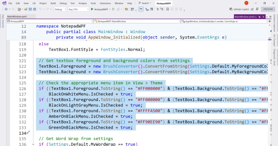
It reads as so.
// Get textbox foreground and background colors from settings
TextBox1.Foreground = new BrushConverter().ConvertFromString(Settings.Default.MyForegroundColor) as SolidColorBrush;
TextBox1.Background = new BrushConverter().ConvertFromString(Settings.Default.MyBackgroundColor) as SolidColorBrush;

// Check the appropriate menu item in View > Theme
if ((TextBox1.Foreground.ToString() == "#FF000000") & (TextBox1.Background.ToString() == "#FFFFFFFF"))
    BlackOnWhiteMenu.IsChecked = true;
if ((TextBox1.Foreground.ToString() == "#FF000000") & (TextBox1.Background.ToString() == "#FFD3D3D3"))
    BlackOnLightGrayMenu.IsChecked = true;
if ((TextBox1.Foreground.ToString() == "#FFFFA500") & (TextBox1.Background.ToString() == "#FF000000"))
    AmberOnBlackMenu.IsChecked = true;
if ((TextBox1.Foreground.ToString() == "#FF90EE90") & (TextBox1.Background.ToString() == "#FF000000"))
    GreenOnBlackMenu.IsChecked = true;
I deleted all that.
The app still runs. And you can still customize the theme, and it will write those changes to settings when you close the app. But when you run the app, the textbox just uses the default foreground (text) and background colors.
Next, I found the code that writes those values to settings. This is in the SaveSettings() method, which isn’t an event handler but is instead just a custom method I wrote because the app needs to save settings at different times, not just when it’s closing. The AppWindow_Closing() method, which is an event handler, runs this method, for example.
In SaveSettings(), I found the following relevant lines of code.
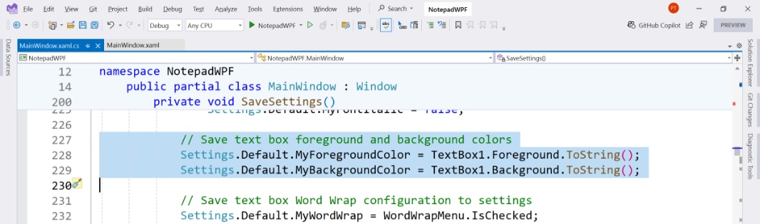
// Save text box foreground and background colors
Settings.Default.MyForegroundColor = TextBox1.Foreground.ToString();
Settings.Default.MyBackgroundColor = TextBox1.Background.ToString();
And I deleted those.
Once again, the app ran OK, it let me change the theme, and it closed without complaint. So it was time to exorcise the Themes sub-menu, which is found in the app’s View menu. You can see the code that creates this menu in MainWindow.xaml.
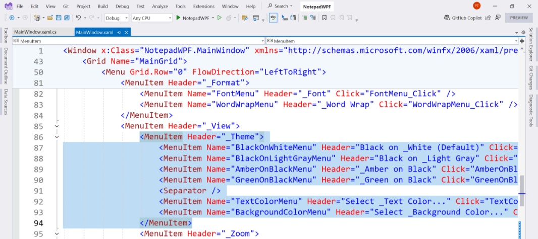
I deleted those, of course. But that’s not enough: Each of these menu items has an associated Click() event handler, too. And if you tried to run it now, Visual Studio would throw a hissy fit and display a lot of error messages. And so I needed to delete those event handlers, which are found in MainWindow.xaml.cs, too. They are:
BlackOnWhiteMenu_Click()
BlackOnLightGrayMenu_Click()
AmberOnBlackMenu_Click()
GreenOnBlackMenu_Click()
TextColorMenu_Click()
BackgroundColorMenu_Click()
Fortunately, they’re all right next to each other, so that was simple enough. And with that done, the app built properly and ran without error, albeit now without that Themes menu.
This isn’t enough: The app works OK as-is, I guess. But the textbox has hard-coded black text on a white background, whether you’re using a light or dark OS theme. If you look at Notepad, you’ll see that it uses black text on a white background in light mode, but it switches to white text on a dark gray background when in dark mode. We want .NETpad to do the same.
We could hard-code colors that try to match or approximate what we see with Notepad. But as it turns out, WPF—like WinUI 3/Windows App SDK—now supports dynamic system colors (starting in .NET 9) so that any app can be consistent with the system, regardless of which OS theme the user chooses. And so we will use that more modern way of implementing color in .NETpad. And not just in the textbox: We’re going to use these colors in the other UI components in .NETpad too. In the main app window and, eventually, the other windows too.
But let’s start with the textbox.
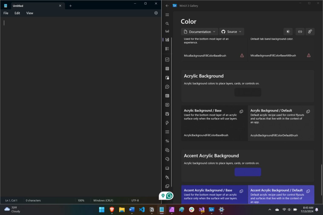
You can find Microsoft’s official color guidance in the WPF Gallery Preview app (under Design Guidance > Colors). There is similar guidance in the WinUI 3 Gallery app, too, and each references the Color in Windows 11 documentation on the Microsoft Learn website if you want to learn more. In either place, you’ll find sets of colors for text, fill, stroke, background, signal, and high contrast. I’m using a text color option for the text, obviously, and then a background color option for the background of the textbox. The question in each case, of course, is … which one?
Here, I just did a visual comparison of the textbox in Notepad, in both light and dark OS themes, to the available color choices. (You can toggle light/dark mode in WPF Gallery or WinUI 3 Gallery with a “Toggle theme” button to see how each looks in either mode on the fly.) The text (foreground) color choice is straightforward: This will be set to the “Text/Primary” choice, which is TextFillColorPrimaryBrush. (Those Gallery apps also let you copy any color to the clipboard using a dedicated button, making things easy.) For the background color, I ended up choosing “Card Background/Default” (CardBackgroundFillColorDefaultBrush) in the top section of the Background colors view because it’s for the background of a layer that contains content that’s visually above the background (bottom layer) of the app. Also, it matches visually in both light and dark modes.
The easiest and most obvious way to apply these colors is in XAML code in MainWindow.xaml. (Later, if we want to allow customization, we can change it dynamically in C# code too. For example, we may eventually offer the user a choice to manually choose light or dark mode in addition to just going with the system theme.)
To do so, I located the textbox (TextBox1) in that XAML file. In the original versions of the app, we configured various textbox properties—AllowDrop, AcceptsReturn, and so on—and referenced four event handler methods—in the XAML. But none of them are related to the foreground (text) or background colors. That’s because these were defined dynamically when the app first ran by reading in settings and applying the appropriate values to the appropriate textbox properties then.
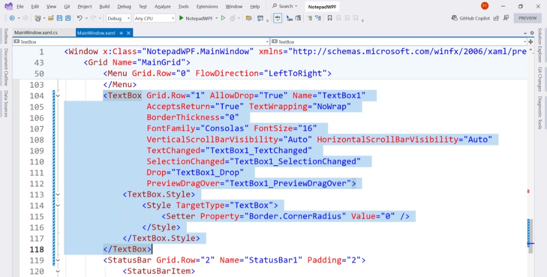
There are different ways (or places) we can add this information: Via properties directly in the <TextBox> block or via setter properties in the associated textbox style block (<TextBox.Style>), where we defined the Border.CornerRadius property of the textbox. The former is, to me, cleaner. So that’s what I did, using the following code:
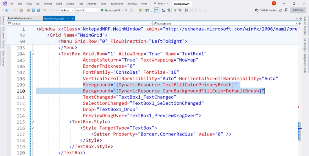
Foreground="{DynamicResource TextFillColorPrimaryBrush}"
Background="{DynamicResource CardBackgroundFillColorDefaultBrush}"
Here’s what it looks like in the XAML code block:
And then I ran the app, switching between OS light and dark modes and comparing the colors in the textbox to those in Notepad. And what I discovered is that while light mode looks fine, dark mode is off: The background color is not the same as that in Notepad. It’s got more of a bluish tint to it.
I could fix this. But there’s a deeper issue here that’s related to a remaining limitation in WPF: It’s not possible, not without a lot of custom code anyway, to remove or style an app window’s title bar. Again, you can do this with WinUI 3/Windows App SDK. But not with WPF. So rather than go through a lot of work for nothing—and, yes, I did of course spend a lot of time on this—let’s just leave it as-is: It’s close enough, and because the menu bar and title bar blend into each other visually and cleanly (in both light and dark modes).
One thing you may have noticed—it’s more obvious in light mode—is that the top of the app (the title bar and menu bar) has a subtle translucency effect now, so the wallpaper colors bleed through. This is a neat effect that helps the app look and feel modern.
But this effect should be present in the status bar, too. Currently, it’s just a solid color with no translucency. To fix this, we just need to apply a dynamic color to that control. Looking at Notepad, I can see that the status bar color is darker than the textbox color in dark mode and similar to (maybe identical to) the in-tab menu bar. (And lighter than the app window background.) Our app doesn’t have that special top area, but we can at least make the status bar darker than the text box in dark mode. And make it more translucent than the textbox (especially visible in light mode.)
For this, I chose the dynamic color SolidBackgroundFillColorSecondaryBrush. And that looks nice. Subtle, but nice.
Interestingly, our textbox is a bit translucent too, where the version is Notepad is not. This, too, I could “fix,” but I like the way .NETpad looks now. So I’m leaving that as-is. But in comparing .NETpad and Notepad side-by-side in light and dark modes, I noticed that the .NETpad status bar isn’t as tall as the version in Notepad. So I changed its Padding property from 2 to 4 in XAML, and now they seem about the same size.
That’s about it for now for the main app window. It’s time to adapt the other windows, which, again, including InputBox (for Find, Find/Replace, and Go to line), Font, and About box.
I started with About box because it’s the simplest.
This window looks OK in light mode, but when you launch it (Help > About) in dark mode, it’s unreadable, with white text on an almost white background.
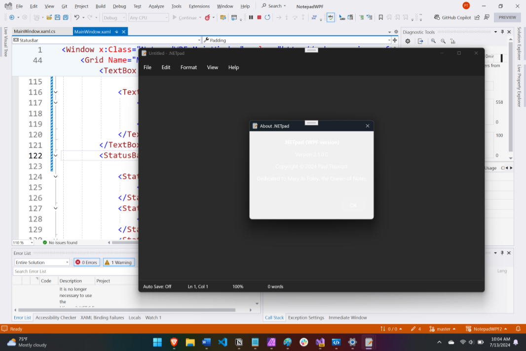
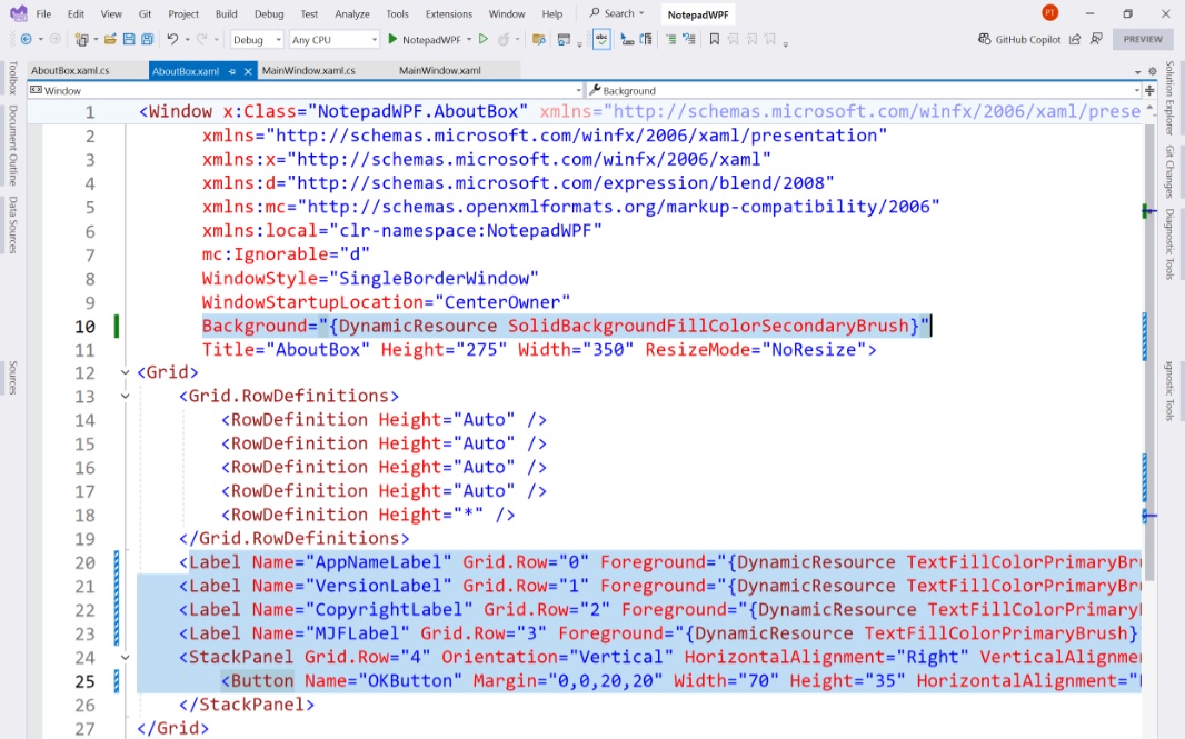
Fixing that was straightforward: I just opened AboutBox.xaml and coded dynamic colors for the foreground (text) and background colors of the relevant controls and/or the window. That is, one can set the background color of the windows once, as it will bleed through to the other controls on it; I chose SolidBackgroundFillColorSecondaryBrush. And then we have to set the foreground color of each control (to TextFillColorPrimaryBrush). There are four labels—AppNameLabel, VersionLabel, CopyrightLabel, and MJFLabel—and one button, OKButton.
And, when I ran the app again … it looked the same as before.
This was easily fixed: The app was originally setting the window background color in C# code in AboutBox.xaml.cs.
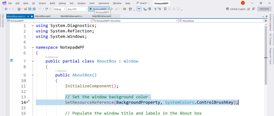
So I deleted that, re-ran the app, and voilà, all is well. In dark and light modes.
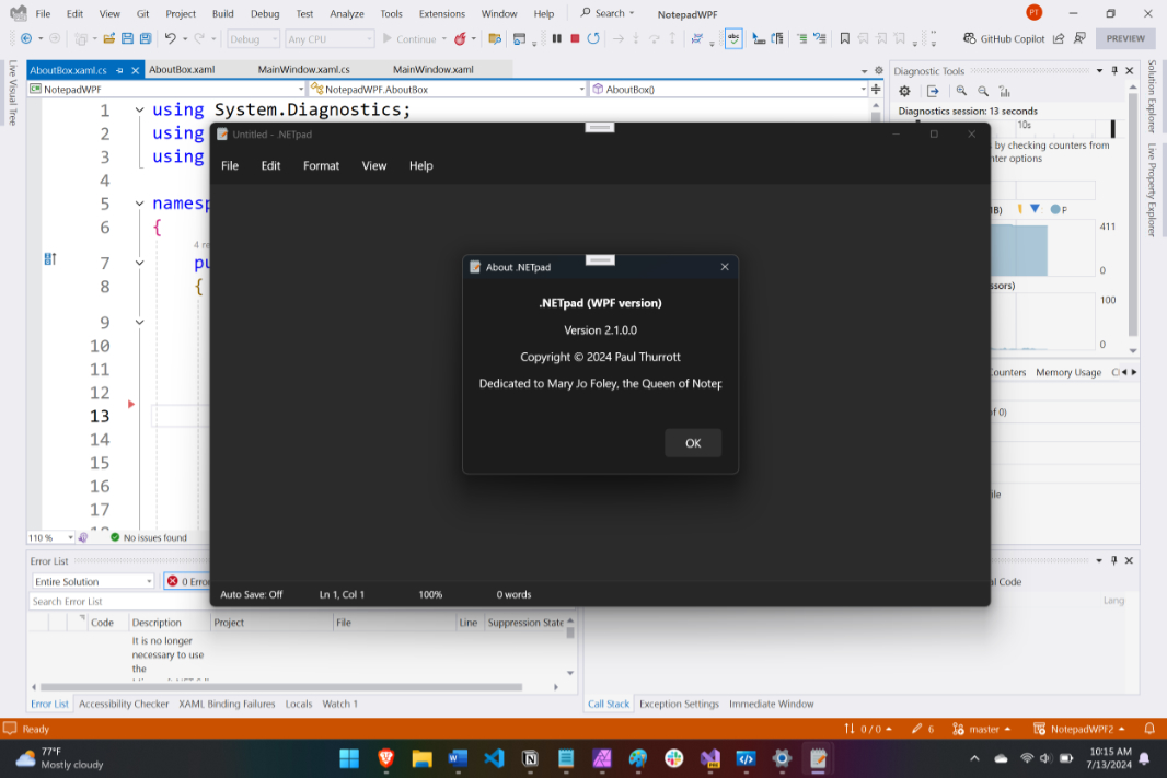
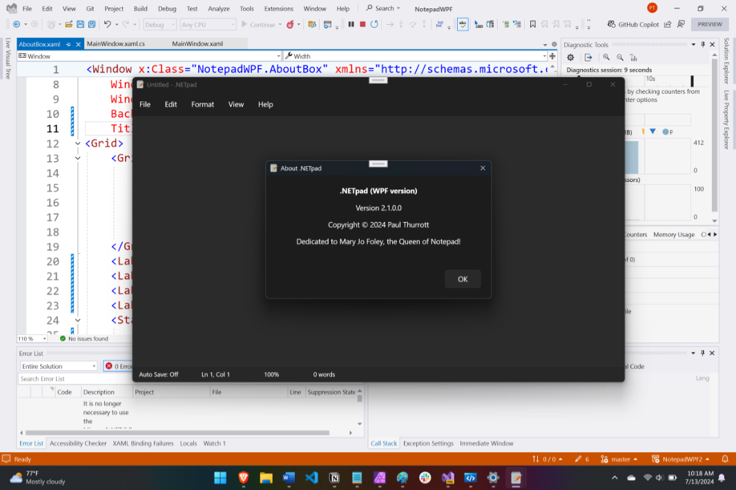
Well, almost. The text in the bottom label, MJFLabel, is cut off. Thanks to how controls are sized differently in Windows 11—most are bigger now—the About box is no longer wide enough to display its contained text. We’re going to get rid of the About box eventually, but this is easy to fix for now: I just changed the width of this window, in AboutBox.xaml, from 350 to 450. Done.
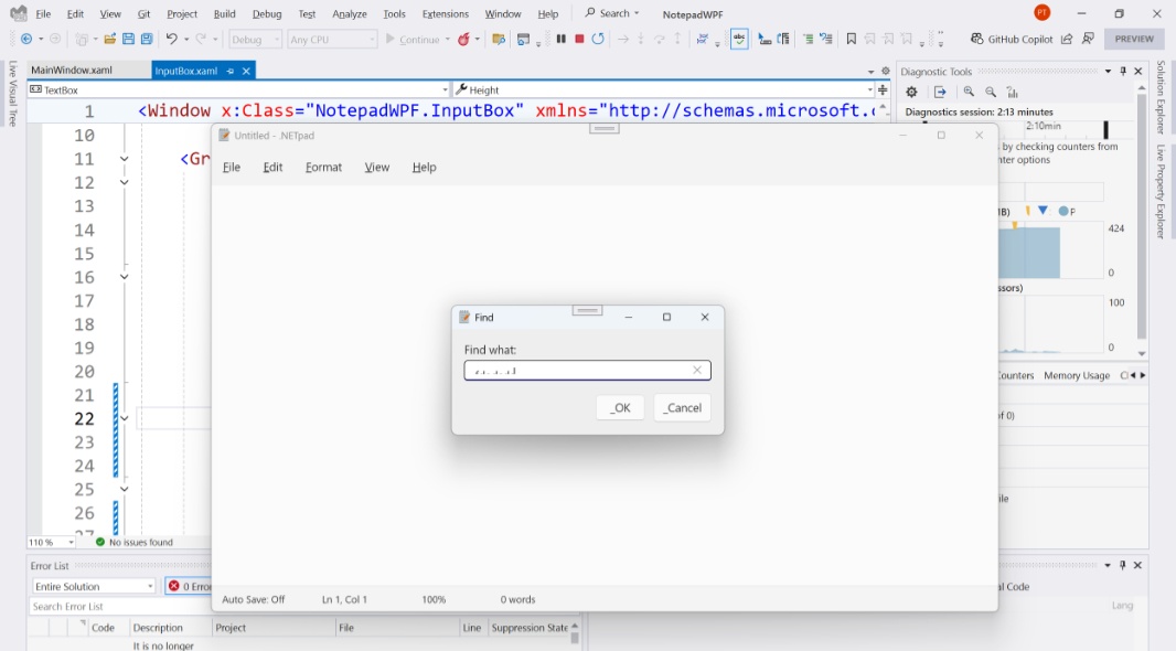
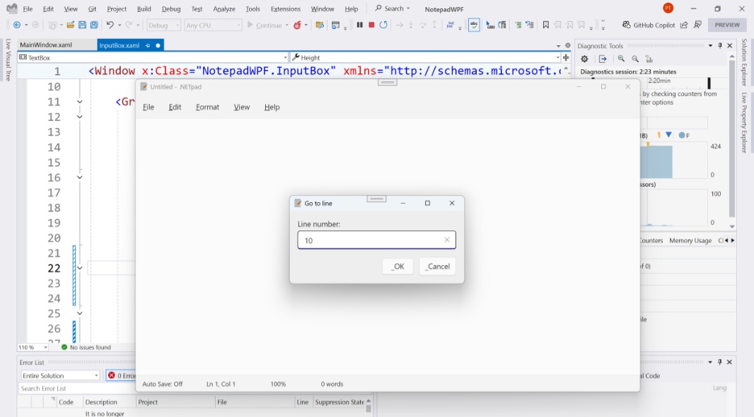
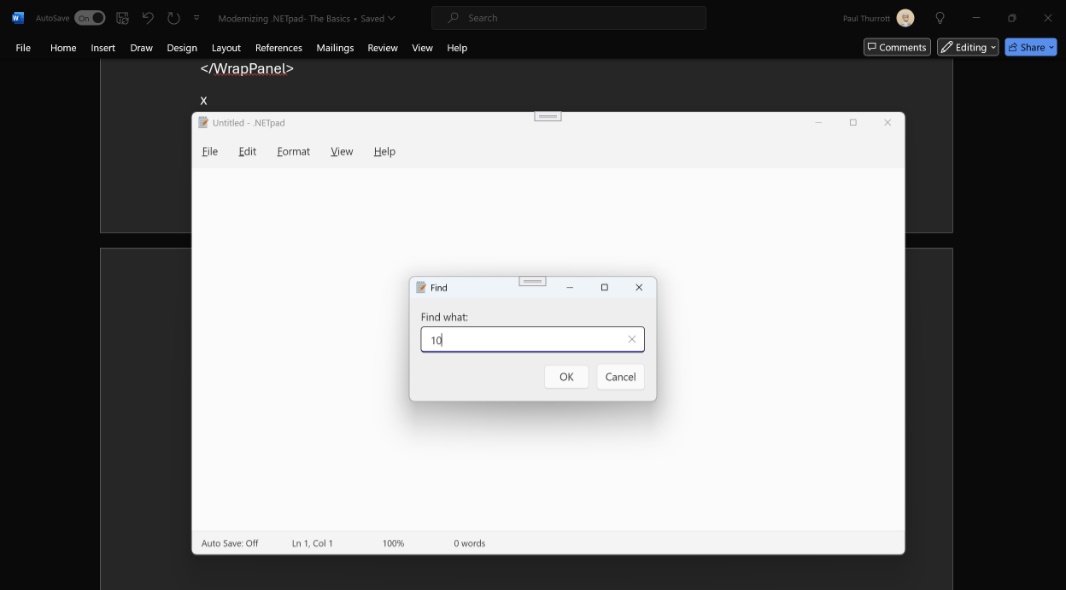
Next, I looked at InputBox. This is the window that appears when Find, Find and Replace, or Go to line are invoked. As with the About box, this looks OK in light mode, but unreadable in dark mode.
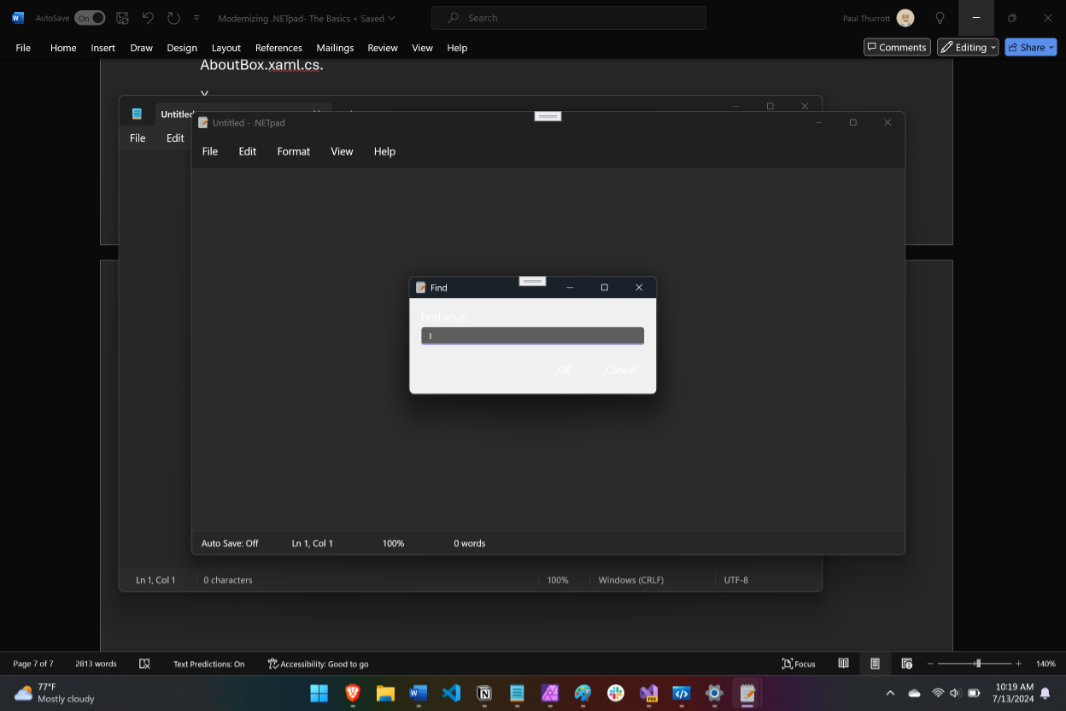
In other words, it’s just like the About box. Knowing this, I opened InputBox.xaml.cs first, and found what I suspected would be there: A line of C# that hard-coded the background color of the window. So I deleted that.
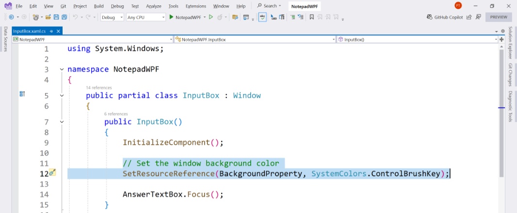
Then, I examined InputBox.xaml. This file defines an Input box window with a label, a text box, and two buttons. And so I just did what I did with the About box: I set the background color of the window to SolidBackgroundFillColorSecondaryBrush and the foreground color of each of those controls to TextFillColorPrimaryBrush.
These changes made the Input box legible in light mode—using Find, Find/Replace, or Go to line—but that also let me see that the layout of the controls it contains, especially the buttons, is now off. Again, because these controls are bigger in Windows 11. So a bit of tweaking to the XAML for this window was necessary.
First, I had to consult my original description of this code to see what this dialog is supposed to look like. It seems straightforward, with a text box and the two buttons below it, aligned to the right. But the code I saw in AboutBox.xaml wouldn’t achieve that, so there was a mistake there as well. (That is, it wasn’t the fault of these bigger new Windows 11 controls necessarily.) I was a bit curious why I did this the way I did, but since I hope to later change this interface, I’ll put that off for another day. The goal for now was to just make it look right. (Which it likely did originally. Something must have happened during an edit.)
Anyway, I changed the code that positions to be correct (again):
<WrapPanel Grid.Row="2" Grid.ColumnSpan="2" HorizontalAlignment="Right" Margin="0,15,0,0">
    <Button IsDefault="True" Name="OKButton" Height="Auto" MinWidth="60" Margin="0,0,10,0" Content="_OK" Click="OKButton_Click" Foreground="{DynamicResource TextFillColorPrimaryBrush}" />
    <Button IsCancel="True" Height="35" MinWidth="60" Content="_Cancel" Foreground="{DynamicResource TextFillColorPrimaryBrush}" />
</WrapPanel>
This looks better, but the textbox is too short for text it will contain now, so I changed its height from 25 to 35. And there we go.
The OK and Cancel buttons—which read as “_OK” and “_Cancel” now—also needed to be fixed. That underscore is supposed to visually indicate the keyboard accelerator one can use to select either button with the keyboard, but buttons labeled “OK” and “Cancel” don’t make any sense to me, and tapping Return or Esc (or tabbing to select and then tapping Space or Enter) should just work anyway. So I just removed those wannabe underscores.
Now it looks fine and seems to work properly. Good.
The final task for this pass at modernization is the Font dialog. I was pretty proud of this custom dialog when I made it four years ago, but this was necessitated thanks to some major changes in how fonts are implemented between Windows Forms and WPF, and because WPF never supported a native Font dialog (one that would be out-of-date now anyway). But looking at it now, especially once it’s been contorted by the Windows 11 theming and its larger controls, I’m not quite as enamored anymore, though I do like that it picks up the system accent color.
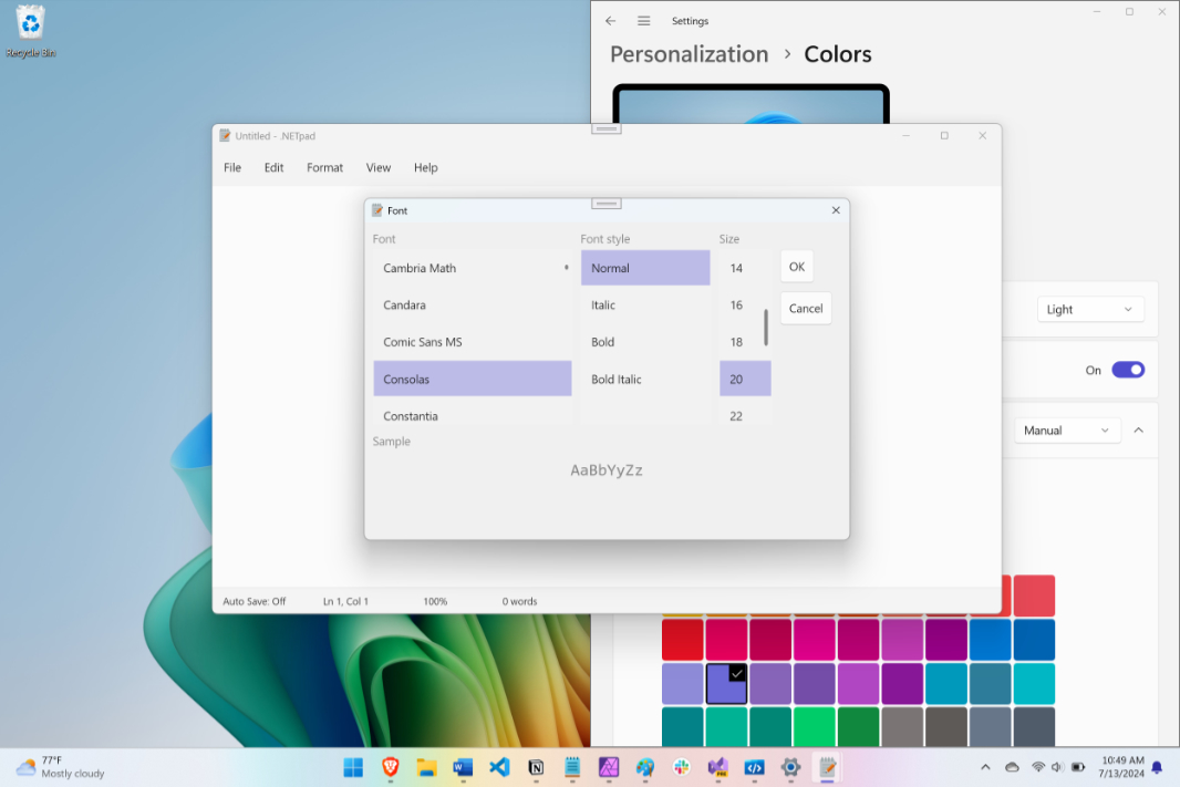
The bigger issue, as with the other secondary windows, is that it’s unusable in dark mode. As noted earlier, I would like to replace this window with a more modern interface, preferably a page similar to how Notepad displays settings now. But getting the current interface working properly is the minimum for the first phase of this modernization project, so we’ll look at that later. For now, I just need to make it look right. And given the experience with the other windows, this was straightforward: I opened FontDialog.xaml.cs and removed the C# code that set the window’s background color. Then, I opened FontDialog.xaml, and set the window’s background color to SolidBackgroundFillColorSecondaryBrush and each control’s foreground color to TextFillColorPrimaryBrush.
And that looks pretty good in both light and dark mode, forgiving for now its non-standard look and feel. It is a modern version of what I created four years ago.
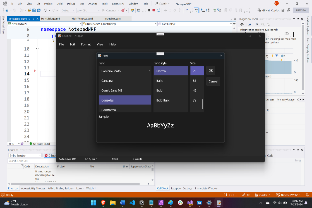
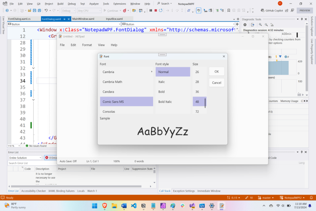
With one minor exception: The OK and Cancel buttons aren’t the same width anymore, as they were before. I experimented with some major changes to the code—for example, changing the StackPanel that contains the two buttons to a Grid, which required a lot of work—but in the end, I just hard-coded width values to each. I set them both to 70, which seemed about right.
This is not perfect, but it’s OK. The controls in this window have curiously large margins and/or padding, and if you set the font size to the largest value in that column, the preview display can overrun the bottom of the window, depending on the font. But I’m not going to waste time on this: As noted, I hope to change this interface to something more elegant and standard, similar to what Notepad uses. And that’s a problem for another day.
For now, I’d say that .NETpad is roughly where it needs to be for a minimally modernized WPF app: All the original UI pieces are in place as before, but they’ve been tweaked to look better with Windows 11 theming, and in both light and dark mode. Unless I’ve missed something—always a possibility—I can now turn my attention to the next phase of modernization. Here, I will be limited by what’s available natively to WPF and how much or whether I’m willing to create some custom UIs to emulate modern features that are not available in WPF.
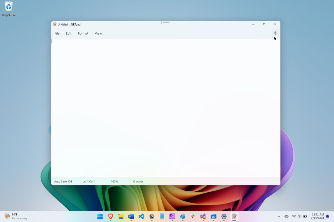
As an example, I mentioned that Notepad uses a Settings gear icon in its menu bar row. This interface isn’t natively available using the WPF Menu control, but I’ve already figured out a workaround to that. Here’s a preview.
More soon.

Gain unlimited access to Premium articles.
With technology shaping our everyday lives, how could we not dig deeper?
Thurrott Premium delivers an honest and thorough perspective about the technologies we use and rely on everyday. Discover deeper content as a Premium member.