Modernizing .NETpad: Title Bar Customization (Premium)
- Paul Thurrott
- Aug 20, 2024
-
0
In addition to implementing a tab-based user interface, the modern Notepad also does something that’s a bit tricky to do well with WPF: It hides the old-school window title bar and implements its own versions of the some of the buttons that usually appear in that area, plus common window actions like windows drag and double-clicking in the title bar area to toggle restore/maximize. I will be implementing a similar interface for .NETpad. And while this work is not yet complete, it’s far enough along that I can at least describe the approach I’m taking.
This comes up from time-to-time, but it’s perhaps too easy to dismiss an app like Notepad as being basic and unsophisticated. I mean, it looks simple enough. But each time I’ve created different versions of .NETpad, I’ve run into features that are difficult or impossible (given my skills) to duplicate. And that’s never been more true than it is now with the current modernization project: Microsoft really raised the bar when it updated Notepad to support tabs, the modern Windows 11 look and feel with support for light and dark themes, and various modern app patterns like the new settings interface.
But even those who write off Notepad as “basic” app have almost certainly noticed these changes, especially the tabs. Tied to that, Microsoft also heavily customized the top area of the app window: It no longer has a traditional title bar, despite being an old-school desktop app. But it still delivers all the features we used to get from the title bar. And so I have to do the same with .NETpad.
It’s a lot of work.
It’s also thankless work: After ripping out all the old-school controls found at the top of a typical desktop app window, you need to replace at least some of the functionality that these things previously provided for free. No one will notice this when it just works, but I can assure you they’ll miss certain features when they’re missing or don’t work.
But what are these features? Among other things I may be forgetting, they include:
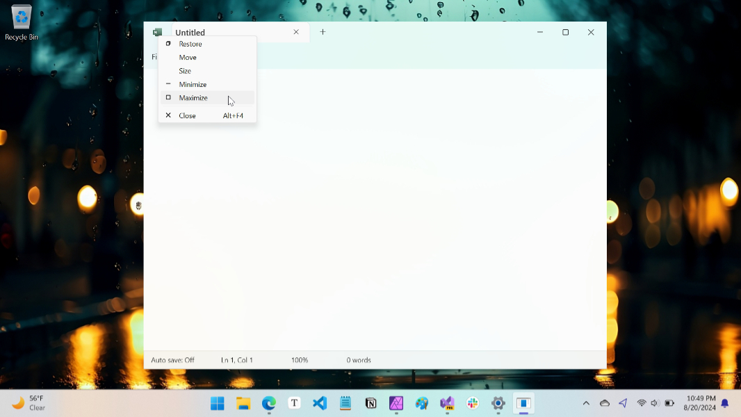
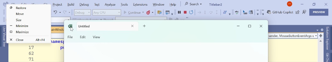
App icon. You click (or right-click) this icon, in the upper-left of an app window (or type Alt + Space, which works in most modern apps, too) to display the little-used application menu, which displays a little of common app window commands (“Restore”, “Move”, “Size”, and so on). This vestigial interface is as old as Windows, and it’s there so the user can control the window using only the keyboard, an act most Windows users haven’t even considered in decades, if ever. But it’s still there in Notepad, despite the modern makeover.
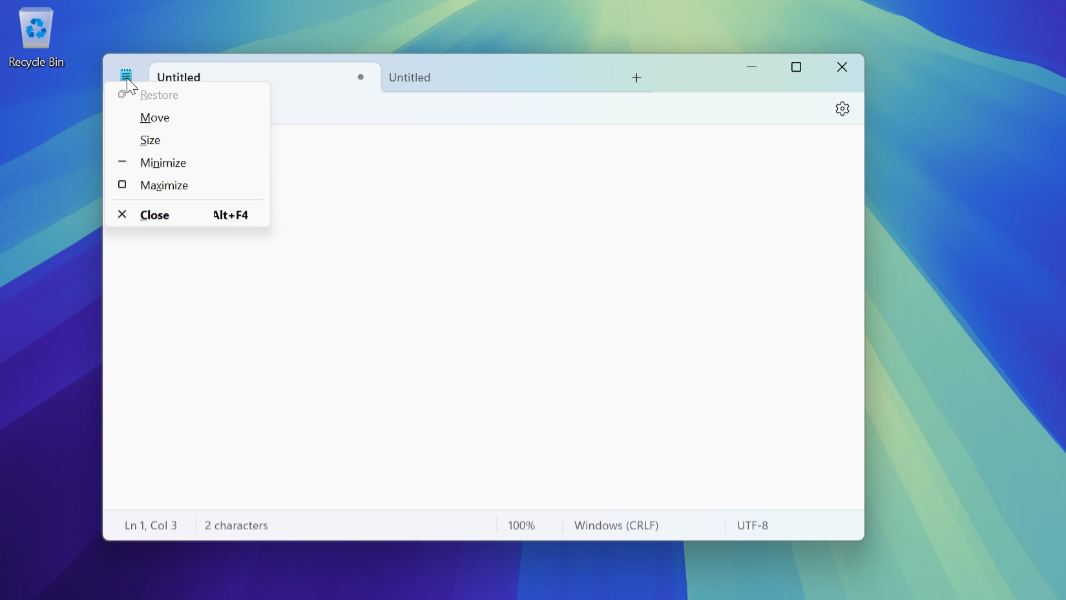
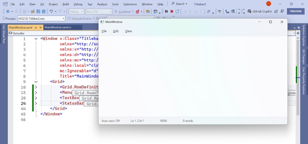
Title bar. The title bar sits at the top of an app window, where it typically displays the name of the app or some other descriptive title. In older Notepad versions, this title was formatted like Notepad – Name of document.txt, and Microsoft displayed a * character next to that title to indicate when the current document had unsaved work. The modern Notepad no longer uses a title bar, however, and there’s no mention of the app’s name in the main app window anywhere. Each tab displays the name of the document it contains (Untitled, with no .txt, for a new document) and its “Close tab” button (an x) changes to display an “update status dot” button (like a bullet point, or •) when the contained document had unsaved work. Perhaps most importantly, the title bar is where the user “grabs” the app window with the mouse cursor to drag it to a new location. And where they can double-click to toggle between the window’s maximized and normal (floating window) states.
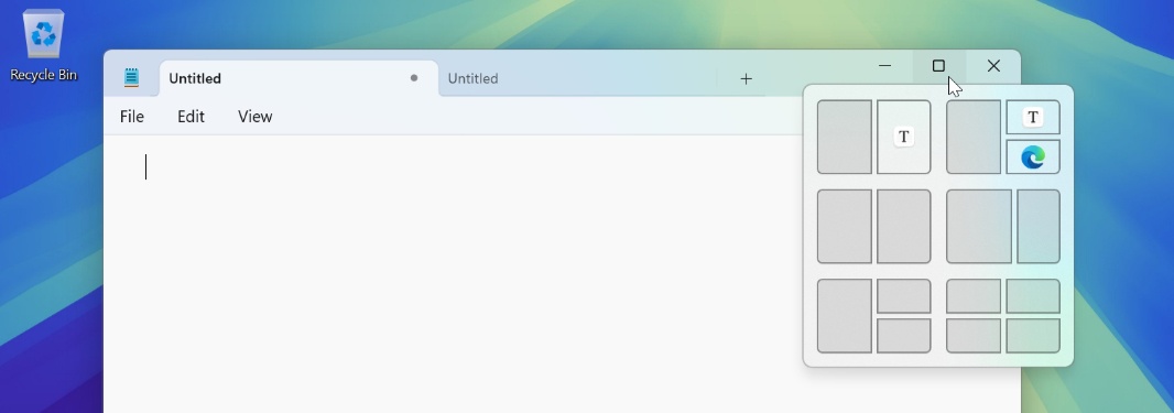
Window buttons. App windows–whether they’re classic desktop apps or more modern apps–usually feature three standard window buttons–“Minimize,” “Maximize/Restore,” and “Close” that are familiar to everyone who uses Windows. These buttons also provide access to the Snap layouts flyout, and its Snap recommendations in Windows 11, a feature I may or may not be able to duplicate.
Just removing the title bar area from a window in WPF is easy–it’s what I did when I created the dialog boxes I described in the previous article in this series–but reimplementing the features noted above after you’ve done that is more difficult. This wasn’t a concern for the dialog boxes I created for a variety of reasons–they all have buttons with default actions that lead to the window closing, for example, and not being able to drag them to reposition them is a feature, not a limitation–but it is very much a concern for the main app window.
And so this is something I’ve been working on, on and off, for the past few months. With the dialog box work mostly done (minus some pesky styling issues that also impact the tabs I need to add to the app), I figured now was the time to get this work up to speed as well.
This is what I’ve done so far.
First steps
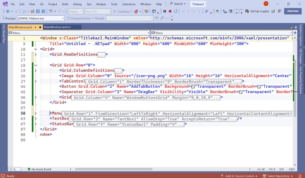
The first step was to create a new Visual Studio project, based on the .NET 9 preview, and with the custom XAML added to the App.xaml file that enables Windows 11 theming support. Then, I blocked out my familiar three-row grid–with a menu bar, text box, and status bar from top to bottom–in XAML, to emulate the basic look and feel of .NETpad. This is the starting point for many of the side projects I’ve worked on over the summer.
To remove the title bar–what we used to call the non-client area–you add the following XAML to the Window block:
WindowStyle=”None”
However, I added more code to make the test app easier to test:
WindowStyle=”None” WindowStartupLocation=”CenterScreen” ResizeMode=”CanResize” Title=”Untitled – .NETpad” Width=”800″ Height=”600″ MinWidth=”600″ MinHeight=”300″
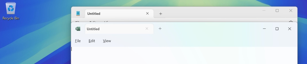
And when I ran the project, it looked like so:
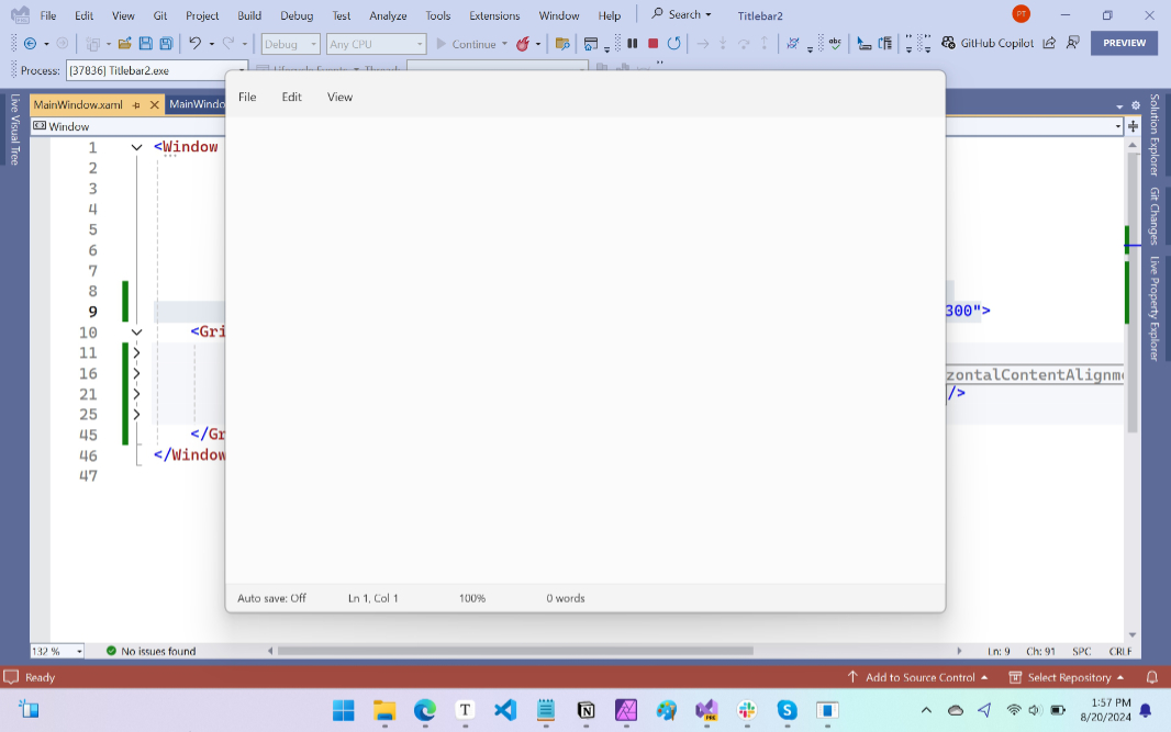
This window can’t be moved (easily) as there’s no title bar, and so there’s nowhere to “grab” the top of the window and drag it. But it can be resized (thanks to that ResizeMode=”CanResize” bit). And if you really need to move it, just type “Alt + Space” then “M,” and then use the arrow keys. But it’s fine as-is for now.
Add the missing controls
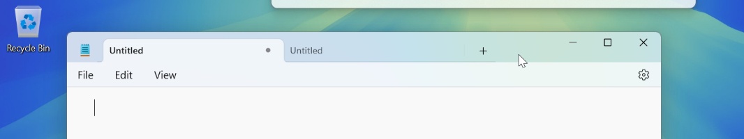
This change will include a tab-based interface at the top, not the menu bar. So it made sense to block that out next, even though my tab work isn’t done and needs a lot of work: The replacement controls for the app icon, drag area, and window buttons all need to be laid out with the tabs, so I had to design that as well. For this, I went back to the well and used a basic grid with one row and then five columns from left to right:
- App icon – This is the app icon that identifies the app, visually, and helps users access the application menu
- TabControl – This is the WPF control that contains the TabItem controls that each represent a tab
- New tab button – The TabControl control doesn’t have a “New tab” feature, so I had to make my own to match the Notepad design
- Separator – This auto-resizable WPF control will sit in the unused space at the top of the window and will be used for dragging the windows around
- Window buttons – This will be a grid of three buttons that will emulate the “Minimize,” “Maximize/Restore,” and “Close” window buttons
To add this, I created a new Grid above the menu bar, and assigned that to Row 0 (the top row) in the outer grid of the app windows UI. (I also had to reassign the menu bar, text box, and status bar to the next row number down in each case.) So there were now four rows in the outer grid, instead of three.
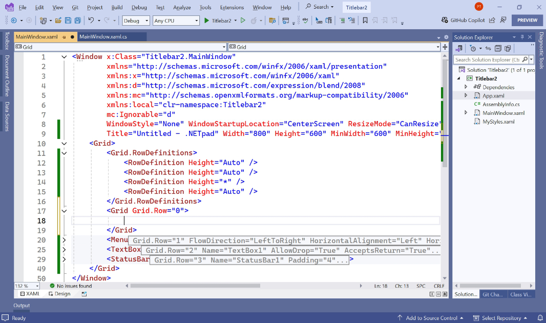
As noted, this grid required five columns. I hard-coded the image in the first column (for the app icon) to 48 dips (so it matches the size of the app icon with the spacing it needs), made three of the other four (a TabControl, a “New tab” button, and a grid for the window buttons) to auto-size to their contents, and then set the separator in the fourth column to a width of “*” (“star”), which supports the dynamic sizing capability that that control needs. Which was more work than it sounds like: I had to create and correctly configure each control, and all four buttons–“New tab” plus the four window buttons–each needed to use the correct Segoe Fluent Icons-based glyph (character), and at the right sizes. (I also struggled a bit getting my app icon to display in the Image control, so I just converted to a PNG file and used that.)
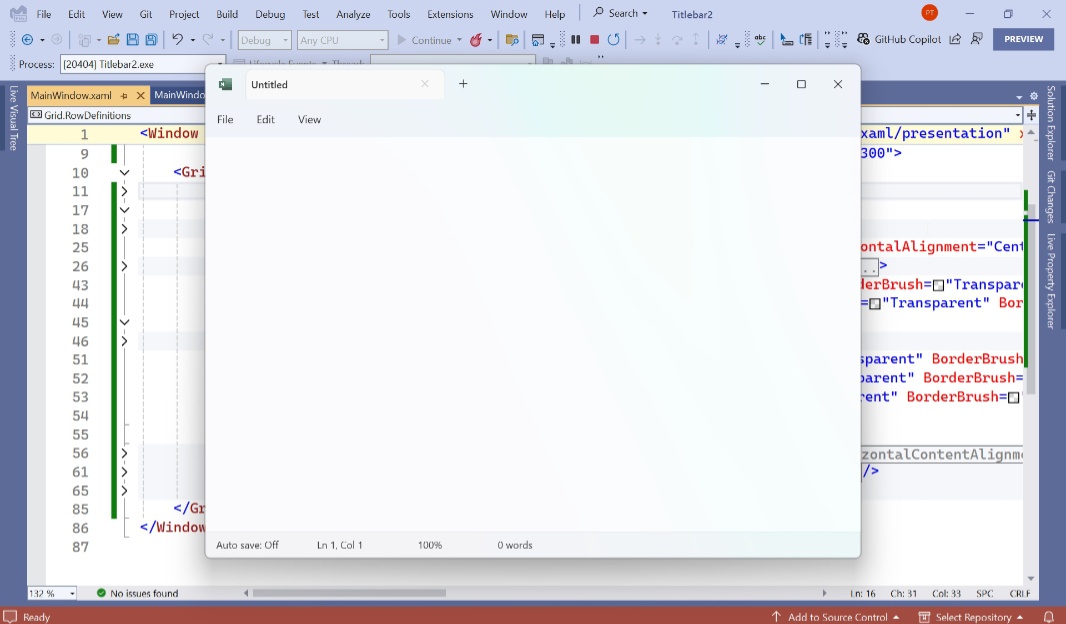
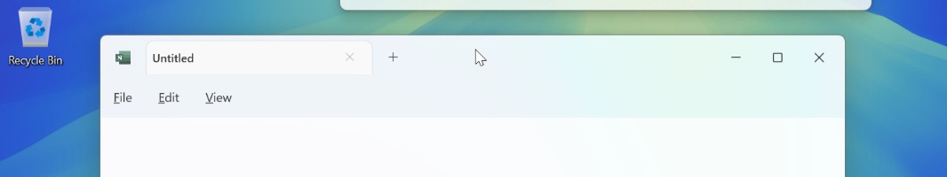
It basically looked like so when I was done roughing it out:
Here’s the high-level code–the new Grid with the five columns–blocked into the main window XAML code.
Honestly, this looks pretty good … assuming you don’t look too closely. I matched this up against Notepad to get the sizing and spacing correct, and it’s not perfect. Some of that is deliberate: I like the position of my window buttons better than how they’re done in Notepad, for example. Some of it just fine-tuning work to do.
Oh, and some is related to that style issue I keep reference: My default/current/selected tab is white whereas that tab in Notepad is color-matched to the menu bar. That’s an issue for another day, and something I’ve been working on separately.
Anyway, what I had at this point was a semi-reasonable facsimile of the top of Notepad, at least visually. The problem was that none of it worked. The biggest issues being the ability drag the windows around with the mouse and those window buttons.
Add windows dragging
Window dragging was surprisingly easy: WPF provides a Window.DragMove method for this purpose, and most controls, including Window, have a MouseLeftButtonDown event that fires when the left mouse button is pressed while the mouse cursor is above it. After flailing around trying to add this event handler directly to the separator, I just added it to the window. This worked as expected: I could now drag the window around normally.
But there were unintended consequences: I could also the window around by grabbing the empty part of the menu bar and the status bar. This was kind of fun, but non-standard. So I added a PreviewMouseLeftButtonDown event handler to the status bar that look like so:
private void StatusBar1_PreviewMouseLeftButtonDown(object sender, MouseButtonEventArgs e)
{
// Prevent status bar being used to drag app window
e.Handled = true;
}
And then I pointed the menubar’s PreviewMouseLeftButtonDown event handler to the same method. Problem solved.
Handle the window buttons
Next, I got to work on those three window buttons. I had expected to just create Click event handlers to each, but as it turns out, WPF supports system commands for window management. And they are exactly what I needed, not just for the window buttons for that app icon too. Nice.
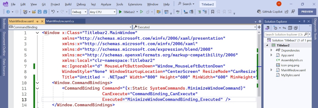
First, I created an empty Window.CommandBindings block inside the Window XAML, above the first top-level grid.
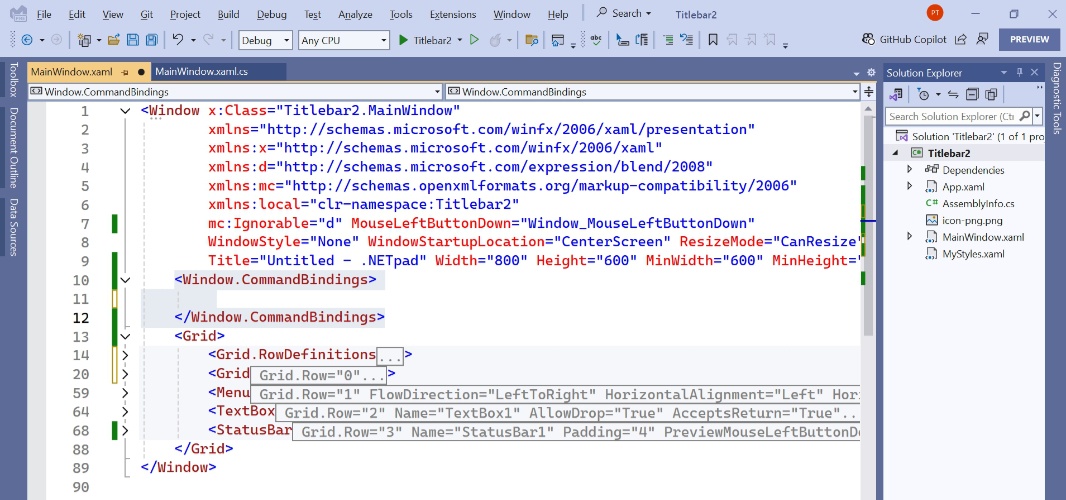
Then, I added a CommandBinding for the “Minimize” window button inside that block. It requires three tags:
- Command. I set this to {x:Static SystemCommands.MinimizeWindowCommand}
- CanExecute. This points to an event handler that determines whether this command can execute. Since I will always want that, and for all three window buttons, I used the same event handler–CommandBinding_CanExecute–for all three of the window buttons.
- Executed. This points to the event handler that fires when this command executes. This will be different for all three window buttons. So I renamed the default event handler that Visual Studio provided to MinimizeWindowCommandBinding_Executed.
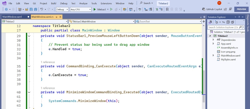
Looking at the C# code-behind file, I could see the two new empty event handlers. Both require just a single line of code.
I wasn’t done yet: Next, I had to a Command tag to the XAML for the “Minimize” window button. That looks like so:
Command=”{x:Static SystemCommands.MinimizeWindowCommand}”
Now, I could finally test it. Voilà! Clicking the “Minimize” window button … wait for it … minimized the window, as God intended.
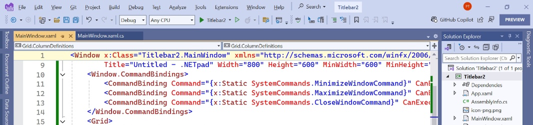
The “Maximize/Restore” and “Close” window buttons required similar code additions. When I was done, there were three command bindings in the Windows.CommandBindings block and a Command tag in each of the blocks for the window buttons.
For the code-behind event handlers, the CloseWindowCommandBinding_Executed handler was straightforward:
SystemCommands.CloseWindow(this);
But the MaximizeWindowCommandBinding_Executed event handler required a bit of thought because this is used to toggle the window between two window states.
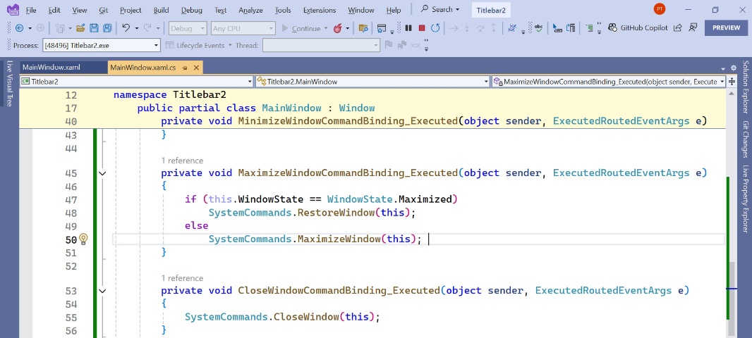
That seemed to work OK: Clicking “Close” closed the window, and the “Maximize/Restore” button would toggle between maximized and restored window states.
But there were two problems. The glyph displayed by the “Maximize/Restore” button should change to indicate which state the window is in. And the maximized window wasn’t just maximized, it was totally full-screen, covering the Taskbar. Oops.
Googling for the answer to these issues unveiled further problems tied to the main app window’s WindowStyle being set to “None.” Among them, there was a visual gap on the right side of the maximized app window, meaning it wasn’t truly maximized. Without belaboring the point, this is a bug in WPF and … whatever. What I did for now was work around it using the following code in the app’s constructor.
MaxHeight = SystemParameters.VirtualScreenHeight; MaxWidth =
SystemParameters.VirtualScreenWidth + 10;
And so that seems to solve that problem. For now. It will likely need more attention. But for now, we’re moving on.
As for the glyph change in the “Maximize/Restore” window button, that required adding a Window_SizeChange event handler for the main app window.
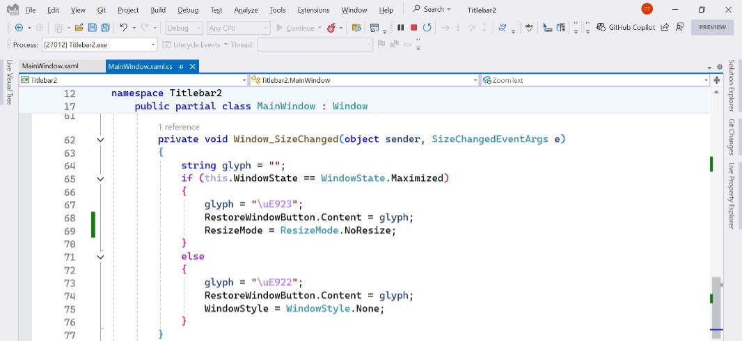
Now it seemed to work OK: When the window is maximized, it covers the entire screen minus the Taskbar. And the “Maximized/Restore” window button looks right in either mode.
But the maximize/restore toggle work wasn’t done.
Double-click the title bar area to toggle maximize/restore
It’s not enough for the window buttons to work: You can also toggle the maximize/restore state of most windows by double-clicking the title bar, if present, and, if not, the place where the title bar would be. For .NETpad, that’s the separator between the “Add new tab” button and the window buttons. Which supports a MouseDoubleClick event handler. Presumably, this what I needed. So I added the event handler. And then added the following code to it.
if (this.WindowState == WindowState.Maximized)
SystemCommands.RestoreWindow(this);
else
SystemCommands.MaximizeWindow(this);
And … it didn’t work. So I added a MouseDoubleClick to the app window, too, pointing it to the same method. And that did work: Now, I can double-click the top empty area of the window to toggle it between maximized and normal window states.
App button
This is all good stuff, but let’s not forget about the app button. Currently, it displays the app icon, which is the minimum. But ideally, it would also display the application menu when clicked or right-clicked; we’ll go with right-click since so few people use this feature anyway.
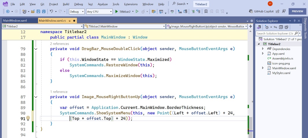
Here, I expected problems: WPF has yet another bug related to the window positioning relative to the screen which has impacted me elsewhere. But I forged ahead, adding a MouseRightButtonUp event handler to the image. And then Googling various ways to display this menu–using the SystemCommands.ShowSystemMenu method–in the right place.
This was not successful: That aforementioned WPF bug put the application menu over the desktop, not the app, no matter how I did it.
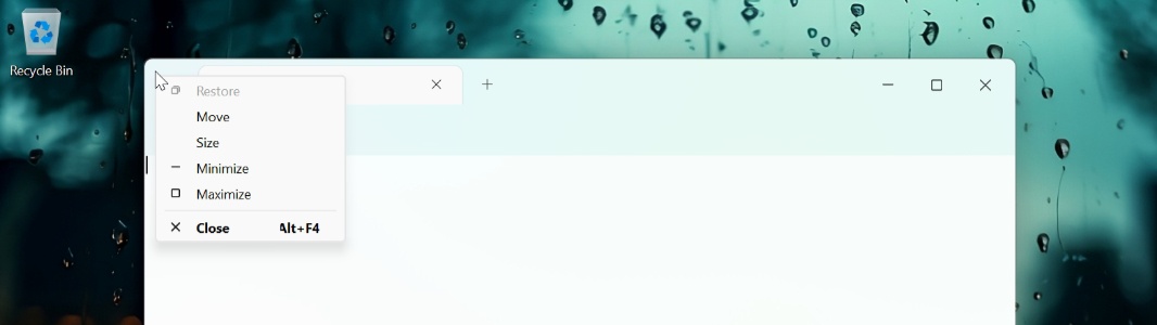
Hilarious. That’s OK. I came up with a Plan B.
And now it … works. Close enough.
And we’re done … right?
No, not really. But this is a reasonable start for this work, a good base to work from. And with that, it’s time to move on: I have much bigger issues to deal with, style issues that make the tabs I want to implement difficult to impossible. But with this out of the way for the most part, at least I can focus on that now.

Gain unlimited access to Premium articles.
With technology shaping our everyday lives, how could we not dig deeper?
Thurrott Premium delivers an honest and thorough perspective about the technologies we use and rely on everyday. Discover deeper content as a Premium member.