Modernizing .NETpad Step-By-Step, Part 3: Settings (Premium)
- Paul Thurrott
- Sep 04, 2024
-
1
In this phase, we’ll add a modern settings interface to .NETpad that mimics the similar user interface in Notepad. This is among the modernization changes I’m most proud of, though in going through the code again for this write-up, I see some obvious improvements. For now, let’s just get it done. This requires a lot of XAML code and an interesting structural change to the core app.
Block out a new outer grid
So let’s start there.
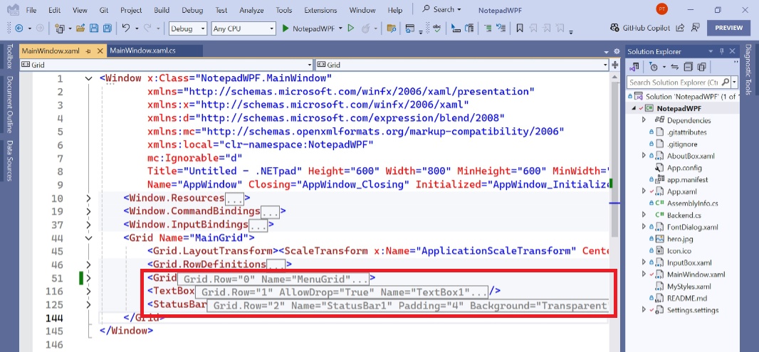
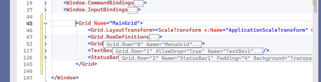
As I keep noting, .NETpad is a simple app, at least from a user interface perspective. The main app window (MainWindow) is a grid with just three rows that represent the menu bar, the text box, and the status bar, respectively, from top to bottom. In XAML, it looks like so:
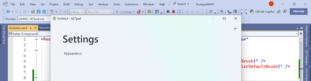
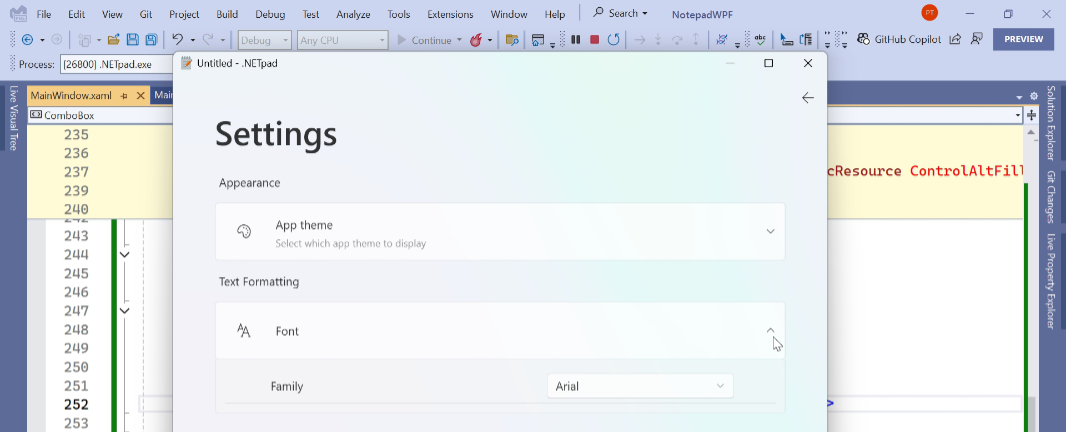
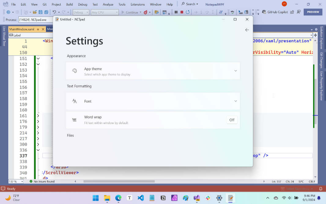
Notepad follows this basic structure, too, of course, though the version in Windows 11 now includes a fourth grid row, at the top, for the tabs. We’ve saving that bit for a later day–and the hope that Microsoft will make some changes that make implementing tabs easier and more elegant–but this phase of our project is about adding a different new UI. When you click the little Settings (gear) icon in the upper-right of Notepad, a settings interface–I’m calling it a pane, for lack of a better term–takes over the entire window in-place, covering up the normal app UI.
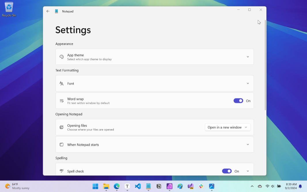
This is the UI we will recreate. Creating that UI is somewhat straightforward, assuming you know XAML and don’t mind spending the time to make it look as close as possible to its inspiration. (I did that work.) But the first trick is to replace the main app UI with a pane that takes up the entire window. There are a few ways to accomplish such a thing, but the method I came up with seems to work well enough.
Basically, I’m adding a new base grid outside the current base grid (MainGrid) that I call OuterGrid. This new outermost grid is as simple as can be: It has two columns, one for MainGrid and one for the new settings pane (which will be implemented in a grid called SettingsGrid). Visually, it looks like this:
Except, of course, that it doesn’t: The user will never see both of these UIs on-screen at the same time. Instead, the app runs normally and displays the standard three-row grid main app window. When they click on the Settings button, that view is hidden and the settings pane is displayed. When they leave settings, the reverse happens. We just flip which grid is displayed, MainGrid or SettingsGrid. Simple.
To get started on this new design, separate the MainGrid block in MainWindow.xaml so that there is space above and below.
Then, add the new OuterGrid block (with code above and below MainGrid)
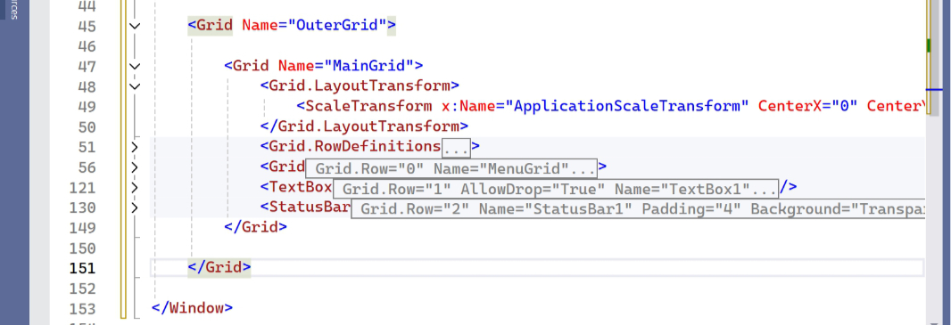
OuterGrid needs some grid column definitions.
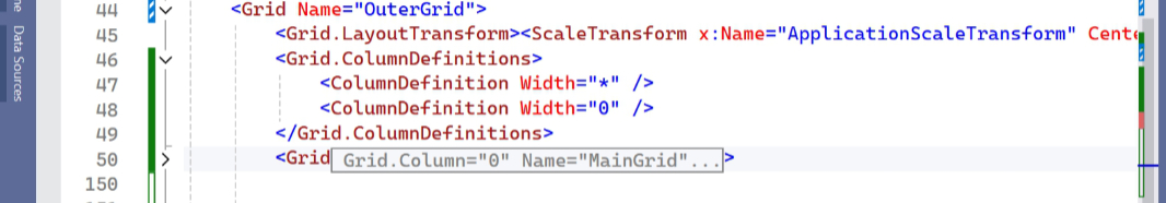
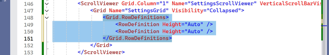
And then we add Grid.Column=”0″ to MainGrid, making it the leftmost of the two columns in OuterGrid. We also add the code for SettingsGrid, which will be Grid.Column=”1″, of course. But we also wrap it in a Scroll viewer control (SettingsScrollViewer) because its UI will often be taller than the app window container, and it needs to scroll.
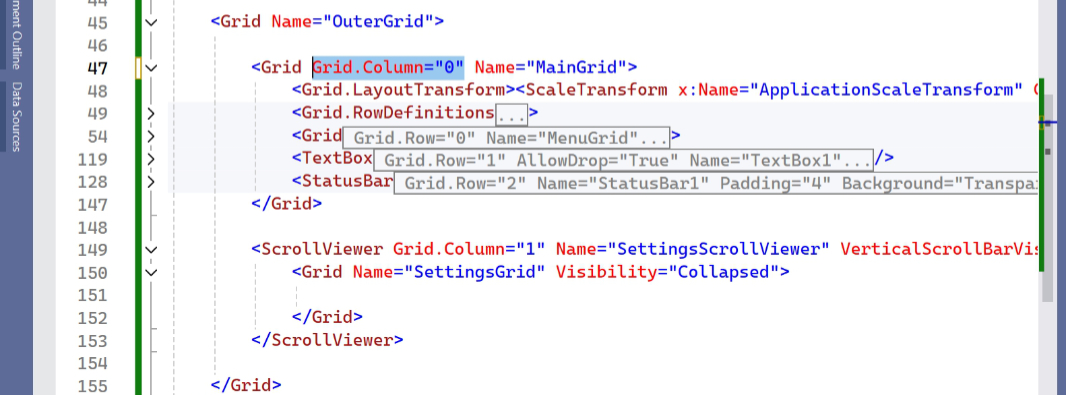
With that, the new basic app structure is complete. If you were to run the app now, it would just look and work as before because the SettingsGrid column is 0 device independent pixels (DIPs) wide and the Scroll viewer is collapsed. Effectively, it’s hidden from view.
Next, we need to move the Grid.LayoutTransform block that’s current inside MainGrid out to be inside OuterGrid. This is what enables the app’s scaling feature, and by moving it to OuterGrid, this functionality will automatically work with the settings pane, too.
Define the basic settings layout
If you look at the shot of the Notepad settings interface and break it down, you’ll see three top-level UI elements: A (subtle) “Back” button in the upper left, an (overly) large “Settings” header, and then multiple rows of individual settings divided by smaller headers (“Appearance,” “Text formatting,” and so on). I implement this as a grid with multiple rows, and while the resulting code is wordy and maybe confusing at first, it’s pretty simple from a layout perspective.
The one gotcha here is that we can’t (easily) put a “Back” button in the app’s title bar area as Notepad does. That requires customizing the title bar area, which is inelegant and buggy in WPF, and a change we’ll look at when and if we add tabs in the future. So I came up with an acceptable (to me) workaround: I put the “Back” button in the top right of the settings pane, roughly in the same place as the Settings (gear) icon appears in the main app UI. So it looks and feels more natural (I think).
Anyway, the first step is to define the first few rows of this grid. (With the understanding that we will keep adding new rows as we build out the UI.)
Then, we add the code for the header area in settings, which consists of a grid with two columns, one for that large “Settings” header and one for the “Back” button. Apologies for all the code, this phase is rife with XAML.
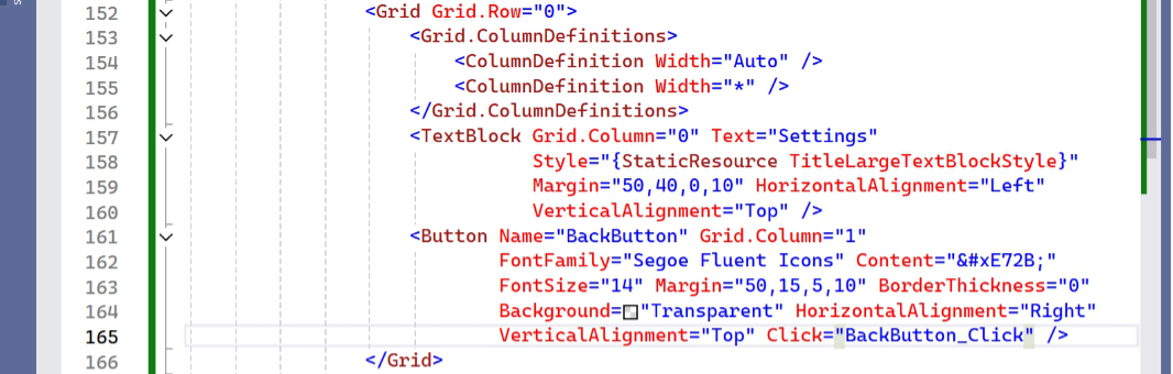
As with the “Settings” button in MainGrid, we use a Segoe Fluent Icons glyph for the “Back” button. We will be using similar glyphs throughout this UI.
Of course, there’s no way to test this yet: The “Settings” button has an associated Click() event handler, but it’s empty. And we’ll need a similar Click() event handler for “Back” so we can get back to the main app UI. (When I first wrote this, I created the settings pane as a standalone app so I didn’t have to deal with that.)
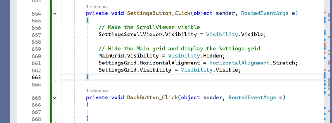
This will eventually need to be more involved, but if you think through what has to happen here, clicking the “Settings” button should hide MainGrid and make SettingsGrid (and its containing Scroll viewer) visible. Like so:
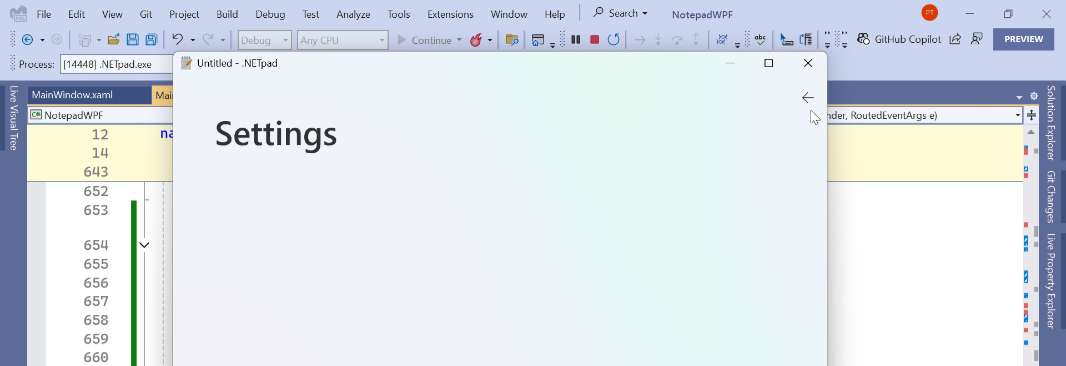
To test this, run the app. Then, click the “Settings” button. When you do, the proto settings pane appears as expected.
Of course, we have no way to get back to the main app UI: Clicking “Back” doesn’t do anything yet.
To fix that, we need to code the basics in the “Back” button’s Close() event handler. This will be updated later, too, but this will suffice for now.
And sure enough, we can now click “Settings” to view settings. And then click “Back” to get back to the main app UI. Nice.
Add some style
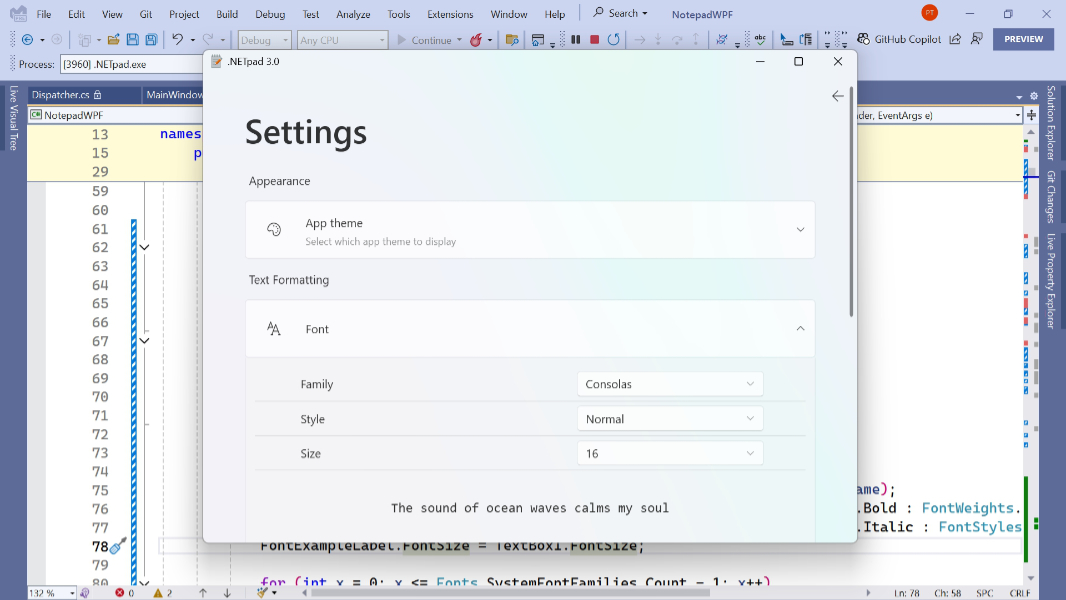
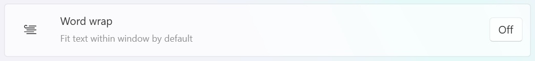
Now it’s time to work on the bulk of the settings pane, which includes some headers and blocks with individual settings, some of which expand. I noted that I identified a few ways to make the mountain of XAML you’re about to experience a bit simpler. That will need to wait for later, but I did at least have the forethought to add styles for two items that repeat throughout this UI: The individual setting names and the individual setting descriptions, the latter of which are smaller. You can see that here, with “Word wrap,” which has both elements.
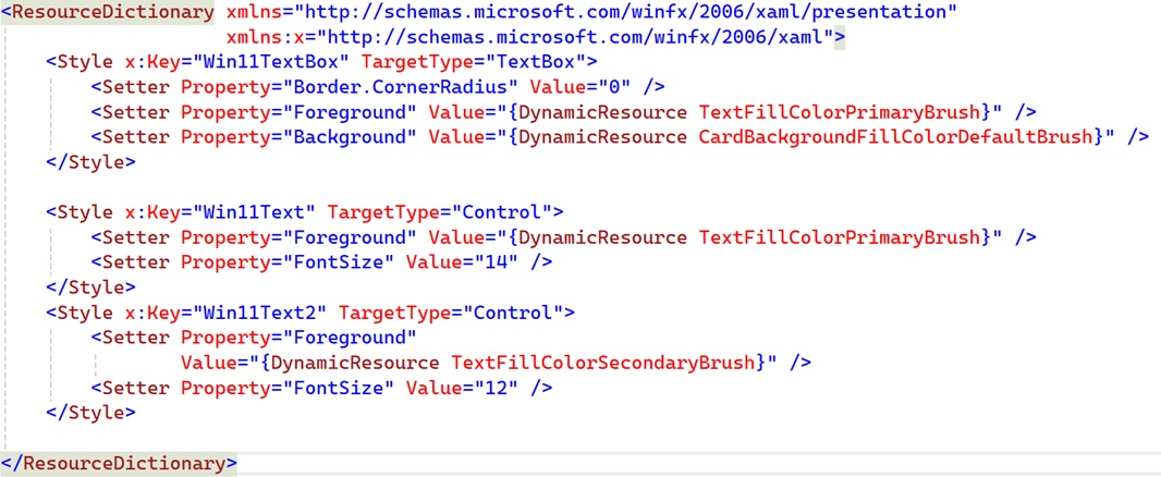
These text styles aren’t unique to the settings UI, so I gave the styles for each more generic (maybe too generic names). To add these styles, open MyStyles.xaml and add the code for Win11Text and Win11Text2 (I know) shown here.
Now, we can start adding the various UI rows.
Add the first header label
The next row is basic enough, it’s just a text header called “Appearance.” We already have two rows defined in the grid, so the following code will suffice.
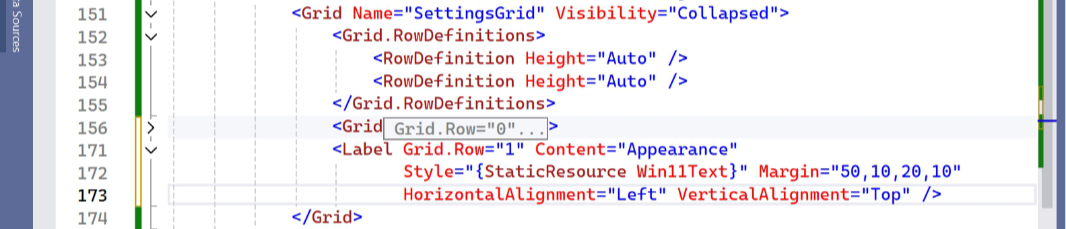
This uses the Win11Text style and, as with the other elements on this page, it’s offset from the left edge of the app window by 50 DIPs using that Margin tag. You can see this spacing if you run the app now.
Implement the first Expander
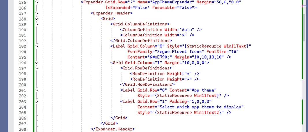
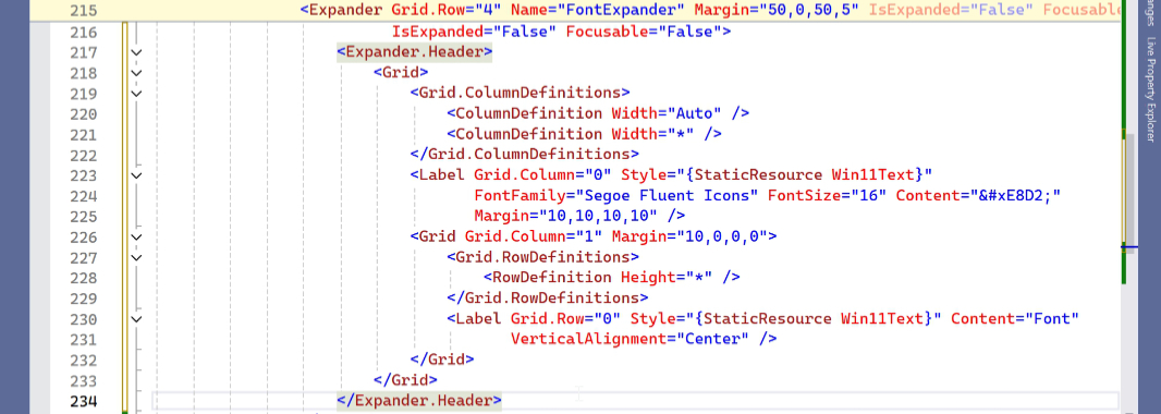
Now it gets more complicated. The next row is an actual setting, and that requires an Expander control, which you probably recognize from its extensive use in the Windows 11 Settings app. This control is usually collapsed by default, but it can be expanded using a little caret button on its right side. And it’s divided into two parts, a top header part and a bottom content part. The header is always visible and the content displays when the control is expanded.
Further complicating matters, the first setting here is for “App theme.” In Notepad, you can choose between Light and Dark themes, of course, or just accept the default, which is to use the system setting automatically. With this year’s addition of Windows 11 theming support to WPF, we can automatically use the system setting (meaning, whichever theme the user chooses). But there’s no way to manually choose Light or Dark theme. And that’s a problem.
Normally, I would have simply skipped this setting and moved on. But I feel like this will change, or that there will be workarounds. So I’m leaving it there for now, with the options in the content area grayed out. Plus, it’s a good first example of using an Expander. This UI requires a lot of XAML because the layout of each expander (header and content) is more complex than may be immediately obvious. Plus, not every expander is the same: Some don’t even expand, some don’t include setting descriptions, and some offer unique control layouts.
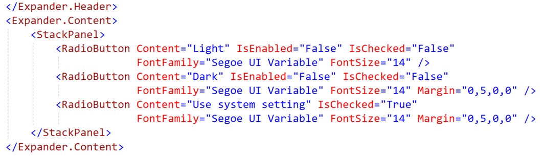
I’m struggling to figure out a way to make this easily understandable. But a typical setting expander includes an icon (implemented as a Segoe Fluent Icons glyph), a title, an optional description, and, if it can expand, a caret button. And that’s just in the header: The content part can be all kinds of things. For the “App theme” expander, it’s a row of three radio buttons for choosing a theme.
Here’s the code for the App theme header. Yes, just the header.
Note that we need to add another Grid row definition to SettingsGrid, too. But when we run the app now and view settings, we can see the new interface. And not much when we expand it, since we haven’t added that code yet.
The content area is a bit simpler, thankfully. Here, I used a Stack panel with three radio buttons, all disabled because, again, we can’t actually write code to complete this feature yet.
But at least you can see the new UI when you run the app to get a feel for how Expanders work.
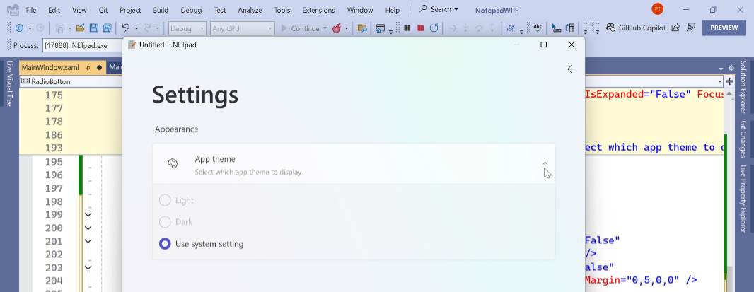
There are issues here: If you expand the App theme expander, exit settings, and come back, it’s still expanded. But we’ll fix that later, as there are some related things to do when we enter and exit settings, and we can do that all at the same time.
Text formatting work
From here, we can implement the remaining rows of settings in this UI. Most of these are pretty straightforward. Some, like Auto save, are specific to .NETpad (i.e. not a feature in Notepad). And some Notepad settings (like opening files in a new tab or window) are not available (yet) in .NETpad. And it’s a ton of XAML code. Given this, I will figure out a simple way to simply let you download all the code for .NETpad settings. But first, let’s look at the next two settings, for Font and Word wrap (under “Text formatting”). These are both unique in some ways.
The “Text formatting” header is easy enough at least. We need to add a new Grid row definition to SettingsGrid, as always. (And if you notice new UI not appearing, or appearing over other UIs here, that’s what you forgot.)
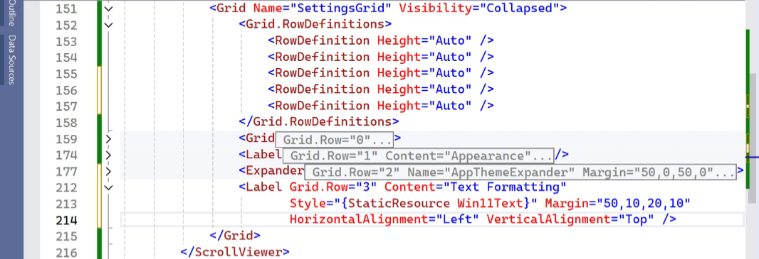
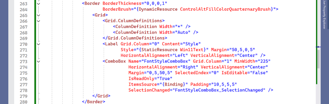
The next two items are more complex. There’s a Font expander with no description and combo box controls for Font family, style, and size (that replaces our old Font dialog), and a Word wrap expander … that doesn’t expand. And is thus not an expander, not really. (Unless I’m missing something, always possible, WPF expanders always display an expand caret.)
The Font expander header is relatively straightforward.
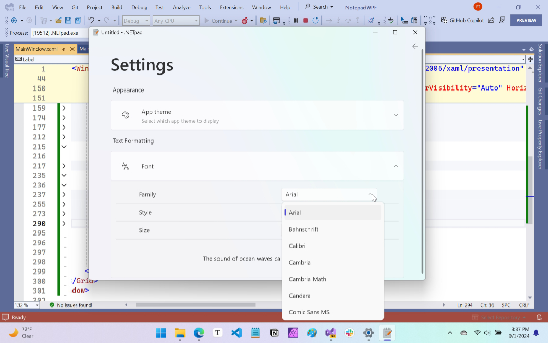
And then I use a Stack panel again for the combo boxes, starting with the topmost “Font” combo box. Which required me to add a border control to use as a separator that’s not quite perfect but is at least close enough to what I see in Notepad. Note, too, the use of WPF data binding in ItemsSource=”{x:Static Fonts.SystemFontFamilies}”.
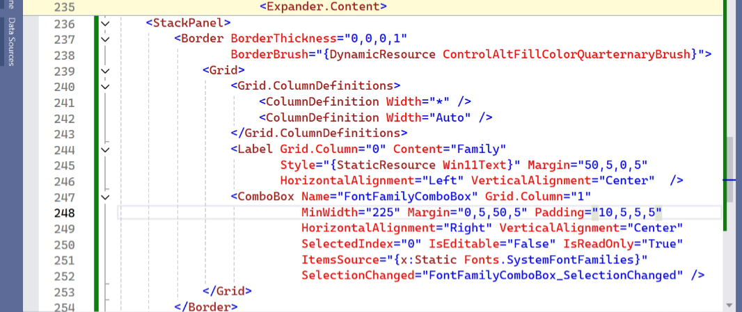
Run it now, and you can see where it’s going. The system fonts are all loaded in the combo box, too, which is nice. But we’ll need to add code to select the correct (user-defined) font.
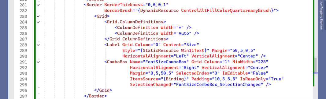
That will come later. For now, it’s time to build out the Style and Size combo box UIs. Each is similar to the combo box we UI we already made. Here’s the code for Style.
And the code for Size.
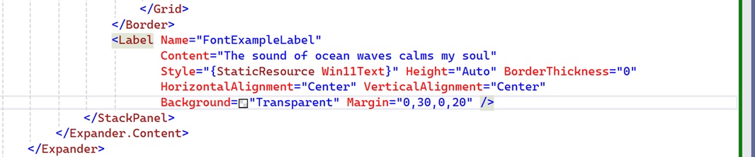
And let’s not forget the code for the font preview, so the user can see what the changes they’re making will look like in the app.
When you run the app, everything is in place. But none of the font combo boxes are linked up correctly. That’s OK, we’ll handle that after the settings UI is completely laid out.
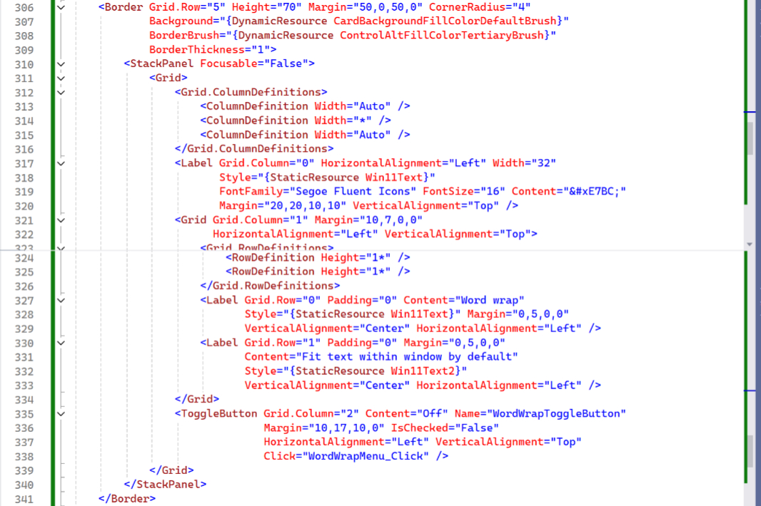
For now, let’s handle the other unique case, Word wrap, our non-expanding expander.
I played around with various solutions to this problem–and am waiting for someone to tell me that the WPF Expander control actually would work–but in the end, I went with a Grid wrapped in a Stack panel wrapped in a Border, the latter of which allowed me to style this element so that it’s roughly identical to a real Expander, with the same rounded corners. Just reading that sounds complex, even to me, and came up with this mess. But here’s the code. Sorry.
A couple of points.
As always, you have to add a new Grid row definition to SettingsGrid each time you add a UI row.
WPF doesn’t support the Toggle switch control that you see in Notepad and all over Windows 11. So I have to use a Toggle button for now. (I suspect we can fix that in the future, but the controls are identical from a functional standpoint.)
And … yikes, this is getting out of control. Pardon the pun. But I did warn you, the XAML this requires is incredible. And we’re only on the third setting.
Anyway, it’s getting there.
Wire it up
This has ballooned to the point where I doubt it makes sense to anyone. But we need to wire up some things before we move on. These include:
- MainWindow AppWindows_Initialized() event – We have a few changes to make here related to fonts now that we’ve changed how that works.
- SettingsButton Click() event – We only have some of the code we need here at the moment.
- FontMenu Click() – When this is clicked, it will also open settings, but with one change: The Font expander will be expanded.
- BackButton Click() – As above, we only have some of the code we need here.
- Bug fixes – Tied to the above, and to some code refactoring I did over the summer that’s not present in this version of the, there are a few changes to make to make sure we’re accurately saving and the loading all user settings (especially those related to fonts) when needed.
This should be entertaining.
Initialize the font controls in settings
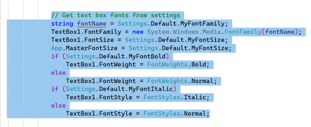
If you look at the App_Initialized() event handler in MainWindow.xaml.cs, you’ll see a section of code dedicated to configuring the app’s fonts. (It’s marked by comment titled // Get text box fonts from settings). This needs to be deleted.
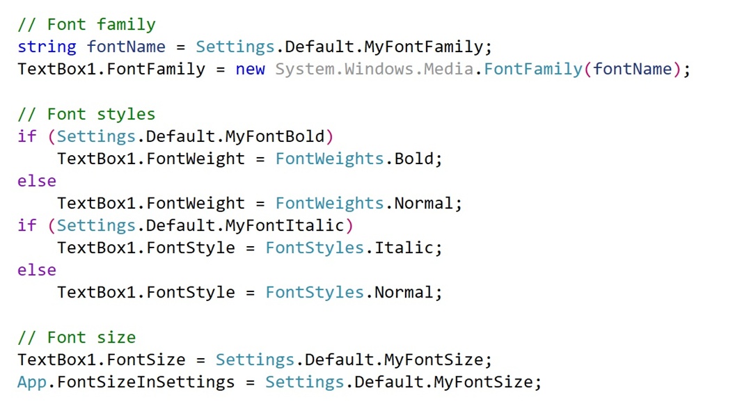
Unfortunately, it also needs to be replaced with a lot more code. Part of the issue is the new fonts interface in settings: Because this UI is sitting there waiting to go (but hidden) when the app first runs, it makes sense to populate the Family, Style, and Size combo boxes up-front. This is especially true because we will later expand the Fonts expander when user clicks the “Font” menu item in the “Edit” menu.
The first addition looks much like the code that was just deleted, but it’s a little cleaner. (And removes a reference to the global variable MasterFontSize.)
After that, things get more interesting. First, we display the correct font in the font preview label in settings.
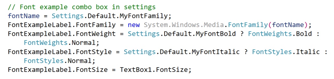
Then, we populate the (Font) Family combo box.
Then, we do the same for the (Font) Style combo box.
Finally, we do the same for (Font) Size.
Rework how the font settings are saved to user settings
We need to make one change to SaveSettings(), which is now in Backend.cs: The new code in the App_Initialized() event handler MainWindow.xaml.cs doesn’t use the MasterFontSize (now App.MasterFontSize) variable anymore, and so it’s possible that saving that variable’s value to user settings could trigger an exception (if it’s 0 or null). So find the line in SaveSettings() that currently reads as:
Settings.Default.MyFontSize = MasterFontSize;
And change that to
Settings.Default.MyFontSize = TextBox1.FontSize;
Problem solved.
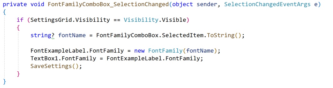
Handle the Font combo box event handlers
But wait, there’s more. Each of the Font combo boxes have a Selection Changed event hander. But each is empty now, and each needs some code. So search for FontFamilyComboBox_SelectionChanged in MainWindow.xaml.cs to get started. Here’s the code it needs to make sure that when the user chooses a new font, it’s reflected in the app’s text box and the example/preview text in settings, and is saved to user settings.
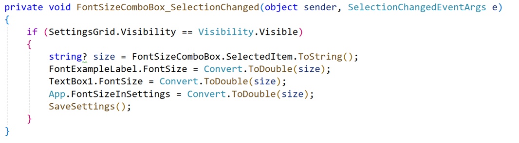
The SelectionChanged event handler for Font size is similar:
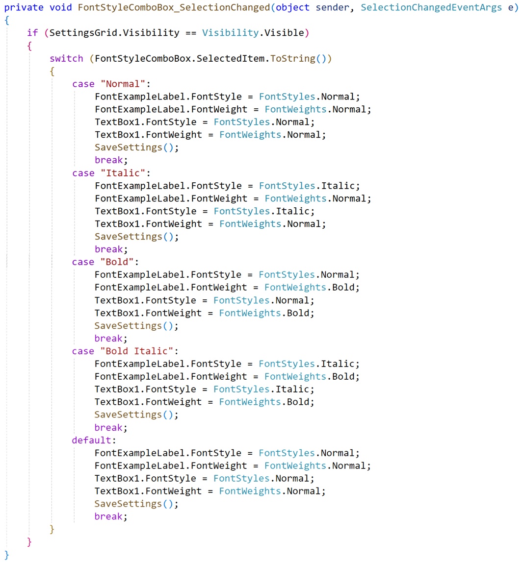
But working with Font style is a nightmare of code, as always.
Build out what happens when the user clicks the Settings button
Now, we can (mostly) finish writing the code for SettingsButton_Click() (in MainWindow.xaml.cs). When we added the code for this event previously (earlier in this post), we just did the basics: Make the settings Scroll viewer and settings Grid visible, and hide MainGrid.
That code will remain. But we have a lot of code to add in that event handler before the existing code.
First up is this little bit of wizardry:
// Clear the Outer grid column definitions
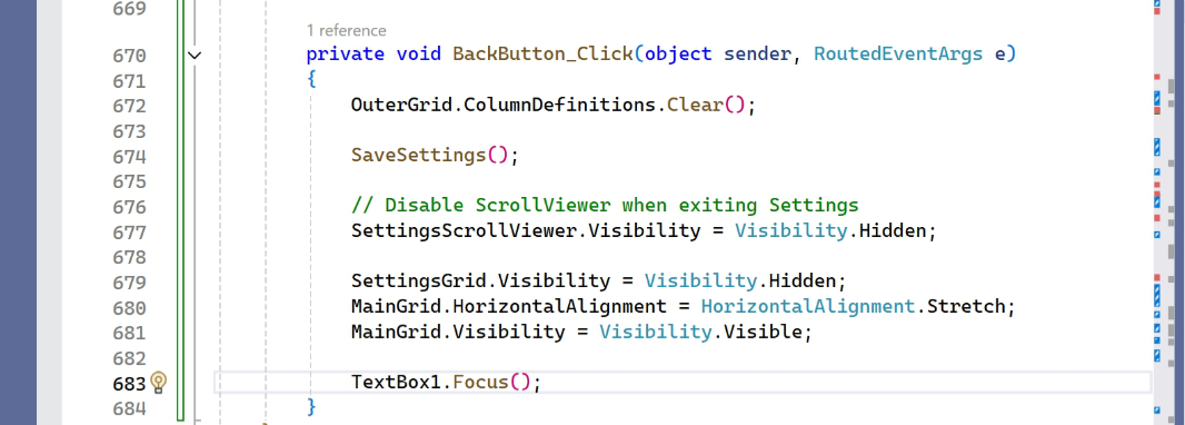
OuterGrid.ColumnDefinitions.Clear();
I assume this isn’t clear. OuterGrid is defined as having two columns, one for MainColumn that’s set to “*” (“star”) so that it will take up as much width as it needs, and one for SettingsGrid (really the SettingsScrollViewer) that is set to 0 DIPs, making it effectively invisible. By clearing the column definitions, SettingsGrid can now take up all the space it needs. (We’ll add code to BackButton_Click() that reverses this change when the user is done in settings.)
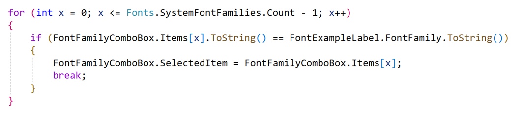
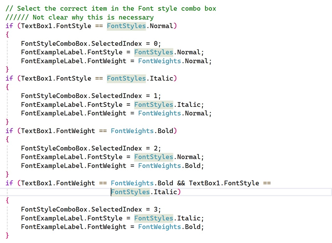
This next bit puzzles me, as I’m not sure why it’s even necessary. But I added it to make sure the correct item is chosen in the (Font) Style combo box in settings. It wasn’t working as expected otherwise.
Finally, we need to add a bit of code to temporarily change the title that appears in the app’s title bar. If you look at Notepad, you’ll see that it doesn’t display the current document name when you’re using app settings. (Most likely because it supports tabs and can have multiple documents in a single window.) It’s not a big deal, but we’ll do the same here.
// Change the window title to just the name of the app (as per Notepad)
App.AppTitleInSettings = AppWindow.Title; AppWindow.Title =
Application.Current.MainWindow.GetType().Assembly.GetName().Name;
That App.AppTitleInSettings variable is one of those application state variables we only need at runtime: It stores the current app title (usually the document name plus the app name) while settings is visible. And then we’ll return it to the original value when the user clicks “Back”.
Why bother? Honestly, I’m not 100 percent sure this is necessary, as I’ve not yet implemented the coming tabs-based UI. It may not be.
Do the same for the Back button
Now, we need to look at BackButton_Click() and make some corresponding changes. Most of what we need is already there: I somehow managed to leave the OuterGrid.ColumnDefinitions.Clear(); bit at the beginning of the event handler, which once again clears out OuterGrid’s column definitions, allowing SettingsGrid to disappear and MainGrid to reappear. So that’s fine.
Below SaveSettings(); add the following lines of code:
// Unexpand all the expanders
AppThemeExpander.IsExpanded = false;
FontExpander.IsExpanded = false;
This is the magic we need for the expanders. It ensures that both expanders–AppThemeExpander and FontExpander–are not expanded so they look correct the next time the user views settings. (There’s one exception to this, noted below.)
There’s one more addition here. (And then more to come: We need to disable the timer and keyboard shortcuts while viewing settings.) We need to return the title bar to the correct title.
I’m of two minds on this one. Notepad no longer displays the app name in the main app view. But .NETpad still uses the old naming style (Document name – App name). As we evolve the app, that will likely change. But for now, we’ll just stick with the classic style. With the understanding that this will likely change later.
Add the following code just above TextBox1.Focus(); …
// Change the window title back to normal (as per Notepad)
AppWindow.Title = App.AppTitleInSettings;
This is a good time to test what it’s like to move in and out of settings. The Font combo boxes should all populate correctly now.
Change the Font menu item Click() event handler
In the original version of .NETpad, the FontMenu_Click() event handler has a lot of code because it displays a custom Font dialog. But that’s all happening in settings now. So we can do what Notepad does: When the user clicks “Font” in the “Edit” menu, settings appears, but the Font expander is expanded so you can see all its options. And that code is much smaller and simpler. After deleting the code in that event handler, you can replace it with this:
SaveSettings();
FontExpander.IsExpanded = true;
SettingsButton_Click(FontExpander, e);
The code we added to SettingsButton_Click() previously ensures that settings looks normal (without Fonts expanded) when the user views settings from that button. Nice.
Next steps
Whew.
For the next part of this series, we can quickly go over each additional setting. After that’s done, we can move on to the dialogs. Which I’m now thinking might require multiple articles as well. We’ll see.

Gain unlimited access to Premium articles.
With technology shaping our everyday lives, how could we not dig deeper?
Thurrott Premium delivers an honest and thorough perspective about the technologies we use and rely on everyday. Discover deeper content as a Premium member.