Modernizing .NETpad Step-By-Step, Part 5: Custom Dialogs (Premium)
- Paul Thurrott
- Sep 09, 2024
-
0
If you kept up with my series on modernizing .NETpad this past summer, you know I came full circle on creating custom dialogs for the app. I’m not happy with the custom dialogs I created for the OG WPF version of this app–they look horrible in Windows 11, especially–and I want the experience to be as native as possible.
Ideally, we’d be able to use all the native dialogs available to modern Windows apps, but as is so often the case, that’s not the case with WPF. So where those who target the Windows App SDK and WinUI 3 can use the native Content dialog … WPF developers can not. Instead, we need to improvise.
There are different approaches, and I explored a few this past summer. In doing so, I inadvertently stumbled across a basic truth: Thanks to the versatility of WPF and its use of XAML to describe user interfaces that can be skinned, and to Microsoft’s continued used of this technology in subsequent frameworks, including the Windows App SDK, it is possible to approximate native UIs pretty closely. You just need to understand them first.
Content dialog is not your father’s dialog. That is, where I still think of dialogs and other sub-windows as, well, windows, Microsoft describes this new thing as a control, a “modal UI overlay” that visually appears on top of the app window to provide contextual information and interactivity, while blocking access to the underlying app window. That is, in Windows 11 and the WinUI 3 world, dialogs aren’t windows anymore. They’re just overlays on the main app window.
Which is fine: The distinction is subtle, and in some ways unimportant. Plus, you get some neat built-in functionality by using a Content dialog. As noted, it’s a modal experience–you must interact with it in some way before you can access the rest of the app again–but it also provides a visual cue that the rest of the app window is unavailable by dimming it while the dialog displays. Like so.
I know how to build overlays in WPF. Creating that shadow effect is trickier, but also less important. But in building out various sub-windows and other UIs as custom overlays during my experimentation with this app update, it occurred to me that perhaps my aversion to custom dialogs–actual sub-windows–was misplaced. The problem with the interfaces I created originally is that they didn’t look native for the most part. But I feel like we can do this “right” now. And if Microsoft ever deigns to bring native Content dialog support to WPF–not an impossibility, though unlikely–then switch to the real thing later will be straightforward.
So what does that look like?
Understand what we need to build
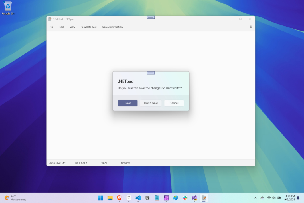
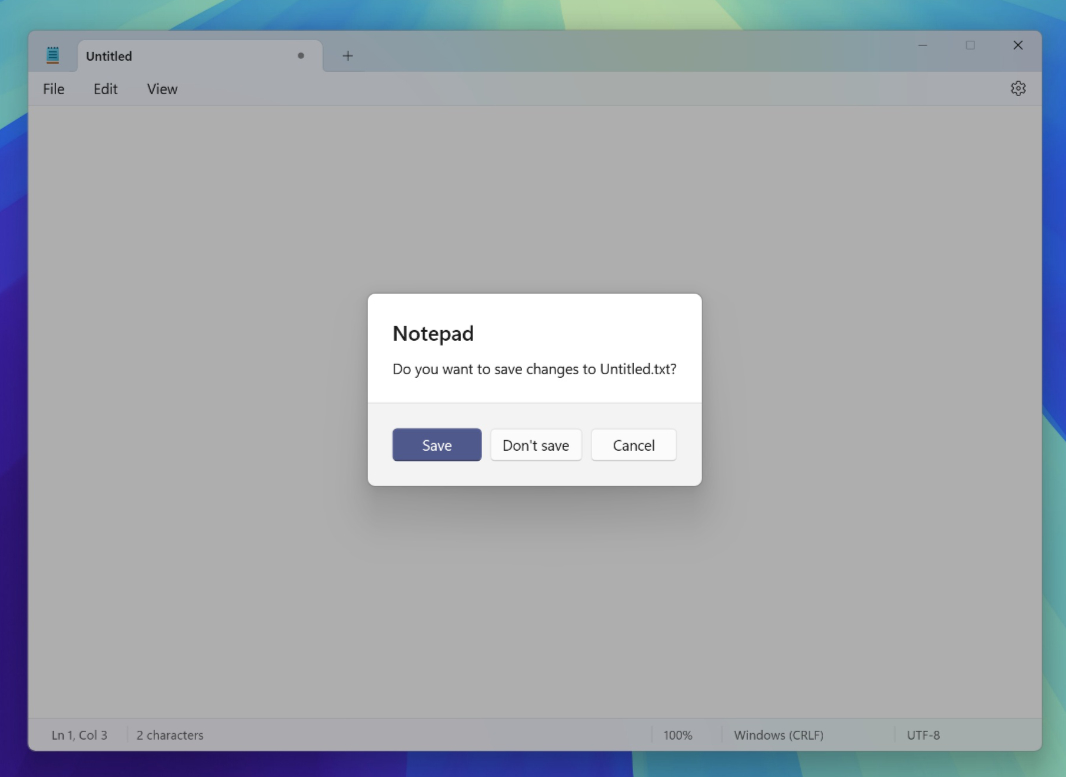
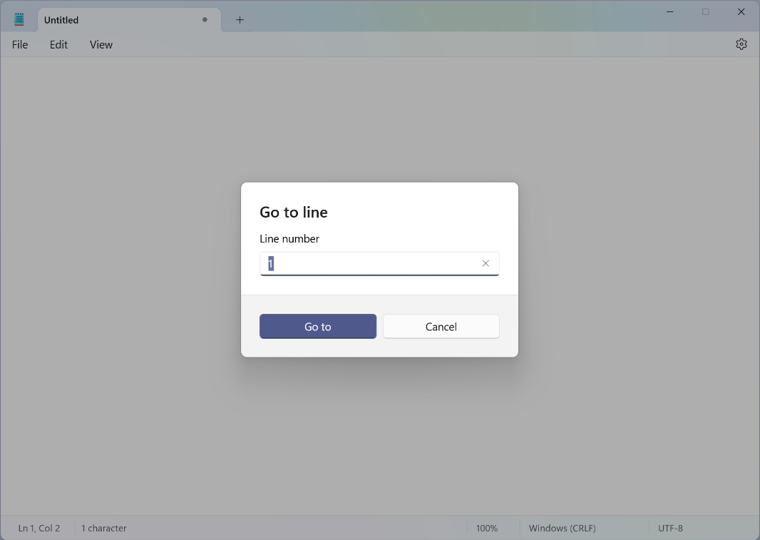
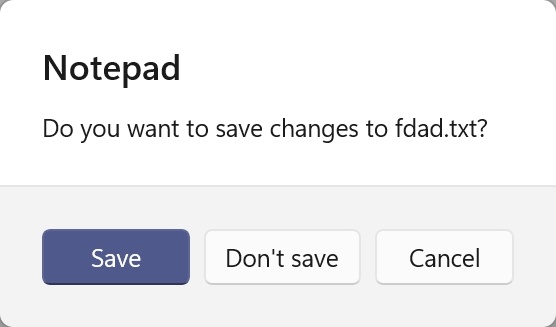
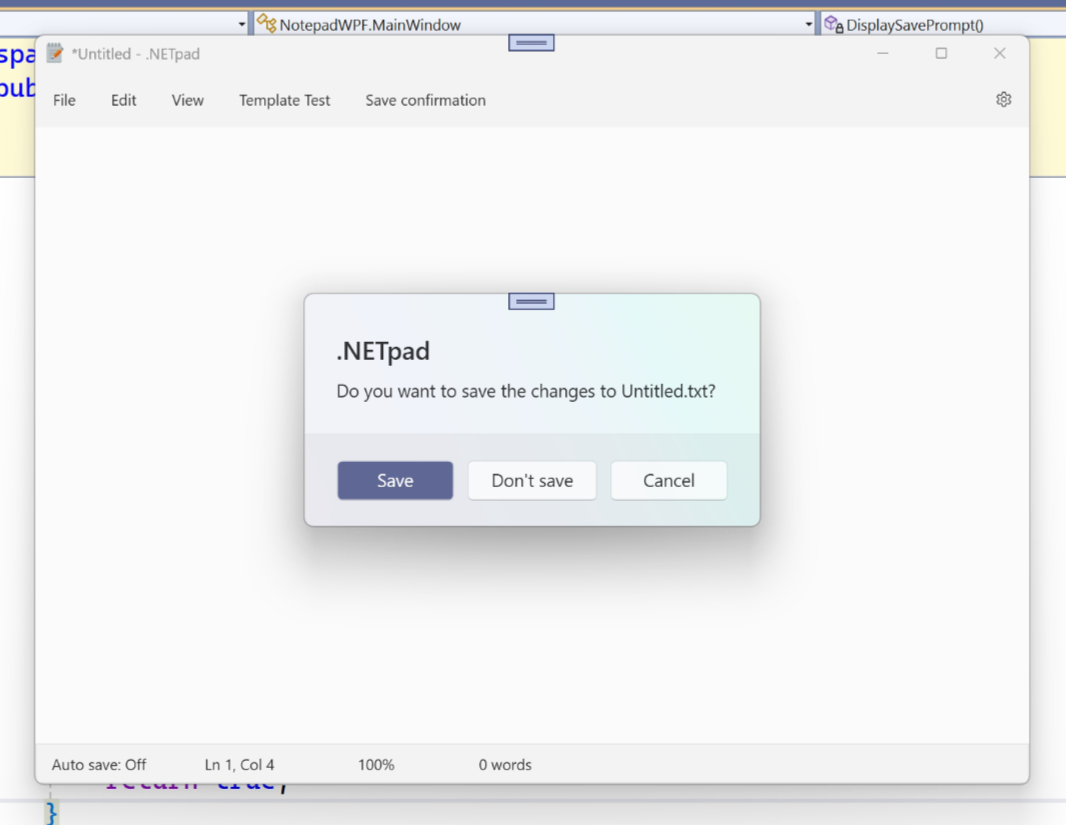
Notepad–the inspiration for .NETpad–uses a Content dialog for what I’m calling the Save confirmation dialog (see in the screenshot above) and for the Go to line dialog:
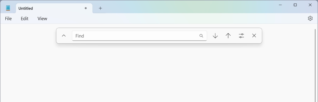
There’s also a Find/Replace flyout–I’m still not sure exactly what this is, it’s unlike anything else in Windows 11 and is likely custom work similar to what we’re doing here–that expands and isn’t modal, but is also not moveable.
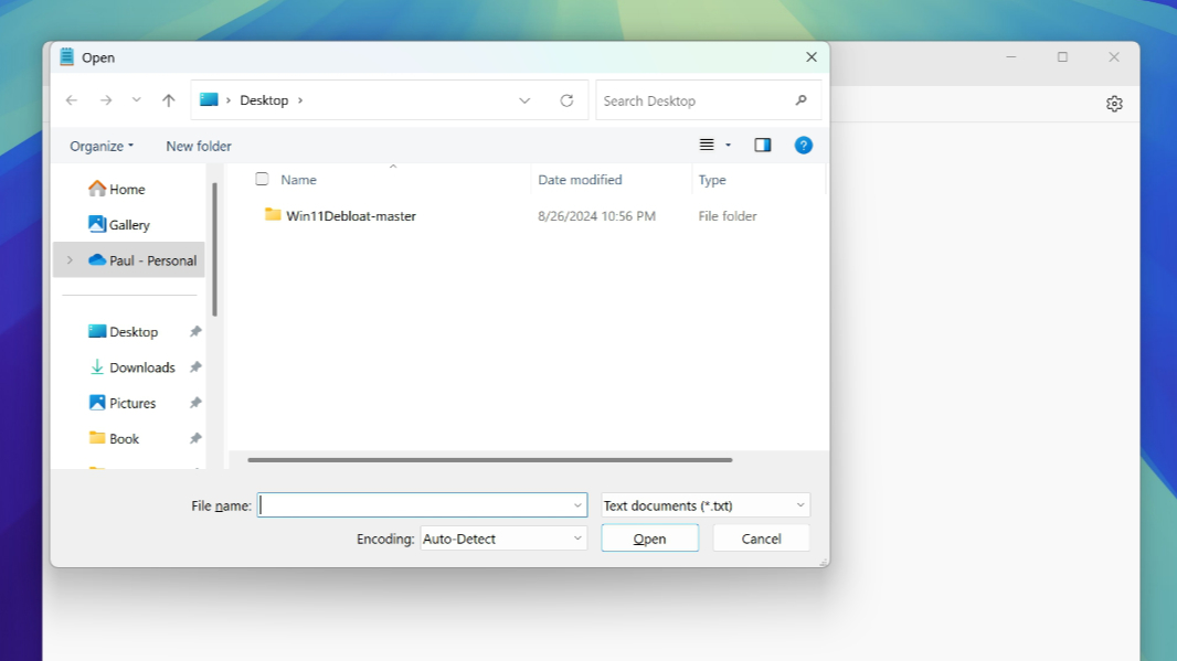
And then it uses the standard File Open/Save as dialogs, which, oddly, have never been updated for the Windows 11 look and feel. We can use these dialogs too, and do, so there’s no need to worry about this one. Ditto for the Print-related dialogs, it’s all just standard stuff. (Some of which is difficult/impossible to access from WPF, but … eh.)
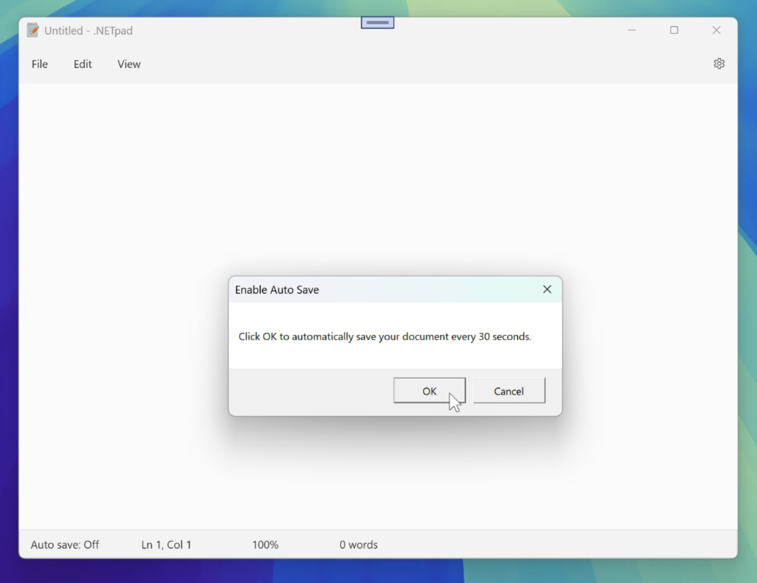
We need our own Save confirmation and Go to line dialogs. But .NETpad also has a few features Notepad lacks, and some of them need what is essentially a custom Content dialog. Auto save is the best example, and there are two versions of this dialog, one that appears when you prompt the user to enable this feature and one that appears when you prompt to disable it. Currently, these dialogs, like the Save confirmation dialogs in .NETpad, use the system Message box. But it’s never been updated for the native Windows 11 look and feel, so we need to recreate those as well.
To summarize, we need a Content dialog-like control that can be used for:
- Save confirmation
- Go to line
- Auto save (with two modes)
And then … something else. That will emulate Find/Replace.
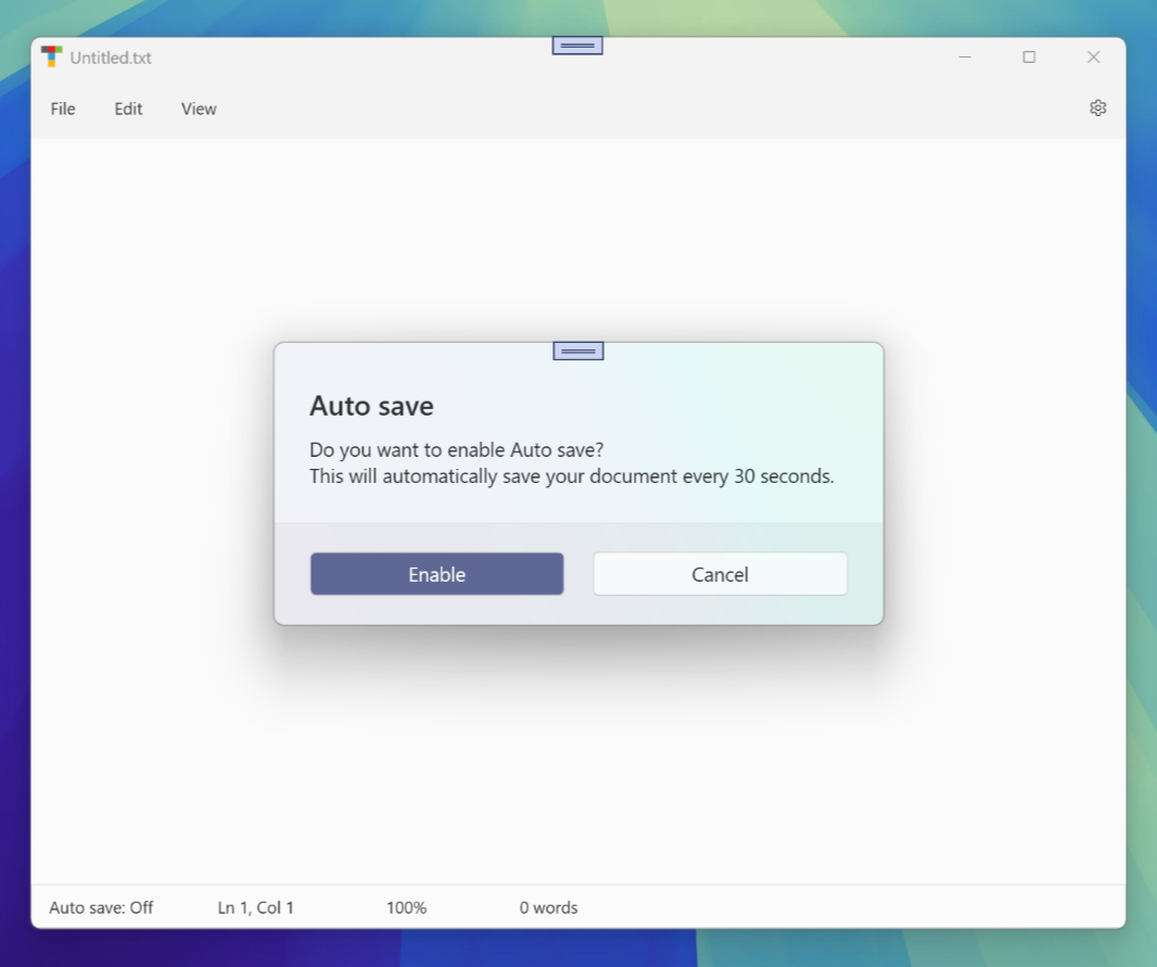
We could recreate each dialog independently. But since we’re emulating a single thing for three/four of those things, I felt that creating a single custom Content dialog that could be customized for each of those needs made a bit of sense. And the goal was for it to be as native as possible. I got pretty close. Right now, I don’t include that shadow effect for the main app window. But I did customize the look and feel of the dialog a bit in a way that I find more attractive than the real thing, with some extra transparency effects that look quite native.
And perhaps it will be customized further as we go. For now, let’s work up our custom Content dialog. And then use it to implement a custom Save confirmation dialog.
Understand the needs of the custom Content dialog
XAML is so versatile that there are almost innumerable ways to create the same user interface. For example, my basic app UI layout is two side-by-side grids, one for the main app window and one for settings, and I hide and display each side as needed as the user moves between those interfaces while using the app. But that’s just one way to implement the interface. I could have used a single grid instead, and then hid and displayed individual elements as needed. There are probably many ways to do it.
But I’m simple. And when I look at a Content dialog like this one from Notepad, I see it as a grid of controls.
Maybe something like this, though there are also numerous ways to build this out.
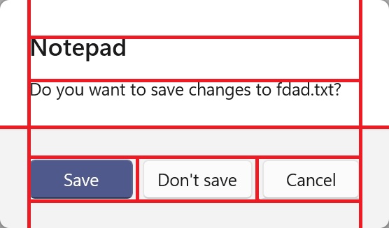
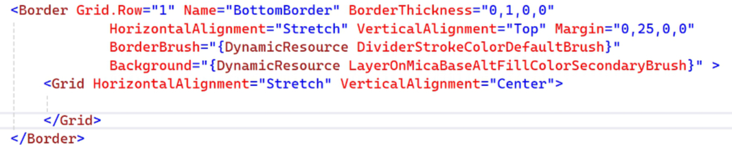
In this design, there are two main grid rows, one for the top half of the dialog and one for the bottom. Here’s what they look like split apart. The top has a background color matching the system theme (white in Light mode), and the bottom has a darker colored background.
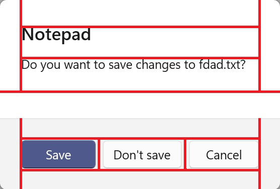
Each half is then divided into three columns. Two spacers on the outsides and then a center column with content. The top is all text here, but there are variations of this dialog with other controls (like the Go to line dialog). And the bottom has one, two, or three buttons depending on the needs of the dialog (and they will almost certainly need to be placed in a sub-grid of some kind). This one has three buttons.
There’s one final nuance here.
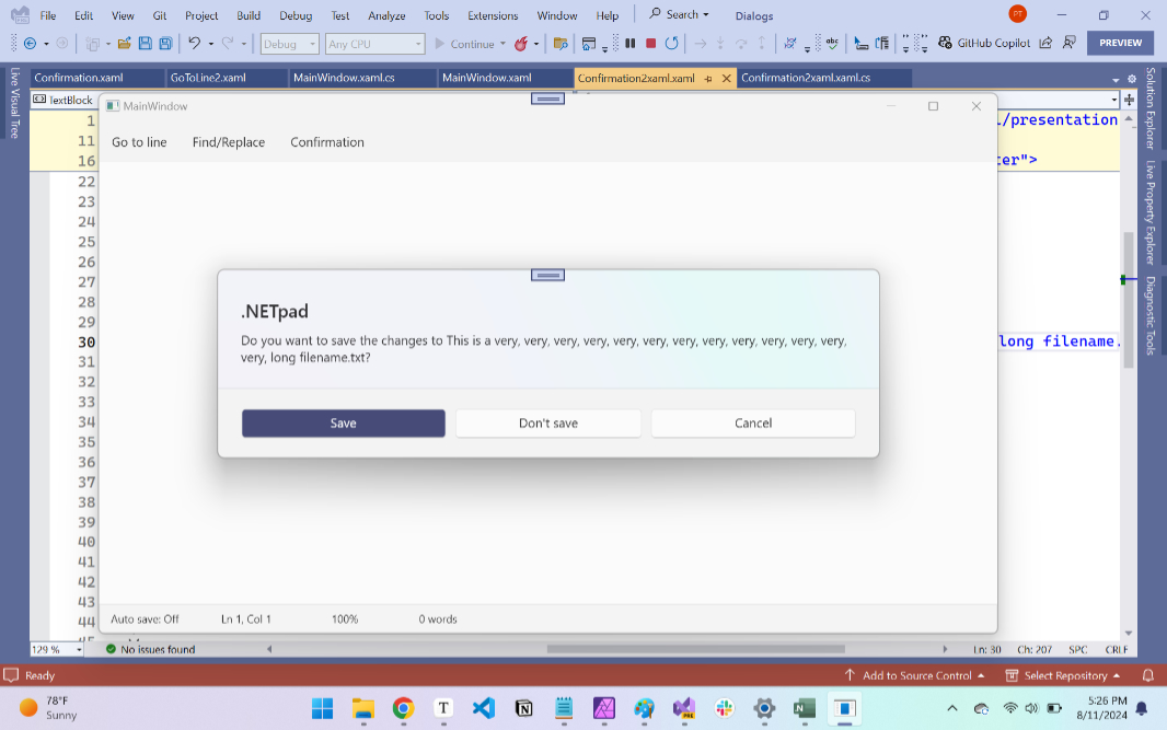
The content this dialog displays can be of various widths. For example, if you’re displaying a Save confirmation dialog with a long filename, the width of the dialog will be wider. At least two things need to happen in that case. The dialog needs to grow to accommodate that width, but only to some point; after that, the content (which is just text) will need to auto-layout to two lines. And the buttons on the bottom need to growth in width as the dialog widens too. Here’s an example of that I worked up earlier this summer.
If you would like to know more, I wrote about my early work figuring this out in Modernizing .NETpad: (More) Dialog about Dialogs (Premium). Here, we’ll just implement our custom Content dialog. And then we’ll use it as the basis for the actual dialogs that we create dynamically at runtime in the app, starting with the Save confirmation dialog.
Create the Content dialog
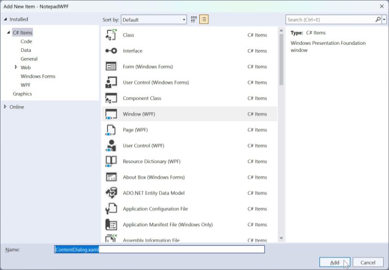
To get started, right-click on “NotepadWPF” (the project name) in Solution Explorer and select Add > Window (WPF) from the context menu that appears. Then, rename the document in the “Add New Item” dialog to “ContentDialog.xaml” and click “Add.”
ContentDialog.xaml will open in the editor. Select the code shown below and delete it.
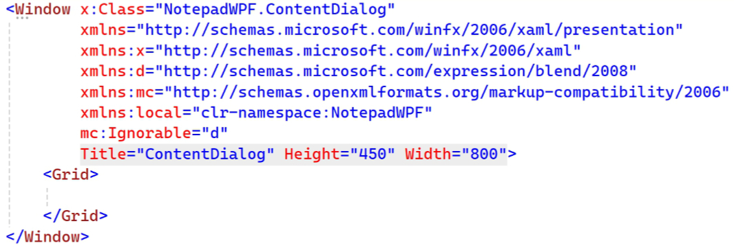
Now, replace it with the following code:
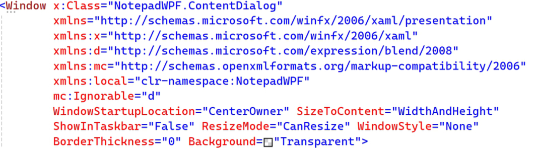
These attributes style the window accordingly so that it starts up in the center of the main app window, is dynamically sized according to the content it contains, doesn’t display a shortcut icon in the Taskbar, cannot be resized, has no window styling (title bar, window buttons, etc.), no border, and supports transparency. In other words, what you want for it to look like a real Content dialog.
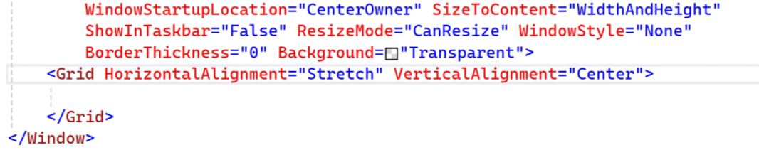
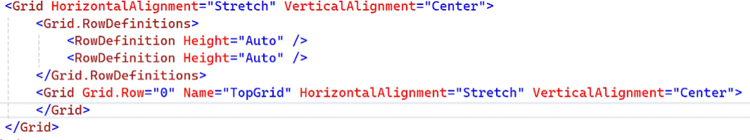
Then, make the following additions to the outer Grid tag:
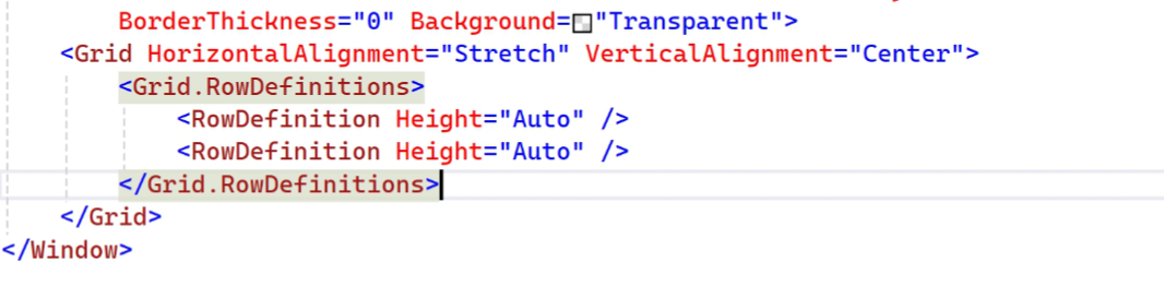
As noted, this dialog consists of two main rows, so add the following grid row definition code:
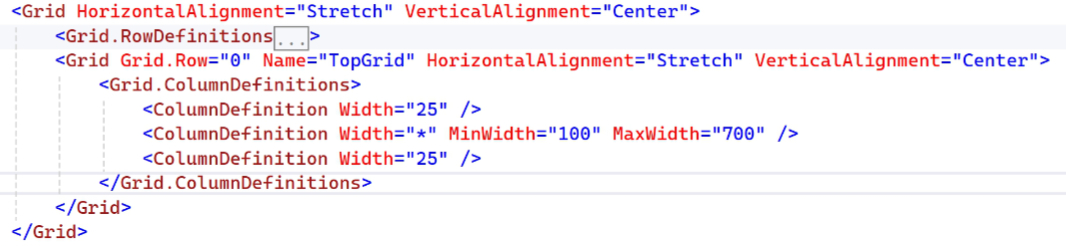
Now, we can start building out the top half, or the first row (Row 0) in the grid. Which is itself a grid.
The top grid consists of three columns. The outer two (Column 0 and Column 2) are 25 device independent pixels (DIPs) wide and will remain empty, and the inner column (Column 1) is dynamically sized according to its content. But we also specify MinWidth and MaxWidth attributes to ensure it never gets too small or too big.
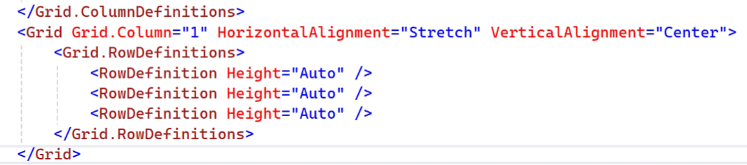
Because Column 0 and 2 are empty we only need to define the middle column (Column 1). This is yet another grid, one that will stretch to the width available horizontally, be centered vertically, and consist of three rows, each of which is sized according to its contents.
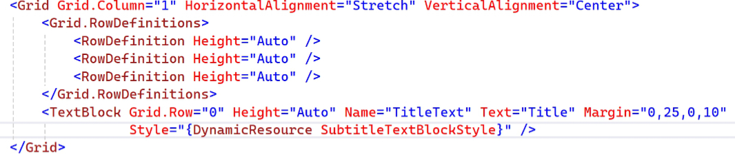
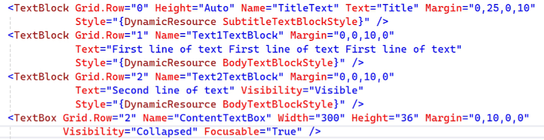
Those rows will each consist of a single Text block. Here’s the code for the top one, which represents the title of the dialog and is styled using the system SubtitleTextBlockStyle.
Here’s the next row, another Text block. This text will appear in every type of Content dialog we create, so it’s non-optional. It’s styled using the system BodyTextBlockStyle.
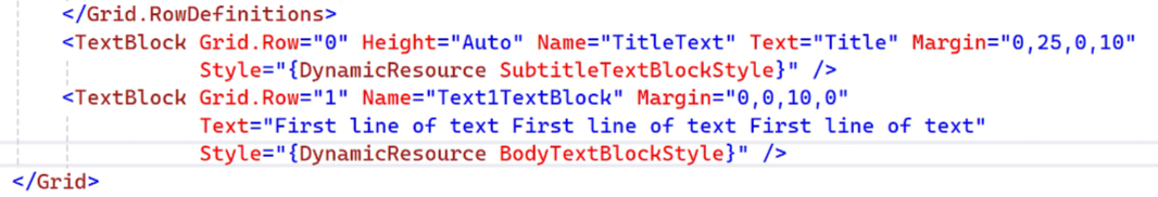
And then the third row, an optional second line of BodyTextBlockStyle-styled text that we currently only use for a single dialog (Auto save). This can be swapped out for a text box when needed; we’ll use that in the Go to line dialog. Note the use of Visibility = Collapsed to ensure it doesn’t appear by default.
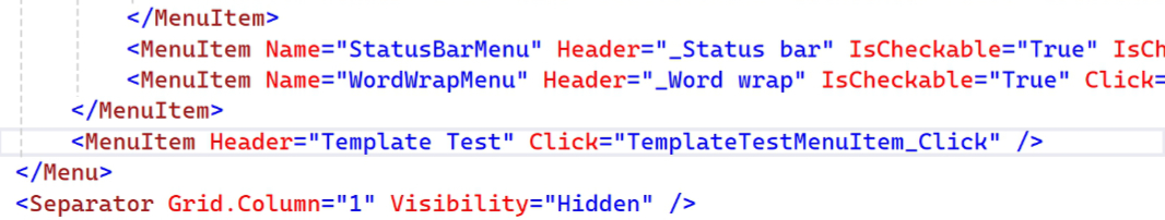
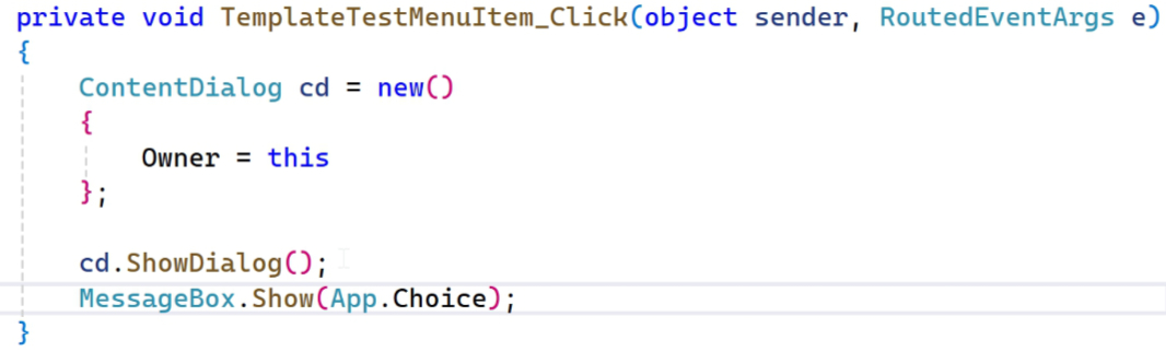
Even though the UI only half implemented, it’s always nice to run the app from time to time to see how it’s going. But we need to add a way to display the Content dialog, so open MainWindow.xaml and add the following code to the end of the main Menu block so we have a temporary new “Template Test” menu item to click. (I renamed the event handler to TemplateTestMenuItem_Click(), though it’s not necessary.)
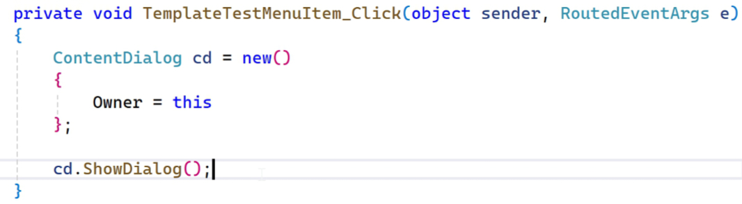
Open MainWindow.xaml.cs and scroll all the way to the bottom to find the new event handler (which I renamed here as well, of course). Then, add the following code so we can see the new dialog in the making.
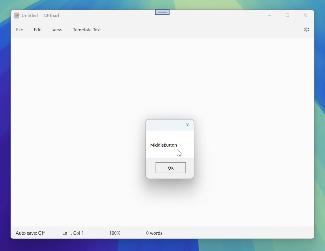
Now, run the app and click the new “Template Test” menu item. When you do, the dialog appears (well, part of it).
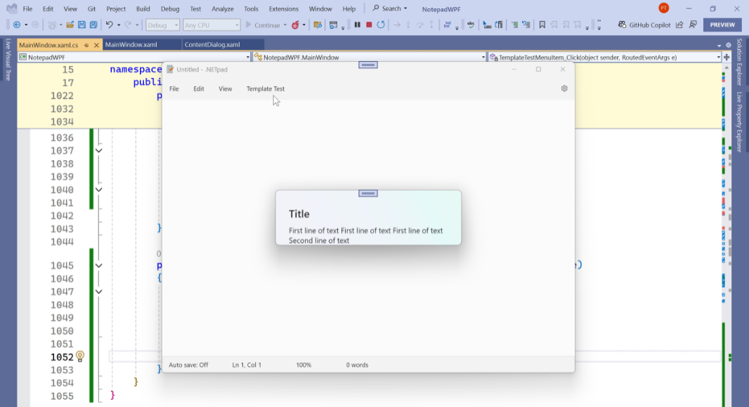
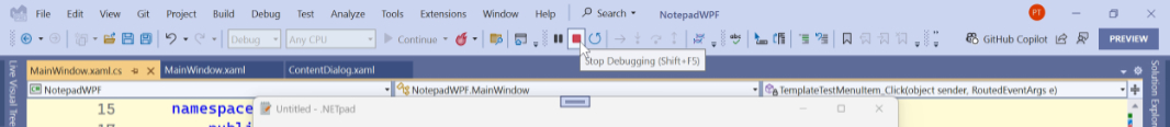
We don’t have a way to close the dialog yet, so click the red “Stop Debugging” toolbar button in Visual Studio to end the task and return to the IDE.
OK, let’s build out the bottom half. Here, we’ll use a Grid again, but we’re going to wrap it in a Border so we can display a border line between the two halves. So we’ll start with that: The new Border is the second row (Row 1) in the containing grid.
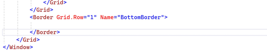
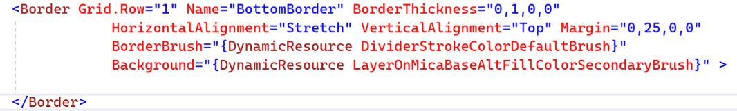
The Border needs several more attributes to get the correct look and feel. So add the addition code to the Border tag as shown here.
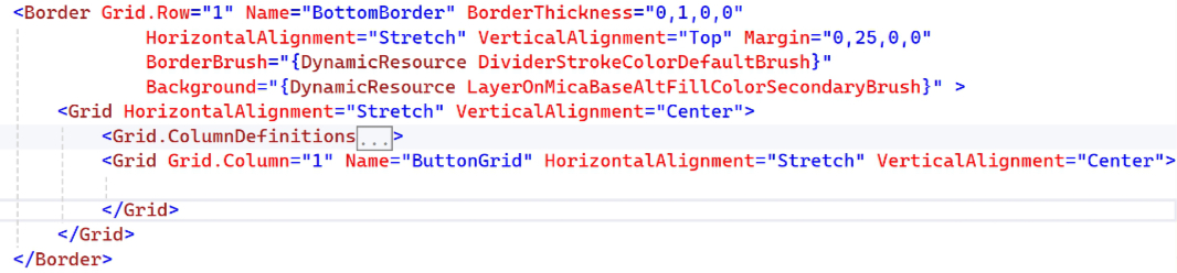
Now, we can add a Grid inside the Border.
This will use exactly the same column definitions as the top grid.
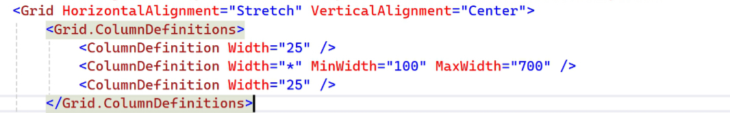
And it will use the same exactly layout where we can ignore the empty outer spaces (Columns 0 and 2) and just define the center column (Column 1), where we’ll create a Grid of three buttons.
Each column in this grid is identical with a specific MaxWidth value and a dynamic width that fills the space with each button the columns contain getting identical space.
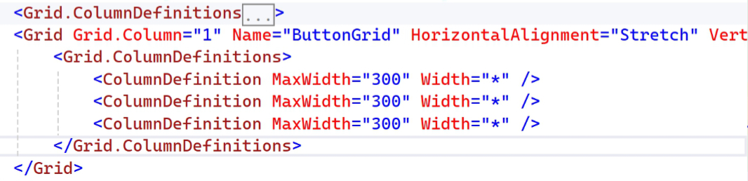
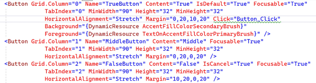
The first button (in Column 0) is a bit special. This is the default button, meaning that its code behind is what runs when the user just taps the Enter key (in addition to an explicit click) as indicated by the IsDefault = “True” attribute. As with the similar button in Notepad, it’s also colored with the user’s system accent color (though the mouse-over color change isn’t correct because WPF doesn’t correctly support this yet).
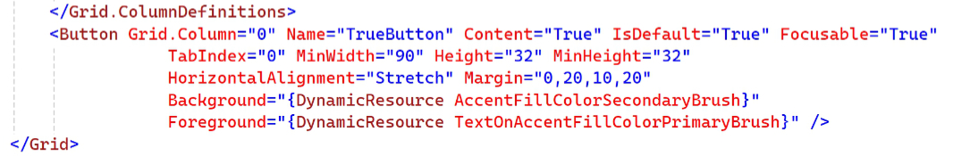
The next button, MiddleButton, is optional and won’t appear on all derivative dialogs. It’s similar to the first button, but without the custom styling or default setting.
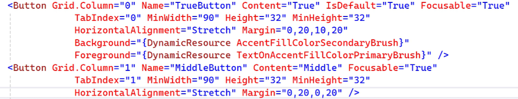
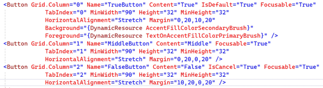
And then the third button, which will appear on all dialogs. This will typically be called “Cancel,” and so it uses the IsCancel = “True” attribute assignment so that this button’s Click() event handler runs if the user taps the Esc key too.
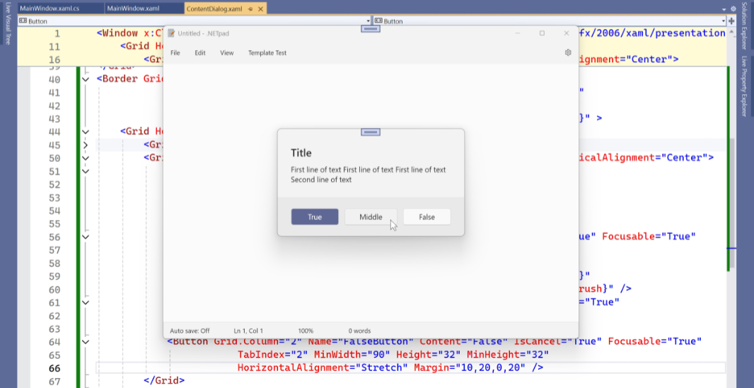
OK, let’s test it: This time, we can see the entire Content dialog when we run the app and click that temporary menu item.
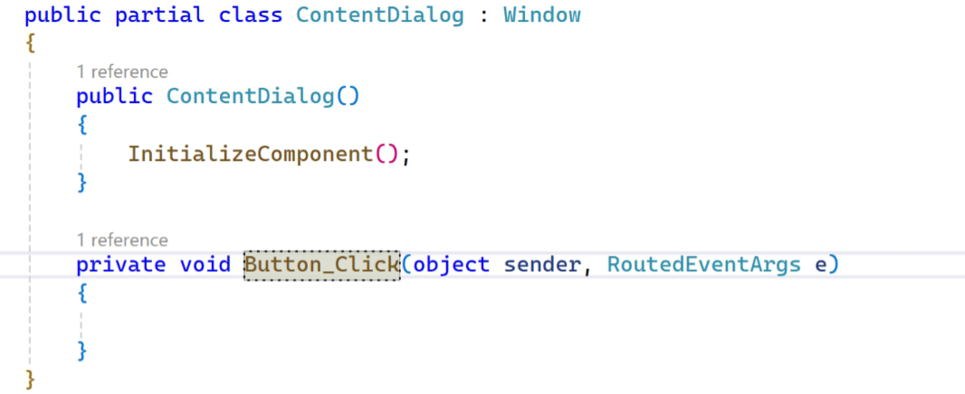
Of course, the buttons don’t do much yet. So return to ContentDialog.xaml and add a Click event handler to each of the three buttons. Visual Studio will assign a default name to each, but rename each to be “Button_Click”:
You’ll need to make the same name change to the empty new event handler in ContentDialog.xaml.cs, of course. Then, you can add some basic code in this event handler, which fires when any of the buttons in the Content dialog is clicked, to assign the correct value to the app-level Choice variable we previously configured in App.xaml.cs and then close the dialog.
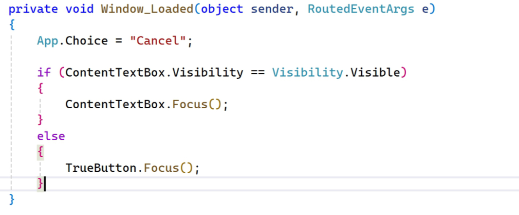
While we’re adding event handlers, let’s open ContentDialog.xaml and add a Loaded() event handler to the window. This requires an addition in XAML like so:
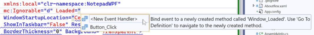
And then in ContentDialog.xaml.cs, we will “reset” that app-level Choice variable and then set the focus to the “True” button (in most cases, or on the text box if we’re in Go to line).
To ensure we’re correctly communicating which button the user pressed to close the dialog, we can temporarily display a Message box that displays that information. Note that this will work for those instances in which the user taps the Enter or Esc keys as well.
To test that, run the app and try all the various ways one might dismiss the dialog. It should report the correct button each time.
Implement the Save confirmation dialog
With our Content dialog done, we can now implement a specific dialog based on that code. We’ll start with the Save confirmation dialog that will replace an old-school Message box.
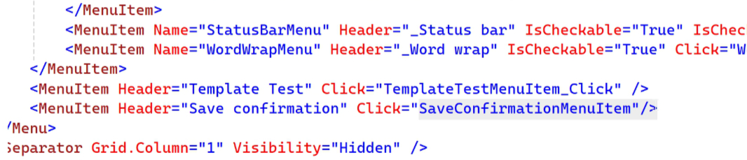
First, add a second test menu item to the main menu bar with a custom Click() event handler using XAML in MainWindow.xaml.cs.
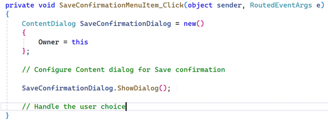
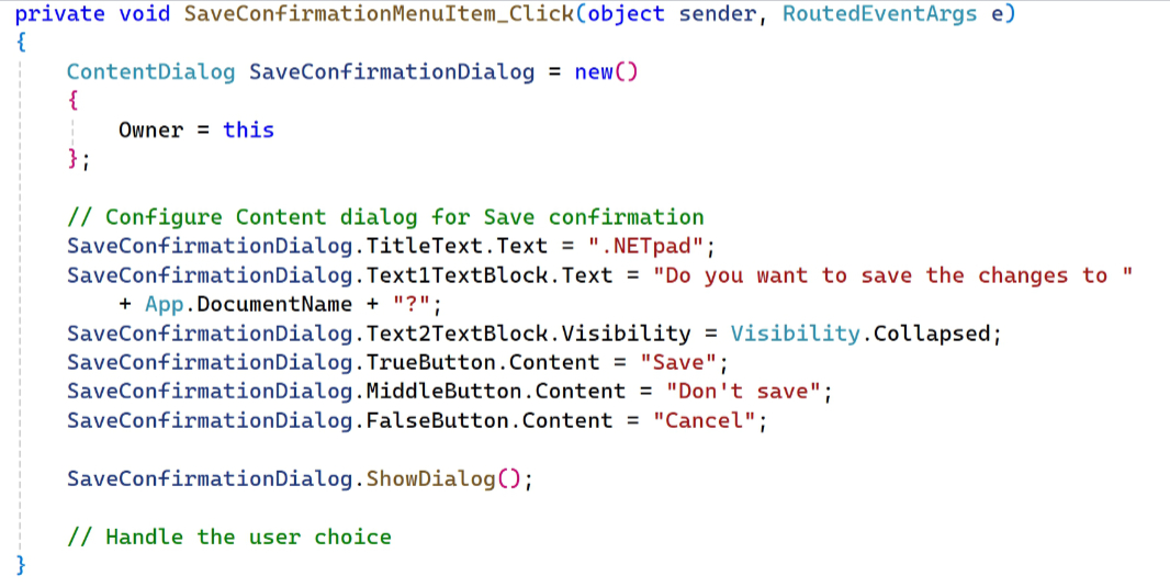
Then, add code to the SaveConfirmationMenuItem_Click() event handler that’s similar to what we did above, but with placeholders for the additional functionality we’ll need to customize Content dialog for this use and to handle the choice the user makes.
To customize the Content dialog for Save confirmation, we need to configure a range of properties that include setting the title text, text description, the three button labels, and hiding the second line of text, since we don’t need that. There are probably many ways to do this, but the most basic is to just do it in-line in the Click() event handler:
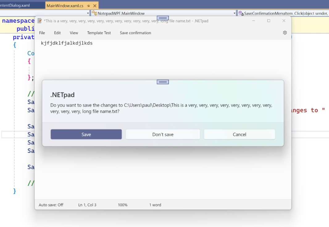
We’ll improve that soon, but it’s worth testing this dialog with a document that has a long file name: I designed the dialog to accommodate long names and then reflow as needed. For example:
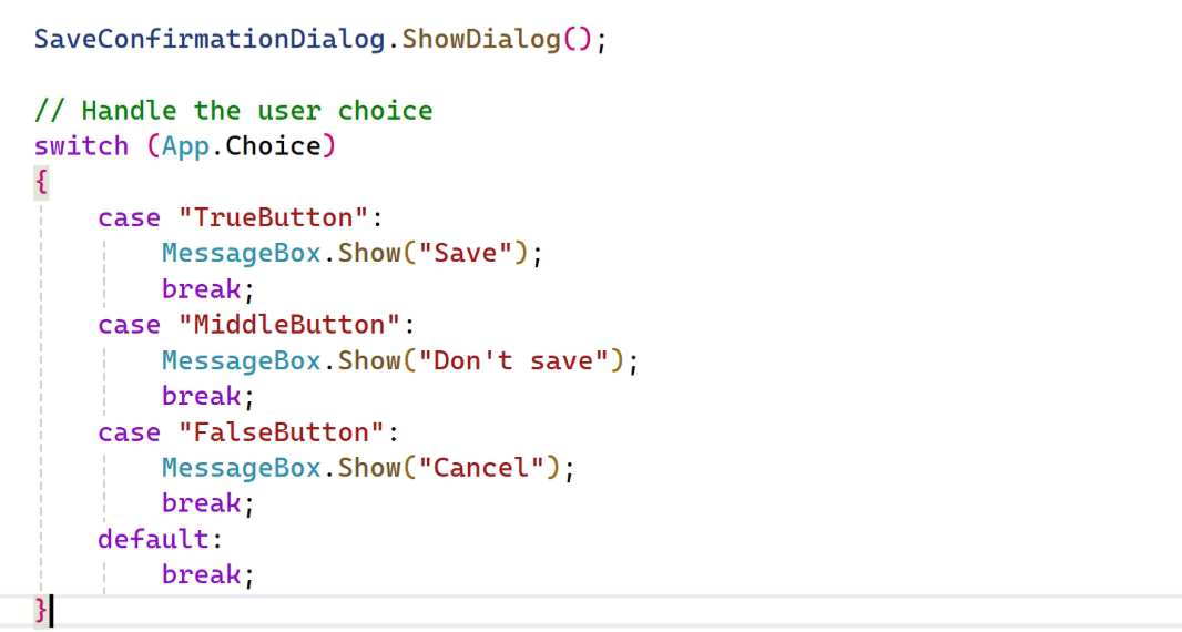
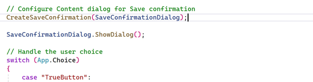
Handling the user choice is straightforward: A basic switch statement can display a custom Message box message for each button choice.
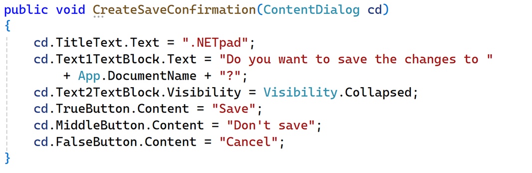
This should work as expected. But before replacing the OG Save confirmation code with this, I’d like to clean up that block of code that customizes various properties. It seems like that could be put into a method in Backend.cs so that the Click() event handler in MainWindow.xaml.cs isn’t so long. (We’ll be making similar changes to other parts of the app’s code in a future phase.) To do this, open Backend.cs and create a new CreateSaveConfirmation() method:
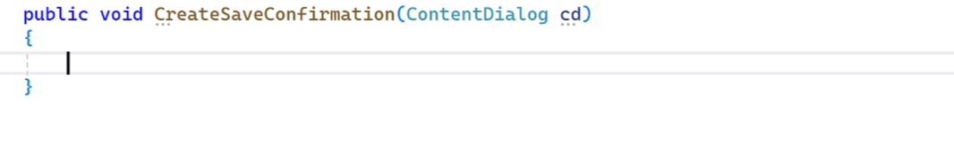
As you can see, this method takes a ContentDialog as a parameter. So we can pass in the newly created Save confirmation dialog, set those properties as before, and then return back to the main code block.
Then, back in the SaveConfirmationMenuItem_Click() event handler, we can replace that back of code with a call to that method.
OK, now it should work as before.
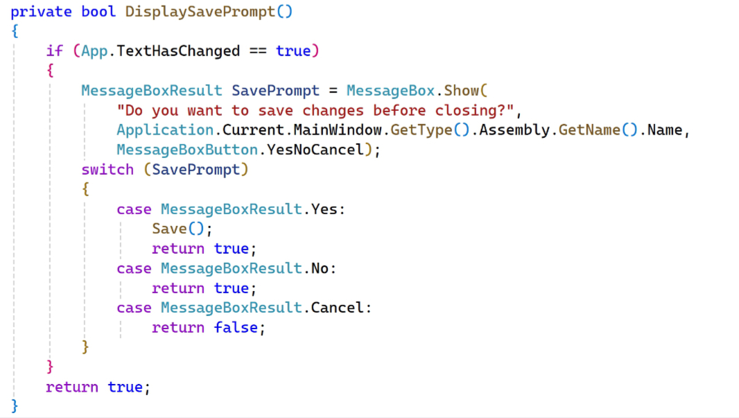
And that means it’s time to replace the old Message box with this new Content dialog-based Save confirmation dialog. As you may recall, there are various instances in which the app needs to prompt the user to see whether they’d like to save an unsaved document (such as when they try to close the app, open a new document, and so on). In this version of .NETpad, there’s a DisplaySavePrompt() method, now in Backend.cs, that handles this. It looks like so.
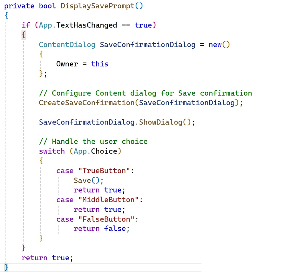
Re-coding this to use our Content dialog is straightforward. We create a new Content dialog instead of a Message box, customize it for Save confirmation, and then change the cases in the Switch statement to handle the output accordingly. It looks like so:
To test this, run the app, add a space to the current (blank) document and the type Ctrl + W to close it. The app will prompt you with the wonderful new Save confirmation dialog.
It looks great. But in testing this, I noticed a bug, no doubt introduced by me juggling so many different versions of this app: The “Save” button doesn’t always work: Instead, it will simply close the app without prompting to save (or, if it’s an existing document, just saving it). This was initially concerning, but then I realized the issue. As I keep mentioning, I’ve been juggling different versions of this app, and I’ve refactored a lot of the code in some of the new versions. In a previous article, I noted that I had had to change some of the old save code so that it just worked again. And we have to do that same fix here. (We’ll move to the new code later.)
To make this fix, replace the code to Save() in the “TrueButton” case of the Switch statement to the following contortion:
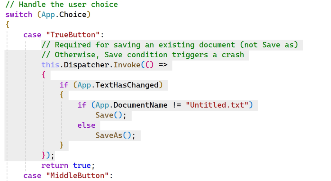
It should work fine now.
Next up: Go to line and Auto save
That’s a lot of work, so we’ll finish up our custom Content dialog work with Go to line and Auto save in the next part. And then we’ll have to figure out Find/Replace, which is a different kind of problem, in part because of its unique (custom, I think) design in Notepad and in part because the original code is a bit primitive. Then, we can get into some refactoring: I’ve rewritten this app so many times this summer that dealing with this OG version has been a bit painful. We can improve itd.
More soon.

Gain unlimited access to Premium articles.
With technology shaping our everyday lives, how could we not dig deeper?
Thurrott Premium delivers an honest and thorough perspective about the technologies we use and rely on everyday. Discover deeper content as a Premium member.