.NETpad 2025: Finalizing the Tabs Layout (Premium)
- Paul Thurrott
- Feb 16, 2025
-
1
After weeks of experimentation, I’ve finally arrived at what I feel is an acceptable compromise for tab overflow in .NETpad. This compromise is the result of limitations in WPF, in particular the TabControl control I will rely on, and probably my limitations as an enthusiast developer, too. But I think it’s in keeping with the spirit of previous versions of this app. You go to war with the army you have, as they say.
This isn’t the biggest technical hurdle in bringing tabs to .NETpad. But it’s been looming over me since the beginning, by which I mean the May 2024 announcement that Microsoft was bringing WPF back from the dead. That inspired me to start my .NETpad modernization effort, which I eventually split into two parts, the work I did last year that resulted in .NETpad 3.0 for Windows 11, and the work I’m doing this year in this series.
I have more time for the work I’m doing this year, and I’m going to need it. Adding tabs is difficult, and in working up the backend tab management capabilities, I’ve repeatedly reached the limitations of my brain capacity in ways that are both fascinating and disturbing to me. My limitations as a developer also play a role, and I feel like there are more sophisticated ways to do what I’m doing. But in the good news department, I have pretty much figured that out. I have the foundation I need to support multiple tabs and their associated documents and state. I could make this happen (and will).
But before I can do that, I had to solve some basic layout issues. I’ve touched on this several times, I think, but most recently in .NETpad 2025: Thinking About Layout (Premium), where I explained how Notepad handles this and why the limitations in WPF will make duplicating that pretty much impossible. And I discussed some of my work trying to get a tabbed-based .NETpad as close as possible to .NETpad visually and functionally. Since then, I think I’ve arrived at that place.
As noted, it’s a compromise.
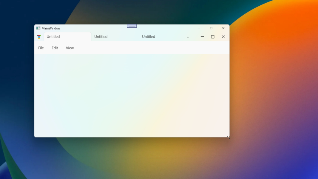
The top of the .NETpad main app window–which is a Row in a WPF Grid–consists of several controls from the left to right. They are:
- App icon
- TabControl (with one or more TabItem controls)
- Add new tab button
- Some amount of empty space (not a control, though it could be)
- Minimize window button
- Maximize/Restore window button
- Close window button
Something like this.

The user can take actions–like resizing the app window and adding/removing tabs–that impact the layout. But all of those top level controls need to be visible at all times. So the minimum width of the app window needs to accommodate all those controls, including some minimum number of TabItems. Three or four, perhaps.
Aside from the TabControl (and the blank space), each of the controls noted above is a fixed width. Achieving that layout with XAML, the XML-based user interface language in WPF, is easy enough. But if I use a TabControl in that top Grid row and keep adding TabItems, it will grow horizontally and push the controls to its right off the edge of the app window. That’s unacceptable, so I need to use some kind of container–or maybe a few containers–to ensure that doesn’t happen. The Add new tab and window control buttons always need to be visible on-screen, fixed in place.
So that’s what I’ve been working on.
Truth be told, I had pretty much given up. WPF is just horrible for this type of layout in its current state, especially the TabControl, a dated 20-year-old user interface that should have been updated several times by now and in no way represents the user interface we see in Notepad and other modern apps. I kept trying, kept failing, and finally figured I could at least experiment with the Plan B I’ve had in the back of my mind: If I can’t get TabControl to work, perhaps I could simply fake it using Buttons to represent TabItems, inside of whatever container to represent the TabControl.
And so this morning, I set out to do that. Just to see if it made any sense at all.
It was during this work that I arrived at the layout compromise I noted up top. That is, I needed the app icon, tabs container (whether it was a native TabControl or whatever else), Add new tab button, and the three window control buttons to always be on-screen. I needed most of them to be fixed in place and size. For example, the Add new tab button has to be attached to the right side of the TabControl (or other thing) no matter how the window is resized. Only the TabControl (or whatever) would resize and, if necessary, deal with whatever overflow issues.
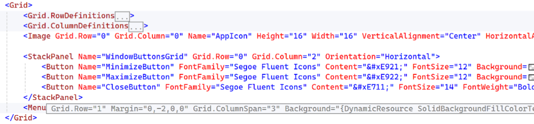
Here’s the quick and dirty experimental version I came up with, using Button controls as fake TabItems. (The empty space at the left is for the app icon and the red rectangle on the right is a stand-in for the window control buttons.)
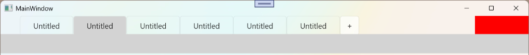
This “works.” As the window resizes, it’s possible to hide some open tabs (which are buttons masquerading as TabItems), and that’s the acceptable compromise. (More on that below.) But everything else stays where it should.
It occurred to me that this same layout might work with a TabControl. That’s preferable: Faking tabs with buttons is a last resort, and I’d rather use the native controls even if they’re not ideal. So I remade the app, replacing the buttons with a TabControl that contains several TabItems. And sure enough, it worked like the Button-based version.
And just like that, I finally arrived at that minimally acceptable UI that I had been struggling to achieve since, honestly, last May. It’s not something I worked on continuously, of course. But I did return to it again and again. And I have been working on it regularly for at least the last few weeks. In failing repeatedly, I was getting worried that I wouldn’t even get to this. Which is why I experimented with Buttons. Oddly, that led to the answer.
Which, again, is a compromise. Ideally, this would be more elegant. Ideally, I could implement some form of tab overflow UI, with little caret-like navigation buttons that let the user navigate between tabs that are currently not visible.
Ideally. But this is a text editor. Most people aren’t going to open 17 tabs, or whatever. (Personally I don’t even use tabs in Notepad, I prefer app document in its own window.) But this design can accommodate three or four or whatever visible tabs–depending on what MinWidth value I set for the app window. And that’s fine. It’s enough. It’s not perfect, no. But it is enough.
The key to this design is a control I’ve pretty much avoided to date called StackPanel. WPF supports several Panel controls, which I think of as containers, and the one I use the most often is Grid. But it was obvious to me that Grid wouldn’t work for this dynamic layout, not everywhere. This is what app developers now call responsive design. I needed something more dynamic, more responsive, at least for parts of it. And a lot of the experiments I’ve done this year, so far, have involved trying different WPF Panel types.
StackPanel seems like a good choice. It restricts its child elements to a single line that can be arranged horizontally (which is what I need) or vertically; that’s good because TabControl will auto-layout to use multiple lines of TabItems if there are too many to fit within the available space, and I do not want that to happen.
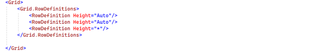
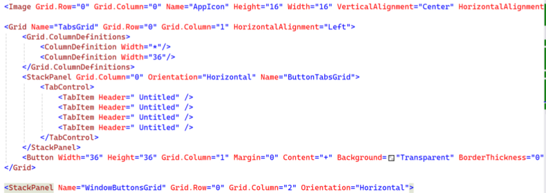
Structurally, the design still uses an outer Grid. It has to, the rest of the real app’s UI is built around a Grid. For this experiment, I just created a Grid with three Rows, one for the UI I was experimenting with, one for a placeholder Menu, and then one that is just the empty rest of the app window.
That’s simple enough. But the key to this dynamic layout is a series of embedded Grids and StackPanels that ensure the controls that need to be static and visible always are, while the one that can be at least partially hidden also is. So this Grid also contains an outer set of Column definitions.
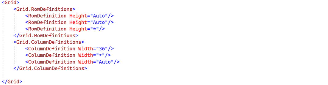
That’s 36 DPIs (device independent pixels) for the app icon, the rest of the width of the app for the TabControl and the Add tab button, which need to be “stuck” together, and whatever width the three window control buttons require. The first and third Columns are fixed width and the middle column is variable width.
Laying out the app icon in the first Column (Column 0) is straightforward. I usually use a Grid for the window control buttons, but now that I’ve been playing with StackPanel, I can see that horizontally oriented StackPanel requires less code, as each control it contains will automatically be laid out left to right. So that’s what’s in the third Column (Column 2). I also added the Menu in the second Row (Row 1) of the outer Grid.
What goes in the middle Column (Column 1) is crucial. There has to be a static container to ensure that the TabControl and Add new tab button are always joined at the hip, so to speak, and a Grid is ideal for that. But the TabControl has to be contained, its contents can’t be allowed to overflow into the controls around it. And this is where the StackPanel works so well. I just contain the TabControl in a StackPanel.
Put another way, the middle Column (Column 1) is a Grid. This Grid has two Columns, a StackPanel that is Width * “star”, meaning it will take up whatever space is available, and a Button that is a fixed Width of 36 DPIs. The StackPanel contains a TabControl. And I’ve experimented with various numbers of TabItems inside that TabControl, but here’s a version with four of them. (It’s what you see in the second video above.)
The silly thing is, this is not complex XAML. Looking at it now, I wonder why it took me so long to get there. But then I look at all my failed experiments in the forms of Visual Studio projects. And … Whatever. I got it there. Not perfect, but OK.
As you resize the window–making it smaller–the top-level controls all stay fixed in place. The contents of the TabControl in Column 1 will all display normally if there’s enough room. But as the window gets less window, the rightmost TabItems will start to disappear, which is less than ideal but acceptable. The Add new tab button remains fixed to the right of the TabControl, which is ideal.
That’s the compromise. And now I will apply this design to the actual app and start building it out using the multiple tab, document, and state code I already wrote. And we’ll see if I can bring this all together. I feel pretty good about it.
Gain unlimited access to Premium articles.
With technology shaping our everyday lives, how could we not dig deeper?
Thurrott Premium delivers an honest and thorough perspective about the technologies we use and rely on everyday. Discover deeper content as a Premium member.