Apple iPhone 16 Pro Max Review
- Paul Thurrott
- Oct 22, 2024
-
7

The iPhone 16 Pro Max is terrific, but it’s also an incremental update to its predecessor with little in the way of useful new features. I find Camera Control and the new pro camera features are frustrating, the new 48 MP ultra-wide lens isn’t the leap forward I wanted, and the remaining updates are so minor that they don’t impact the user experience in a meaningful way. I do like the new desert titanium color, though.
With all that in mind, this is a bit different from my usual reviews. After spending almost six weeks with the iPhone 16 Pro Max, my key takeaway is that it’s nearly identical to its predecessor. So please reference my iPhone 15 Pro Max review for the details. Here, I am focusing only on what’s new and different.
Design
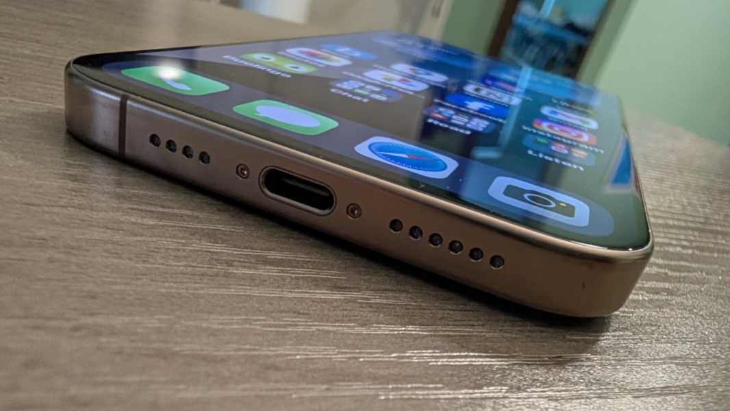
The overall design of the iPhone 16 Pro Max is unchanged from last year, with the same shiny titanium exterior frame and lightly textured matte glass back that is far too slippery to use without a case. The only notable change is the new Desert Titanium color, which is what I chose for my iPhone. It’s better looking in person than the rumors suggested but difficult to photograph accurately. To my eyes, the sides and camera lens surrounds are a pleasant bronze color, and quite unique, while the back is so lightly tinted that it’s almost a white.
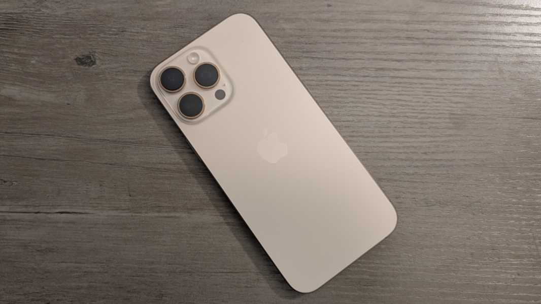
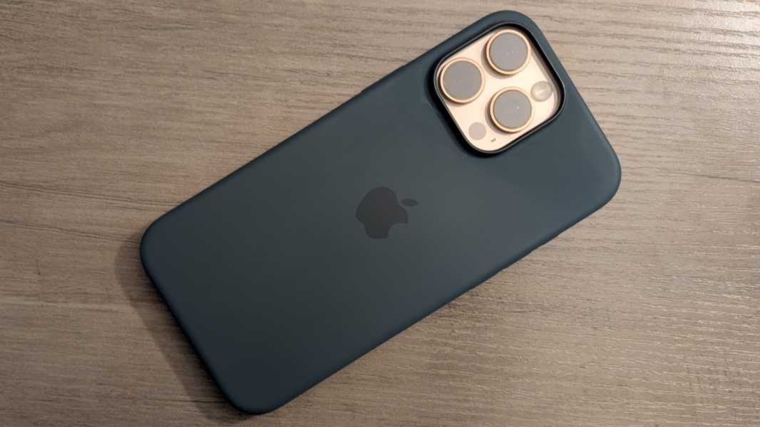
I like it quite a bit, and I’m curious how the Suti phone back I ordered will transform the day-to-day experience when I return home in late November. The green Apple silicone case I also bought is serviceable, and I like the color, but I prefer something a bit more low profile.
Last year, Apple added the Action button, altering the hardware button layout for the first time in years. I was excited about that change, but with a year of use, I’m sad to report that I just use it like its slider predecessor to toggle between Silent and Ring modes.
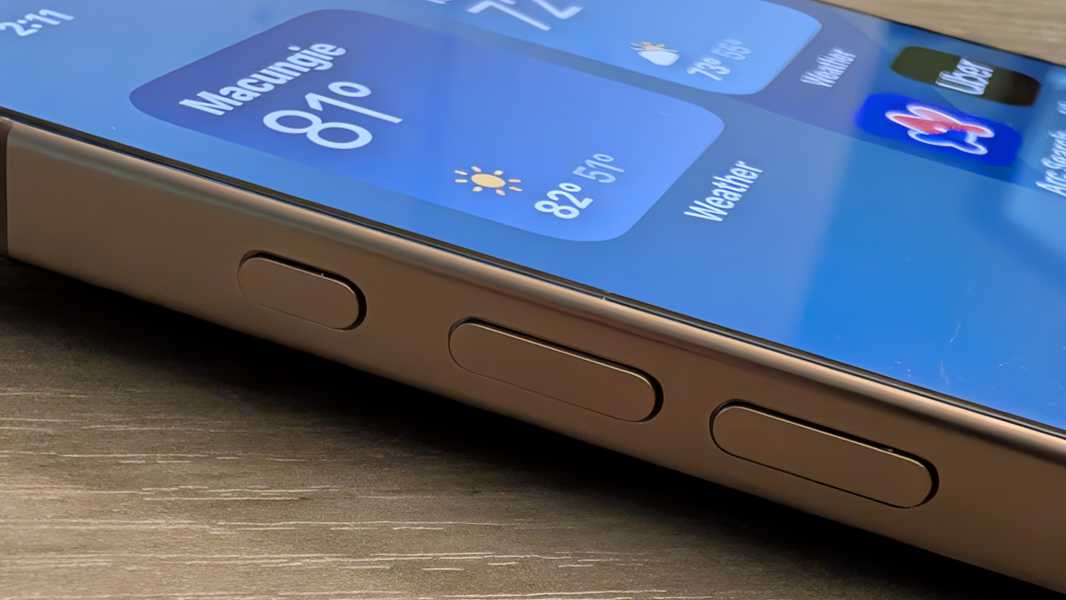
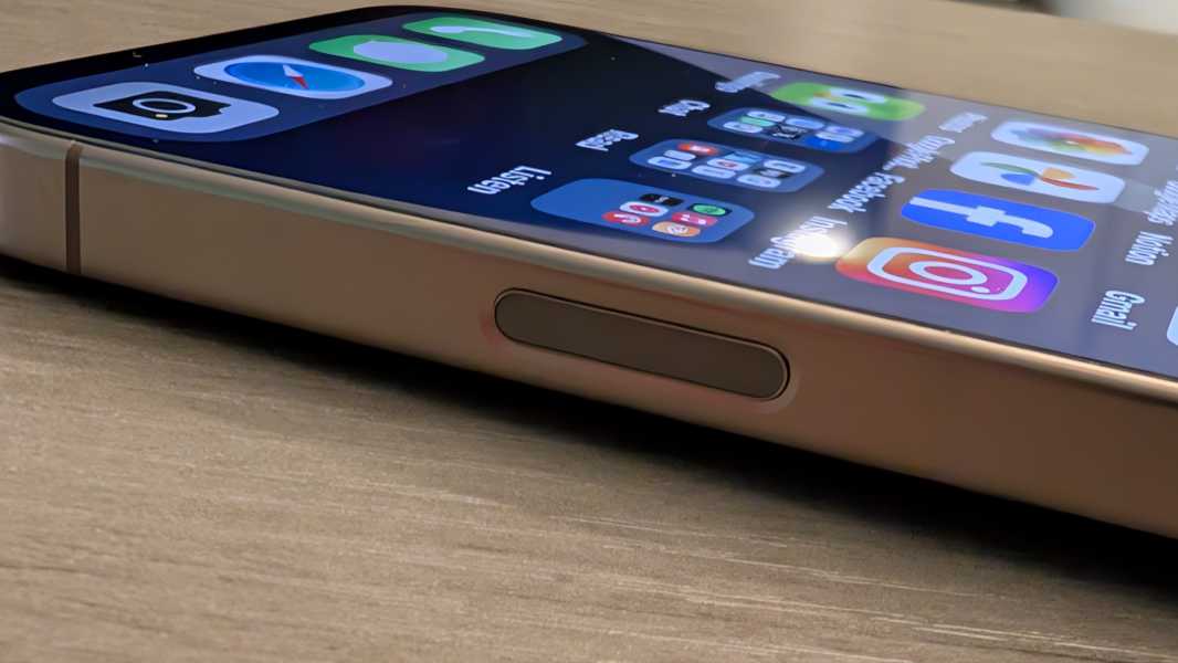
This year, I was just as excited about the new Camera Control button, which I discuss below. From a design perspective, however, the impact is minimal as this weird little button is easily missed: Camera Control is the same size and shape as the Power button–it’s on the same side of the device, too–but it’s roughly flush with the titanium side.
Beyond that, Apple claims the bezels are a bit smaller than before, but this is the type of thing you’d only notice if you had the two iPhones side-by-side and were really looking for it. But we’re well past the point where one could complain about bezels on an Apple flagship. They are delightfully small and give the iPhone 16 Pro Max that “all screen” look that Apple long promised.
Display
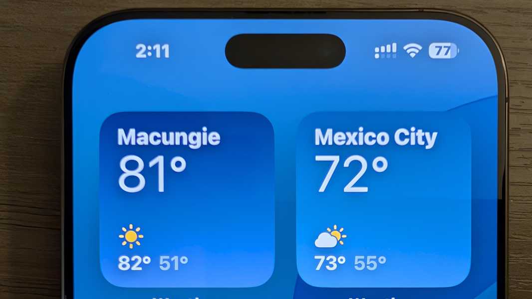
The iPhone 16 Pro Max uses the same terrific dynamic high refresh rate OLED display panel as its predecessor, which it calls Super Retina XDR because of course it does. There are some updates here, however. The panel is slightly bigger at 6.9 inches–vs. 6.7 inches–and has a correspondingly higher 2868 x 1320 resolution but at the same 460 PPI as last year. Apple says the Ceramic Shield protection on the front has been updated a bit since last year. For the first time, its adaptive refresh rate capabilities allow it to slow down all the way to just 1 Hz (from a high of 120 Hz, as before). And the Pro also supports dimming the display to as little as 1 nit, which can be a game changer at bedtime or in other dark environments.
But I’ve not noticed any significant changes from a display standpoint, and when I pick up the iPhone in the dark, the always-on display beams brightly in the dark. Pixel handles always-on more intelligently, and if you leave it upside down on a nightstand, it just goes into a “shh” mode in which the display will never light up. Apple doesn’t offer anything like that on iPhone, so you have to deal with routines or manually tone it down.
Hardware and specs
The chips used by the iPhone Pro lineup have long boasted the best performance numbers in the smartphone market, and I’m sure that’s still true with the iPhone 16 Pro Max and its A18 Pro chip, not that I’ve noticed any performance improvements year over year.
Like the A17 Pro it replaces, the A18 Pro delivers a 6-core CPU, a 6-core GPU, and a 16-core Neural Engine (NPU). But it’s built on a “second generation” 3-nanometer manufacturing process, and each of those components is improved over its predecessor. The CPU has two performance cores and four efficiency cores, as before, but it’s up to 15 percent faster than the A17 Pro and delivers the same performance while using 20 percent less power. The GPU is up to 20 percent faster than that of its predecessor, and it can perform ray tracing up to twice as fast. The “new” NPU is “faster and more efficient” and will run Apple Intelligence features up to 20 percent faster. And the A18 Pro is paired with 8 GB of RAM, the same as last year, but total system memory bandwidth is now 17 percent better.
That’s all seems very impressive, and everything I do on the iPhone happens immediately and with alacrity, though that’s been true for a long time. Perhaps the coming Apple Intelligence improvements will make sense of this, but my previous iPhone is long gone, so I won’t be able to compare them.
There is one thing I have noticed, however. Where the iPhone 15 Pro Max would get noticeably warm more than I liked, I don’t have that issue with the iPhone 16 Pro Max. It’s only gotten warm once, and that was during a friend’s event during which I took over 100 photos in a short period of time, and was thus understandable. Apple made two internal improvements to the device’s substructure to improve thermal management, and perhaps that plays a role in the shift. But I feel like improved heat dissipation might logically increase the heat on the iPhone’s exterior as it has to get out somehow. So I’m not sure what to say there.
Last year, I was curious to test the then-new AAA gaming capabilities, but little has changed year over year, and I’m too old to play high resolution console-quality games on a display this small. My iPad Air is another story.
Connectivity
The iPhone 16 Pro Max picks up Wi-Fi 7 with 2×2 MIMO, a nice upgrade from the Wi-Fi 6E in last year’s iPhones. At least theoretically: I’m on Wi-Fi 6E here in Mexico and back in Pennsylvania and will likely remain so for a few years at least. But the rest of the communications hardware and connectivity options are identical year-over-year. The only issue I’ve had isn’t Apple’s fault: Google Fi utilizes an inferior wireless carrier (at least in my neighborhood) here, so I had to switch to a third-party data eSIM that uses Telcel instead. It’s worked perfectly with both eSIMs enabled.
Audio-video
There’s nothing major to report on this front. As before, the iPhone 16 Pro Max sports Dolby Vision HDR10+/10 and stereo speakers–one in the earpiece and one on the bottom next to the USB-C port–and delivers a solid multimedia experience. I don’t watch long videos on a phone, of course. But I often listen to podcasts while shaving and cleaning up, and the speakers are surprisingly loud and clear, and ideal for this use.
Cameras
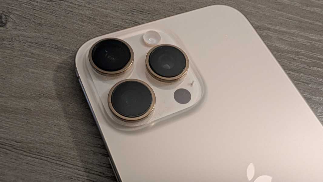
Heading into September’s iPhone event, I wasn’t particularly keen on upgrading, and as that event unfolded, I was surprised that Apple brought a new hardware feature–Camera Control–to the Pro and non-Pro models simultaneously, the first time I can recall that happening. But a few Pro-only advances sealed the deal, and they were mostly camera-related. The Pro models continue forward with a telephoto lens with 5x optical zoom that the non-Pro models lack. This year, the Pro models received a 48 MP ultrawide lens, with the non-Pro versions stuck at 12 MP. And then that faster USB-C 3 connection for offloading photos and videos much more quickly.
And it was all for naught. Camera Control is a bust, at least for me. And that ultrawide doesn’t really deliver much in the way of superior photos, though I do like the return to a true macro mode.

At a high level, the camera system is largely the same as before. It consists of three rear lenses and a single front-facing selfie camera. The rear mains lens debuted last year and is (mostly) unchanged: It’s a 48 MP wide lens with an ƒ/1.78 aperture that Apple for some reason now calls a “Fusion” lens instead of a main lens. The ultrawide is new–48 MP vs. 12–but with the same ƒ/2.2 aperture and the same 12 MP output since Apple doesn’t let you configure it to shoot 24 MP or 48 MP shots, as it does with the main lens, unless you go with the ProRAW format. And the telephoto lens is unchanged, it’s still stuck at 12 MP, has 5x optical zoom as noted, and an ƒ/2.8 aperture.
Most software capabilities–Night mode, Smart HDR5, Portrait mode with Focus and Depth control, and so on–carry forward too. But the iPhone 16 Pro Max sports Spatial Audio recording for Vision Pro fans, a “studio quality” four-mic array, wind noise reduction capabilities, an Audio Mix feature for editing audio in video after the fact, and a handful of new video recording configurations.

Beyond these, there are two major changes, one hardware and one software.
The hardware change is called Camera Control. This is a button on the right side of the device, below the Power button and ideally located when the device is held in landscape orientation, that offers a surprising range of features. At its most basic, it’s a button: Press it and the Camera app appears. Press it again and you take a photo. Press and hold it and you start recording a video.
This is all very basic, and it works well enough, though Apple already offered multiple ways to get into the Camera app, from the home screen, the lock screen, and via the Action button. But Camera Control is also capacitive. When you’re in the Camera app, you can lightly double-press it to get an on-screen menu of camera controls like exposure, depth, zoom, cameras (lens presets like selfie, 1X, 2X, and 5X), styles, and tone.
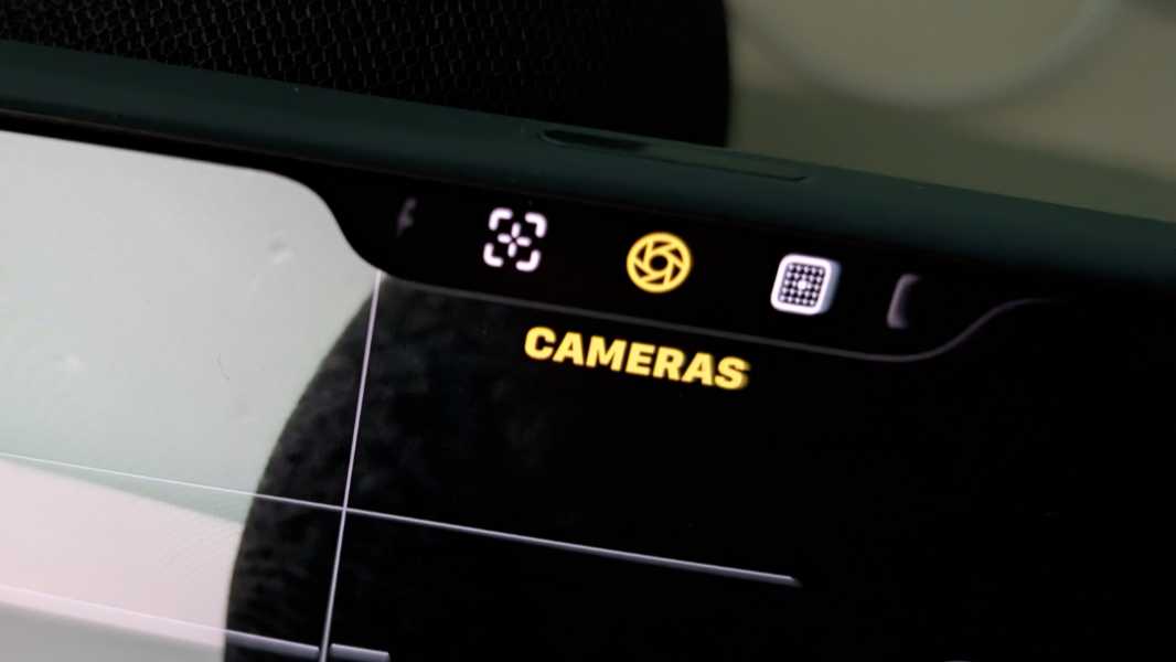
And with a control selected, you can slide across the Camera Control surface to select a value and then softly press it once to select the chosen value. For example, with zoom, you can scroll between 1.5X and 25X, and in increments big or small depending on the scroll speed.
Camera Control is the type of thing that seems useful at first glance. But nothing it controls is particularly difficult to access with the existing on-screen controls. Its physical placement is much less ideal if you are taking pictures in portrait mode, something that is quite common with phones. And in my experience–with a case and without–Camera Control is so sensitive and finicky that I just stopped using it. I was genuinely excited about this feature, and it’s a dud. (That said, Apple will add yet another feature to Camera Control soon, a manual focus. I will try again when that happens.)

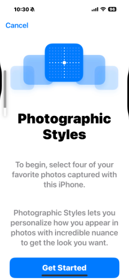
The new software feature is an entirely new version of Photographic Styles that Apple stupidly called Latest-generation Photographic Styles. The original version was terrific: It offered several presets that you could summon on the fly or just use all the time to permanently alter how the iPhone took photos. Because I find iPhone photos to be dull and flat by default, I could configure the Camera app to use a more vibrant Photographic Style called Rich Contrast that could have been named “Pixel style.” It was precisely what I wanted, and it put the iPhone over the top for me.

Photographic Styles weren’t filters, something you apply “to” a photo. Instead, this feature permanently altered the look of the resulting photos. You could edit them later, of course. But you couldn’t remove the style, it was baked into the photos. So with this Latest-generation Photographic Styles, Apple made some impressive underlying changes: If you shoot photos in its HEIC format (instead of JPEG), you can remove–or change the style after the fact. That, admittedly, is cool. And incredibly useful.

Leaving aside the format concerns, something I’d live with to use this feature, the Latest-generation Photographic Styles has a fatal flaw. It sucks, and in multiple ways.

To configure a style, you go into Camera settings (which is accessible only in the Settings app and not in the Camera app) and step through a simple wizard that first asks you to select four photos so you can see how applying whatever styles impacts them to help you make a choice. Simple enough. But you have to take at least four photos before you can even configure or use this feature.
Here’s the thing. If you go into this settings interface again later to change the style, you can’t select any photos: They’re all grayed out. And that’s because those four sample photos you chose earlier are all still selected. And as time goes by, and you take more and more photos, those selected photos are way down a long, long grid of photos. That you must scroll through like a madman to find them. God help you if you selected discontinuous photos in that grid. I’m not sure how you’d ever find them. But in my case, the second time I did this, I just had to scroll, manually, all the way to the end. There’s no “Start over” or “Unselect” option. And you can’t continue until you select four. And only four. It’s stupid.
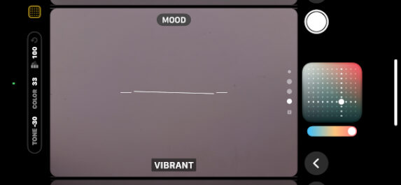
The Latest-generation Photographic Styles don’t have simple choices like Rich Contrast, Vibrant, Warm, and Cool. No, no. That would be too normal. Instead, they have a few reasonable choices like Standard and Neutral, and then several nonsensical choices like Amber, Gold, Rose Gold, and Cool Rose that read more like iPhone colors than anything related to photography. Worse, each (except for Standard) is accompanied by a slider you use to configure the amount of undertone the style will impart. (It doesn’t say this, but it means “skin undertone.”)
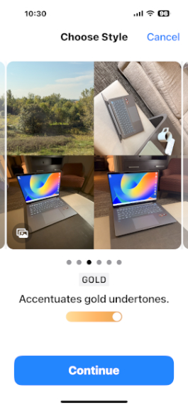
And then it gets weird. When you continue from those two choices–the style and the amount of undertone–you’re presented with a grid of dots and two intersecting lines, and no explanation of what the frick it is this thing does. According to Apple, you use this grid to adjust tone and color across the X and Y axes. This is, if not the dumbest interface I’ve ever seen, somewhere in the top five. I hate it. I hate it with the burning heat of a thousand suns.
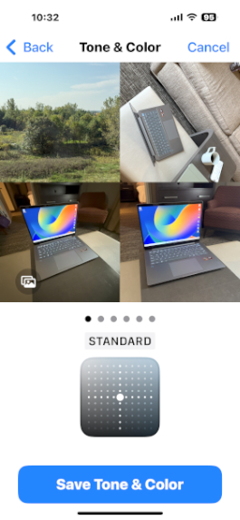
The problem is worse than you may understand. If you think back to the original Photographic Styles, there’s a bit I didn’t mention: Each preset–Rich Contrast, Vibrant, Warm, and Cool–was labeled with specific tone and color values, in numbers. The Latest-generation Photographic Styles interface I note above does not provide those values as you can configure it with the grid, so there’s no way to get to the same settings as a preset you liked before. Not that you could anyway: Most people will trade in the old iPhone and not realize they need those numbers, as I did.

But it gets weirder. When you’re in the Camera app, you can edit the Latest-generation Photographic Styles on the fly using an on-screen button that displays that grid control. And when you do that, Apple displays the tone and color values. F#$%ing seriously. When I saw my son in September, I explained this mess to him and then had him bring up the interface on his older iPhone, which still uses the old software, so I could get the tone and color values. So now it’s finally configured the way I want it. This used to take 15 seconds or less.
So that’s a long description of what I believe to be six or seven user experience gaffs in a single feature. It’s a sobering reminder that not even Apple gets it right every time.

Getting past that, there are no surprises with the cameras beyond the ultra-wide shots not being noticeably better or different from before. I assume that Apple will upgrade its telephoto lens next year and belatedly match what Google did with Pixel last year and have three high resolution lenses on the rear. But it would be as big a deal to support 24 and 48 MP shots on each lens and without requiring the user to configure ProRAW. And, as noted, to perhaps have pro and non-pro modes. Most people just take snapshots, and the Camera experience has gotten far too complex.
Security
No changes here. Face ID remains the superior way of authenticating oneself on a phone, and having moved exclusively to phone-based payments, I really enjoy how seamless it is.
Battery
Battery life has been terrific, and in a routine annual experience, the iPhone 16 Pro Max handily outperforms the Pixel 9 Pro XL in day-to-day use. But Apple’s claims of improved battery life when compared to its predecessor haven’t materialized. It’s about the same, and some days–curiously, as it’s never clear why–are much worse. This is almost certainly tied to my testing Apple Intelligence in beta, so it’s difficult to know where to land on this one. All I can say for sure is that iPhones generally provide terrific battery life, and that the iPhone 16 Pro Max continues this theme. I feel safer leaving the house for the day than I do with Pixel, and I’ve let it wind down the battery on long weekend days while taking numerous photos here in Mexico, just to see how low it would go. It’s never died on me.
Unique hardware features
The iPhone 16 Pro Max offers three unique hardware features compared to most smartphones, though only one is new to this year. As noted previously, Apple introduced the Action button last year, and it is unchanged. It introduced the Dynamic Island two years ago, and it remains a delight, and one of the iPhone’s best signature features. And then there’s Camera Control, which I discussed earlier in the review: It’s a mixed bag, basically.
Software
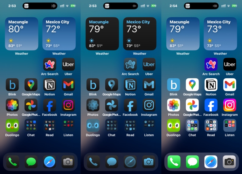
For the past several years, Apple has slowly chipped away at the obvious customization shortcomings in iOS that Android fans always used as an excuse to stay on their side of the platform fence. But the iPhone 16 Pro Max shipped with iOS 18, and this release hasn’t just closed the gap, it’s pulled the rug out from Google and its Pixel variation of Android, at least from a personalization perspective. Most obviously, iOS 18 finally allows iPhone users to put app icons anywhere on the home screen, though I find myself doing this much less than expected. And rearranging these icons can be problematic, with the other icons sometimes all rearranging when all I meant to do was move one icon.
But the bigger deal, to me, is that Apple actually gives you control of your home screen. Where Google supposedly more open platform forces you to deal with a search bar and At a Glance widget you can’t remove, you can do whatever you want on the iPhone home screen. My, how things have changed.
As good is the new icon tinting capabilities, which support both light and dark modes and can integrate with the look and feel of your wallpaper. Better still, it can be dynamic, shifting colors automatically throughout the day and changing into dark-tinted colors at night. I love this feature, and it’s dramatically nicer than the themed icon capabilities that Google has struggled to get right for, what? Three years? That feature’s still in beta, but Apple nailed it on the first try.
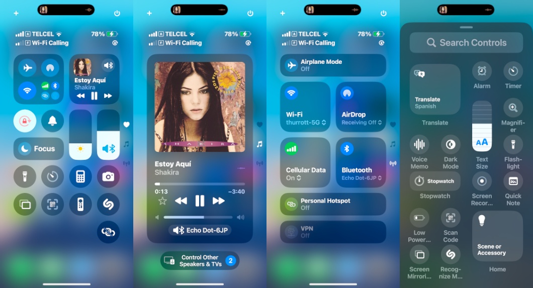
There are more useful updates. Control Center is now more configurable and expands over three scrollable screens. You can replace the two lock screen controls–flashlight and camera by default–from a selection of dozens of other choices, including third-party camera apps like Halide.
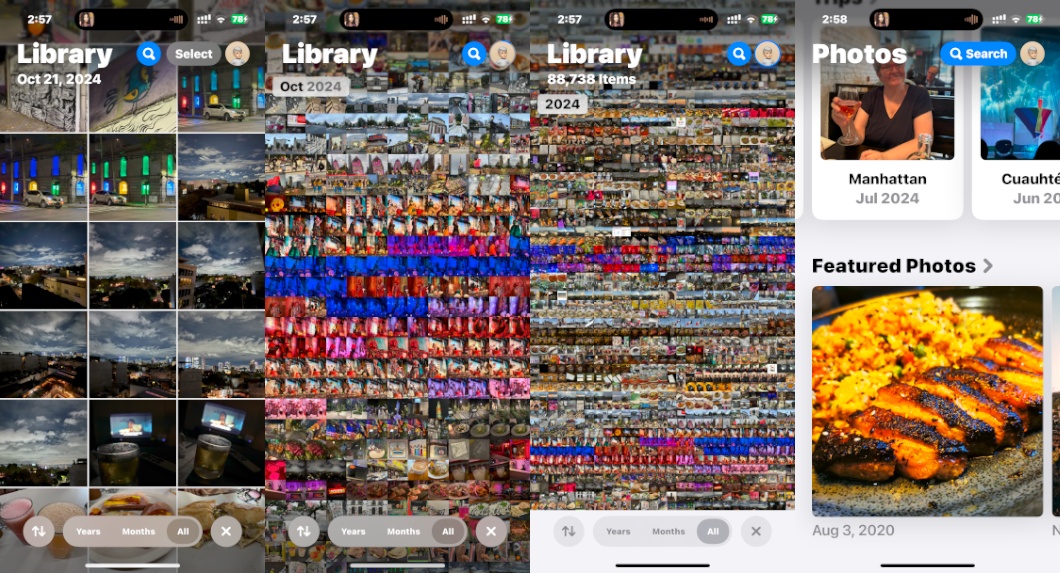
And while I try to stay away from lock-in, the Photos app is gorgeous now, and much more logically organized, and you can customize the views to a surprising degree. I like it better than Google Photos. My only major disappointment is the lackluster spam call and text protections. They’re almost non-existent, as always.
But this is just a slice in time: iOS is about to change–and then change again and again–as Apple finally introduces Apple Intelligence, starting as soon as next week. The first several features are modest–summaries in Mail, Safari, and so on, writing improvement tools, a slightly improved Siri with a colorful new user experience, generative object removal in photos, and the like–more impressive features will arrive in December and then throughout 2025. We’re entering a brave new era, and it should prove to be a calmer experience on iPhone than the chaos we see from Google and Microsoft.
But that’s for another day.
Pricing and availability
Apple raised prices last year, but it held the line in 2024, at least on the iPhone 16 Pro Max, which starts at the same $1199 as its predecessor. That’s a lot of money, but it at least comes with 256 GB of storage, and Apple offers good trade-in values for those with an older iPhone. Storage upgrades are still far too expensive, however: You’ll spend another $200 ($1399) to get 512 GB of storage, or another $400 ($1599) to get 1 TB. The iPhone 16 Pro Max is available in four color choices–The Desert Titanium I chose, Natural Titanium, White Titanium, and Black Titanium–with no limitations on colors and configurations, as we see with Pixel. I like the vibrant non-Pro color choices better.
Recommendations and conclusions
The iPhone 16 Pro Max is the obvious choice for Apple fans who want the latest camera features and the largest, highest-quality display. iOS 18 is a surprisingly full-featured upgrade, though that will be true for any supported iPhone. And everything that’s always been great about these flagships iPhones is still great, from the design to the performance, display, build quality, and battery life.
But this is perhaps the first time I didn’t feel pro enough to justify the expense: I would have been happier with an iPhone 16 Plus, I think, and could have saved a lot of money. Camera Control and the new ultra-wide lens are both disappointing, and the new Photographic Styles feature is ridiculously complex and non-intuitive. Perhaps it’s time for pro and non-pro camera modes. This is one area where Pixel comes out ahead handily, and it’s important enough to make me consider switching back.
But don’t let my personal issues get in the way. Few would ever be disappointed by a phone this excellent. And I can recommend it without reservation
At-a-glance
Pros
- Best-in-class performance, future-proof specs
- Large, gorgeous display
- Major advances in iOS personalization
- All-day battery life
Cons
- Camera Control is too sensitive, less useful than hoped
- New version of Photographic Styles is too complex
- Lackluster spam blocking functionality