Apple MacBook Air 15-Inch M3: Fun with Multitasking
- Paul Thurrott
- Mar 24, 2024
-
35
I’ve spent the past two weeks fully immersing myself in the Mac, most recently with the MacBook Air 15-Inch M3 I recently purchased. So far, I have few complaints: This is a special laptop with a magical blend of portability, capability, and performance, and while macOS itself has a few quirks, none are insurmountable. Indeed, compared to the crazy enshittification of Windows 11, the Mac is an island of purpose-driven calm and an ideal productivity tool.
That said, adapting to the Mac requires a bit of time and effort—you can’t unwind decades of experience over a weekend—and while I wouldn’t call this a struggle, there are still many small differences I don’t quite understand. Some of these are literally just differences, while others feel like functional deficiencies. You can see each in how this system handles multitasking, the ability to use and switch between multiple apps.
I have very specific habits when using Windows. I leave the Taskbar in its default visible state on all PCs, though I did recently experiment with hiding it when forced to go back to a laptop with a 16:9 display recently and found doing so workable. On laptops, I tend to use most apps maximized, switching between them with Alt + Tab. And on desktop PCs with their bigger displays, I tend to use most apps as floating windows, while still using Alt + Tab for switching. In both cases, I often use Snap to position two windows side-by-side, though I rarely use more complex layouts with more than two snapped apps. I don’t use Task view, or Winkey + Tab, almost ever, nor do I use Desktops (virtual desktops).
Windows Intelligence In Your Inbox
Sign up for our new free newsletter to get three time-saving tips each Friday — and get free copies of Paul Thurrott's Windows 11 and Windows 10 Field Guides (normally $9.99) as a special welcome gift!
"*" indicates required fields
But the Mac is different. Instead of a Taskbar, there’s a Dock, which can be positioned on the left or right of the display and not just on the bottom as with the Windows Taskbar. And there’s also a system menu that’s always displayed by default, at the top of the display. These differences have existed for decades—the Mac system menu literally dates back to the 1980s—and are well-understood. But there are lots of little changes you can make, and you can configure the menu and the Dock in various ways, such as hiding them automatically. Thanks in part to new customization limitations imposed by Windows 11, I find the system personalization capabilities on macOS to be superior now.
How one deals with the often subtle differences between two different platforms varies by person, perhaps, but some differences are more meaningful than others. And the Mac, like Windows, has its own unique quirks and inconsistencies, some of which are likely rooted in age-old traditions I’m not aware of, while others arrived more recently as Apple added iOS-like software features to its desktop platform or introduced hardware changes like the notch on the MacBook Air (and recent MacBook Pros).
Whatever the reason, it gets weird sometimes.
The MacBook Air is a laptop, of course, and so I use it much like I use Windows laptops, meaning that I want most apps to fill the screen, so I can then switch between them using a keyboard shortcut, in this case Cmd + Tab (the macOS version of Alt + Tab). Without getting into the specifics of when certain features appeared, this requires a bit more thought on the Mac, however, because this system supports maximized apps like Windows, but more inconsistently and with different configuration capabilities related to the Dock and system menu. And because the Mac also supports a true Full Screen mode which, wait for it, also works inconsistently and can vary depending on how you configure the Dock and system menu.
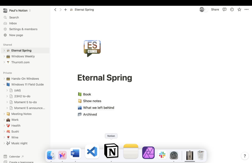
By default, when you put an app in Full Screen mode—assuming it supports that, as not all apps and windows do—its window expands to fill the entire screen. But the entire screen, at least not on my MacBook Air, which features a notch that descends into the top of the screen. Apple works around this self-imposed occlusion by filling the area to the notch’s sides with the system menu. But in Full Screen mode, all the apps I have used so far just ignore that top part of the screen, and it’s colored black to match the display bezels but is unusable space.

My understanding is that Mac apps can display in Full Screen and use that area. But I haven’t found a single example of that: All the windows and apps I use, including Finder windows, leave a system menu/notch-sized black space at the top of the screen while in Full Screen mode. I would like that to be fixed.
Beyond this, the inconsistencies are many.
For example, when I launch Microsoft Word on the Mac, it opens in a floating window despite me configuring it to run in Full Screen mode every time I use it. So I have to manually switch it to Full Screen mode every time. Other apps (like Notion and Affinity Photo 2) handle this correctly (or at least as expected).

Apple’s implementation of Full Screen mode is interesting, and it sometimes butts into older, more established window mode capabilities like Maximize. That is, as with Windows, the Mac has long supported things like minimizing, maximizing, and closing windows, but it has also supported the notion of hiding apps (inconsistently) and now putting apps in Full Screen mode. And these things can work differently in each app.
Most Mac apps and windows display the familiar traffic light-like red, yellow, and green window control buttons that loosely mirror the Minimize, Restore/Maximize, and Close window buttons in Windows. However, these buttons have long worked a bit differently than they do in Windows, and the introduction of Full Screen has changed things yet again. The red button is literally Close, so that works as expected, and the yellow button, apparently unnamed, maps to Minimize. But the green button now triggers Full Screen when clicked—if the app/window supports it—where it used to toggle Restore/Maximize. Except that it’s always been inconsistent: I’m sure a Mac user could explain this better than me, but some apps just don’t maximize normally. Instead, this button would toggles Zoom, a feature that lets the app window change between two different display states (meaning window size/shapes).
In today’s macOS, you can still access Maximize—or that Zoom toggle—by holding down the Option key when you click the green button. Or, you can double-click what I still think of as the title bar area of an app/window; basically the top. And what you get will vary: Apple Notes, for example, toggles between a floating window and a maximized window. But Microsoft Word toggles between two window sizes. It’s very strange.
As noted above, macOS has long supported the ability to Hide apps and windows, and when it comes to apps, the distinction between Hide and minimize is that the former will hide all of an app’s windows, not just the current focused window. But that’s when it’s available at all: Not all apps support Hide, and not all apps that do support it do so identically, For example, you can hide most apps by typing Cmd + H, but some apps use a custom keyboard shortcut instead. Sigh.
In any event, I try to use most apps in Full Screen on the MacBook Air, which I like quite a bit despite that none of the apps I use can actually fill the entire screen (around the notch). The implementation of this mode is interesting, and I’m surprised Microsoft doesn’t offer something similar in Windows. You may recall that Windows 8 introduced a full-screen mode but only for Metro apps, and that the desktop and all the apps it ran were treated much like a single full-screen app. But in the shift away from that platform, we mostly lost that capability, and all we can do now is try to mimic it by hiding the Taskbar.
In Full Screen mode, an app displays in its own space, or virtual desktop. In this mode, an app displays over the entire display (minus the menu bar area, as described previously), and the Dock and menu are both hidden. You can display either by mousing over the top or bottom edge of the display, but I rarely do so. I really like this mode, as it helps you focus on what you’re doing without any distractions.

Full Screen mode makes switching between apps more elegant as well. You can use Cmd + Alt, of course, but Apple has enabled a superior system of touchpad gestures, now largely copied by Windows, that I prefer using instead: Using three fingers, you can swipe left and right to switch between each available space, or, in effect, between each app, though floating apps and windows and the Finder (the shell, like Explorer in Windows) are treated as a single space. It’s quite elegant and reliable.
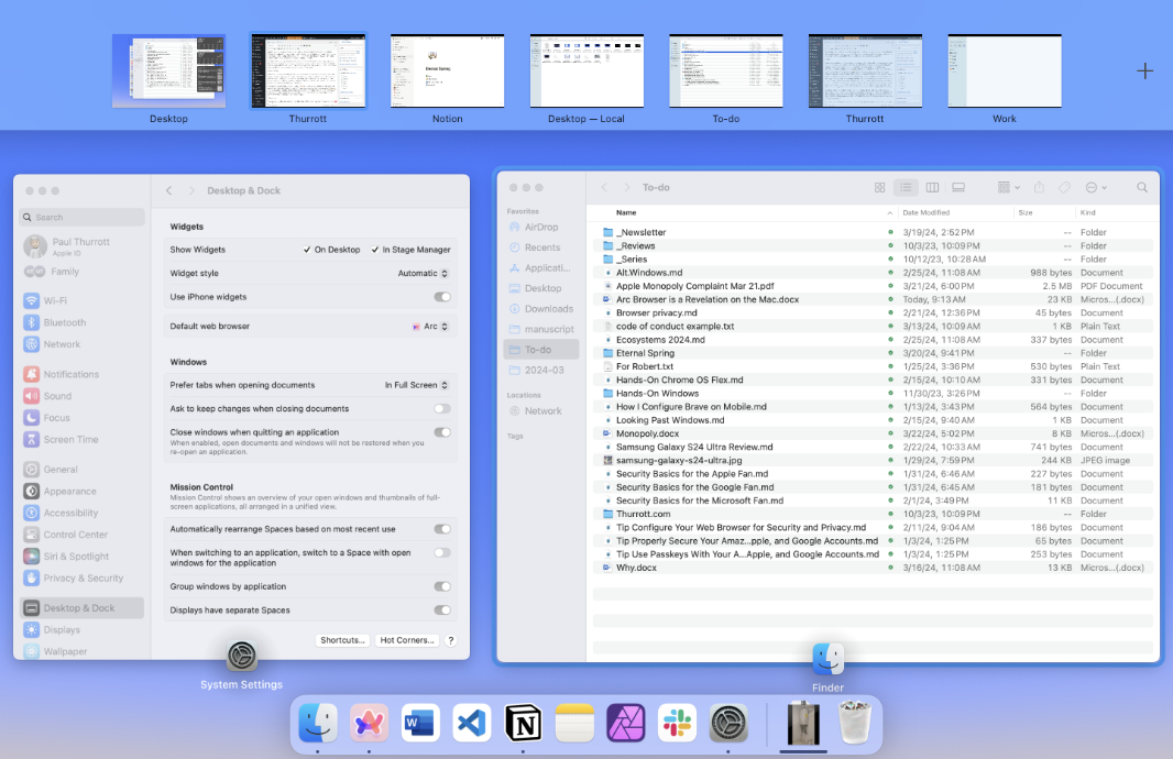
You can also use a three-finger gesture, this time in an upward direction, to access Mission Control, which is the macOS take on Task view. Mission Control is a full-screen experience in which you see each space/Full Screen app in a row at the top and then all other (floating) apps and windows in the area below. As with Task view, you can create and manage virtual desktops (spaces) here. But I only use spaces for Full Screen apps. (I might behave differently on a desktop Mac with a larger display.)

There’s more.
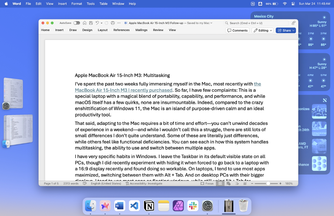
You can also optionally enable another multitasking feature called Stage Manager that I’m surprised to say I really like. (I disabled Stage Manager immediately when it appeared on my iPad.) Stage Manager works on the desktop—it’s not available in Full Screen mode—where it provides an angled thumbnail of the most recent several apps/windows off to the side while the focused window you’re currently working in displays normally. You can switch between these apps and other windows by clicking the thumbnail of the window you want, or via the Cmd + Tab shortcut.

Stage Manager, like Full Screen, is about focus. When it’s enabled, only one app/windows appears normally over the desktop, while the others toggle to angled thumbnails and desktop items—icons and widgets, basically—are either hidden entirely or faded into the background by default. (You can configure those behaviors to your liking.)
Related to this, Apple now hides everything on the desktop when you click it, a sort of “Show Desktop” mode that I find confusing: Generally, when I look at the desktop, it’s because I want to see the icons there and then do something with them. But you can disable this behavior, which I did. (I’m guessing it may have something to do with the ability to put widgets on the desktop, which is a recent development, but whatever. Being able to configure it the way you want is all I can ask for.)
Aside from the confusing inconsistencies, I like most of the features described above. What the Mac is missing, however, is a decent Snap feature like we have in Windows. You can tile two apps/windows side-by-side on the Mac using something called Split View, but like so much else noted above, it’s inconsistent and only works with some apps and windows. It also doesn’t support keyboard shortcuts (like Cmd + ] or whatever), which makes it a non-starter for me.
From what I can tell, the only way to access Split View is to mouse-over an app’s or window’s green window button, and only when it’s not in Full Screen mode, and see whether a flyout with window tiling options appears. It’s hit or miss, in my experience.

If it does, you can tile the app or window and then a Snap Assist-like display appears so you can choose the app or window that will be tiled next to it. Apps in Split View are placed into their own space, like a single app in Full Screen, and from there, your options are limited: You can use the splitter in the middle to resize the tiled apps relative to each other. And you can use drag and drop to switch the position of the titled apps. But you can’t tile three or more apps and windows in more complex layouts, it just supports two apps/windows side-by-side. I will likely never use this feature, though I often use Snap on Windows laptops.’

One issue I’ve mentioned in the past is that the Mac doesn’t support full keyboard control, which can be problematic in dialog boxes when some controls aren’t part of the z-order and thus can’t ever be selected by tapping TAB (or any other key), forcing you to use the mouse. As it turns out, this is the default behavior, but you can fix it, and doing so is a game changer for those who prefer to stick to the keyboard as much as possible (like me). To do so, just enable the “Keyboard navigation” option in System Settings > Keyboard. Excellent.
For the most part, I really like how multitasking works on the Mac, though the inconsistencies are bizarre and some of the limitations are surprising. I suspect there are third-party utilities that address some of these issues, but the one I’d like to fix the most—the inability to use the areas of the display on either side of the notch in Full Screen—is apparently a hard computer science problem, and the only “solution” I’ve found suffers from inconsistencies and reliability issues that make it untenable to me.
That’s OK. Full Screen, Stage Manager, and the other macOS multitasking features work well enough that I can get by nicely. And I love using the three-finger keyboard gesture to switch between Full Screen apps and the desktop. It’s already become quite natural, despite a few quirks and app-specific limitations.