Microsoft Edge is What’s Wrong with Windows 10 (Premium)
- Paul Thurrott
- Sep 05, 2018
-
68
I spent most of the long weekend updating the Microsoft Edge chapter in the Windows 10 Field Guide for the October 2018 Update. And now I don’t know what to think.
As you may know, I’ve reevaluated Microsoft Edge with each passing release of Windows 10, noting how it’s improved, often dramatically, in each version. I’ve also spent a lot of time ruminating over what Microsoft Edge should be, a debate that basically boils down to whether Edge should be “detached” from the operating system so that it can be updated more frequently.
But that’s the thing. Microsoft Edge and Windows 10 are essentially non-separable. And as Microsoft Edge goes, so does Windows 10. This has worked to the detriment of both, I think.
Put another way, Microsoft Edge is, in many ways, a microcosm of the overall Windows 10 experience. And I think that this fact, more than any technical issue, explains my ongoing concerns with both Microsoft Edge and Windows 10. That is, for everything that Microsoft gets right, there is too much inconsistency, broken functionality, and just outright weirdness.
Browsers are … complicated. They’re both apps and the host for another platform, the web, that runs on top of Windows (in this case). As the maker of Windows, Microsoft has long employed a strategy by which its own browser gains artificial advantages over third-party browsers by being so closely tied to the operating system.
This strategy worked for Internet Explorer, which once enjoyed over 80 percent usage share because it was bundled with Windows at a time when Windows was personal computing. But thanks to a variety of factors—IE’s quality problems and the rise of mobile and web computing—that strategy no longer works.
And despite multiple antitrust cases, Microsoft never really stopped doing it either. Today, Edge is bundled with Windows 10, a platform that boasts about 700 million users, but it commands just 4.3 percent of the web browser market. Most users are on other platforms—Android, iOS, plus other versions of Windows—and most had long ago moved to better browsers like Google Chrome. Which, incidentally, just celebrated its 10th anniversary.
That both Google and Apple, the personal computing platform makers that rose to prominence in the wake of Microsoft’s decline, make their own web browsers is not coincidental. Both play major roles in both mobile and desktop computing today, after all. But it is more interesting to me how different these browsers are from Microsoft Edge.
Yes, there are some similarities. On iOS, Safari is artificially given a non-removable status as the default web browser, a situation that does not exist on Android (or the Mac, for that matter). Likewise, Safari on iOS is only updated with the operating system, and not separately as an app as is the case with Chrome.
But neither Safari nor Chrome is as integrated with the underlying platform as is Edge. They’re just standalone apps, really. And both of these browsers are comparatively lightweight from a functional standpoint. Edge, by comparison, is brimming both with superfluous extra features and the expanding user interface that these features require.
You can see the impact of this stuff by simply looking at Microsoft Edge in different versions of Windows 10. Like the Settings app, Edge started off as a relatively lightweight app that did all the basics. But over time, as more and more features were added, the user interface has had to expand, and get denser and more complicated, in order to handle all the additional functionality.
In the latest version of Microsoft Edge, there is precious little in the way of major new features. But the more obvious major changes are all UI-related. Microsoft has completely revamped the “Settings and more” menu—-worst name ever—Settings (which is now multi-tabbed), and what used to be called the Hub, which is where you manage your Favorites, Reading list, ebooks library, browsing history, and downloads. Additionally, you can now configure (some of) the buttons that appear by default on the Edge toolbar.
In other words, Microsoft basically touched every single part of the browser that people interact with regularly. For some reason.
Well, not for some reason. It’s because Edge is full of features that most people will never—or, more charitably, rarely—use. The ability to “set tabs aside,” organize those tab sets, and then access them late. An ebook store and ebook management system. Reading list, a proprietary way to save articles for later. An expanding set of learning, reading, and grammar tools whose UI has exploded into an inconsistent mess in this most recent version. The ability to take notes or draw on top of web pages, PDF files, E-PUB files, and ebooks using a pen, mouse, finger, or the keyboard. Integrated Cortana features that have never really improved over time; for example, an address bar feature that still only works with restaurants but not other locations. It kind of goes on and on.
Let me fend off the obvious knee-jerk retort to this: That you may find one of these features useful is sort of beside the point. The point is that most people find none of these features useful most of the time. These are to Edge as features like Paint 3D, Windows Mixed Reality, and, sorry, Cortana are to Windows 10. Superfluous. Nonsense, as I put it.
They’re also a complexity, a mess. Something that distracts if not detracts from the core purpose of the thing. In the case of Edge, these are things that would perhaps be better served by extensions or other optional add-ins that users could seek out only when needed.
I struggle to understand why Microsoft does this, why there is no niche usage case that the company will not blindly chase, as if this one thing will put its failures behind it. Is there no vetting of features, no thought about maybe nailing the basics, like consistency, first?
And my God, is Edge full of inconsistencies. Over the course of re-documenting this browser for Windows 10 version 1809 in the Windows 10 Field Guide, I was struck by the many inconsistencies more than I was by any improvements.
For example, Microsoft Edge lets you read both E-PUB file and ebooks—which are also E-PUB files with some form of copy protection—directly in the browser, and it provides similar (but not identical) tools for doing so with each. Your ebooks—which you buy or obtain from the Microsoft Store—are managed in a Books interface in the browser. But you cannot store E-PUB files you download or view from the Internet in this interface, even though they, too, are often ebooks. And that means that your E-PUB files, and your progress in them, will not sync from PC to PC (or to Edge on mobile devices).
You can save E-PUB files in Edge’s proprietary Reading list as a workaround, something I’ve recommended in the book. But having two interfaces for what is essentially the same thing is dumb. And so sadly typical of Microsoft.
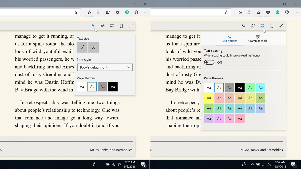
Here’s another one. In addition to reading web pages, Edge lets you read PDF files, EPUB files, and ebooks. And each has its own toolbar (or toolbars in some cases). Each of which is presented differently. The toolbar for Edge’s Reading view is off by default and appears as a floating toolbar. The one for PDF is on by default and is anchored to the top of the browser. The toolbars for EPUB files and ebooks are off by default but float.
In Windows 10 version 1809, the Text options button in each of these toolbars has been stripped of text spacing, which is now considered a Learning tools option. For some reason. Worse, there are four page themes under Text options, but there are 22 page themes under Learning tools. Yes, page themes are in two different locations on the same toolbar. For some reason.
This whole thing is a mess. And what’s truly sad about this is that the people who would benefit from these features the most are the ones who are least likely to even bother looking for, finding, or configuring anything in this mess. And that’s a shame, because some of the tools in there look really useful for those with reading deficiencies.
But then, that’s the zeitgeist of today’s Microsoft, isn’t it? Make a surface-level push to look inclusive without really understanding the impact of the halfhearted crap you just added to the product.
The Cortana voice-over in Windows 10 Setup is the perfect example of this kind of nonsense: She’s loud and shrill, and is on by default despite the fact that this functionality is unnecessary for 99.99 percent of the people who will ever set up Windows. As bad, you turn off this harpy by clicking—wait for it—the microphone icon in the toolbar in Setup. Not the speaker icon. Because, again, Microsoft doesn’t ever really think through things logically.
(Two more points about Cortana in Windows 10 Setup. First, Apple gets this functionality right in macOS: The voice-over capabilities don’t kick in until and unless the user hasn’t touched the keyboard or touchpad for a minute, so it never annoys the majority of those who don’t need it; it’s also not annoyingly loud when it does trigger. And you can’t actually complete Windows 10 Setup using just your voice. You can only complete part of Setup. Ah boy.)
I’m not sure how to summarize this. Microsoft Edge, like Windows 10, is teetering under the weight of years of additions that will benefit few people. And I guess I’m just worried about the long-term impact of these kinds of updates. This is especially a problem because of Microsoft’s bad history of not finishing the job. Oftentimes, things are added and then never touched again. Those who were responsible for the mess move on, their mission accomplished. And the crap just piles up.
So maybe that’s the summary. The crap just piles up.

Gain unlimited access to Premium articles.
With technology shaping our everyday lives, how could we not dig deeper?
Thurrott Premium delivers an honest and thorough perspective about the technologies we use and rely on everyday. Discover deeper content as a Premium member.