Windows 10 Insider Preview Build Brings New Disk Management UI

A new Windows 10 Insider Preview build adds a new disk management interface to Settings for those in the Dev channel, so this is probably aimed for Windows 10 version 21H1 or later.

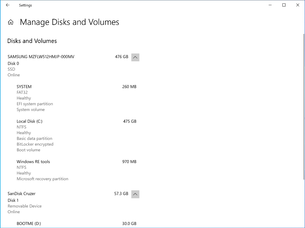
Windows 10 Insider Preview build 20197 comes with exactly one new feature: A new Manage Disk and Volumes page in Settings > System > Storage > Manage Disks and Volumes that duplicates some of the functionality of the old Disk Management MMC (Microsoft Management Console) that will still be available for us old-timers.

Windows Intelligence In Your Inbox

Sign up for our new free newsletter to get three time-saving tips each Friday — and get free copies of Paul Thurrott's Windows 11 and Windows 10 Field Guides (normally $9.99) as a special welcome gift!

"*" indicates required fields

This field is for validation purposes and should be left unchanged.

The new interface provides a way to view information about each disk attached to the PC, create and format volumes, and assign drive letters. Microsoft claims it was “built from the ground up to with accessibility in mind,” whatever that means, and it offers better integration with Storage Spaces.

That’s it for new features.

Share post

Please check our Community Guidelines before commenting

Conversation 27 comments

  • olditpro2000

    Premium Member
    21 August, 2020 - 1:51 pm

    <p>Small step, but a welcome one – as long as it has feature parity with the existing MMC.</p>

  • MutualCore

    21 August, 2020 - 1:59 pm

    <p>That's horrible, just a bunch of text. No UI, what the frak is going on? So does 'accessibility' now mean no icons?</p>

    • codymesh

      21 August, 2020 - 2:15 pm

      <blockquote><em><a href="#562913">In reply to MutualCore:</a></em></blockquote><p>it's probably unfinished</p>

    • jimchamplin

      Premium Member
      21 August, 2020 - 2:16 pm

      <blockquote><em><a href="#562913">In reply to MutualCore:</a></em></blockquote><p>Yes, it’s text. Shows each physical drive and the volumes on each. In keeping with the style of these UIs, when you select a volume, you’ll see available operations as buttons and or menus.</p><p><br></p><p>Seems fine to me.</p>

      • wilhil

        21 August, 2020 - 2:40 pm

        <blockquote><em><a href="#562919">In reply to jimchamplin:</a></em></blockquote><p>Have you ever used Disk Manager in MMC? Compare a quick glance of that to this – it's harder to see what is going on.</p><p><br></p><p>The only thing this has got going for it is that it is a unified design with the other settings pages… however, most of the other settings pages are equally as bad!</p><p><br></p><p>I can't believe how strong I feel about this that I actually registered an account to say how bad this looks!</p>

        • jimchamplin

          Premium Member
          21 August, 2020 - 8:11 pm

          <blockquote><em><a href="#562932">In reply to wilhil:</a></em></blockquote><p>Disk Manager <em>is</em> easier to understand what's going on for people like you and I. Not for everyone. I usually prefer diskpart anyway, but I know that for most folks, even Disk Manager is scary looking. It's visually dense and provides a massive amount of information.</p><p><br></p><p>When all they want to do is split a USB disk in two, this will work for them. For you, Disk Manager will let you tweak your NTFS cluster size. Two different UIs for two different kinds of user.</p><p><br></p><p>Still seems fine to me. Also probably unfinished, which is also fine.</p><p><br></p><p>Fine. It's fine.</p>

          • hrlngrv

            Premium Member
            21 August, 2020 - 8:48 pm

            <p><a href="https://www.thurrott.com/windows/windows-10/239361/windows-10-insider-preview-brings-new-disk-management-ui#562986&quot; target="_blank"><em>In reply to jimchamplin:</em></a></p><p>The fundamental question is whether <em>most users</em> should get anywhere near any tool which could change disk partitions.</p><p>As for just splitting usb drives in 2, IMO gparted provides a far superior UI than what's in the screen shot above.</p>

            • jimchamplin

              Premium Member
              23 August, 2020 - 1:34 am

              <blockquote><em><a href="#562991">In reply to hrlngrv:</a></em></blockquote><p>Oh. No, they shouldn't. Nobody had brought up the actual, real question here yet. Also, those same people would never be able to use gparted.</p>

    • exreey

      22 August, 2020 - 4:04 am

      <blockquote><em><a href="#562913">In reply to MutualCore:</a></em></blockquote><p>The only thing they've left to do is invert the colors and we're right back in MSDOS 6.22 🙂 </p>

  • bart

    Premium Member
    21 August, 2020 - 3:02 pm

    <p>Do I spot a trend in the last few build with MS re-starting efforts to update old UI? </p><p>Panos demanding Windows gets a clean up? </p>

  • sevenacids

    21 August, 2020 - 3:30 pm

    <p>I don't know about you, but honestly, this UI is just terrible. And I don't understand why. At one point, they show these nice PR demos of Fluent Design, pretty UI, and all the yada yada – and then this happens. What's wrong with them? The old disk management MMC looks a bit dated, but way better than this. This looks like an alpha UI made by a developer before it was handed over to the designer. Just like most of the remaining settings app, by the way.</p><p><br></p><p>I'm really disappointed, they don't seem to care for what they do. If the code behind this looks equally bad… I wouldn't be surprised. </p>

    • PhilipVasta

      21 August, 2020 - 4:22 pm

      <blockquote><em><a href="#562949">In reply to sevenacids:</a></em></blockquote><p>I know, it's crazy. Seems like some tasteful delineation between the sections should be there. There's such a mismatch when you look at the Fluent sizzle videos and then… This. </p>

      • praveen_m

        07 September, 2020 - 9:12 pm

        <blockquote><em><a href="#562970">In reply to PhilipVasta:</a></em></blockquote><p>more like fizzle</p>

  • hrlngrv

    Premium Member
    21 August, 2020 - 4:04 pm

    <p>I like the <strong>BOOTME</strong> label for D:. FWIW, all my test files begin with <strong>deleteme</strong>.</p><p>If that's intended to replace the Disk Management plugin in the Management Console, it stinks. For some things it's better to have denser information displays, and for me that includes disk/partition management. Especially as the screen image above lacks free space and % free information. Partition management may be something which shouldn't be too accessible lest people try to use it too quickly without knowing what it actually is and what they should avoid.</p>

  • blue77star

    21 August, 2020 - 9:54 pm

    <p>Honestly, if this is going to bring some consistency in interface I am all for it. On the other hand, ever since Windows 10 was released I never used settings except for Windows Update screen because it is that useless, cluttered and ugly looking. But again for the sake of consistency, let's kill control panel.</p>

  • Thomas Parkison

    21 August, 2020 - 10:57 pm

    <p>Now all it needs is a new BitLocker GUI.</p>

  • techreader

    21 August, 2020 - 11:10 pm

    <p>I miss the bar chart that lets you visualize the disk usage. Hope they will add that. It certainly does look alpha. </p><p><br></p><p>But, yeah, glad to see them picking away at porting all these separate applets into Settings. </p>

  • javial

    Premium Member
    22 August, 2020 - 2:05 am

    <p>Its really ugly and unintuitive, like all the new Windows 10 UI. Its a smarphone UI. Mobile first, cloud first and desktop never again. </p>

  • dwindleflip

    22 August, 2020 - 3:55 am

    <p>I give up. This is just shit work. It's as if they don't care anymore or have never used a computer.</p><p><br></p><p>At this point, people need to be fired.</p><p><br></p><p>Windows has no future with leadership like this.</p><p><br></p><p>Could you imagine the reaction Steve Jobs would have had if this was checked into MacOS by a dev?

  • Nischi

    22 August, 2020 - 9:38 am

    <p>worst ui design ever seen, but it's sadly just following the foot steps of the rest of the modern settings app.</p>

  • wright_is

    Premium Member
    24 August, 2020 - 3:39 am

    <p>Now all they need to do is sort out the bug, where administrators don't have access to the new settings, but do have access to the old control panel!</p>

  • Greg Green

    24 August, 2020 - 10:29 am

    <p>It sure wastes a lot of space. On a 27” monitor this uses only 13”.</p>

  • zhackwyatt

    Premium Member
    24 August, 2020 - 9:25 pm

    <p>&gt; Microsoft claims it was “built from the ground up to with accessibility in mind,” whatever that means.</p><p><br></p><p>My guess is that it works better with screen readers for the visually impaired. That sort of thing.</p>

    • Paul Thurrott

      Premium Member
      25 August, 2020 - 8:48 am

      We shouldn’t have to guess. Why can’t Microsoft just communicate that? It really bothers me how terrible these Insider posts are.

  • praveen_m

    07 September, 2020 - 9:20 pm

    <p>Do they think this is some kind of joke? This is the sort of thing you show your boss to prove that you're working on something. </p><p><br></p><p>It's a shame because WinUI isn't bad at all. But guess what? They're still using the system XAML for the shell. People have just found feature flags that enable it so that means that the shell will use WinUI at least 3 years after its release. Hooray for find and replace! </p><p><br></p><p>I'm really glad that you didn't praise Microsoft, Paul. Many articles thought that this was Microsoft actually moving to Settings. Those people thought that Microsoft wasn't finished but time and time again, we know that they'll push this as is. I still can't get over what they did to Task View. I use virtual desktops every day. Explorer should not be crashing. Anyway, you could've done better with the title and mentioned that they took a three year hiatus from this work 😛 </p>

Windows Intelligence In Your Inbox

Sign up for our new free newsletter to get three time-saving tips each Friday

"*" indicates required fields

This field is for validation purposes and should be left unchanged.

Thurrott © 2024 Thurrott LLC