Microsoft Finally Starts Testing Windows 11 Start Improvements

Windows 11 was released in an unfinished state back in October, and one of the key complaints was the new Start menu, which many correctly view as a major step back from that in Windows 10 and with its own functional deficiencies. But today, Microsoft finally started testing an updated Start menu in the Windows Insider Program. And while it’s not as sophisticated as I had hoped, it is at least a baby step forward.

Windows 11 Insider Preview Build 22509 includes the following changes:

Windows Intelligence In Your Inbox

Sign up for our new free newsletter to get three time-saving tips each Friday — and get free copies of Paul Thurrott's Windows 11 and Windows 10 Field Guides (normally $9.99) as a special welcome gift!

"*" indicates required fields

This field is for validation purposes and should be left unchanged.

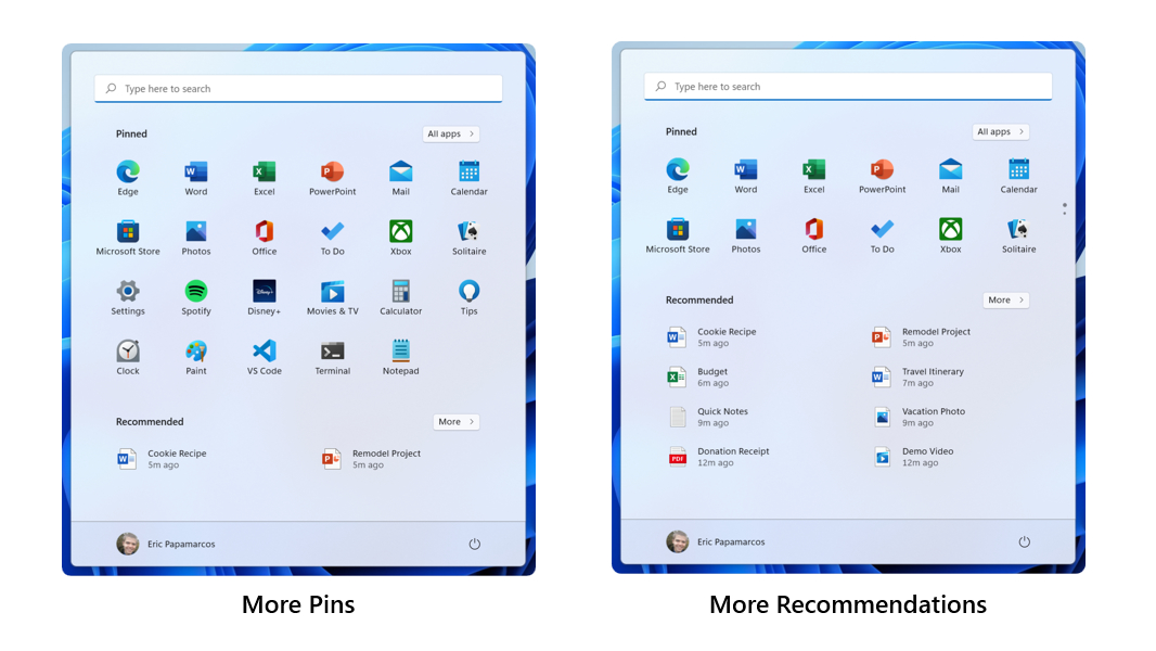
Updated Start. With this build, testers can choose between two more Start layouts: “More pins” and “More recommendations.” Each adds an extra row of icons to the respective Start area (and, I assume, removes one from the other). Again, not super sophisticated, but a positive change.

Improved Narrator-based navigation in Microsoft Edge. Microsoft says that typing in edit fields should now be faster, more useful information is provided when navigating around the web, and that you will have a more consistent navigation experience with Narrator.

More Settings, less Control Panel. More Control Panel settings have moved to the Settings app, including advanced sharing settings (Network discovery, File and printer sharing, and public folder sharing), more Printers & Scanners settings, and some entry points for network and devices settings.

Clock and date on secondary displays. When a secondary monitor is connected, the clock and date will now also be displayed on the taskbars of the secondary display(s) “for glanceability.” Also for non-regressionism.

Notifications improvements. More high-priority notifications will now be shown as stacked, and at the same time, in the Notifications panel. Now, you can see up to 4 notifications at the same time—3 high-priority notifications and one normal priority notification.

And a few other things. Check out the original post for the details.

Share post

Please check our Community Guidelines before commenting

Conversation 36 comments

  • red.radar

    Premium Member
    01 December, 2021 - 2:13 pm

    <p>I would be grateful for a way to disable search the web from the start menu. That way I am not spammed with useless results when looking for a file or application on my system </p>

  • wolters

    Premium Member
    01 December, 2021 - 2:18 pm

    <p>I’d like to see a way to alphabetize the pinned apps. If we can’t group them by type or in folders, it would be nice to be able to quickly sort them alphabetically. </p>

  • bbennett40

    01 December, 2021 - 2:41 pm

    <p>"More recommendations, please" said no one ever.</p>

  • jdawgnoonan

    01 December, 2021 - 2:43 pm

    <p>I would like to see the No Recommendations option. </p>

    • anderb

      Premium Member
      01 December, 2021 - 5:41 pm

      <p>If they remove ‘Recommendations’ entirely then where would the ads be displayed?</p>

      • jdawgnoonan

        01 December, 2021 - 9:36 pm

        <p>Yeah, true. But, despite what a lot of people seem to think, Windows is not free, and a not free product should not have ads. If I start seeing ads there I am immediately going to quit using my Windows partitions on my personal machines. </p>

  • pachi

    01 December, 2021 - 2:57 pm

    <p>I did find an app on GitHub that enables some basic drag and drop but it’s kinda iffy. And doesn’t work for show desktop either. </p><p><br></p><p>even things like I right click start to restart or shutdown and hover that power submenu. It takes half a second to pop up. Just these little annoyances build up</p>

  • bluvg

    01 December, 2021 - 3:00 pm

    <p>MDI Control Panel &gt;&gt;&gt;&gt;&gt;&gt;&gt; SDI Settings. </p><p><br></p><p>There are some things in Settings that seem just poorly implemented or information sparse vs. e.g. Sound playback/recording tabs in Control Panel. If they remove that at some point… well, what’s the opposite of Windows delighting customers?</p>

    • darkgrayknight

      Premium Member
      01 December, 2021 - 3:07 pm

      <p>Yeah, those tabs contain a lot more information and ways to edit than what’s displayed in Settings -&gt; Sound now.</p>

  • darkgrayknight

    Premium Member
    01 December, 2021 - 3:04 pm

    <p>I would like to set the Task bar to be on the shortest side (bottom or left) of the screen. Currently it is only on the bottom and will rotate to the bottom if you rotate the surface pro. It is fine at the bottom when I have the screen vertical. I just want it to take less space always.</p>

  • jumpingjackflash5

    01 December, 2021 - 4:26 pm

    <p>Microsoft simply cannot do it (Windows) right anymore.</p>

  • LT1 Z51

    Premium Member
    01 December, 2021 - 4:27 pm

    <p>Ah, yes, they are fixing my biggest complaint with pins.</p>

  • Rob_Wade

    01 December, 2021 - 5:02 pm

    <p>There is, quite literally, NOTHING about the Windows 11 Start menu to like. It is complete and utter GARBAGE. I get angry every time I use it. EVERY time.</p>

    • miamimauler

      01 December, 2021 - 5:17 pm

      <p>@Bobby Wade</p><p><br></p><p>Then why are you using it? Why not use W10?</p>

  • ringofvoid

    01 December, 2021 - 5:12 pm

    <p>These are a nice set of updates. I’m still going to use Start11 whenever possible but I’m happy to see the other improvements</p>

  • barrywohl

    Premium Member
    01 December, 2021 - 5:14 pm

    <p>Give me back the same old "right click" menu that included the four things I used most for the last 25 years: "copy", "paste", "cut", "rename". I can’t be the only one. At least make the old right click menu available as a setting, instead of as a hack. I’m almost surprised that the bottom of the menu you get with "show more options" doesn’t include another "show more options." </p>

    • lwetzel

      Premium Member
      01 December, 2021 - 7:13 pm

      <p>"<span style="color: rgb(0, 0, 0);">four things I used most for the last 25 years: "copy", "paste", "cut", "rename".&nbsp;"</span></p><p><br></p><p>@barrywohl</p><p><br></p><p>Those things are on the top of the file explore tool bar when you click on a file.</p>

    • lwetzel

      Premium Member
      01 December, 2021 - 7:15 pm

      <p>by the way, they are icons so maybe you didn’t notice.</p><p><br></p>

    • casualadventurer

      02 December, 2021 - 10:20 am

      <p>Agreed. Why have anything in a second menu if you don’t have to? Why did they not simply give the old right-click menu the Windows 11 makeover? </p>

  • chronocidal

    Premium Member
    01 December, 2021 - 5:31 pm

    <p>I still cannot believe anyone thought the "smaller desktop for only 18 items" was a good replacement for the existing menu for pinned applications. What on earth is "better" about forcing a uniform grid of limited items when compared with a customizable layout <em>that can easily be made into a uniform grid if you actually wanted that anyway?</em></p><p><br></p><p>Maybe they just got tired of doing the legwork of making sure customizable features don’t break things?</p>

    • jwpear

      Premium Member
      02 December, 2021 - 12:02 pm

      <p>I can’t believe how much I miss the customizable grid support. I’m also surprised by how much I miss a full screen Start menu option. I have all this screen space and I want to use it rather than having to artificially scroll my menu because some UX person thought this constrained layout was best for me. </p><p><br></p><p>It’s no wonder we have crazy people with 100s of files and shortcuts littering their desktop! This may even drive me to such an insane thing! I’m kidding of course.</p><p><br></p><p>I’m pretty flexible, and I don’t use the Start menu that much, but it’s interesting how much these changes impact its usability and discoverability of apps. If an app isn’t in the pin list, they’re not all that discoverable. I think non-technical users will struggle. I have to believe Microsoft’s usability testing has shown this, assuming they’ve done such testing.</p>

      • chronocidal

        Premium Member
        02 December, 2021 - 3:42 pm

        <p>I’d day the idea that they tested anything about this is a pretty big assumption.. at least with people not already on board with the new layout to begin with.</p><p><br></p><p>To me, the extra menu navigation necessary to find all of the apps that didn’t make the cut to be on the main list is maybe a slightly lesser slap in the face compared with the inability to arrange them in anything other than a uniform grid. Why would I want that? Why would anyone want to have to squint at a uniform grid of icons to find the things they use the most, rather than nice groupings of related icons that they can arrange however they like?</p><p><br></p><p>The baffling thing about that? This is where the start menu has become <em>less functional than the desktop.</em> I haven’t done it in a long time, because the Win10 start menu lets me pin things however I like, but I remember in days gone by I would drag icons all over the desktop and they would just magically stay where I put them, as long as I turned off the auto-arrange options.</p><p><br></p><p>In fact, I just decided to try this, and it’s still entirely possible in Win10. Yes, I can group shortcuts however I want on the desktop, drag them wherever I want (though I don’t know if they’ll reset with a reboot). And I can have dozens of them! And I can even have multiple desktops! I could just straight-up make a purpose-built desktop layout to function as my start menu if I wanted!</p><p><br></p><p><em>Why is the desktop suddenly a more customizable and user-friendly start menu than the actual start menu?</em></p>

      • Breaker119

        Premium Member
        02 December, 2021 - 10:48 pm

        <p>I’m absolutely missing the full-screen Start Menu with grouped grids of tiles. I have lots of tools that I don’t regularly use, and there’s no way I can remember all of their names. The full screen allowed me to group things together visually…all Admin tools grouped, all production tools (e.g. video, gif, photo editing) grouped, all social things grouped, etc.</p><p><br></p><p>This was so helpful!…now I have to guess and scroll until I hopefully recognize an Icon I am looking for.</p>

  • winner

    01 December, 2021 - 7:15 pm

    <p>Once these features are released into production, we will be running Windows 11 beta 2!</p>

  • ezzy

    Premium Member
    01 December, 2021 - 11:59 pm

    <p>So THAT’S the new Start Menu. I thought it was showing a smartphone screen. /s</p>

  • Cardch

    02 December, 2021 - 2:28 am

    <p>The fact that the two apps I use most of all: Netflix and Prime, have not started appearing automatically in the Start Menu says it all. </p>

  • justme

    Premium Member
    02 December, 2021 - 7:28 am

    <p>I dont know. While the changes are certainly moves in the right direction, I also dont see Microsoft ‘fixing’ the start menu. They will change it, and say ‘look, we listened, see these changes?’ It may even deaden some of the complaint noise. But they are firmly attached to the Bing and telemtry boat anchors (telemetry drives recommendations and thereby ads). Microsoft will never allow you to be able to get rid of the recommendations area completely and anything you search for using the start menu will be routed through Bing. </p><p><br></p><p>Personally, I prefer the approach Windows 7 took over anything recent. (And thank you, Stardock). I want folders in the start menu. If I search using the start menu, I want to search locally (and ONLY locally), not the web or onedrive. I want no recommendations whatsoever. Never going to happen, but it is nice to dream.</p>

  • rm

    02 December, 2021 - 10:03 am

    <p>These updates show that Windows 11 still needs more capabilities added that is for sure. I don’t want recommendations shown at all. So "Only Pins" option would be even better!</p>

  • dftf

    02 December, 2021 - 2:07 pm

    <p><strong style="color: rgb(0, 0, 0);">"More Settings, less Control Panel"</strong><span style="color: rgb(0, 0, 0);"> — I’d be in-shock if during the </span><em style="color: rgb(0, 0, 0);">Windows 11 </em><span style="color: rgb(0, 0, 0);">lifecycle they actually make significant-progress in this-area, given since </span><em style="color: rgb(0, 0, 0);">2015 </em><span style="color: rgb(0, 0, 0);">for </span><em style="color: rgb(0, 0, 0);">Windows 10 </em><span style="color: rgb(0, 0, 0);">they really stagnated on this. If you were to install the original 1507 release inside a VM and compare the </span><em style="color: rgb(0, 0, 0);">Control Panel </em><span style="color: rgb(0, 0, 0);">there to what exists in 21H2 right-now, it’s sad how-little progress has been made.</span></p>

    • thewarragulman

      Premium Member
      05 December, 2021 - 9:32 pm

      <p><br></p>

    • thewarragulman

      Premium Member
      05 December, 2021 - 9:36 pm

      <p>I have exactly that, each version of Windows 10 installed in a VM (did that when they came out) for archival purposes and in all honesty, I miss some of the way things used to be in earlier WIndows 10 versions with Control Panel being the main thing they’ve changed.</p><p><br></p><p>As a sys admin, my years of knowledge of where things are in the Control Panel is being ruined as each version of Windows 10, and now 11 has made changes to locations of things that I can’t remember where basic things are anymore.</p>

  • fredericbarry

    Premium Member
    02 December, 2021 - 6:44 pm

    <p>My biggest issue with the new Start menu is how *slow* it is to respond to search queries. Under Windows 10 it was quick and easy to click the Start button and you could immediately start typing to search apps, etc. Under Windows 11 it takes so long for typed keys to show up after bringing up the Start menu that most of the time I think it’s stalled out. This is happening across all my Windows 11 installs including the highest-end machine I’m testing (i7-10700 with 48-GB RAM)…</p>

  • roundaboutskid

    03 December, 2021 - 3:39 am

    <p>And why, oh why, isn’t the Start Menu button persistently in the center of the Task Bar? With all the shortcuts I have in the Task Bar, the Start Menu button is far off to the left, but not all the way as in previous versions of Windows, meaning that the position will vary with use, and the muscle memory click will not work. Just think about all the admins that will have to look for the position of the Start Menu button on each computer. The UX designer who came up with this, should be fired along with whomever approved it. Utter useless crap. Why did I ever upgrade? </p>

Windows Intelligence In Your Inbox

Sign up for our new free newsletter to get three time-saving tips each Friday

"*" indicates required fields

This field is for validation purposes and should be left unchanged.

Thurrott © 2024 Thurrott LLC